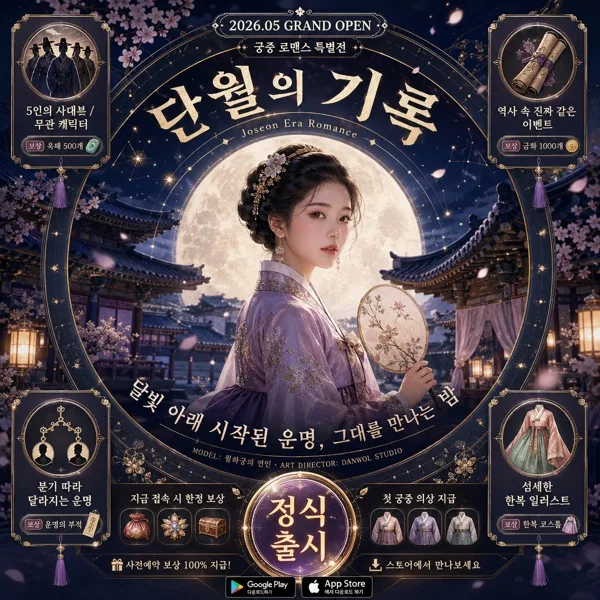
광고/포스터
리뷰 캡처 → 광고 카드
고객 리뷰 스크린샷 → 광고 슬라이드 변환.
리뷰 캡처 → 광고 카드 검색 요약
리뷰 캡처 → 광고 카드은 광고/포스터 결과물을 만들 때 바로 복사해 활용할 수 있는 ChatGPT 이미지 프롬프트입니다. 주제, 배경, 스타일, 구도 조건을 함께 담아 빠르게 시안을 만들 수 있도록 구성했습니다.
관련 키워드: 리뷰 캡처 → 광고 카드, 리뷰 캡처 → 광고 카드 프롬프트, 광고/포스터 프롬프트, 광고/포스터 AI 이미지 프롬프트, ChatGPT 이미지 프롬프트, AI 이미지 생성 프롬프트, AI 프롬프트, 이미지 프롬프트
리뷰 캡처 → 광고 카드 활용 포인트
원본 구조를 유지하면서 피사체, 배경, 색감, 구도를 바꿔 다양한 시안으로 확장할 수 있습니다.
- 핵심 소재는 유지하고 브랜드, 계절, 채널 목적에 맞는 색감과 배경을 바꿔보세요.
- 결과가 산만하면 배경 요소를 줄이고 피사체, 구도, 조명 조건을 구체화하세요.
- 복사한 뒤 ChatGPT에서 플랫폼, 화면 비율, 텍스트 포함 여부를 추가로 요청할 수 있습니다.
프롬프트 원문
[Input]
- reference_image: {참고 이미지}
- language: Korean
- output_size: 1024x1024

[Purpose]
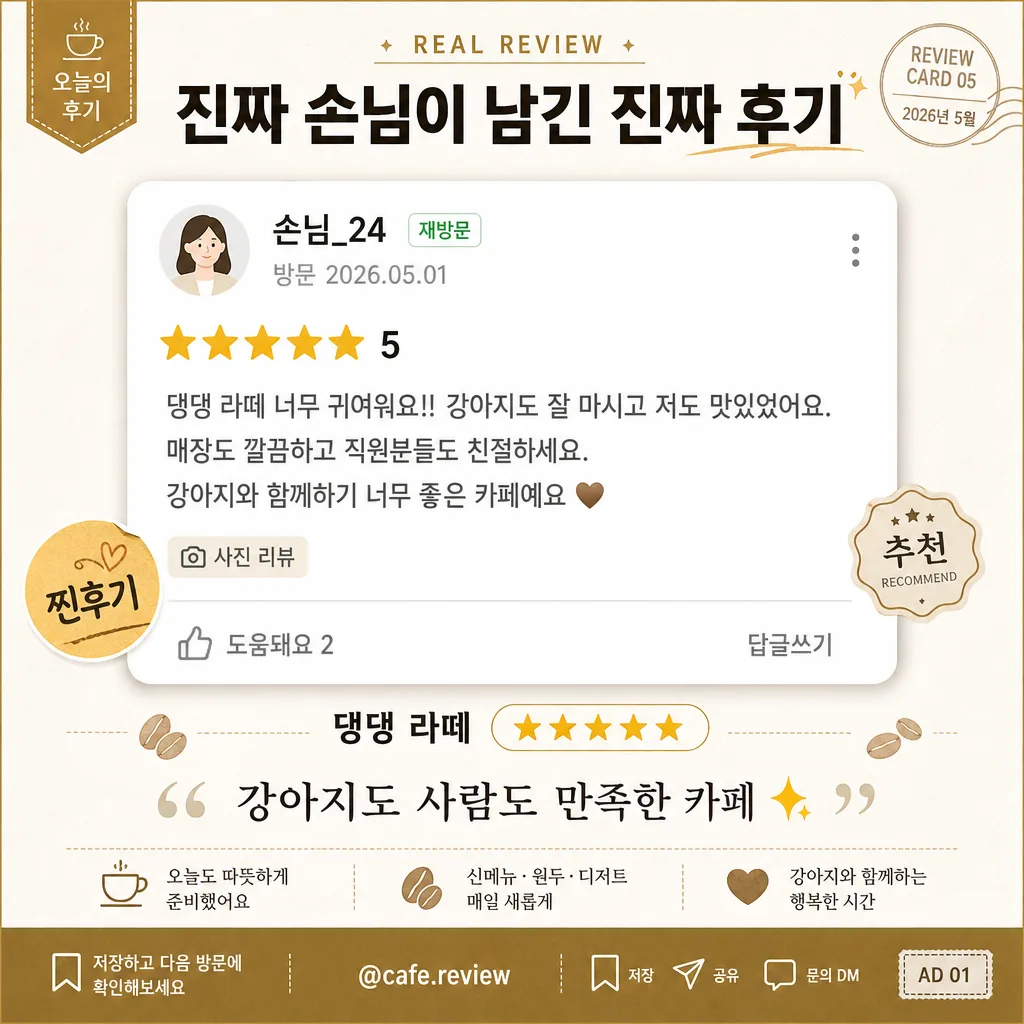
Korean café review advertisement card for social media, designed as a square testimonial promo graphic.
Transform a customer review screenshot into a believable, ad-ready local café marketing card with a real campaign feel: review proof, café identity, rating emphasis, short CTA, handle, date label, and small social-media details that make the layout feel published rather than like a blank mockup.

[Composition]
- Square canvas composition: build a 1:1 social ad card where the main review screenshot occupies the center 62–68% of the frame, supported by a branded header, café trust strip, short testimonial quote, and compact CTA footer.
- Header placement: {헤드라인} sits in the top band as the main bold Korean hook, with a small campaign label above it such as "오늘의 후기", "REAL REVIEW", or "고객 추천 카드" and a tiny date tag like "2026.05".
- Main focal block: {참고 이미지} is presented as a polished screenshot card with crisp crop edges, lightly rounded corners, a subtle drop shadow, and realistic review-capture details around or inside the card: small avatar circle, masked nickname such as "손님_24", date "방문 2026.05.01", star icons, short gray body-text lines, and a small "사진 리뷰" tag.
- Trust row and quote: {상호} and {리뷰 점수} appear directly under the screenshot, followed by {리뷰 한 줄} in the lower band as the main quoted testimonial line, with a warm gold star accent and a quotation-mark graphic.
- Advertising details: add a compact café promo footer with short Korean microcopy such as "저장하고 다음 방문에 확인해보세요", "오늘도 따뜻하게 준비했어요", "신메뉴 · 원두 · 디저트", plus tiny save/share/comment-like micro icons and a handle-style label such as "@cafe.review".
- Background treatment: use a premium warm-white paper or café receipt-inspired surface (#FFFFFF / #F5F5F5) with subtle paper grain, faint receipt grid lines, pale gold accent shapes, small coffee-bean or cup-line icons, and tasteful sticker-like tags that support the café testimonial theme.

[3. CORE STRUCTURE]
1. Header area (top 14%): Place a small label "REAL REVIEW" or "오늘의 후기" at the top, then set {헤드라인} centered in bold Korean type with strong contrast. Include a tiny issue/date-style mark such as "REVIEW CARD 05" or "2026년 5월" near the header corner.
2. Main image area (middle 60–64%): Place {참고 이미지} as the dominant cropped review screenshot block, scaled large enough to read clearly. Add a believable generic review-card frame with avatar dot, nickname, star row, timestamp, and gray review-body snippets without copying an exact real platform interface.
3. Trust cue row (lower-middle 9%): Set {상호} and {리뷰 점수} centered beneath the screenshot; emphasize {리뷰 점수} with warm gold stars, a small rounded badge, or a highlighted pill so the row reads as a confidence cue at a glance.
4. Review quote area (bottom 8–10%): Place {리뷰 한 줄} as a quoted line in Korean, slightly smaller than the headline but clearly readable, accompanied by a small quotation icon or soft underline accent.
5. CTA and social detail area (bottom edge 4–6%): Add tiny realistic social-card elements such as "@cafe.review", "저장", "공유", "문의 DM", a bookmark icon, a small page marker "AD 01", or a short line "방문 전 메뉴 확인하기".
6. Decorative hierarchy: Use warm gold separators, small rounded stickers reading "찐후기", "재방문", or "추천", and faint receipt-style dividers to create a richer café advertisement while keeping the review screenshot as the main focal element.

[4. STYLE RULES]
- Typography: Pretendard Bold for {헤드라인}, Pretendard SemiBold for {상호} and {리뷰 점수}, Pretendard Regular for {리뷰 한 줄}; header about 42–52px equivalent, body about 24–30px equivalent, micro labels about 12–16px equivalent, with clean Korean kerning.
- Color palette: #111111 for primary text, #FFFFFF for background, #F5F5F5 for subtle surface blocks, #FFD36A and #D8A93A for the review accent, with optional #FF6B6B only for a tiny highlight if needed.
- Border/shadow: screenshot card shadow with 0px x-offset, 6px y-offset, 18px blur, 12% opacity; corners lightly rounded to soften the layout without making it playful.
- Graphic accents: Use small gold star icons, pale beige receipt lines, soft cream sticker shapes, tiny gray UI icons, and one or two warm coral highlights to make the card feel like a finished social media advertisement.
- Text realism: Add short Korean supporting text that fits a café ad, for example "오늘의 고객 후기", "재방문 의사 100%", "따뜻한 커피와 디저트", "저장 후 방문해보세요", while keeping all required placeholder text exact.

[5. VISUAL STYLE]
- Camera / lens: digital UI card composition, no photographic camera effect; present the screenshot as a crisp screen-capture block rather than a physical photo, with pixel-clean edges and print-safe scaling.
- Lighting: flat, even studio-style presentation light with no glare, no harsh reflections, and no screen bloom.
- Color grade: neutral clean editorial tone, white-dominant with restrained warm accents for trust and readability.
- Rendering quality: high-resolution social ad graphic with sharp vector-like typography, realistic UI spacing, subtle paper texture, polished shadows, and believable café-brand design details.

[6. MOOD]
Trustworthy local-business testimonial card — like a modern Korean café Instagram advertisement that combines real customer proof, warm café branding, and polished lifestyle-magazine advertorial design.

[7. CRITICAL]
- Korean text accuracy: "{상호}", "{리뷰 점수}", "{리뷰 한 줄}", "{헤드라인}" must appear exactly as written.
- Layout invariant: preserve the square 1:1 composition indicated by {비율}, with the review screenshot remaining the dominant focal element.
- The review capture should feel generic and believable, with invented Korean microcopy such as "방문 후기", "사진 리뷰", "손님_24", and "2026.05.01" allowed as supporting detail.
- Required rendered additions should be in Korean where visible: include at least one small label like "오늘의 후기", one CTA like "저장하고 방문해보세요", and one handle-style text like "@cafe.review".

[8. 🚫 PROHIBITED]
- Fake official seals / certifications
- Broken Korean characters