광고/포스터
회사 채용 hero
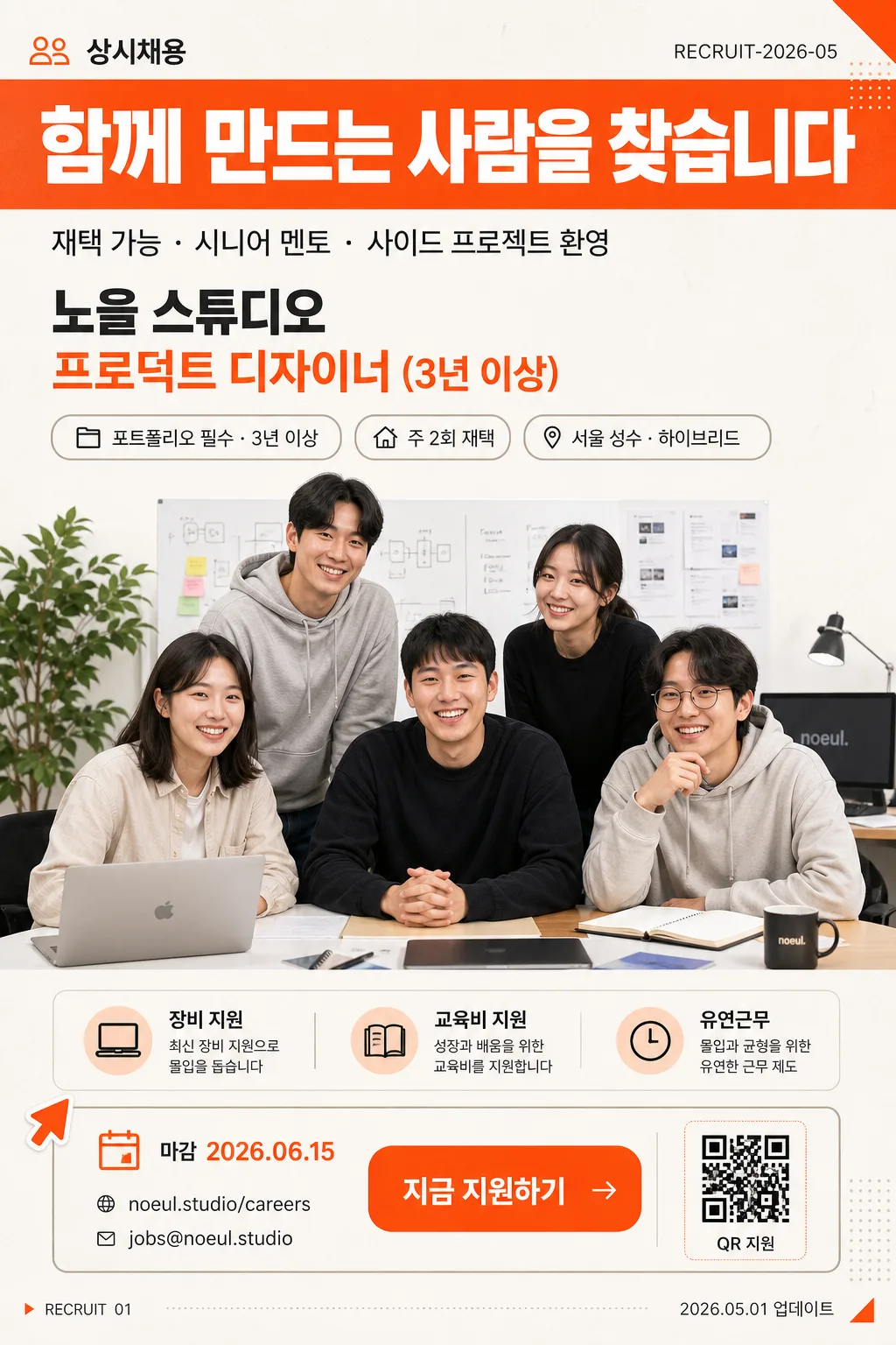
사무실 사진 → 채용 모집 카피 합성한 hero 이미지.
회사 채용 hero 검색 요약
회사 채용 hero은 광고/포스터 결과물을 만들 때 바로 복사해 활용할 수 있는 ChatGPT 이미지 프롬프트입니다. 주제, 배경, 스타일, 구도 조건을 함께 담아 빠르게 시안을 만들 수 있도록 구성했습니다.
관련 키워드: 회사 채용 hero, 회사 채용 hero 프롬프트, 광고/포스터 프롬프트, 광고/포스터 AI 이미지 프롬프트, ChatGPT 이미지 프롬프트, AI 이미지 생성 프롬프트, AI 프롬프트, 이미지 프롬프트
회사 채용 hero 활용 포인트
원본 구조를 유지하면서 피사체, 배경, 색감, 구도를 바꿔 다양한 시안으로 확장할 수 있습니다.
- 핵심 소재는 유지하고 브랜드, 계절, 채널 목적에 맞는 색감과 배경을 바꿔보세요.
- 결과가 산만하면 배경 요소를 줄이고 피사체, 구도, 조명 조건을 구체화하세요.
- 복사한 뒤 ChatGPT에서 플랫폼, 화면 비율, 텍스트 포함 여부를 추가로 요청할 수 있습니다.
프롬프트 원문
[Input]
- reference_image: {참고 이미지}
- language: Korean
- output_size: 1024x1536

[Purpose]
Korean recruitment hero poster for a job board and social-share card, vertical editorial layout.
Designed as a polished hiring banner with a strong headline band, centered team-photo hero, and practical hiring information such as deadline, workplace, benefits, contact, and application CTA for immediate scanning.

[Composition]
- Subject placement: the cut-out team/company photo occupies the center 56–60% of the frame, the top header band takes about 18%, and the lower information panel anchors the bottom 24–26%.
- Background treatment: warm off-white to light gray matte surface with subtle paper grain, faint geometric hiring-poster graphics, and a few realistic office cues such as a soft desk shadow, plant silhouette, laptop edge, or whiteboard blur when naturally connected to {참고 이미지}.
- Spacing and framing: structured vertical hierarchy from {헤드라인} to {서브}, central team photo, role information, and application CTA; use confident editorial alignment with readable gutters and clear section dividers.
- On-image text content: include {회사 이름}, {포지션}, {헤드라인}, {서브}, {채용 라벨}, {공고 번호}, {마감일}, {근무지}, {근무 형태}, {핵심 혜택}, {경력 요건}, {지원 링크}, {문의 이메일}, {CTA}, {날짜 스탬프} as realistic recruitment-poster typography.

[3. CORE STRUCTURE]
1. Hero area (mid 56–60%): {참고 이미지} cleanly cut out and centered, professionally retouched with crisp edges and a soft realistic shadow; preserve natural facial details, believable office lighting, and authentic team/company context such as desks, notebooks, monitors, or collaborative background elements if present in the reference.
2. Header area (top 18%): {채용 라벨} and {공고 번호} appear as small editorial metadata above or beside {헤드라인}; {헤드라인} set inside a full-width solid orange band, bold and highly legible, anchored top-left with a confident recruitment-campaign feel.
3. Subheader and role summary area: {서브} placed directly under the headline band in smaller type, followed by a clear role block showing {회사 이름}, {포지션}, {경력 요건}, {근무 형태}, and {근무지}; use pill-shaped labels, thin dividers, and small icon-style marks for location, calendar, and work type.
4. Footer application strip: include {마감일}, {지원 링크}, {문의 이메일}, and {CTA}; add a small QR-code placeholder box labeled “QR 지원”, a tiny page-style mark “RECRUIT 01”, and {날짜 스탬프} for a realistic job-board/social-share artifact.
5. Decorative recruitment details: add subtle dotted grid accents, orange corner tabs, small arrow stickers, and a compact benefits row using {핵심 혜택}; keep all decorative graphics secondary to the headline, team photo, and application information.

[4. STYLE RULES]
- Typography: Pretendard ExtraBold for {헤드라인} at large poster scale; Pretendard SemiBold for {회사 이름}, {포지션}, {채용 라벨}, and {CTA}; Noto Sans KR Regular for {서브}, {근무지}, {근무 형태}, {마감일}, {지원 링크}, and {문의 이메일}; keep Korean letterforms crisp, evenly tracked, and anti-aliased.
- Color palette: header band in #FF5733, primary text in #333333, background in #FFFFFF, with warm support tones from cream #F7F1E8, charcoal gray #2B2B2B, pale peach #FFE0D4, and muted beige #D8C8B6.
- Border/shadow: soft drop shadow with 5px y-offset, 10px blur, 20% opacity on the hero cut-out; use refined hairline dividers, rounded information chips, and matte editorial surfaces; no hard outlines, no bevel effects, no glossy finishes.
- Information design: all hiring details should feel like a real Korean startup recruitment poster, including deadline, contact, application route, benefit tags, and small metadata, without crowding the main portrait.

[5. VISUAL STYLE]
- Camera / lens: 85mm f/1.8 portrait lens look, shallow depth of field, sharp subject separation, clean business-portrait clarity.
- Lighting: soft natural window light from the upper-left at roughly 45°, with gentle fill from the right to keep the face and office scene readable; avoid harsh contrast.
- Color grade: warm cream + muted orange + neutral gray grade, similar to a polished LinkedIn premium job listing with subtle editorial polish.
- Rendering detail: realistic paper texture, clean vector-like typography, natural shadows under the cut-out photo, and believable printed-poster depth for a premium hiring campaign.

[6. MOOD]
Professional yet welcoming recruitment hero — LinkedIn premium job listing meets a warm startup editorial poster with credible hiring details and approachable team energy.

[7. CRITICAL]
- Korean text accuracy: “함께 만드는 사람을 찾습니다”, “재택 가능 · 시니어 멘토 · 사이드 프로젝트 환영”, “노을 스튜디오”, “프로덕트 디자이너 (3년 이상)” must appear correctly.
- Also render the recruitment details clearly in Korean: “상시채용”, “RECRUIT-2026-05”, “마감 2026.06.15”, “서울 성수 · 하이브리드”, “주 2회 재택”, “포트폴리오 필수 · 3년 이상”, “noeul.studio/careers”, “jobs@noeul.studio”, “지금 지원하기”, “2026.05.01 업데이트”.
- Maintain the specified vertical ratio of {비율} and the 1024x1536 output-size implication.
- The layout must preserve a clear top headline band, central hero cut-out, and bottom role/company/application block.

[8. 🚫 PROHIBITED]
- Fake official seals or certification badges
- Broken Korean characters
- Celebrity composites or unauthorized famous-person likenesses