SNS/카드뉴스
봄 피크닉 도시락 후기
자기 도시락 사진 → 봄 무드 변환 SNS 카드.
봄 피크닉 도시락 후기 검색 요약
봄 피크닉 도시락 후기은 SNS/카드뉴스 결과물을 만들 때 바로 복사해 활용할 수 있는 ChatGPT 이미지 프롬프트입니다. 주제, 배경, 스타일, 구도 조건을 함께 담아 빠르게 시안을 만들 수 있도록 구성했습니다.
관련 키워드: 봄 피크닉 도시락 후기, 봄 피크닉 도시락 후기 프롬프트, SNS/카드뉴스 프롬프트, SNS/카드뉴스 AI 이미지 프롬프트, ChatGPT 이미지 프롬프트, AI 이미지 생성 프롬프트, AI 프롬프트, 이미지 프롬프트
봄 피크닉 도시락 후기 활용 포인트
원본 구조를 유지하면서 피사체, 배경, 색감, 구도를 바꿔 다양한 시안으로 확장할 수 있습니다.
- 핵심 소재는 유지하고 브랜드, 계절, 채널 목적에 맞는 색감과 배경을 바꿔보세요.
- 결과가 산만하면 배경 요소를 줄이고 피사체, 구도, 조명 조건을 구체화하세요.
- 복사한 뒤 ChatGPT에서 플랫폼, 화면 비율, 텍스트 포함 여부를 추가로 요청할 수 있습니다.
프롬프트 원문
[Input]
- language: Korean
- output_size: 1024x1024

[Purpose]
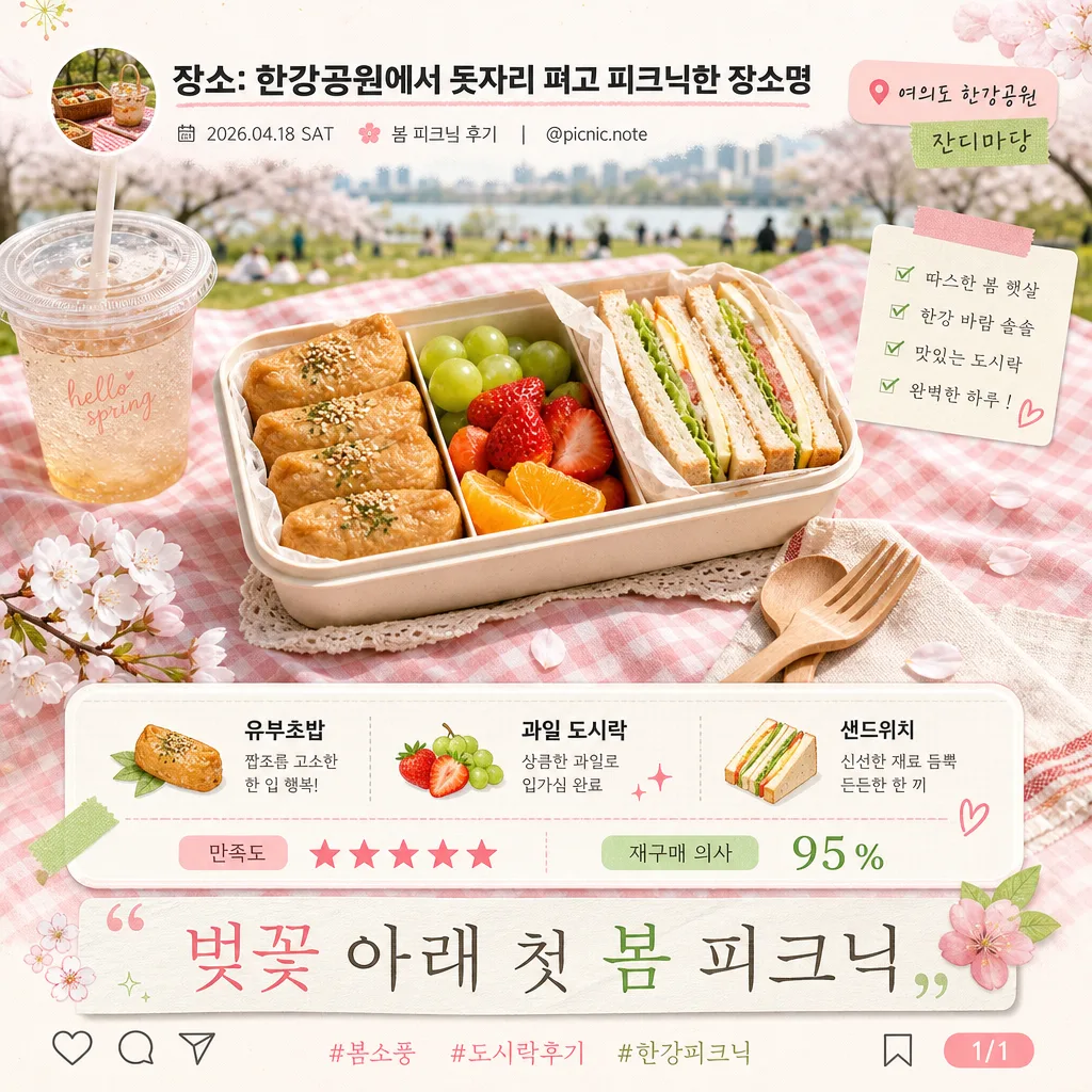
Spring picnic lunch review card for a square social post, presenting a personal bento photo as a polished lifestyle review with a warm, real-life picnic atmosphere.
Editorial 1:1 composition with a centered food hero, layered Instagram-style UI details, handwritten scrapbook accents, and content-rich Korean microcopy that feels like an authentic picnic diary post.

[Composition]
- Centered hero occupies about 60% of the frame, with {참고 이미지} as the main visual anchor, placed naturally on a gingham picnic mat with visible napkin edges, wooden cutlery, a drink cup, cherry blossom petals, and soft spring grass details around it.
- Background treatment: softly blurred park lawn and spring trees with pastel bokeh, using a pale pink wash and fresh green accents to evoke Han River Park; include realistic picnic textures such as fabric weave, paper label stickers, light crumbs, and sunlit shadows.
- Text spacing: top social header and location/date label aligned near the upper area, middle content block placed beneath or beside the hero depending on crop, footer quote anchored low with balanced padding and small UI micro-icons.
- Framing direction: slightly elevated eye-level composition so the lunchbox feels naturally placed on a picnic mat, while keeping all edges square and balanced for {비율} viewing.

[3. CORE STRUCTURE]
1. Hero area (mid 60%): {참고 이미지} integrated as a realistic central bento/lunchbox photo with soft contact shadow, natural highlights on food, and picnic mat context; make the bento the largest visual element and keep ingredients clearly visible.
2. Top header (10%): Place bold header text "장소: {장소}" near the top center or top-left in a social-card header. Add small Korean metadata nearby: "2026.04.18 SAT", "봄 피크닉 후기", "@picnic.note" and a tiny circular profile thumbnail placeholder.
3. Middle section (20%): Show "{도시락 구성}" as a neat item line or stacked mini-list beneath the hero, with small illustrated food markers, washi-tape labels, and a short rating strip such as "만족도 ★★★★★" and "재구매 의사 95%" in Korean.
4. Footer (10%): Set "{한 줄}" in an elegant quote style near the bottom, accented with the {컬러 톤} palette so it reads like a short personal caption. Add subtle Instagram-like save/share/comment micro icons, a small hashtag line "#봄소풍 #도시락후기 #한강피크닉", and a tiny page indicator "1/1".

[4. STYLE RULES]
- Typography: Pretendard Bold for the top header at medium-large size, Noto Sans KR Regular for the food list and microcopy at small-medium size, Nanum Myeongjo for the footer quote at slightly larger display size with a refined editorial feel.
- Color palette: use #FFB6C1 pastel pink, #98FB98 light green, #FFFFFF white, and #FFF8F1 soft cream for surfaces; keep all accents within {컬러 톤}, with warm beige paper textures and soft green picnic details.
- Border/shadow: soft drop shadow with 5px y-offset, 10px blur, 20% opacity under the hero; subtle 1px white border around text blocks for clarity on the blurred background; add sticker-style rounded rectangles, translucent caption chips, washi tape strips, and tiny hand-drawn sparkle or flower doodles.

[5. VISUAL STYLE]
- Camera / lens: 50mm f/2.8 natural perspective, slightly top-down picnic editorial framing, crisp enough to read the bento details without distortion.
- Lighting: soft morning light from the upper-left at about 45°, gentle fill from the lower-right, with diffused highlights and no harsh specular glare.
- Color grade: pastel pink and fresh spring green with soft highlights, lightly desaturated park tones, and clean bright whites for a fresh magazine-spread finish. Emphasize believable food texture, fabric weave, paper grain, condensation on drink cup, and natural outdoor shadows.

[6. MOOD]
Charming spring picnic review card — Kinfolk magazine spread meets a gentle Korean café lifestyle post, with the friendliness of an Instagram food diary and the tactility of a real picnic afternoon.

[7. CRITICAL]
- Korean text accuracy: "장소: {장소}", "{도시락 구성}", "{한 줄}" must appear exactly and remain fully legible.
- Additional Korean text may appear and should be cleanly rendered: "2026.04.18 SAT", "봄 피크닉 후기", "@picnic.note", "만족도 ★★★★★", "재구매 의사 95%", "#봄소풍 #도시락후기 #한강피크닉", "1/1".
- Layout invariants: the bento photo must remain the dominant central subject, the text must not overlap the important food details, and all typography must stay aligned within the square frame.
- The background should stay softly blurred behind the food while still showing realistic picnic context, spring park atmosphere, and lifestyle props that support the review story.

[8. 🚫 PROHIBITED]
- Fake official seals / certifications
- Broken Korean characters