SNS/카드뉴스
신혼집 인테리어 전후 비교
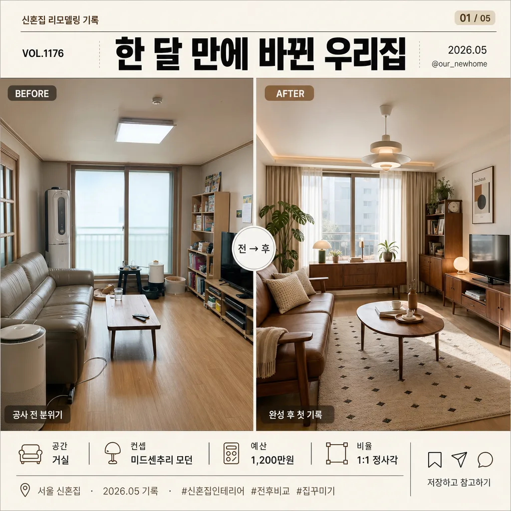
전·후 사진 → 신혼집 인테리어 비교 카드.
신혼집 인테리어 전후 비교 검색 요약
신혼집 인테리어 전후 비교은 SNS/카드뉴스 결과물을 만들 때 바로 복사해 활용할 수 있는 ChatGPT 이미지 프롬프트입니다. 주제, 배경, 스타일, 구도 조건을 함께 담아 빠르게 시안을 만들 수 있도록 구성했습니다.
관련 키워드: 신혼집 인테리어 전후 비교, 신혼집 인테리어 전후 비교 프롬프트, SNS/카드뉴스 프롬프트, SNS/카드뉴스 AI 이미지 프롬프트, ChatGPT 이미지 프롬프트, AI 이미지 생성 프롬프트, AI 프롬프트, 이미지 프롬프트
신혼집 인테리어 전후 비교 활용 포인트
원본 구조를 유지하면서 피사체, 배경, 색감, 구도를 바꿔 다양한 시안으로 확장할 수 있습니다.
- 핵심 소재는 유지하고 브랜드, 계절, 채널 목적에 맞는 색감과 배경을 바꿔보세요.
- 결과가 산만하면 배경 요소를 줄이고 피사체, 구도, 조명 조건을 구체화하세요.
- 복사한 뒤 ChatGPT에서 플랫폼, 화면 비율, 텍스트 포함 여부를 추가로 요청할 수 있습니다.
프롬프트 원문
[Input]
- reference_image: {참고 이미지}
- language: Korean
- output_size: 1024x1024

[Purpose]
Create a square social-media-shareable before/after renovation comparison card with a realistic home editorial layout.
Show a {공간} interior makeover reveal with immediate contrast between pre-renovation and post-renovation states, like a printed home magazine comparison spread adapted for an Instagram carousel cover.

[Composition]
- Split the square canvas into two equal vertical photo panels, each taking exactly 50% width, with a slim center divider for instant comparison.
- Keep the {공간} recognizable in both panels with a matched camera angle and crop height; preserve real room details such as flooring, window direction, ceiling line, door frame, built-in storage, furniture placement, cables, fabric texture, wall finish, and lived-in scale cues.
- Use a warm off-white editorial canvas behind the layout, allowing magazine-like labels, small captions, icons, and project metadata to make the card feel published and real.
- Place the header across the full top width with a magazine-cover style title lockup; include a small series label, issue/date text, and a tiny account handle near the header.
- Reserve a structured footer band at the bottom for compact renovation details, including {공간}, {컨셉}, {예산}, {비율}, date/location label, hashtags-like text, and tiny save/share micro icons.
- Use {한 줄} as the main title, and keep {공간}, {컨셉}, and {예산} as the main supporting information.

[3. CORE STRUCTURE]
1. Header area (top 14%): Set {한 줄} centered in a bold masthead style with strong visual hierarchy. Add small Korean editorial text above and beside it: "신혼집 리모델링 기록", "VOL.1176", "2026.05", and "@our_newhome". Include a small page indicator "01 / 05" on the upper right as if this is the first slide of a carousel.
2. Left panel — before state (middle left 43%): Place the before image from {참고 이미지} within the left half, showing the original {공간} layout with unchanged perspective and no distortion. Add a small rounded label at the upper-left of the photo reading "BEFORE" and a short Korean caption near the lower edge: "공사 전 분위기". Let realistic pre-renovation details remain visible, such as older finishes, mismatched furniture, exposed storage, worn flooring, dated lighting, or practical household items.
3. Right panel — after state (middle right 43%): Place the after image from {참고 이미지} in the right half, matched to the left panel in framing, height, and camera angle for direct side-by-side comparison. Add a small rounded label at the upper-left of the photo reading "AFTER" and a short Korean caption near the lower edge: "완성 후 첫 기록". Show richer finished styling appropriate to {컨셉}, such as coordinated furniture, rug, curtains, lighting fixture, wall art, plants, cushions, books, trays, ceramics, and natural textile textures.
4. Center divider (middle 2%): Add a thin vertical separator in soft gray #D3D3D3 with a small circular arrow badge at the center reading "전 → 후" so the transformation reads immediately.
5. Footer area (bottom 13%): Display a compact project information strip with icons and dividers: "공간  {공간}" / "컨셉  {컨셉}" / "예산  {예산}" / "비율  {비율}". Add a second micro line: "서울 신혼집 · 2026.05 기록 · #신혼집인테리어 #전후비교 #집꾸미기". Place tiny outline save/share/comment icons on the right and a small CTA text "저장하고 참고하기".

[4. STYLE RULES]
- Typography: Pretendard Bold for the header at 24–28pt equivalent, Pretendard SemiBold for BEFORE/AFTER badges at 10–12pt equivalent, Noto Sans KR Regular for footer details and captions at 11–15pt equivalent, with tight tracking and clean Korean readability.
- Color palette: #FFFFFF, #F7F3EE, #F3F4F6, #D3D3D3, #111111, warm beige #D8C7B2, muted brown #8A6F5A, plus muted neutral tones sampled from the room photos; keep contrast crisp while allowing natural home textures and realistic material color variation.
- Border/shadow: Use subtle soft drop shadows with 5px y-offset, 10px blur, and 20% opacity around each photo panel; use thin editorial rules, rounded micro-labels, and small icon details to create a realistic designed social card.
- Photo treatment: Maintain believable lens geometry, real shadows, true material textures, and natural imperfections; the before side may look slightly cooler and flatter, while the after side may feel warmer, brighter, and more styled.

[5. VISUAL STYLE]
- Camera / lens: Natural interior photography look with a full-frame 50mm lens at f/5.6, straight-on perspective, and matched framing across both panels.
- Lighting: Even diffused daylight from a window source, softly filling the room with balanced exposure in both before and after images; allow realistic localized shadows under furniture, curtain folds, lamp shades, shelving, and objects.
- Color grade: Neutral editorial grade with clean whites, soft grays, accurate room colors, gentle warm highlights on the after side, and slightly reduced saturation for a realistic renovation comparison.

[6. MOOD]
Modern interior renovation feature — like a home decor magazine before/after spread turned into an Instagram carousel cover, warm and aspirational but still realistic, with enough captions, labels, icons, and room details to feel like an actual published 신혼집 인테리어 case study.

[7. CRITICAL]
- Korean text accuracy: "한 달 만에 바뀐 우리집", "거실", "미드센추리 모던", "1,200만원" must appear exactly and correctly in the rendered image.
- Also render these Korean text elements clearly: "신혼집 리모델링 기록", "공사 전 분위기", "완성 후 첫 기록", "서울 신혼집", "저장하고 참고하기".
- The before and after images must show the same {공간} from the same approximate angle so the transformation is instantly recognizable.
- Both panels must stay visually balanced with equal width and aligned top and bottom edges.
- All visible Korean must be legible, correctly spaced, and not garbled; use the provided {한 줄}, {공간}, {컨셉}, {예산}, and {비율} values exactly where they appear.

[8. 🚫 PROHIBITED]
- Fake official seals / certifications
- Broken Korean characters