SNS/카드뉴스
돌잔치·환갑 초대장
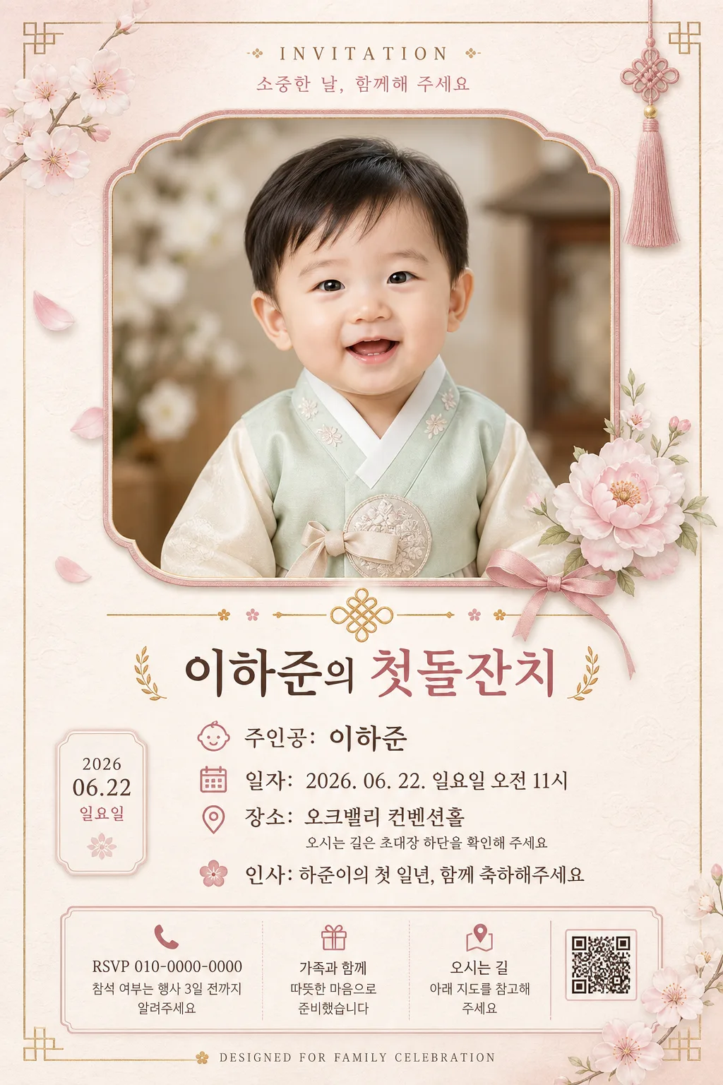
주인공 사진 → 돌잔치 또는 환갑 초대장 시안.
돌잔치·환갑 초대장 검색 요약
돌잔치·환갑 초대장은 SNS/카드뉴스 결과물을 만들 때 바로 복사해 활용할 수 있는 ChatGPT 이미지 프롬프트입니다. 주제, 배경, 스타일, 구도 조건을 함께 담아 빠르게 시안을 만들 수 있도록 구성했습니다.
관련 키워드: 돌잔치·환갑 초대장, 돌잔치·환갑 초대장 프롬프트, SNS/카드뉴스 프롬프트, SNS/카드뉴스 AI 이미지 프롬프트, ChatGPT 이미지 프롬프트, AI 이미지 생성 프롬프트, AI 프롬프트, 이미지 프롬프트
돌잔치·환갑 초대장 활용 포인트
원본 구조를 유지하면서 피사체, 배경, 색감, 구도를 바꿔 다양한 시안으로 확장할 수 있습니다.
- 핵심 소재는 유지하고 브랜드, 계절, 채널 목적에 맞는 색감과 배경을 바꿔보세요.
- 결과가 산만하면 배경 요소를 줄이고 피사체, 구도, 조명 조건을 구체화하세요.
- 복사한 뒤 ChatGPT에서 플랫폼, 화면 비율, 텍스트 포함 여부를 추가로 요청할 수 있습니다.
프롬프트 원문
[Input]
- reference_image: {참고 이미지}
- language: Korean
- output_size: 1024x1536

[Purpose]
Elegant vertical family invitation card for a 돌잔치 or 환갑 celebration, combining a personalized portrait hero, rich Korean ceremonial details, and clear event information.
Designed for print-like social sharing with a refined Korean celebration editorial feel, like a premium printed invitation photographed in soft natural light.

[Composition]
- Main portrait hero is centered and occupies the upper 50% of the canvas, framed to emphasize {주인공} clearly with a warm family-celebration atmosphere around the portrait.
- Event information block sits in the lower 50% with refined hierarchy, centered alignment, and realistic invitation-card typography.
- Background uses a soft pastel cream-pink surface with visible fine paper grain, gentle hanji texture, faint floral embossing, and small ceremonial accents such as ribbon, petal motifs, or a subtle gold foil pattern.
- Maintain {비율} with a polished vertical reading flow suitable for mobile sharing and print.
- Add small realistic invitation details: a top label reading "INVITATION", a date badge, a small RSVP/contact line, tiny location/map and clock icons, decorative corner florals, and a modest bottom credit line.

[Core Structure]
1. Hero area (top 50%): place {참고 이미지} as the main visual, cleanly integrated in a centered portrait frame with a soft vignette edge, delicate shadow, and a fine warm-rose mat border. Add tiny floral sprigs or ribbon details near the frame corners to make the invitation feel physically designed.
2. Header label: above or overlapping the portrait frame, add small refined text "INVITATION" and "소중한 날, 함께해 주세요" in muted rose or gray-brown.
3. Divider treatment: add an elegant ornamental separator between portrait and text area, using a muted pastel accent with small blossom dots, thin gold-foil strokes, or a traditional knot-inspired line.
4. Event title line: render "이벤트: {이벤트}" as the primary header, visually strongest in the text block, with clear hierarchy and a formal invitation tone.
5. Host line: place "주인공: {주인공}" directly under the title, matching the formal invitation tone and keeping the name highly legible.
6. Date line: render "일자: {일자}" on its own line with consistent alignment and include a small calendar icon or date badge nearby.
7. Venue line: render "장소: {장소}" beneath the date, with a tiny map-pin icon and a secondary fixed guide text "오시는 길은 초대장 하단을 확인해 주세요" in small Korean type.
8. Greeting line: render "인사: {인사말}" as the closing message, slightly softer in weight than the header but still clearly readable.
9. Practical info area: at the bottom, add small realistic invitation text such as "RSVP 010-0000-0000", "참석 여부는 행사 3일 전까지 알려주세요", "가족과 함께 따뜻한 마음으로 준비했습니다", and a tiny footer credit "DESIGNED FOR FAMILY CELEBRATION".

[Style Rules]
- Typography: use Noto Sans KR Bold for the event title and key labels, Noto Sans KR Medium for secondary lines, and Nanum Myeongjo Regular for the greeting message; title size should feel prominent at roughly 48-56px equivalent, body text around 28-34px equivalent, micro text around 15-20px equivalent.
- Color palette: soft blush #F5E6E8, pale mint #E8F5E6, warm cream #FFF8F1, muted rose #D9A7B0, soft gray-brown #6F625D, with restrained champagne-gold accents #C9A86A for foil-like dividers and tiny icons.
- Border/shadow: apply a subtle drop shadow to the portrait frame, 3px y-offset, 8px blur, 10% opacity; use fine printed-card edge shading, slight paper thickness, and delicate foil highlights on dividers or corner ornaments.
- Decorative language: include realistic Korean invitation motifs such as soft peony petals, tiny ribbon knots, hanji grain, pressed-flower silhouettes, or faint traditional pattern embossing while keeping all required text readable.

[Visual Style]
- Camera / lens: 50mm f/1.8 natural-perspective portrait look, softly compressed enough for a clean invitation hero crop.
- Lighting: soft window light from the left at roughly 45°, with gentle fill from the right to keep faces evenly exposed and flattering.
- Color grade: warm cream and blush tonal grading with slightly muted saturation, similar to a refined Kinfolk-style event spread.
- Render quality: realistic printed stationery texture, crisp Korean typography, soft paper fibers, gentle shadow depth, and tactile invitation-card finish.

[Mood]
Elegant family celebration invitation — Kinfolk magazine event spread aesthetic with a calm, premium Korean ceremony tone, warm handmade stationery details, and a sincere family gathering mood.

[Critical]
- Korean text accuracy: the following strings must appear exactly as written: "이벤트: {이벤트}", "주인공: {주인공}", "일자: {일자}", "장소: {장소}", "인사: {인사말}".
- Additional Korean text may appear as realistic invitation details, including "소중한 날, 함께해 주세요", "참석 여부는 행사 3일 전까지 알려주세요", "가족과 함께 따뜻한 마음으로 준비했습니다", and "오시는 길은 초대장 하단을 확인해 주세요".
- Ensure the main subject in {참고 이미지} matches {주인공} and is treated as the visual focal point.
- Maintain a 2:3 vertical invitation structure with centered hierarchy, crisp printed Korean text, and visually rich celebration-card details.

[8. 🚫 PROHIBITED]
- Fake official seals or certifications
- Broken Korean characters