SNS/카드뉴스
업데이트 릴리즈 노트 카드
앱·웹서비스 업데이트 내용을 새 기능·개선·수정 3줄로 정리하는 카드.
업데이트 릴리즈 노트 카드 검색 요약
업데이트 릴리즈 노트 카드은 SNS/카드뉴스 결과물을 만들 때 바로 복사해 활용할 수 있는 ChatGPT 이미지 프롬프트입니다. 주제, 배경, 스타일, 구도 조건을 함께 담아 빠르게 시안을 만들 수 있도록 구성했습니다.
관련 키워드: 업데이트 릴리즈 노트 카드, 업데이트 릴리즈 노트 카드 프롬프트, SNS/카드뉴스 프롬프트, SNS/카드뉴스 AI 이미지 프롬프트, ChatGPT 이미지 프롬프트, AI 이미지 생성 프롬프트, AI 프롬프트, 이미지 프롬프트
업데이트 릴리즈 노트 카드 활용 포인트
원본 구조를 유지하면서 피사체, 배경, 색감, 구도를 바꿔 다양한 시안으로 확장할 수 있습니다.
- 핵심 소재는 유지하고 브랜드, 계절, 채널 목적에 맞는 색감과 배경을 바꿔보세요.
- 결과가 산만하면 배경 요소를 줄이고 피사체, 구도, 조명 조건을 구체화하세요.
- 복사한 뒤 ChatGPT에서 플랫폼, 화면 비율, 텍스트 포함 여부를 추가로 요청할 수 있습니다.
프롬프트 원문
[Input]
- language: Korean
- output_size: 1024x1536

[Purpose]
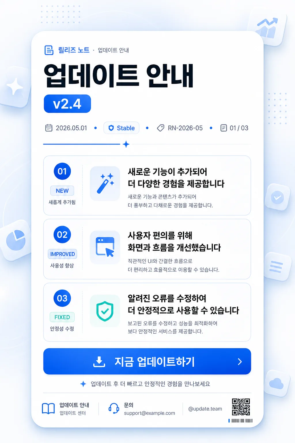
Modern vertical app release-notes announcement card, designed as a polished editorial UI poster for an in-app update notice.
Shareable 2:3 mobile release-note layout with strong information hierarchy, version emphasis, three update items, realistic app-news metadata, and a premium product-launch feeling.

[Composition]
- Subject placement: centered rounded card occupying about 86% of the canvas width and 90% of the height, with the hero header block in the top 20%, three update rows in the middle 50%, and the CTA + footer information anchored in the bottom 16%.
- Background treatment: white #FFFFFF to near-white #F8FAFC canvas with a faint electric-blue radial glow, soft cool-gray floating UI tiles, small abstract app-icon glyphs, and subtle dotted grid accents that make the poster feel like a real SaaS update announcement.
- Spacing, framing direction: left-aligned text columns inside the centered card, editorial vertical rhythm, app-store-style clarity, realistic metadata labels, compact footer details, and polished product-card depth.
- Use {서비스명}, {버전}, {새 기능}, {개선}, {수정} placeholders as the exact Korean content hierarchy.
- Add credible release-note supporting content around the placeholders: small eyebrow label “릴리즈 노트”, date label “2026.05.01”, channel chip “Stable”, release ID text “RN-2026-05”, slide/page indicator “01 / 03”, and a tiny service-team handle “@update.team” where appropriate.

[3. CORE STRUCTURE]
1) Header area (top 20%): set {서비스명} as the primary title in a bold editorial UI style, slightly left-aligned; place a compact rounded {버전} badge immediately beside or just below the title, using a premium pill shape with strong contrast and tight padding. Above it, include a small uppercase/Korean eyebrow line reading “릴리즈 노트 · 업데이트 안내”.
2) Header metadata strip: add a slim row under the title with “2026.05.01”, “Stable”, “RN-2026-05”, and “01 / 03” separated by tiny blue dots or short dividers, giving the card an authentic product-release bulletin feel.
3) Intro divider: add a thin electric-blue accent line or small geometric separator beneath the header, spanning about 26% of the card width, paired with a tiny sparkle or arrow glyph to signal the start of the release notes.
4) Feature rows (middle 50%): show three separate rows with a small blue icon bullet or numbered marker on the left and the corresponding text on the right; row 1 for {새 기능}, row 2 for {개선}, row 3 for {수정}; each row should be readable at a glance with clear spacing and aligned baselines.
5) Row styling: each update item should sit inside a refined rounded rectangle with layered pale-blue highlights, light gray dividers, inset padding, micro labels such as “NEW”, “IMPROVED”, and “FIXED”, and tiny supporting captions in Korean such as “새롭게 추가됨”, “사용성 향상”, “안정성 수정”.
6) CTA area (bottom 16%): place a prominent filled button reading “지금 업데이트하기” centered across the width of the card, with electric-blue fill, white text, rounded corners, and clear tap-target proportions. Add a secondary microtext line below it reading “업데이트 후 더 빠르고 안정적인 경험을 만나보세요”.
7) Footer details: include a small footer row with “{서비스명} 업데이트 센터”, “문의 support@example.com”, and a tiny QR-code-like decorative block or barcode-style release marker in the lower corner, rendered as a design element rather than a scannable official code.

[4. STYLE RULES]
- Typography: Pretendard or Noto Sans KR; title ExtraBold 54-64px, version badge Medium 24-28px, metadata 18-22px, body SemiBold 28-34px, row label Bold 16-18px, CTA Bold 30-34px, footer 14-18px, with crisp anti-aliased Korean text.
- Color palette: white #FFFFFF, electric blue #2F6BFF, deep blue #1746D0, cool gray #E9EEF5, pale blue #EEF4FF, slate text #1F2937, secondary gray #6B7280, tiny accent cyan #4DD5FF.
- Border/shadow: rounded corners 28px, layered soft drop shadow 0px 10px 30px rgba(23,70,208,0.10), extra ambient card shadow 0px 28px 70px rgba(31,41,55,0.08), button shadow 0px 6px 18px rgba(47,107,255,0.22).
- Decorative UI details: small app-style icon chips, dot-grid accents, release timeline ticks, thin divider lines, and subtle blue gradient highlights may be used to enrich the product announcement while preserving readability.

[5. VISUAL STYLE]
- Camera / lens: crisp UI mockup look, orthographic front view, no perspective distortion, as if captured as a high-resolution product poster; render the card with tactile paper-like UI layering and realistic soft shadows.
- Lighting: even studio diffused lighting with a very slight cool top-left highlight, gentle ambient shadowing for depth, and a faint reflected blue glow around the CTA button.
- Color grade: clean white + electric blue + soft cool-gray, high contrast for legibility, modern SaaS-app aesthetic with realistic release-campaign polish.
- Surface detail: smooth rounded-card material, subtle glassy highlight on the version badge, faint noise/grain in the background gradient, and carefully aligned vector-like UI components.

[6. MOOD]
Premium mobile product update card — a polished SaaS release note poster with Apple App Store announcement energy, card-news readability, and a real product-team launch notice feel.

[7. CRITICAL]
- Korean text accuracy: “{서비스명}”, “{버전}”, “{새 기능}”, “{개선}”, “{수정}”, “지금 업데이트하기” must appear exactly and be clearly readable.
- Additional Korean text should be clean and readable, including “릴리즈 노트”, “업데이트 안내”, “새롭게 추가됨”, “사용성 향상”, “안정성 수정”, and “업데이트 후 더 빠르고 안정적인 경험을 만나보세요”.
- Layout invariants: the version badge must be visible near the title, all 3 update items must be present as separate rows, and the CTA button must stay at the bottom.
- All Korean characters must be clean, correctly rendered, and not distorted.

[8. 🚫 PROHIBITED]
- Broken Korean characters
- Fake official seals or certification marks