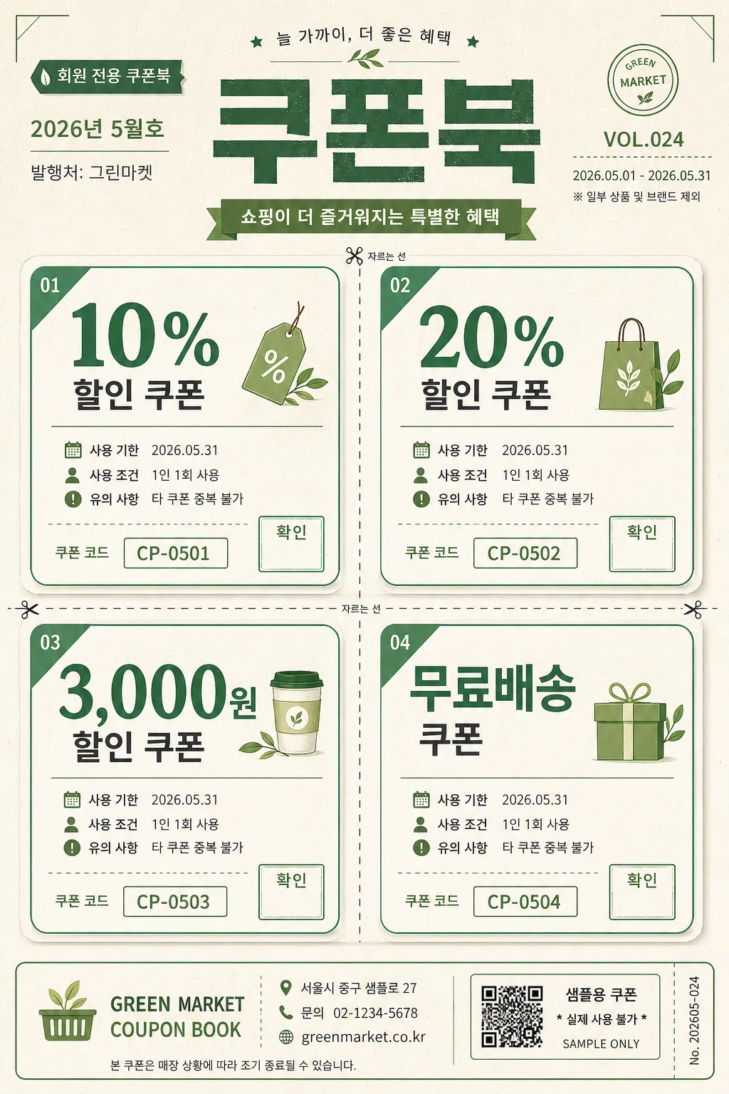
광고/포스터
쿠폰북 4장 세트
오프라인 매장·스마트스토어에서 쓸 수 있는 절취선 쿠폰 4장 디자인.
쿠폰북 4장 세트 검색 요약
쿠폰북 4장 세트은 광고/포스터 결과물을 만들 때 바로 복사해 활용할 수 있는 ChatGPT 이미지 프롬프트입니다. 주제, 배경, 스타일, 구도 조건을 함께 담아 빠르게 시안을 만들 수 있도록 구성했습니다.
관련 키워드: 쿠폰북 4장 세트, 쿠폰북 4장 세트 프롬프트, 광고/포스터 프롬프트, 광고/포스터 AI 이미지 프롬프트, ChatGPT 이미지 프롬프트, AI 이미지 생성 프롬프트, AI 프롬프트, 이미지 프롬프트
쿠폰북 4장 세트 활용 포인트
원본 구조를 유지하면서 피사체, 배경, 색감, 구도를 바꿔 다양한 시안으로 확장할 수 있습니다.
- 핵심 소재는 유지하고 브랜드, 계절, 채널 목적에 맞는 색감과 배경을 바꿔보세요.
- 결과가 산만하면 배경 요소를 줄이고 피사체, 구도, 조명 조건을 구체화하세요.
- 복사한 뒤 ChatGPT에서 플랫폼, 화면 비율, 텍스트 포함 여부를 추가로 요청할 수 있습니다.
프롬프트 원문
[Input]
- language: Korean
- output_size: 1024x1536

[Purpose]
Vertical 2:3 printable coupon book cover and insert sheet for retail counters, membership handouts, and in-store promotional flyers.
Realistic 4-coupon grid with a polished stationery-print feel, designed to look like an actual coupon booklet page that can be cut, stamped, handed out, and used in a neighborhood retail shop.

[Composition]
- Main title {제목} is centered at the top and occupies about 15% of the frame, with strong hierarchy, a small subtitle strip, and a retail campaign masthead feel.
- Add realistic header details around the title: small Korean label text such as "회원 전용 쿠폰북", "2026년 5월호", "VOL.024", and a tiny issue/date line.
- A balanced 2x2 coupon grid fills the middle 70% of the canvas, with each panel equal in size and aligned to a strict baseline.
- Dashed perforation-style dividers run between rows and columns, visually separating the coupons like tear-off tickets; include tiny scissor icons and "CUT HERE" markers near the dashed lines.
- Each coupon panel contains the required coupon text plus supporting retail details: coupon code, validity date, short condition line, small stamp/check area, and a decorative leaf or tag icon.
- Background is soft ivory paper with fresh green accents, subtle paper grain texture, faint print fibers, light ink texture, and practical retail-stationery details.
- Add a realistic footer band with store/contact information, address line, campaign note, and a small nonfunctional barcode-style/QR-style coupon control box labeled as sample use only.

[3. CORE STRUCTURE]
1. Header area (top 15%): Set {제목} in large bold centered type, with clear top padding and a friendly retail-flyer masthead feel. Add small readable Korean supporting text: "회원 전용 쿠폰북", "2026.05.01 - 2026.05.31", "발행처: 그린마켓", and "VOL.024".
2. Coupon grid (center 70%): Place {쿠폰 1}, {쿠폰 2}, {쿠폰 3}, {쿠폰 4} into a 2x2 layout, each panel showing one primary benefit line, equal padding, and identical internal spacing. Under each benefit line, add realistic microcopy in Korean such as "사용 기한 2026.05.31", "1인 1회 사용", "타 쿠폰 중복 불가", and unique coupon codes "CP-0501", "CP-0502", "CP-0503", "CP-0504".
3. Divider treatment: Use thin dashed green lines between the four panels to mimic perforation, keeping the strokes precise against the ivory paper. Add tiny scissors, dotted tear tabs, and small labels "자르는 선" to make it feel like a real coupon insert.
4. Coupon panel details: Each coupon has a rounded rectangle border, soft drop shadow, pale green corner tabs, a small stamp/check box labeled "확인", and a tiny decorative icon such as a leaf, shopping bag, coffee cup, gift box, or percent tag.
5. Footer area (bottom 15%): Add a slim green border, store name line "GREEN MARKET COUPON BOOK", Korean address "서울시 중구 샘플로 27", contact "문의 02-1234-5678", website-like text "greenmarket.co.kr", and a small disclaimer line "본 쿠폰은 매장 상황에 따라 조기 종료될 수 있습니다." Include a small sample-only coupon control area, not a payment barcode.

[4. STYLE RULES]
- Typography: Use Pretendard Bold for the title at about 48pt, and Noto Sans KR Medium for coupon text at about 24pt; use Noto Sans KR Regular at 10–14pt for coupon codes, date labels, address, and conditions. Keep line spacing tight but legible.
- Color palette: ivory #f5f5dc, medium sea green #3cb371, deep green #2f6f4e, soft paper white #fffdf7, muted leaf green #6aa84f.
- Border/shadow: Apply a soft drop shadow to each coupon block with 2px y-offset, 8px blur, 20% opacity; use thin rounded corners for a neat retail flyer finish.
- Add tactile print realism: faint paper grain, slightly imperfect ink edges, delicate green rules, small serial numbers, stamp boxes, subtle corner crop marks, and coupon-book production details.
- Decorative elements should support the coupon theme: leaf motifs, small discount tags, shopping bag icons, dotted perforation marks, and soft green header/footer bands.

[5. VISUAL STYLE]
- Camera / lens: Flat lay top-down composition, equivalent to a 35mm lens on a high-resolution studio setup, with an orthographic-looking presentation.
- Lighting: Soft even studio light from directly above with very mild ambient fill, no harsh directional shadows.
- Color grade: Warm ivory base with fresh green highlights and slightly muted contrast for a clean stationery-print look.
- Material rendering: convincing matte paper stock, subtle fiber texture, gentle printed-ink absorption, crisp but natural typography, and slight shadow separation between coupon blocks and background.

[6. MOOD]
Casual retail coupon flyer — like a friendly neighborhood market coupon book, a lifestyle stationery insert, and a clean supermarket promo sheet with practical real-world print details.

[7. CRITICAL]
- Korean text accuracy: "{제목}", "{쿠폰 1}", "{쿠폰 2}", "{쿠폰 3}", "{쿠폰 4}" must appear exactly and be fully legible.
- All four coupon blocks must use the same layout, same typography scale, and same visual treatment.
- The 2x2 coupon grid must remain balanced, with clear separation lines and consistent alignment.
- Render the added Korean text clearly: "회원 전용 쿠폰북", "2026년 5월호", "사용 기한 2026.05.31", "1인 1회 사용", "자르는 선", "확인", "문의 02-1234-5678".
- Coupon details, serial numbers, date labels, footer address, and small conditions should look like real printed retail information, while the main five placeholder texts remain the most prominent.

[8. 🚫 PROHIBITED]
- Fake official seals/certifications
- Broken Korean characters