광고/포스터
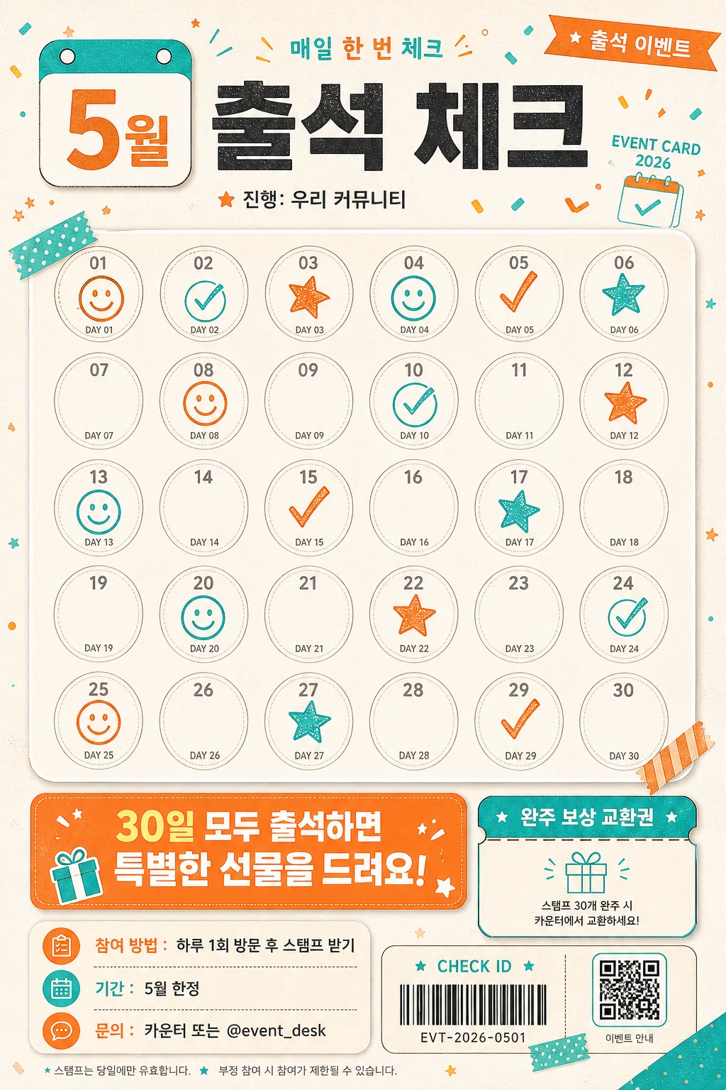
출석 체크 스탬프판
학원·클래스·매장 방문 이벤트에 쓰기 좋은 30칸 출석 스탬프 카드.
출석 체크 스탬프판 검색 요약
출석 체크 스탬프판은 광고/포스터 결과물을 만들 때 바로 복사해 활용할 수 있는 ChatGPT 이미지 프롬프트입니다. 주제, 배경, 스타일, 구도 조건을 함께 담아 빠르게 시안을 만들 수 있도록 구성했습니다.
관련 키워드: 출석 체크 스탬프판, 출석 체크 스탬프판 프롬프트, 광고/포스터 프롬프트, 광고/포스터 AI 이미지 프롬프트, ChatGPT 이미지 프롬프트, AI 이미지 생성 프롬프트, AI 프롬프트, 이미지 프롬프트
출석 체크 스탬프판 활용 포인트
원본 구조를 유지하면서 피사체, 배경, 색감, 구도를 바꿔 다양한 시안으로 확장할 수 있습니다.
- 핵심 소재는 유지하고 브랜드, 계절, 채널 목적에 맞는 색감과 배경을 바꿔보세요.
- 결과가 산만하면 배경 요소를 줄이고 피사체, 구도, 조명 조건을 구체화하세요.
- 복사한 뒤 ChatGPT에서 플랫폼, 화면 비율, 텍스트 포함 여부를 추가로 요청할 수 있습니다.
프롬프트 원문
[Input]
- language: Korean
- output_size: 1024x1536

[Purpose]
Vertical 2:3 attendance check stamp board for promotional use, designed as a cheerful printed event card with a realistic community notice-board feel and a highly readable stamp layout.
Suitable for school, cafe, app, bookstore, class, or local community attendance campaigns where the stamp grid is the main focus, enriched with practical event information and friendly visual details.

[Composition]
- Header occupies the top 20% with a compact calendar-style {월} badge, bold title lockup, small event label, and tiny credit/date text; the stamp grid fills the central 60% as the visual centerpiece; the reward notice and participation details anchor the bottom 20%.
- Background treatment: bright printed poster/card base with tactile paper grain, faint ink speckles, soft cream panels, and playful seasonal shapes in {컬러 톤}; include subtle realistic print texture and small stationery-like accents that support the attendance theme.
- Spacing and framing: balanced poster hierarchy with clear separation between header, grid, footer information, and decorative accents; all important text and stamp slots remain fully legible and within the 1024x1536 vertical format.
- Use {제목}, {월}, {보상}, {스탬프 수}, {컬러 톤} placeholders exactly as provided.

[3. CORE STRUCTURE]
1. Header area (top 20%): Place a rounded {월} badge on the upper-left with a calendar-tab feel and small punched-hole details. Set "{제목}" large and bold to its right, aligned on the same baseline for strong first-read hierarchy. Add small Korean microcopy around it such as "출석 이벤트", "매일 한 번 체크", "EVENT CARD 2026", and a tiny organizer line "진행: 우리 커뮤니티".
2. Stamp grid (middle 60%): Build {스탬프 수} evenly spaced circular stamp slots in a clean grid, each circle identical in size, with thin outlines, consistent internal padding, and enough gap for visible stamped marks. Add small day labels like "DAY 01", "DAY 02" or Korean numerals inside/under the circles where space allows. Some slots may show realistic ink-stamp effects, smile icons, check marks, or tiny star stamps, while the full {스탬프 수} count remains clearly present and visually consistent.
3. Reward notice (bottom 20%): Add a prominent rounded notification box containing "{보상}" with strong contrast and centered alignment, sized for instant readability at thumbnail scale. Surround it with practical event details in Korean: "참여 방법: 하루 1회 방문 후 스탬프 받기", "기간: {월} 한정", "문의: 카운터 또는 @event_desk", plus a small ticket-strip or coupon-style area reading "완주 보상 교환권".
4. Decorative support: Use cheerful accent dots, tiny stars, small check icons, washi-tape corner strips, a tiny calendar icon, and confetti strokes in {컬러 톤} around the header, corners, and footer. Include a small faux QR-code block or barcode-like attendance ID area labeled "CHECK ID" as a realistic event-card detail, without covering the grid or main Korean text.

[4. STYLE RULES]
- Typography: Pretendard ExtraBold for the title at large poster size, Noto Sans KR Medium for badges and body copy, with clean rounded numerals and crisp Korean letterforms; keep the title bold enough for quick scanning.
- Color palette: white (#FFFFFF), orange (#FF8A3D), teal (#2BB7B3), soft cream (#FFF7ED), charcoal (#222222) for text contrast; use {컬러 톤} as the overall palette guide with lively but cohesive accents.
- Border/shadow: apply a soft drop shadow to the stamp grid panel and reward box, 4px y-offset, 12px blur, 15% opacity; use thin 1.5px outlines for circles and badge borders, with realistic ink variation on stamped marks.
- Print details: add subtle paper fibers, slightly imperfect ink edges on stamps, tiny registration-like marks, small divider lines, sticker tabs, and coupon perforation details to make the design feel like a real printed attendance board.

[5. VISUAL STYLE]
- Camera / lens: top-down flat lay, orthographic poster composition feel, equivalent to a 35mm lens straight-on document layout with no perspective distortion.
- Lighting: soft diffused studio light from directly above with even fill across the full page, natural paper texture visible, no harsh shadows, no glare on text.
- Color grade: bright editorial print style with fresh white base, orange energy, and teal accents, clean and high-contrast.

[6. MOOD]
Cheerful seasonal promo card — like a well-designed school event notice, cafe loyalty stamp board, or playful community app campaign poster, friendly enough to feel used in a real place.

[7. CRITICAL]
- Korean text accuracy: "{제목}", "{월}", "{보상}" must appear exactly and clearly in Korean.
- Include short supporting Korean text such as "출석 이벤트", "매일 한 번 체크", "참여 방법", "완주 보상 교환권", and "문의: @event_desk" with clean, readable Korean characters.
- Layout invariants: the stamp grid must remain evenly spaced, circular, and fully visible; the bottom reward box must not overlap the grid.
- Grid count: {스탬프 수} stamp slots must be present and visually consistent.

[8. 🚫 PROHIBITED]
- Fake official seals or certification marks
- Broken Korean characters
- Celebrity composites or unauthorized likeness