만화/일러스트
한국형 시티팝 로파이 일러스트
그림자/그라데이션 최소화한 플랫·매트 톤. 픽시브 서브컬처 + 시티팝 + 로파이 감성. 아무 장면이나 한국어로 입력하면 일관된 톤으로 변환.
한국형 시티팝 로파이 일러스트 검색 요약
한국형 시티팝 로파이 일러스트은 만화/일러스트 결과물을 만들 때 바로 복사해 활용할 수 있는 ChatGPT 이미지 프롬프트입니다. 주제, 배경, 스타일, 구도 조건을 함께 담아 빠르게 시안을 만들 수 있도록 구성했습니다.
관련 키워드: 한국형 시티팝 로파이 일러스트, 한국형 시티팝 로파이 일러스트 프롬프트, 만화/일러스트 프롬프트, 만화/일러스트 AI 이미지 프롬프트, ChatGPT 이미지 프롬프트, AI 이미지 생성 프롬프트, AI 프롬프트, 이미지 프롬프트
한국형 시티팝 로파이 일러스트 활용 포인트
원본 구조를 유지하면서 피사체, 배경, 색감, 구도를 바꿔 다양한 시안으로 확장할 수 있습니다.
- 핵심 소재는 유지하고 브랜드, 계절, 채널 목적에 맞는 색감과 배경을 바꿔보세요.
- 결과가 산만하면 배경 요소를 줄이고 피사체, 구도, 조명 조건을 구체화하세요.
- 복사한 뒤 ChatGPT에서 플랫폼, 화면 비율, 텍스트 포함 여부를 추가로 요청할 수 있습니다.
프롬프트 원문
[Input]
- language: Korean
- output_size: 1024x1536

[Purpose]
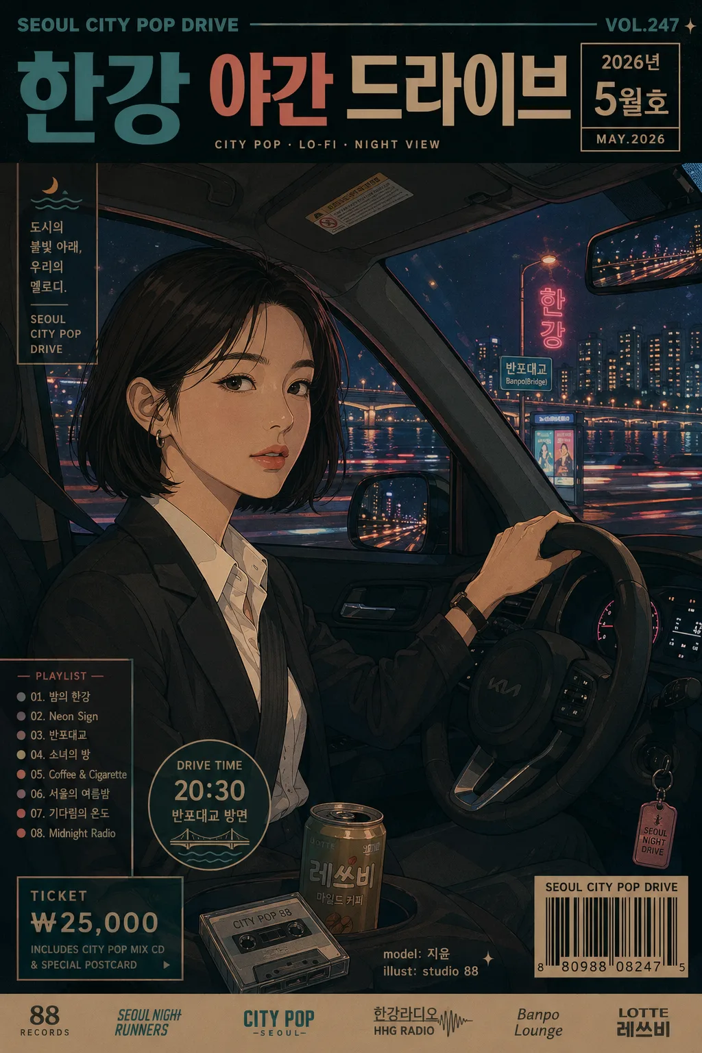
Korean city pop lo-fi illustration, Pixiv-inspired subculture artwork for a vertical music-poster layout.
Urban nighttime driving scene with a stylish Korean woman in the driver’s seat, designed as a rich flat-shaded editorial illustration with realistic car-interior details, glowing Seoul night scenery, and integrated retro poster typography.

[Composition]
- Main subject: {인물 묘사} placed in a 3/4 side medium close-up or near-frontal composition, with the face occupying about one-third of the frame and remaining the emotional anchor of the poster.
- Scene setting: {장면 설명} as the core narrative, with the car interior clearly readable in the foreground: steering wheel, dashboard glow, rear-view mirror, seat belt, door trim, side window frame, keychain, cassette tape or small convenience-store drink placed naturally in the cabin.
- Background treatment: {배경 디테일} layered behind the subject with recognizable Seoul night elements such as Han River bridge lights, apartment silhouettes, riverside road lamps, neon shop signs, bus-stop panels, and soft light trails reflected on the glass.
- Framing direction: vertical poster composition with a strong driver-seat viewpoint, keeping the face, hands, steering wheel, window reflections, and outside skyline all visible in a cinematic arrangement.
- Poster overlay: add tasteful city-pop graphic elements around the image area, including a main Korean title, date label, catalog/issue number, barcode area, short playlist/event details, and small sponsor/credit text without covering the face.
- Composition reference: follow {구도} and {비율} while preserving the 1024x1536 vertical poster feeling.

[3. CORE STRUCTURE]
1) Hero subject area: {인물 묘사} rendered with a calm confident expression, clean facial shapes, realistic proportions, soft retro makeup details, natural hair highlights, and accurate hand anatomy if hands are visible on the steering wheel.
2) Interior foreground: steering wheel, dashboard edge, instrument cluster glow, gear selector, fabric or leather seat texture, door handle, side mirror, and small personal objects arranged as believable shapes that support the driver-seat viewpoint.
3) Window layer: layered reflections across the car window, combining bridge lights, neon signage, rain-speckled glass or faint windshield streaks, passing headlights, and dashboard reflections to create a late-night lo-fi drive mood.
4) Background layer: {배경 디테일} arranged as glowing urban forms, with Han River bridge lights stretching horizontally, riverside apartment windows, street signs, and neon storefront fragments adding Korean city rhythm.
5) Poster information layer: include a retro editorial header and footer such as “SEOUL CITY POP DRIVE”, “VOL.247”, “2026년 5월호”, “한강 야간 드라이브”, “20:30 / 반포대교 방면”, “TICKET ₩25,000”, a small barcode block, and tiny credit text like “model: 지윤 / illust: studio 88”.
6) Style integration: {화풍} applied uniformly across character, car, typography, and background, preserving flat shading, smooth outlines, graphic shape language, and carefully placed print-like texture.
7) Palette application: {컬러 톤} used with matte, slightly faded blocks of color; neon accents appear in signage, dashboard indicators, window reflections, and headline accents while the overall palette remains cohesive.
8) Scene emphasis: {장면 설명} should feel like one captured late-night moment, with driving motion implied through light trails, reflections, hair movement, and small dashboard details.
9) Final polish: make the image feel like a finished Korean city-pop poster sold at a record shop or indie illustration fair, with purposeful composition, readable text zones, and atmospheric urban detail.

[4. STYLE RULES]
- Typography: include integrated retro Korean/English poster typography using bold geometric sans-serif and condensed 1980s magazine lettering. Set bold cover line in Korean: “나다운 밤, 서울을 달리다”. Add smaller Korean blurbs such as “시티팝 플레이리스트”, “한강의 네온과 라디오”, “오늘의 드라이브 코스”.
- Color palette: use {컬러 톤} as the main palette, with faded cyan, coral, mustard, violet-blue shadows, and neon pink accents; keep blacks softened into deep navy rather than pure black.
- Graphic layout: combine the illustrated driving scene with poster bands, small corner labels, a barcode rectangle, cassette-track numbering, and thin decorative divider lines that match the city-pop theme.
- Shadow and light: use soft cell-shaded shadow blocks, dashboard under-lighting, neon rim highlights, and controlled glow around bridge lights and signage so the scene feels luminous but still hand-drawn.
- Surface treatment: matte vintage print finish with subtle paper tooth, slight offset-print color variation, and gentle halftone or risograph-inspired texture in large color areas.
- Environmental details: include believable Korean urban cues such as road signs, apartment window grids, bridge pylons, taxi-light colors, convenience-store glow, and Hangang riverside reflections.

[5. VISUAL STYLE]
- Camera / lens: 50mm standard lens look, medium close-up framing, eye-level to slightly off-center driver perspective, as if viewed from the passenger side.
- Lighting: night interior lighting with soft dashboard glow from below, neon spill from the city outside the window, faint rim light from street lamps and bridge lights, and reflected signage across the side window.
- Color grade: faded city pop grade with cyan-coral balance, muted mustard mids, violet navy shadows, neon pink highlights, and a restrained lo-fi matte finish.
- Illustration finish: Pixiv-inspired Korean subculture poster art with confident linework, flat-shaded faces, detailed but graphic car-interior forms, retro print texture, and cinematic night-drive atmosphere.

[6. MOOD]
Late-night Japanese city pop meets Korean urban lo-fi editorial illustration — a Seoul Han River night-drive poster with the calm confidence of an 80s retro radio program, the intimacy of a passenger-seat snapshot, and the collectible feel of an indie music event print.

[7. CRITICAL]
- Korean text accuracy: render all Korean text cleanly and legibly. Use short Korean strings such as “나다운 밤, 서울을 달리다”, “시티팝 플레이리스트”, “한강의 네온과 라디오”, “오늘의 드라이브 코스”, “2026년 5월호”, “반포대교 방면”, and “티켓 ₩25,000”.
- Anatomy/layout invariants: realistic human proportions only; no exaggerated body shape, and if hands are shown, fingers must be anatomically correct with exactly 5 fingers per hand.
- Composition requirement: the face should remain clearly readable as the focal point, with poster typography, dashboard elements, and background lights arranged around the subject rather than covering the eyes or mouth.
- Text placement requirement: barcode, VOL/date label, credit line, and event details should sit in corners, bottom bands, or side margins of the poster layout while preserving the character-driven driving scene.

[8. 🚫 PROHIBITED]
- Fake official seals / certifications
- Broken Korean characters