인포그래픽/안내
한국 도시 수채 미식 지도
도시별 맛집·랜드마크를 손그림 수채 지도로. 서울/부산/제주 등 어떤 한국 도시도 가능. 인포그래픽·블로그 헤더·여행 콘텐츠용.
한국 도시 수채 미식 지도 검색 요약
한국 도시 수채 미식 지도은 인포그래픽/안내 결과물을 만들 때 바로 복사해 활용할 수 있는 ChatGPT 이미지 프롬프트입니다. 주제, 배경, 스타일, 구도 조건을 함께 담아 빠르게 시안을 만들 수 있도록 구성했습니다.
관련 키워드: 한국 도시 수채 미식 지도, 한국 도시 수채 미식 지도 프롬프트, 인포그래픽/안내 프롬프트, 인포그래픽/안내 AI 이미지 프롬프트, ChatGPT 이미지 프롬프트, AI 이미지 생성 프롬프트, AI 프롬프트, 이미지 프롬프트
한국 도시 수채 미식 지도 활용 포인트
원본 구조를 유지하면서 피사체, 배경, 색감, 구도를 바꿔 다양한 시안으로 확장할 수 있습니다.
- 핵심 소재는 유지하고 브랜드, 계절, 채널 목적에 맞는 색감과 배경을 바꿔보세요.
- 결과가 산만하면 배경 요소를 줄이고 피사체, 구도, 조명 조건을 구체화하세요.
- 복사한 뒤 ChatGPT에서 플랫폼, 화면 비율, 텍스트 포함 여부를 추가로 요청할 수 있습니다.
프롬프트 원문
[Input]
- language: Korean
- output_size: 1024x1024

[Purpose]
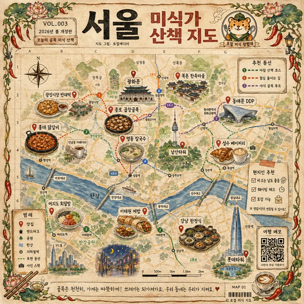
Illustrated Korean city food-map infographic for social sharing, combining tourist landmarks, neighborhood routes, local food spots, and small travel-editorial details in a hand-drawn atlas style.
Editorial poster look with whimsical mascot branding, designed like a vintage Korean travel map you’d frame, save, or post online, with enough real guidebook information to feel useful and lived-in.

[Composition]
- Center the map as a square composition with the title band occupying the top 14% and the footer warning occupying the bottom 8%.
- Use {도시 이름} and {지도 제목} as the main header text, with the mascot placed beside the title as a compact emblem.
- Build the map on a tactile parchment background with yellow street lines, blue river shapes, green park masses, subway dots, market blocks, alley clusters, tiny food doodles, and hand-labeled district callouts.
- Wrap the entire map with {테두리 장식} as a decorative border, keeping corner density slightly heavier than the sides and adding small illustrated corner motifs such as chopsticks, street lamps, leaves, and steam curls.
- Add realistic guide-map details: a compass rose, scale bar, small grid coordinates, illustrated walking-route arrows, a mini transit badge row, page-like registration text, and a compact QR-style square marked 여행 메모.

[3. CORE STRUCTURE]
- Header area (top 14%): set {도시 이름} + {지도 제목} in a bold illustrated headline, with the mascot directly adjacent to the title block like a stamp logo. Add small guide text such as VOL.003, 2026년 봄 개정판, 오늘의 골목 미식 산책, and a tiny credit line 지도 그림: 로컬에디터.
- Main map field (middle 62%): draw the city network on textured beige parchment, with roads in warm yellow, the river in muted blue, parks in soft green blocks, subway lines in thin charcoal strokes, pedestrian alleys as dotted lines, and small icons for markets, bridges, hills, cafés, and night streets.
- Landmark layer: place {랜드마크 1}, {랜드마크 2}, {랜드마크 3}, {랜드마크 4}, {랜드마크 5}, {랜드마크 6} clearly at their respective city positions, each paired with a small icon or map pin for fast recognition.
- Food-spot layer: place {맛집 1}, {맛집 2}, {맛집 3}, {맛집 4}, {맛집 5}, {맛집 6}, {맛집 7}, {맛집 8} in visually balanced clusters near commercial districts, markets, station exits, and nightlife areas so the map feels navigable and rich with local texture.
- Add 3 short route ribbons across the map: 아침 산책 코스, 점심 줄서는 길, 야식 골목 루트, each drawn as a colored dashed path with tiny numbered circles.
- Legend box: include the category key for 맛집, 랜드마크, 공원, 한강, 지하철역 in a compact corner panel with simple pictograms, plus marker styles for 추천 동선 and 사진 스팟.
- Add a small side-note panel with handwritten guide copy: 현지인 추천, 비 오는 날도 좋음, 웨이팅 체크, 포장 가능, using tiny checkboxes and sticker-like labels.
- Footer strip (bottom 8%): render the warning line in small handwritten-style text, centered and separated from the map body by a thin rule. Include page number MAP 01, tiny copyright-style credit 로컬 미식 지도, and a small barcode-like decorative block.

[4. STYLE RULES]
- Typography: use Pretendard ExtraBold for the title at large display size, Noto Sans KR Medium for labels, and a hand-drawn brush style for the footer note and side annotations.
- Color palette: parchment #F3E6C8, warm yellow #D8B14A, river blue #5E8FB8, park green #7DAA63, chili red #C9412A, charcoal ink #2E2A26.
- Border/shadow: apply a thin ink-outline frame with slightly irregular watercolor edges, plus a subtle paper shadow 3px y-offset, 10px blur, 12% opacity.
- Illustration density: use layered watercolor washes, visible paper grain, ink bleeds, pencil-like micro labels, and small food illustrations such as 국수 그릇, 만두, 김밥, 떡볶이, 커피잔, and grilled skewers around the relevant 맛집 pins.
- Layout realism: make the map feel like a printed city-guide page photographed or scanned from a boutique travel booklet, including small imperfections, registration ticks, soft stain marks, and uneven hand-drawn linework.

[5. VISUAL STYLE]
- Camera / lens: top-down flat lay infographic look, like a scanned illustrated atlas page; emulate a 35mm documentary graphic composition rather than a photo-realistic city rendering.
- Lighting: even studio illumination with gentle paper depth, preserving paper texture, watercolor pigment variation, and ink line clarity.
- Color grade: vintage parchment warmth with restrained teal-blue river accents, muted natural greens, saturated chili-red highlights, and slightly faded printed-ink edges.

[6. MOOD]
Playful travel-editorial atlas — feels like a Kinfolk-style city guide crossed with a nostalgic Korean market sketchbook, with the charm of a real local recommendation map picked up at a neighborhood café.

[7. CRITICAL]
- Korean text accuracy: 반드시 정확히 표시되어야 하는 문구
  - {도시 이름} {지도 제목}
  - {랜드마크 1}
  - {랜드마크 2}
  - {랜드마크 3}
  - {랜드마크 4}
  - {랜드마크 5}
  - {랜드마크 6}
  - {맛집 1}
  - {맛집 2}
  - {맛집 3}
  - {맛집 4}
  - {맛집 5}
  - {맛집 6}
  - {맛집 7}
  - {맛집 8}
  - 맛집
  - 랜드마크
  - 공원
  - 한강
  - 지하철역
  - 아침 산책 코스
  - 점심 줄서는 길
  - 야식 골목 루트
  - 맛 보장은 못 함, 길은 본인 책임
- Map integrity: 6 landmark labels and 8 food labels must all be present, legible, and non-overlapping, with pins/icons visually connected to their locations.
- Mascot must be a cute cartoon kimchi character wearing sunglasses and giving a thumbs up.
- The final image must read as a polished Korean illustrated food-map poster with real guidebook details, not a blank template.

[8. 🚫 PROHIBITED]
- Fake official seals / certifications
- Broken Korean characters