漫畫/插畫
카카오톡 이모티콘 6컷 세트
카카오톡 스타일 이모티콘 6컷 sticker sheet. 캐릭터 + 6가지 감정/멘트 자유 입력. 굿즈/메신저용.
카카오톡 이모티콘 6컷 세트摘要
這是用來製作漫畫/插畫內容的 ChatGPT 圖像提示詞,已整理主題、背景、風格與構圖,方便快速調整。
相關關鍵字: 카카오톡 이모티콘 6컷 세트, 카카오톡 이모티콘 6컷 세트 프롬프트, 漫畫/插畫 프롬프트, 漫畫/插畫 AI 이미지 프롬프트, ChatGPT 이미지 프롬프트, AI 이미지 생성 프롬프트, AI 프롬프트, 이미지 프롬프트
카카오톡 이모티콘 6컷 세트使用方式
保留原始結構並替換主體、背景、色彩或構圖,即可延伸出不同版本。
- 保留核心主體,並依品牌、季節或平台調整色彩與背景。
- 如果畫面太複雜,請減少背景元素並具體描述主體、構圖與光線。
- 複製後可要求 ChatGPT 配合平台、長寬比或文字需求調整。
提示詞原文
[Input]
- language: Korean
- output_size: 1024x1024

[Purpose]
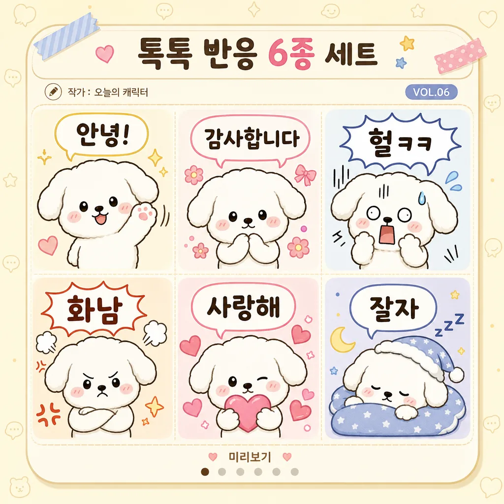
Korean KakaoTalk-style emoticon sticker sheet, 2x3 grid set for chat usage.
Six-panel compact emoji pack with cute reaction variety, optimized for mobile messenger readability, presented like a polished sticker-pack preview page with realistic app-store-style details.

[Composition]
- 2x3 grid layout: six equal square cells arranged inside a rounded square preview card, with consistent gutters, soft cream paper texture, and gentle pastel divider lines between cells.
- Character placement: {캐릭터 디자인} placed as the main subject in each panel, occupying about 65–75% of each cell, with room for speech bubbles, motion marks, hearts, sweat drops, sleep symbols, or tiny decorative reaction stickers.
- Text placement: {6가지 멘트} shown as Korean speech bubbles or floating captions in each cell, clear, bold, and legible at mobile thumbnail size.
- Preview-page details: add a small Korean title strip at the top reading "톡톡 반응 6종 세트", a tiny creator credit such as "작가: 오늘의 캐릭터", a small version label "VOL.06", and subtle bottom metadata like "미리보기" and small page dots; keep these secondary and smaller than the six main captions.
- Background treatment: warm pale cream sticker-sheet background with faint KakaoTalk-like chat wallpaper motifs, small stars, hearts, dots, tape corners, and soft drop shadows that make the sheet feel like a real downloadable emoticon preview.
- Consistency: same character design across all 6 panels, only pose, expression, gesture, emotion icons, and caption change.

[3. CORE STRUCTURE]
1) Overall sheet: create a polished 2x3 emoji grid on a warm cream rounded card, with six preview cells separated by soft pastel gutters, a small top header bar, and subtle app-preview metadata elements.
2) Top-left panel: show {캐릭터 디자인} with a friendly greeting expression, waving or leaning forward, paired with the first message from {6가지 멘트} in a rounded speech bubble; add small sparkle marks and a tiny pastel hello icon.
3) Top-middle panel: show {캐릭터 디자인} reacting with gratitude, using a soft smile, clasped hands or a polite bow, and the second message from {6가지 멘트}; add blush, small flower or ribbon accents.
4) Top-right panel: show {캐릭터 디자인} with a shocked or flustered face, wide eyes, sweat drop, motion lines, and the third message from {6가지 멘트}; use a playful burst bubble behind the caption.
5) Bottom-left panel: show {캐릭터 디자인} in an angry or annoyed pose, cheeks puffed or tiny stomp gesture, with the fourth message from {6가지 멘트} placed prominently but still cute; add red-orange comic marks and tiny steam puffs.
6) Bottom-middle panel: show {캐릭터 디자인} making a heart/love gesture, holding a heart, finger-heart pose, or surrounded by floating hearts, paired with the fifth message from {6가지 멘트}; make this panel warm peach and pink.
7) Bottom-right panel: show {캐릭터 디자인} sleepy and relaxed, tucked into a tiny cushion or cozy blanket-like sticker shape, paired with the sixth message from {6가지 멘트} in a tiny cozy caption bubble; add moon, zzz symbols, and soft blue accents.
8) Text rendering: all Korean caption text from {6가지 멘트} must be crisp, centered, and evenly spaced within each bubble; header and metadata text should be smaller and secondary, never competing with the six intended captions.

[4. STYLE RULES]
- Typography: rounded Korean sans style similar to Pretendard Rounded or Noto Sans KR Rounded, bold for short exclamations, medium for longer lines, size tuned for sticker readability; add tiny secondary Korean UI labels in a lighter weight.
- Color palette: use {아트 스타일} with soft pastel accents; prioritize cream #FFF8EE, light blue #CFE8FF, peach #FFD6C9, mint #D7F4E3, butter yellow #FFE8A3, soft pink #FFC7DE, and charcoal #2B2B2B for text outlines.
- Linework: clean vector outlines with consistent stroke width, smooth curves, expressive face details, soft blush, gentle highlights, and small comic reaction marks for each emotion.
- Border/shadow: rounded sticker-card frame with pale pastel dividers, light soft shadow under the character in each cell, 2px y-offset, 8px blur, 12% opacity; add slight sticker cutline effect around the character for a real emoticon-pack preview feel.

[5. VISUAL STYLE]
- Camera / lens: front-facing digital illustration look, equivalent to a clean studio product render, no perspective distortion, flat sticker-sheet composition.
- Lighting: even diffuse studio lighting from above, no harsh shadows, uniform brightness across all six panels, with gentle ambient shading on the card and speech bubbles.
- Color grade: pastel KakaoTalk UI palette with soft cream base and gentle candy colors, slightly warm-neutral overall balance; lively but still readable on a mobile messenger screen.

[6. MOOD]
Cute Korean messenger sticker pack — a cheerful KakaoTalk-style emoticon preview sheet with the playful clarity of a LINE sticker set, enriched with real app-preview details, tiny decorative reaction icons, and a polished downloadable sticker-pack presentation.

[7. CRITICAL]
- Korean text accuracy: every rendered Korean string from {6가지 멘트} must appear exactly and clearly as specified.
- Include small supplementary Korean preview text only if crisp and intentional, such as "톡톡 반응 6종 세트", "작가: 오늘의 캐릭터", "VOL.06", and "미리보기".
- All 6 panels must use the same character design from {캐릭터 디자인}; only expression, pose, gesture, emotion icons, and caption change.
- Each panel must contain one distinct emotional reaction and one corresponding Korean text bubble.
- Do not let secondary metadata, decorative icons, or wallpaper motifs obscure the six main Korean captions.

[8. 🚫 PROHIBITED]
- Fake official seals / certifications
- Broken Korean characters