굿즈/목업
한국 단행본 표지 디자인
한국 출판사풍 책 표지 디자인. 제목·부제·저자·시각 컨셉 자유 입력. 모의 표지 / 작가 굿즈용.
한국 단행본 표지 디자인 검색 요약
한국 단행본 표지 디자인은 굿즈/목업 결과물을 만들 때 바로 복사해 활용할 수 있는 ChatGPT 이미지 프롬프트입니다. 주제, 배경, 스타일, 구도 조건을 함께 담아 빠르게 시안을 만들 수 있도록 구성했습니다.
관련 키워드: 한국 단행본 표지 디자인, 한국 단행본 표지 디자인 프롬프트, 굿즈/목업 프롬프트, 굿즈/목업 AI 이미지 프롬프트, ChatGPT 이미지 프롬프트, AI 이미지 생성 프롬프트, AI 프롬프트, 이미지 프롬프트
한국 단행본 표지 디자인 활용 포인트
원본 구조를 유지하면서 피사체, 배경, 색감, 구도를 바꿔 다양한 시안으로 확장할 수 있습니다.
- 핵심 소재는 유지하고 브랜드, 계절, 채널 목적에 맞는 색감과 배경을 바꿔보세요.
- 결과가 산만하면 배경 요소를 줄이고 피사체, 구도, 조명 조건을 구체화하세요.
- 복사한 뒤 ChatGPT에서 플랫폼, 화면 비율, 텍스트 포함 여부를 추가로 요청할 수 있습니다.
프롬프트 원문
[Input]
- language: Korean
- output_size: 1024x1536

[Purpose]
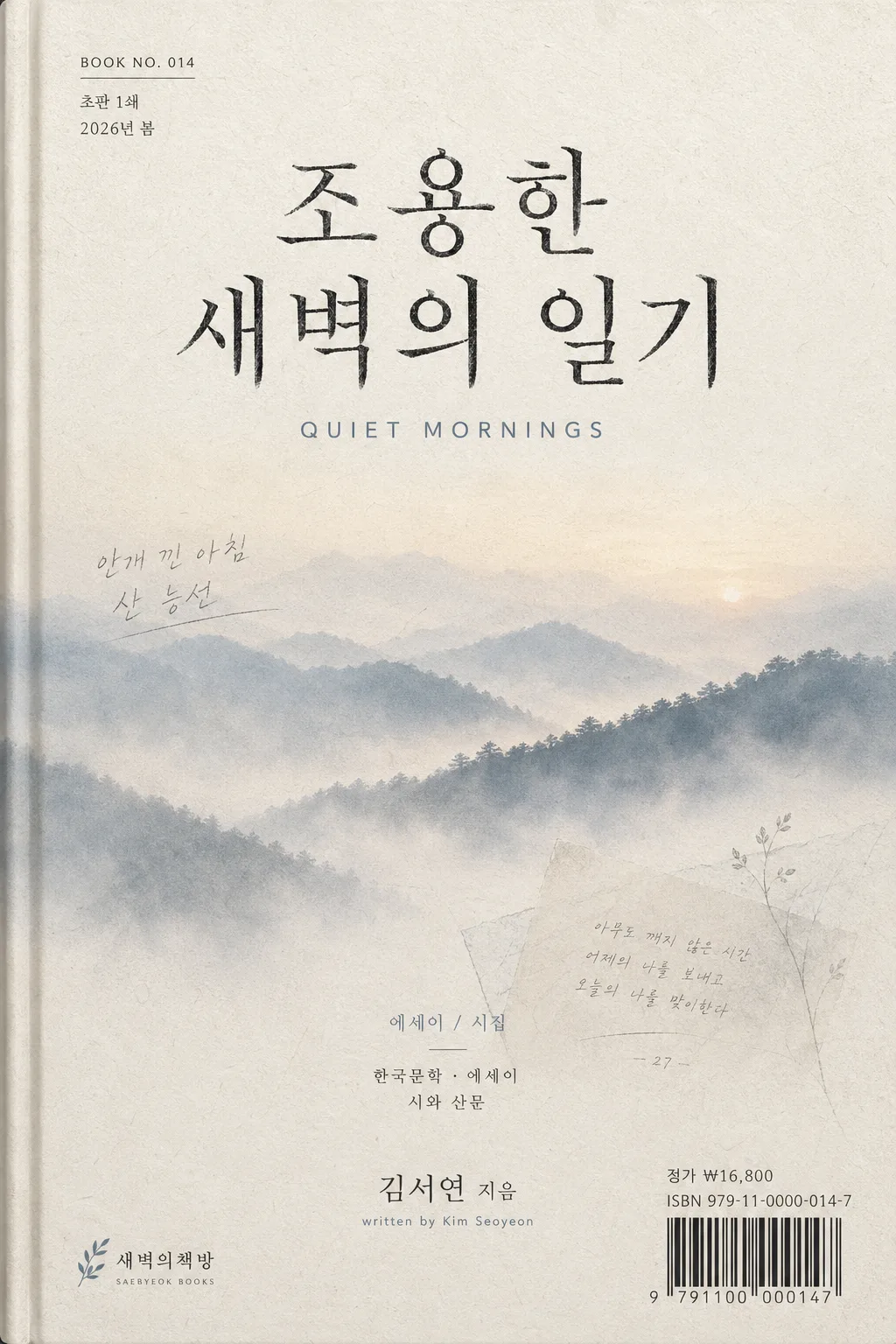
Korean literary book cover design, vertical paperback dust-jacket style, poetic contemporary indie publishing look with realistic printed-book details.
Designed to feel like a contemporary essay or poetry collection cover suitable for online bookstore thumbnail, editorial catalog listing, and a believable print-ready cover mockup.

[Composition]
- Vertical composition with the main title occupying the upper 42% of the cover, the visual concept spanning the middle zone, and author/publisher area across the lower 16%.
- Background treatment: off-white paper base with visible fine fiber texture, faint grain, slight ink absorption, soft scuffs, and a delicate atmospheric wash that supports the visual concept while keeping typography clear.
- Build a refined central publishing layout with realistic book-cover micro details: small series number, edition/date label, price line, ISBN/barcode block, and tiny imprint text placed naturally near the lower edge or back-cover suggestion area.
- Add subtle physical print cues such as a thin dust-jacket fold line near one vertical edge, very light paper waviness, a barely raised ink impression on the title, and a soft studio shadow that makes the cover feel like an actual photographed book surface.
- Use {책 제목}, {영문 부제}, {저자}, {장르}, {시각 컨셉} as editable text/content anchors while preserving the overall refined publishing-house layout.

[Core Structure]
- Top title zone (upper 28%): place {책 제목} in large Korean serif typography, crisp and centered, with strong vertical presence and carefully balanced line spacing; give the title a subtle printed ink texture rather than perfectly flat digital edges.
- Small editorial metadata above or beside the title: add tiny Korean/English text such as “BOOK NO. 014”, “초판 1쇄”, “2026년 봄”, or “LITERARY ESSAY SERIES” in fine type, aligned with the title column.
- Subtitle zone (below title, 6–8% down): set {영문 부제} in smaller clean sans-serif, tracking slightly expanded, aligned to the title axis, with clear hierarchy separation and a quiet editorial rhythm.
- Mid visual zone (center 38–45%): interpret {시각 컨셉} as an atmospheric illustration or gradient field, e.g. misty mountain silhouette, pale dawn haze, window light across a desk, soft layered forms, handwritten paper fragments, or a distant shoreline with gentle depth, integrated into the paper surface with visible print grain.
- Add 1–2 tactile literary details inside the mid/lower visual field when appropriate: a faint pencil line, tiny page-number-like mark, translucent leaf shadow, folded note edge, or pale archival texture that supports the book’s mood without competing with the title.
- Genre cue zone (lower middle 8–10%): place {장르} as a small editorial descriptor, understated and secondary, using thin-weight type and wide letter spacing; include a short Korean category line such as “한국문학 · 에세이” or “시와 산문” if it fits the genre.
- Bottom author zone (lower 10%): position {저자} near the bottom margin, aligned to the main column and visually lighter than the title; add a tiny author-credit line such as “written by” or “지은이” nearby if appropriate.
- Publisher/imprint area: place a small fictional imprint text mark at the bottom corner, plus tiny production details such as “정가 ₩16,800”, “ISBN 979-11-0000-014-7”, and a compact barcode area rendered as cover-print information, not as a certification seal.

[Style Rules]
- Typography: Korean title in Pretendard Serif or Noto Serif KR Bold, 64–86px equivalent; English subtitle in Inter or Noto Sans KR Medium, 22–30px equivalent; author, genre, metadata, price, and ISBN lines in smaller regular/medium weights.
- Color palette: off-white #F5F1E8, warm gray #CFC8BE, mist blue #BFC8D2, charcoal #2C2C2C, optional accent in muted sage #A8B6A3 or dusty blue #91A7B8.
- Border/shadow: no heavy border; use a subtle physical book-edge shadow, fine fold-line shading, and very soft ink shadow under text only if needed, around 2px y-offset, 8px blur, 10% opacity.
- Keep the design editorial, tactile, and print-realistic; allow carefully placed microtype, barcode/ISBN information, paper marks, dust-jacket fold cues, and atmospheric illustration details that make the cover feel like a real Korean paperback.

[Visual Style]
- Camera / lens: flat printed-cover mockup look, equivalent to a high-resolution studio reproduction with a 50mm normal perspective, no wide-angle distortion.
- Lighting: soft diffused studio light from upper-left, gentle ambient fill, slight paper sheen on raised ink, and enough texture visibility to reveal the matte stock and printed grain.
- Color grade: muted cream + mist blue + cool gray with a quiet dawn atmosphere, low saturation, slight analog print softness.
- Material finish: matte uncoated paper, subtle fiber texture, faint ink spread around Korean characters, soft scuffed edges, and a believable dust-jacket surface.

[Mood]
Contemporary Korean indie publisher cover — Minumsa / Munhakdongne editorial poetry aesthetic, like a refined literary magazine spread with quiet dawn atmosphere, tactile bookstore realism, and a thoughtful handmade literary object quality.

[Critical]
- Korean text accuracy: 반드시 아래 문자열이 정확히 보여야 함: “조용한 새벽의 일기”, “김서연 지음”
- Also render realistic Korean cover microcopy clearly where suitable: “초판 1쇄”, “2026년 봄”, “정가 ₩16,800”, “ISBN 979-11-0000-014-7”, “한국문학 · 에세이”.
- Preserve exact layout hierarchy: large Korean title, smaller English subtitle, author name near bottom, genre descriptor, and publisher/imprint information at bottom corner.
- All Korean characters must render cleanly with no garbling, broken spacing, or mixed-up glyphs.

[8. 🚫 PROHIBITED]
- Fake official seals or certification marks
- Broken Korean characters