Comics/Illustration
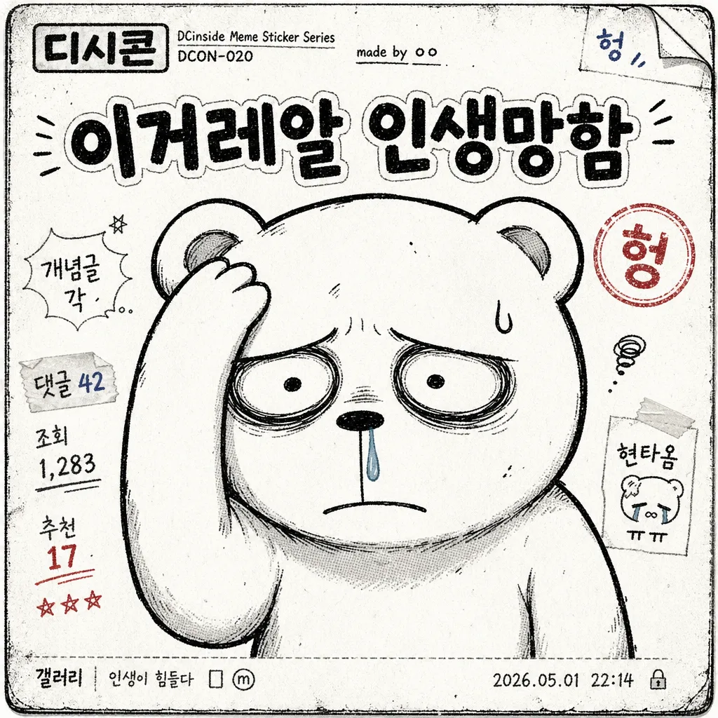
헝짤풍 디시콘 단일 컷
디시콘 단일 1컷. 거친 손그림 + 굵은 한글 멘트 + 단색/투명 배경. 갤러리 댓글·짤방용.
헝짤풍 디시콘 단일 컷 summary
Copy this ChatGPT image prompt to create Comics/Illustration results. Its subject, background, style, and composition are organized for quick iteration.
Related keywords: 헝짤풍 디시콘 단일 컷, 헝짤풍 디시콘 단일 컷 프롬프트, Comics/Illustration 프롬프트, Comics/Illustration AI 이미지 프롬프트, ChatGPT 이미지 프롬프트, AI 이미지 생성 프롬프트, AI 프롬프트, 이미지 프롬프트
How to use 헝짤풍 디시콘 단일 컷
Keep the prompt structure and swap the subject, background, palette, or composition to create new variations.
- Keep the main subject and adjust the palette and background for your brand, season, or channel.
- If the result feels busy, simplify the background and make the subject, composition, and lighting more specific.
- After copying, ask ChatGPT to adapt it for your platform, aspect ratio, or text requirements.
Original prompt
[Input]
- language: Korean
- output_size: 1024x1024

[Purpose]
Single-panel DCInside-style meme sticker, low-fi gallery-joke format for sharing in chat and community posts.
One-cut character gag image with rough hand-drawn humor, centered on a frustrated reaction and a punchy Korean caption, enriched with believable old-forum sticker-sheet details, scan texture, tiny post metadata, and community-reaction marks.

[Composition]
- Canvas: 1:1 square, with {캐릭터} occupying about 60-70% of the frame as the dominant subject.
- Subject placement: character centered slightly low, with {멘트} placed above the head or upper side in a bold readable block.
- Background treatment: {배경} should feel like a printed DCInside meme-sticker panel: off-white paper, faint photocopy grime, small UI-like scraps, tiny reaction labels, and subtle gallery-post metadata around the edges.
- Framing details: add a rough sticker-card boundary, misregistered ink edge, small corner scuffs, tiny handwritten side notes such as “개념글 각”, “댓글 42”, “조회 1,283”, “추천 17”, and a small timestamp like “2026.05.01 22:14” without competing with the main caption.
- Expression and pose: {포즈} should read instantly even at thumbnail size, with exaggerated slouch, comedic exhaustion, and a defeated reaction that matches the meme caption.

[3. CORE STRUCTURE]
1) Main character layer — Draw {캐릭터} as the primary focal point, cut crisply against the forum-sticker background, with rough black linework, slightly uneven edges, simple 2-3 color fills, small ink overlaps, and a hand-scanned cartoon feel.
2) Expression emphasis — Make the face readable first: tired eyes, damaged or deadpan mood, and visible comedic details such as a sweat bead, drooping mouth, trembling cheek line, eye bags, or tiny impact marks if they fit {캐릭터}.
3) Pose definition — Render {포즈} with clear gesture language, oversized head-to-body ratio, visibly drooped shoulder line, and a slightly crushed body silhouette to intensify the defeated reaction.
4) Caption placement — Place {멘트} above the head or to the upper side in a compact block, using thick handwritten Korean lettering with chunky outline, slightly crooked baseline, ink pooling at stroke ends, and strong contrast.
5) Meme-panel enrichment — Surround the character with believable low-fi community-post details: a small top-left label “디시콘”, a tiny creator credit “made by ㅇㅇ”, sticker pack code “DCON-020”, small reaction stamp “헝”, faint halftone dots, photocopy streaks, folded-paper shadows, and rough margin doodles that support the joke while keeping the single-panel gag clear.

[4. STYLE RULES]
- Typography: bold Korean hand-drawn lettering, equivalent to a rough marker style, heavy weight, 44-72px feel, slightly irregular stroke width, chunky outline for legibility; tiny metadata text should look like compressed forum UI text but remain plausibly Korean.
- Color palette: mostly off-white #F6F4EF, ink black #111111, and one muted accent color; use dull red #C84A4A for reaction stamps or gray-blue #6D7C8A for forum UI scraps if needed.
- Border/shadow: use a rough 2-4px sticker-card outline, faint offset photocopy shadow, slightly misregistered black ink, and small scuffed edges for a grungy zine/forum-emoticon feel.
- Texture: light halftone speckle, photocopy noise, paper grain, tiny dust flecks, subtle scanner banding, and minor line wobble; keep the main Korean caption clean and fully readable.

[5. VISUAL STYLE]
- Camera / lens: flat graphic illustration look, no photographic perspective; if treated as a poster mockup, use a straight-on 50mm equivalent framing feel with no lens distortion.
- Lighting: even studio-flat illumination with a scanned sticker-sheet impression, including slight paper-edge shadow and mild photocopy contrast.
- Color grade: desaturated monochrome base with a tiny accent pop, similar to early-2000s Korean internet meme boards, scanned comic-strip prints, and compressed forum emoticon packs.

[6. MOOD]
DCInside gallery meme — rough internet joke sticker feel, like a scanned low-fi comic panel from an old Korean forum post, with chaotic-but-readable community humor and defeated “헝짤” energy.

[7. CRITICAL]
- Korean text accuracy: the main caption must render {멘트} exactly as provided; if the default caption is used, “이거레알 인생망함” must appear exactly as written, with correct Korean characters and no garbling.
- Composition invariant: single panel only, no multi-panel grid, no extra speech bubbles beyond the main caption, and {캐릭터} must remain the dominant subject.
- Keep added Korean microtext short and secondary, such as “디시콘”, “개념글 각”, “댓글 42”, “조회 1,283”, “추천 17”, “made by ㅇㅇ”, so it enriches the sticker without overpowering {멘트}.
- Rendering invariant: hands, if visible, should look natural and clearly formed, with no malformed anatomy.

[8. 🚫 PROHIBITED]
- Fake official seals / certifications
- Broken Korean characters
- Celebrity composites / unauthorized likeness