유튜브/썸네일
연애·심리 유튜브 썸네일
한국 연애·심리·자기성찰 채널. 텍스트 위주 + 책 표지 같은 분위기. 일러스트 보조.
연애·심리 유튜브 썸네일 검색 요약
연애·심리 유튜브 썸네일은 유튜브/썸네일 결과물을 만들 때 바로 복사해 활용할 수 있는 ChatGPT 이미지 프롬프트입니다. 주제, 배경, 스타일, 구도 조건을 함께 담아 빠르게 시안을 만들 수 있도록 구성했습니다.
관련 키워드: 연애·심리 유튜브 썸네일, 연애·심리 유튜브 썸네일 프롬프트, 유튜브/썸네일 프롬프트, 유튜브/썸네일 AI 이미지 프롬프트, ChatGPT 이미지 프롬프트, AI 이미지 생성 프롬프트, AI 프롬프트, 이미지 프롬프트
연애·심리 유튜브 썸네일 활용 포인트
원본 구조를 유지하면서 피사체, 배경, 색감, 구도를 바꿔 다양한 시안으로 확장할 수 있습니다.
- 핵심 소재는 유지하고 브랜드, 계절, 채널 목적에 맞는 색감과 배경을 바꿔보세요.
- 결과가 산만하면 배경 요소를 줄이고 피사체, 구도, 조명 조건을 구체화하세요.
- 복사한 뒤 ChatGPT에서 플랫폼, 화면 비율, 텍스트 포함 여부를 추가로 요청할 수 있습니다.
프롬프트 원문
[Input]
- language: Korean
- output_size: 1536x1024

[Purpose]
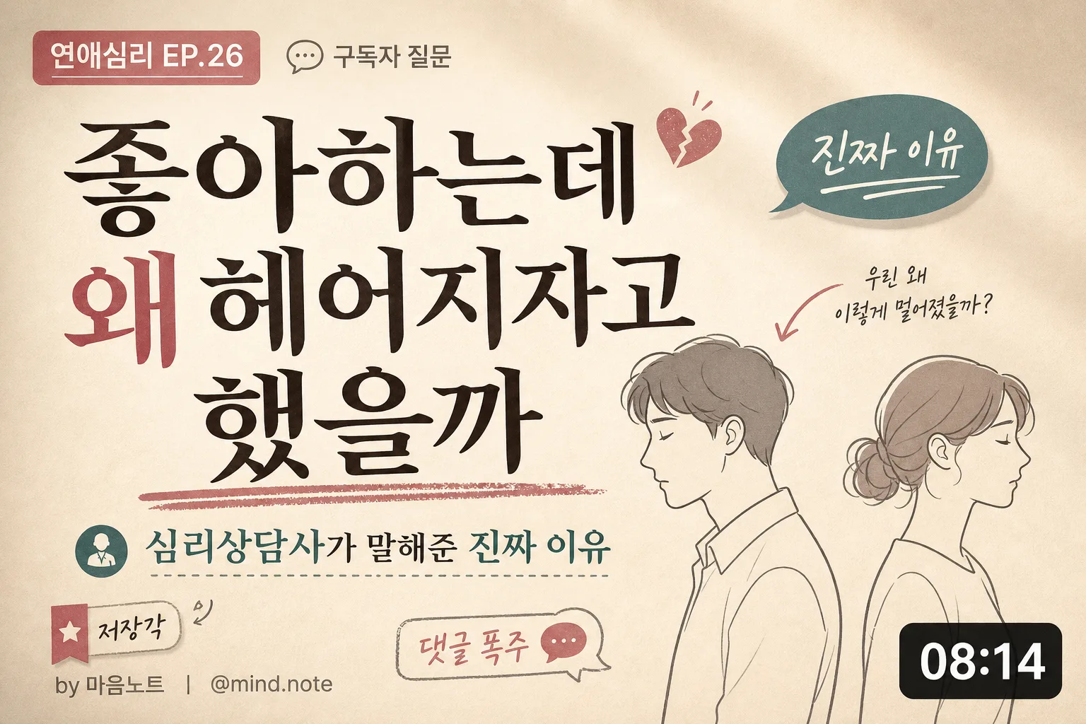
Korean YouTube thumbnail for a relationship/psychology/self-reflection channel, designed like a premium editorial thumbnail inspired by a relationship essay cover and a high-retention video card.
Make it feel clickable, emotionally specific, and credible, with strong readability at small size, a clear psychological hook, and realistic YouTube thumbnail details.

[Composition]
- Main subject: {메인 텍스트} occupies the center 45–50% of the frame, set as the dominant visual anchor with bold line breaks and strong contrast for mobile viewing.
- Subtitle: {부제} sits directly below the main text in a smaller, lighter weight, aligned left or centered depending on balance with the illustration.
- Illustration: {일러스트} placed on the right side third or lower-right corner, showing two side-profile people turned away from each other, with expressive posture and a subtle emotional distance.
- Background treatment: {배경} as a warm editorial paper-board surface with believable paper grain, soft vignette, faint desk-light shadowing, and gentle tonal variation.
- Accent use: {액센트 색} appears in clickable thumbnail elements such as a bold underline, speech-bubble tag, alert dot, arrow, sticker shape, or soft highlight block behind a short phrase.
- YouTube metadata details: add a small channel handle "@mind.note", a compact episode label "연애심리 EP.26", a tiny runtime-style badge "08:14", and a small sticker text such as "저장각" or "댓글 폭주" without weakening the title.
- Spacing and framing: composition is dense enough to feel like a real thumbnail, but the main title remains the largest and clearest element with safe crop space for YouTube UI.

[3. CORE STRUCTURE]
1) Background layer: build a warm off-white to beige atmosphere using {배경}, with matte paper texture, faint gradient, soft corner shading, and a realistic editorial print surface.
2) Title block: place {메인 텍스트} in very large Korean serif typography, centered or slightly left of center and slightly above true middle, with bold contrast against the background.
3) Subtitle block: place {부제} beneath the title with smaller size, softer contrast, and a concise hook-like layout so it reads as the explanatory promise of the video.
4) Illustration layer: render {일러스트} as a clean line illustration with moderate detail, thin-to-medium strokes, and muted fill accents; position it on the right side so it creates a relationship tension visual.
5) Accent detail: apply {액센트 색} to 2–3 supporting thumbnail devices: a hand-drawn underline beneath a key phrase, a small arrow pointing toward the separated couple, and a rounded sticker tag reading "진짜 이유" or "심리 분석".
6) Thumbnail readability pass: keep the composition bold enough for 1/4 scale viewing, with the main message instantly legible on mobile and secondary details readable at full size.
7) Realistic YouTube card polish: include a small top-left series label "연애심리 EP.26", a tiny bottom-left credit "by 마음노트", a bottom-right runtime badge "08:14", and micro UI-style text like "구독자 질문" as subtle supporting context.

[4. STYLE RULES]
- Typography: Noto Serif KR or Nanum Myeongjo for the main text, bold weight, large headline size; Pretendard or Noto Sans KR for the subtitle and metadata labels, regular to medium weight.
- Color palette: cream #F4EFE6, warm beige #E7DCCB, dark brown-black #2B2019, muted gray #8C8680, and {액센트 색} as the dominant accent for sticker, underline, arrow, and small emphasis marks.
- Border/shadow: avoid heavy framing; use soft printed-card depth, subtle paper-edge shadow, 2px y-offset / 8px blur title shadow at 12% opacity if needed, and light sticker shadows for realistic layering.
- Graphic details: add small editorial symbols such as a tiny heart-break icon, speech bubble, circled number, torn-paper label, or marker highlight, all supporting the relationship psychology theme.
- Text hierarchy: {메인 텍스트} must be much larger than all added labels; metadata and stickers must feel secondary and not compete with the main message.

[5. VISUAL STYLE]
- Camera / lens: clean graphic editorial layout, simulated as if shot on a medium-format 80mm lens perspective with flat front-facing composition, no distortion.
- Lighting: soft window light from upper-left at 45°, diffused and even, with a faint warm fill from the lower-right to keep the paper-like background gentle.
- Color grade: warm cream, muted rose/teal, soft brown neutrals, slightly desaturated for a thoughtful psychology-editorial look.
- Rendering quality: realistic printed thumbnail artwork with tactile paper grain, subtle ink texture, layered sticker pieces, and crisp Korean typography.

[6. MOOD]
Thoughtful Korean relationship editorial meets a polished YouTube psychology thumbnail — calm, emotionally sharp, intimate, and highly clickable without looking sensationalist.

[7. CRITICAL]
- Korean text accuracy: 반드시 다음 문구가 정확히 보여야 함: "좋아하는데 왜 헤어지자고 했을까", "심리상담사가 말해준 진짜 이유"
- Additional Korean thumbnail details may include: "연애심리 EP.26", "@mind.note", "저장각", "댓글 폭주", "구독자 질문", "08:14".
- Keep the main title fully legible, with correct Korean spacing and no broken syllables or mangled characters.
- Illustration must remain simple and non-photorealistic, showing two people in side profile who are not facing each other.
- Layout must read clearly as a YouTube thumbnail at small size, with the title as the dominant element.

[8. 🚫 PROHIBITED]
- Fake official seals / certifications
- Broken Korean characters
- Celebrity composites / unauthorized likeness