漫画・イラスト
한국 웹툰 메인 표지 일러스트
네이버웹툰 인기작 메인 비주얼 풍. 작품 제목·장르·인물 자유. 표지·홍보 키 비주얼용.
한국 웹툰 메인 표지 일러스트の概要
漫画・イラスト画像を作るためのChatGPT画像プロンプトです。主題、背景、スタイル、構図を整理し、すぐに試せるよう構成しています。
関連キーワード: 한국 웹툰 메인 표지 일러스트, 한국 웹툰 메인 표지 일러스트 프롬프트, 漫画・イラスト 프롬프트, 漫画・イラスト AI 이미지 프롬프트, ChatGPT 이미지 프롬프트, AI 이미지 생성 프롬프트, AI 프롬프트, 이미지 프롬프트
한국 웹툰 메인 표지 일러스트の活用方法
元の構造を保ちながら、被写体、背景、色、構図を変更して別案に展開できます。
- 主題を維持し、ブランドや季節、媒体に合わせて色と背景を変更してください。
- 結果が複雑な場合は背景要素を減らし、被写体、構図、照明を具体化してください。
- コピー後、ChatGPTに媒体、アスペクト比、文字の有無を追加で指定できます。
プロンプト原文
[Input]
- language: Korean
- output_size: 1024x1536

[Purpose]
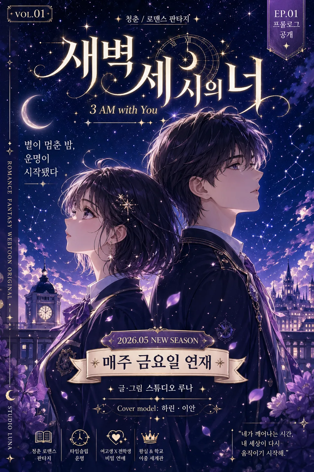
Korean webtoon main cover key visual illustration, vertical 9:16 poster composition for a romance-fantasy youth series.
Designed for platform thumbnail and main title cover use, with polished cel-shading, cinematic sparkle effects, and the richer editorial finish of a real serialized webtoon launch cover.

[Composition]
- Center the two leads as the main focal point, occupying about 55–60% of the frame height, with {주인공} arranged in a dramatic back-to-back pose that reads clearly at thumbnail size.
- Place the title typography in a large hierarchy at the top or lower third depending on balance, while adding a compact subtitle, genre label, launch-date ribbon, author credit, and platform-cover metadata around it.
- Build a complete publish-ready cover layout: a small top issue-style label, short Korean tagline blurbs, episode/serialization badge, and tiny production-credit text along the lower edge or side spine.
- Background should be a starry night scene with layered depth, moonlit clouds, distant school rooftop or palace-balcony silhouettes, faint constellation motifs, flower petals, and atmospheric haze using {컬러} and {시각 효과} to create a dreamy but readable webtoon-cover atmosphere.

[3. CORE STRUCTURE]
1. Background layer: build a deep night sky backdrop with subtle gradient depth, scattered stars, crescent moon glow, soft cloud bands, faint constellation lines, and a distant city/school/palace silhouette so the cover feels like a real romance-fantasy setting.
2. Character block: place {주인공} in the central zone, back-to-back, with clear facial profile emphasis, expressive eyes, elegant costume shapes, flowing hair strands, webtoon-friendly clean outlines, and small accessories that hint at the youth romance-fantasy genre.
3. Light effects: integrate {시각 효과} around hair edges, shoulders, jewelry, costume trim, petals, and the upper sky area, keeping the glow controlled so it enhances the composition without washing out the typography.
4. Title area: render {작품 제목} as the dominant typographic element, with bold Korean lettering that feels premium and highly legible; position {영문 부제} smaller beneath or beside it as a secondary line.
5. Editorial cover details: include {장르} as a small genre label, a readable launch line such as "매주 금요일 연재", a date label such as "2026.05 NEW SEASON", a short teaser blurb such as "별이 멈춘 밤, 운명이 시작됐다", and a creator/model-name credit such as "글·그림 스튜디오 루나" or "Cover model: 하린 · 이안".
6. Metadata corner: place small production-credit-style text, slide/episode-style information such as "EP.01 프롤로그 공개", and tiny vertical spine text like "ROMANCE FANTASY WEBTOON ORIGINAL" along one edge, maintaining the feel of an official serialized webtoon cover.

[4. STYLE RULES]
- Typography: bold Korean display font for the main title, such as Pretendard ExtraBold or Noto Sans KR Black for clean readability; use a lighter sans-serif for the English subtitle at about 35–45% of the title size.
- Color palette: use {컬러} with deep navy #0B1030, lilac #B79CFF, and metallic gold #F4D36B accents; keep text in high-contrast ivory or warm white for legibility.
- Border/shadow: add a soft outer glow around title letters, plus a subtle 3–5px drop shadow with 20% opacity to separate typography from the night background.
- Cover decoration: add refined editorial ornaments such as thin constellation arcs, small gold star dividers, translucent ribbon labels, petal trails, magical dust, and a tiny age/episode-style tag without making it look like a fake certification.
- Text hierarchy: main title largest, English subtitle second, Korean teaser blurbs and metadata smaller but still intentionally typeset; all text should feel integrated into a professional webtoon platform cover rather than floating randomly.

[5. VISUAL STYLE]
- Camera / lens: digital illustration presented like an anime key visual, with a 50mm portrait framing equivalent and slight depth layering rather than a wide lens distortion.
- Lighting: moonlit backlight from upper-left, faint rim light on hair and shoulders, plus soft sparkle highlights across the sky; keep contrast cinematic but not harsh.
- Color grade: cool midnight navy with lilac bloom and restrained gold highlights, similar to polished Korean webtoon promotional artwork.
- Rendering quality: clean cel-shading with delicate gradients on skin and fabric, crisp linework, glossy eye highlights, atmospheric bloom, and detailed costume textures such as satin folds, embroidered trim, school-uniform buttons, ribbons, or fantasy jewelry.

[6. MOOD]
Premium Korean webtoon editorial cover — a refined Naver Webtoon / Kakao Webtoon launch-poster feel with cinematic romance-fantasy tension, emotional youth-drama intimacy, and a collectible first-episode cover richness.

[7. CRITICAL]
- Korean text accuracy: render {작품 제목}, {영문 부제}, and {장르} cleanly; include readable supporting Korean cover copy such as "매주 금요일 연재", "EP.01 프롤로그 공개", "별이 멈춘 밤, 운명이 시작됐다", "청춘 로맨스 판타지", and "글·그림 스튜디오 루나".
- Layout invariant: the two leads must remain centered as the main visual anchor, and the title must be large, crisp, and fully readable in Korean.
- Keep all Korean typography clean and correctly spaced; no distorted Hangul, no broken syllables.
- The final image should look like a finished, content-rich Korean webtoon main cover with believable publication labels, teaser blurbs, date/episode information, and polished romance-fantasy illustration details.

[8. 🚫 PROHIBITED]
- Fake official seals / certifications
- Broken Korean characters
- Celebrity composites or unauthorized likeness