광고/포스터
미연시·로맨스 모바일 게임 광고
Sharo Games·시프트업 풍 미연시·서브컬쳐 게임 광고 배너. 게임 제목·캐릭터·기능 자유. 12세 이용가 톤.
미연시·로맨스 모바일 게임 광고 검색 요약
미연시·로맨스 모바일 게임 광고은 광고/포스터 결과물을 만들 때 바로 복사해 활용할 수 있는 ChatGPT 이미지 프롬프트입니다. 주제, 배경, 스타일, 구도 조건을 함께 담아 빠르게 시안을 만들 수 있도록 구성했습니다.
관련 키워드: 미연시·로맨스 모바일 게임 광고, 미연시·로맨스 모바일 게임 광고 프롬프트, 광고/포스터 프롬프트, 광고/포스터 AI 이미지 프롬프트, ChatGPT 이미지 프롬프트, AI 이미지 생성 프롬프트, AI 프롬프트, 이미지 프롬프트
미연시·로맨스 모바일 게임 광고 활용 포인트
원본 구조를 유지하면서 피사체, 배경, 색감, 구도를 바꿔 다양한 시안으로 확장할 수 있습니다.
- 핵심 소재는 유지하고 브랜드, 계절, 채널 목적에 맞는 색감과 배경을 바꿔보세요.
- 결과가 산만하면 배경 요소를 줄이고 피사체, 구도, 조명 조건을 구체화하세요.
- 복사한 뒤 ChatGPT에서 플랫폼, 화면 비율, 텍스트 포함 여부를 추가로 요청할 수 있습니다.
프롬프트 원문
[Input]
- language: Korean
- output_size: 1024x1536

[Purpose]
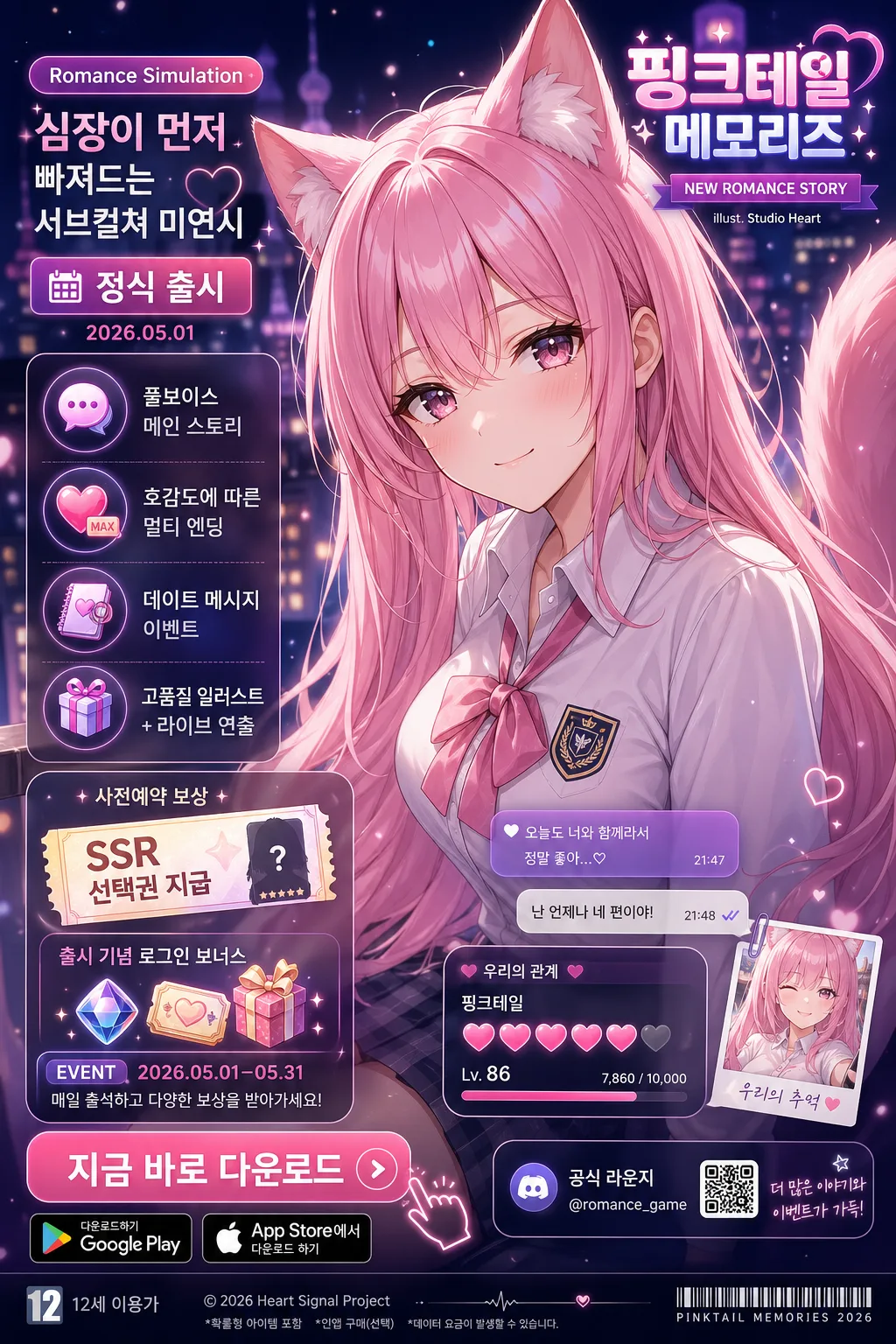
Korean mobile game launch ad poster for a romance simulation / visual novel style subculture game, vertical 9:16 hero composition optimized for app-store style promotion and social ads.
Character mood and polished in-game advertising feel should dominate, supported by realistic launch-campaign UI, event labels, store badges, reward callouts, and clear CTA emphasis.

[Composition]
- Main subject placement: {캐릭터} occupies the upper 65% of the frame as a shoulder-up close-up, with the face slightly angled toward camera and the gaze soft but engaging.
- Title placement: {게임 제목} appears in the upper-right corner as a polished mobile-game logo label, highly legible, with a small subtitle ribbon and glow accent.
- Supporting UI: {장르 라벨}, {부제}, {출시 정보}, the 4 feature icons, reward/event labels, and CTA are stacked as a premium promotional panel on the left side, visually integrated with glassmorphism cards and small badge elements.
- Background treatment: {배경} rendered as a blurred, cinematic night backdrop with pink-lilac glow, distant city lights or school-festival bokeh, tiny floating sparkle particles, soft heart/star accents, and layered mobile-ad depth.
- Framing direction: guide the eye first to the character expression, then to the upper-right game title, then down the left promotional stack and lower CTA area.

[3. CORE STRUCTURE]
- Upper hero area (65%): {캐릭터} in clean anime-subculture illustration style, shoulder-up framing, soft rim light around hair and ears/tail if visible, glossy eye highlights, delicate blush, and sparkle particles floating near the silhouette.
- Upper-right corner label: place {게임 제목} in bold Korean display typography, compact and polished, aligned to the right with a small luminous tag reading “NEW ROMANCE STORY” and a tiny credit line “illust. Studio Heart”.
- Main promo ribbon: near the left-upper promotional panel, place {장르 라벨} as a pill badge, {부제} beneath it as a short romantic copy line, and {출시 정보} as a date/status label with a small calendar icon.
- Feature stack: arrange exactly 4 matching rounded icon tiles with labels {feature 1}, {feature 2}, {feature 3}, {feature 4}; each tile should include a tiny themed pictogram such as a chat bubble, heart meter, diary page, or gift box.
- Launch campaign details: add small Korean microcopy blocks such as “사전예약 보상”, “SSR 선택권 지급”, “출시 기념 로그인 보너스”, “EVENT 2026.05.01–05.31”, and “공식 라운지 @romance_game” in realistic ad typography.
- CTA block: at the lower-left, place a prominent rounded button reading “지금 바로 다운로드”, with Google Play and App Store style download badges below it, plus a small arrow/hand-tap accent and subtle glow.
- Bottom information band: include “12세 이용가” at the bottom edge, a tiny copyright-style line “© 2026 Heart Signal Project”, a small barcode-like app campaign marker, and fine-print store notice styling.
- Decorative campaign elements: add translucent chat bubbles, a small relationship meter card, a ticket-shaped reward coupon, and soft pink-purple gradient panels around the UI without covering the character’s face.

[4. STYLE RULES]
- Typography: Pretendard Bold for {게임 제목}, Pretendard SemiBold for {장르 라벨} and {출시 정보}, Noto Sans KR Regular for {부제}, feature labels, and microcopy; use strong hierarchy with bold CTA, medium feature labels, and tiny footer/legal text.
- Color palette: vibrant pink-purple-navy palette using #F48FB1, #C77DFF, #6C63FF, #1E1B4B, #F7F3FF, and soft white highlights.
- UI treatment: rounded buttons with 14px corner radius, thin 1px white outline on selected panels, translucent dark overlays at 20–35% opacity for text legibility, glossy gradient badges, and glass-card reflections.
- Shadow/glow: soft outer glow around character and title, 6px y-offset shadow, 18px blur, 20% opacity; sparkle particles, heart accents, and bokeh should enhance the romance-game mood without overpowering readable text.
- Realistic ad finish: include layered UI depth, clean alignment guides, subtle texture in gradient panels, tiny app-store campaign details, and polished Korean mobile-game launch poster production quality.

[5. VISUAL STYLE]
- Camera / lens: 85mm portrait lens look, f/1.8 shallow depth of field, close-up framing with clean facial detail and soft background separation.
- Lighting: cinematic night lighting with soft key light from upper-left at about 45°, gentle magenta rim light from the right, and faint cool fill from below to preserve facial structure.
- Color grade: glossy pink-lilac highlights against deep navy shadows, with a modern mobile-game ad polish similar to Sharo Games / 시프트업 / 카카오게임즈 campaign visuals.
- Rendering details: high-resolution anime key visual, crisp Korean typography, realistic screen-ad compositing, subtle lens bloom, soft atmospheric haze, and premium storefront-promotion sharpness.

[6. MOOD]
Premium Korean romance-game launch poster — polished subculture anime ad aesthetic with a cinematic K-drama glow, collectible character appeal, romantic event-campaign energy, and high-end mobile storefront promotion feel.

[7. CRITICAL]
- Korean text accuracy: the following strings must appear exactly as written: “지금 바로 다운로드”, “12세 이용가”, {게임 제목}, {장르 라벨}, {부제}, {출시 정보}, {feature 1}, {feature 2}, {feature 3}, {feature 4}.
- Additional Korean text should be readable and natural, including short launch-ad labels such as “사전예약 보상”, “SSR 선택권 지급”, “출시 기념 로그인 보너스”, “EVENT 2026.05.01–05.31”, and “공식 라운지 @romance_game”.
- Composition invariant: main visual must be a shoulder-up character close-up occupying the upper 65% of the frame; do not use a left-text/right-character split layout.
- Character safety: the character must remain tasteful and age-appropriate, with no sexualized pose, no revealing outfit, and no adult content cues.
- Feature list must contain exactly 4 icons with matching labels: {feature 1}, {feature 2}, {feature 3}, {feature 4}.
- Keep the upper-right {게임 제목} readable as the game logo label while the CTA and store badges remain clearly visible in the lower-left.

[8. 🚫 PROHIBITED]
- Fake official seals / certifications
- Broken Korean characters
- Celebrity composites / unauthorized likeness