廣告/海報
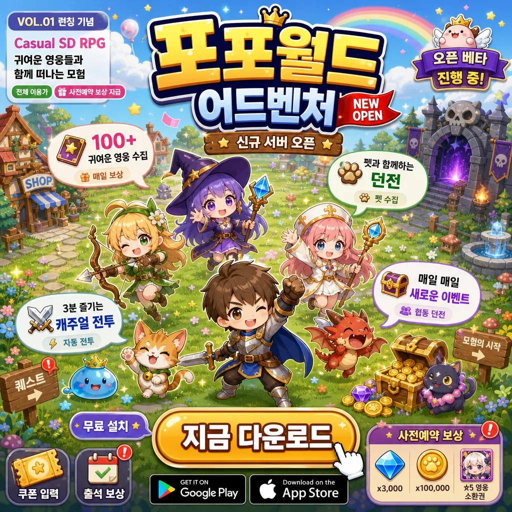
캐주얼 SD RPG 모바일 게임 광고
치비·SD 캐릭터 + 펫 컬렉션 모바일 게임 광고. 귀여운 톤, 알록달록 색감. 캐주얼 게이머 타겟.
캐주얼 SD RPG 모바일 게임 광고摘要
這是用來製作廣告/海報內容的 ChatGPT 圖像提示詞,已整理主題、背景、風格與構圖,方便快速調整。
相關關鍵字: 캐주얼 SD RPG 모바일 게임 광고, 캐주얼 SD RPG 모바일 게임 광고 프롬프트, 廣告/海報 프롬프트, 廣告/海報 AI 이미지 프롬프트, ChatGPT 이미지 프롬프트, AI 이미지 생성 프롬프트, AI 프롬프트, 이미지 프롬프트
캐주얼 SD RPG 모바일 게임 광고使用方式
保留原始結構並替換主體、背景、色彩或構圖,即可延伸出不同版本。
- 保留核心主體,並依品牌、季節或平台調整色彩與背景。
- 如果畫面太複雜,請減少背景元素並具體描述主體、構圖與光線。
- 複製後可要求 ChatGPT 配合平台、長寬比或文字需求調整。
提示詞原文
[Input]
- language: Korean
- output_size: 1024x1024

[Purpose]
Korean casual SD RPG mobile game ad banner, 1:1 square format, lively app-store and social-feed promo graphic for install and pre-registration conversion.
Board-game-like isometric plan view with cute collectible heroes, pets, reward UI, event callouts, and a playable-looking pastel fantasy field that feels like an actual mobile game launch advertisement.

[Composition]
- Overall framing: 1:1 square composition with an isometric top-down view, designed as a compact mobile-game advertisement with real app-ad details, layered UI stickers, reward badges, and readable Korean promotional text.
- Main scene placement: 5–6 small SD heroes and pets are distributed across the center and lower-middle area, each in a different lively pose so the eye travels around the whole frame; include a tiny healer, warrior, mage, archer, mascot pet, treasure pet, and a few animated-looking effect trails.
- Title placement: {게임 제목} sits large at the top center in bold rounded Korean cartoon lettering with a thick navy outline, soft drop shadow, small sparkle highlights, and a tiny “NEW OPEN” ribbon tucked near the title.
- CTA placement: a large rounded button sits at the bottom center, with high contrast and easy tap-readability; button text reads “지금 다운로드” and is clearly separated from the playable scene, with a small “무료 설치” tag and store badge row nearby.
- Feature presentation: four floating speech-bubble icons are placed near the characters, each bubble containing one concise feature line; add tiny related icons such as sword, gem, pet paw, treasure chest, or dice.
- Background treatment: pastel grass field blended with a tiny village edge and dungeon entrance, rainbow sky accents, cloud puffs, sparkle particles, star confetti, stone path tiles, signboards, reward chests, potion bottles, coin piles, and small UI markers so the ad feels content-rich and game-like.
- Use {메인 비주얼}, {배경}, {feature 1}, {feature 2}, {feature 3}, {feature 4}, {장르 라벨}, {태그라인}, {출시 정보} placeholders naturally in the ad layout.

[3. CORE STRUCTURE]
1. Top header zone (upper 18%): place {게임 제목} at the exact top center, oversized, with thick outline and a subtle shadow so it reads instantly on mobile; add small supporting labels around it such as “VOL.01 런칭 기념”, “신규 서버 오픈”, and a tiny decorative crown icon.
2. Genre and tagline cluster (upper-left or upper-right small block): stack {장르 라벨} above {태그라인} in a compact promo-copy arrangement, using smaller but still bold rounded type; include a pill-shaped “전체 이용가” rating tag and a tiny “사전예약 보상 지급” chip beside it.
3. Main character field (middle 55%): render {메인 비주얼} as a cheerful grouped scene of chibi heroes and pets, with each character separated enough to be individually readable; include hand wave, jump, idle victory pose, spell-casting pose, treasure-opening pose, and pet reaction poses.
4. World surface (middle-to-lower area): paint {배경} as a pastel fantasy map surface with soft grass texture, cobblestone paths, small village props, a cozy shop sign, mailbox, mushroom cluster, glowing portal, mini dungeon gate, and tiny quest arrows, all simplified to match SD game UI art.
5. Feature bubbles (around characters): show {feature 1}, {feature 2}, {feature 3}, {feature 4} in four floating speech bubbles or icon callouts, each bubble anchored near a different hero/pet group for visual balance; add small readable secondary micro-copy such as “매일 보상”, “자동 전투”, “펫 수집”, “협동 던전”.
6. CTA zone (bottom 14%): place a large rounded install button with strong contrast and clear button depth; place app-store-style badges beside or below it in a tidy app-ad layout, plus tiny UI labels “무료 설치”, “쿠폰 입력”, “출석 보상”, and a red notification dot.
7. Release note strip (bottom edge): add {출시 정보} as a small but legible status line under the CTA area; include a fine-print event strip reading “런칭 7일 보상 · SSR 영웅 선택권 · 3,000젬 지급” and a compact coupon label “WELCOME2026”.

[4. STYLE RULES]
- Typography: use a rounded Korean sans-serif such as Pretendard Rounded or Noto Sans KR Rounded for UI text, with heavy weight for the title and medium weight for feature labels; title size should feel like a banner masthead, while UI copy remains compact and readable.
- Color palette: vivid rainbow pastel set with pink #FF7AB6, mint #8BE6D1, yellow #FFE36E, lilac #BFA7FF, sky blue #79C7FF, plus warm white #FFF9F2 and deep navy outline #2B2B44.
- Borders/shadow: thick cartoon outlines on characters and UI, soft drop shadows on title and CTA button, 4px vertical offset with 14px blur at about 18% opacity for layered pop.
- Icon style: speech bubbles, reward chips, store badges, coupon tags, and feature icons should be glossy, rounded, tactile, and game-like, with tiny sparkle accents, gem highlights, coin glints, and soft sticker edges.
- Detail density: fill the ad with believable mobile-game marketing details—reward boxes, event ribbons, badges, readable micro-labels, mini quest markers, and UI counters—while keeping the main title, four features, and bottom CTA immediately readable.

[5. VISUAL STYLE]
- Camera / lens: isometric top-down board-game view, simulated as a 35mm equivalent digital illustration with crisp perspective control and no real-camera blur.
- Lighting: even studio-like diffuse light from above-left, with gentle bounce fill from the lower-right so character faces and pet shapes stay bright and legible.
- Color grade: candy pastel fantasy grade with clean saturated accents, soft cream highlights, and controlled contrast; keep shadows light and playful rather than dramatic.
- Rendering finish: polished Korean mobile game key-art illustration with crisp vector-like UI, rounded 3D sticker depth, soft cel-shaded characters, glossy gems, readable icons, and a finished app campaign look.

[6. MOOD]
Cute Korean mobile RPG launch art with the upbeat polish of Cookie Run-style character marketing and the friendly collectathon feel of a polished fantasy app store banner; energetic, generous, reward-filled, and instantly understandable as a casual SD RPG ad.

[7. CRITICAL]
- Korean text accuracy: the following Korean strings must appear exactly and be spelled correctly in the image:
  - {게임 제목}
  - {장르 라벨}
  - {태그라인}
  - {출시 정보}
  - {feature 1}
  - {feature 2}
  - {feature 3}
  - {feature 4}
  - 전체 이용가
  - 지금 다운로드
  - 무료 설치
  - 매일 보상
  - 자동 전투
  - 펫 수집
  - 협동 던전
- Layout invariant: the composition must be 1:1 square with an isometric top-down plan-view scene, not a left-text/right-character split.
- Character invariant: all heroes and pets must remain cute SD/chibi proportions, with no realistic anatomy or intimidating action.
- UI invariant: CTA button must be clearly visible at the bottom center and must read as a download action.
- Ad realism invariant: include app-ad details such as reward chips, coupon tag, rating tag, store badges, event ribbon, notification dot, and small launch benefit text so the image feels like a real Korean mobile game campaign creative.

[8. 🚫 PROHIBITED]
- Fake official seals / certifications
- Broken Korean characters
- Celebrity composites / unauthorized likeness