광고/포스터
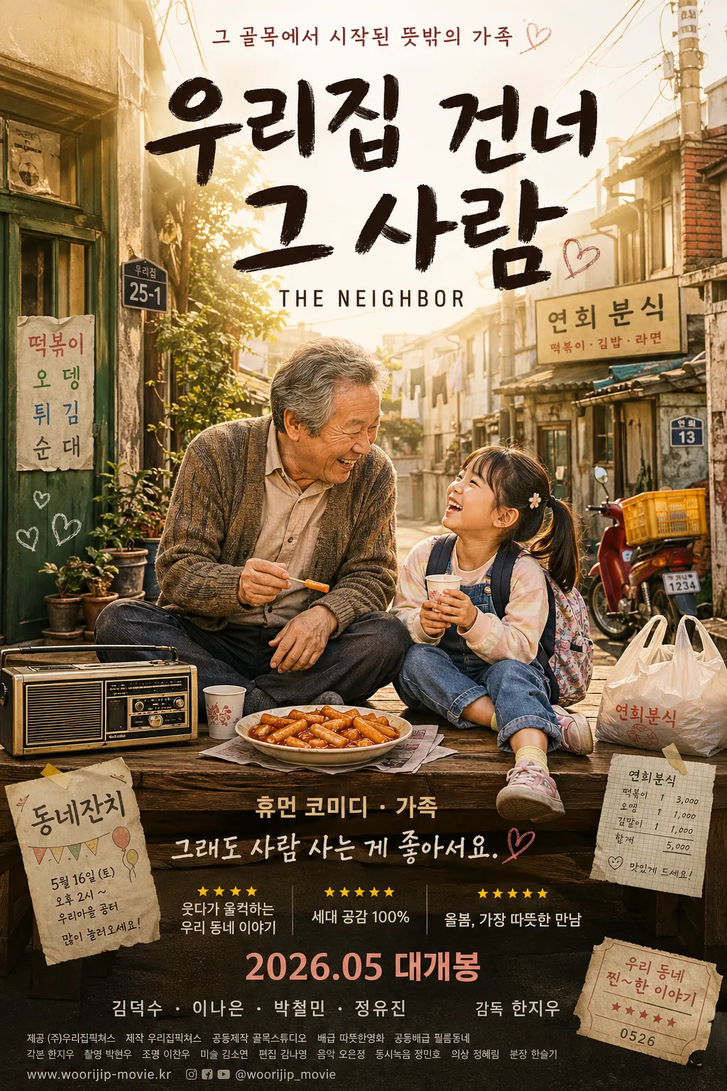
휴먼 코미디 가족 영화 포스터
7번방의 선물·국제시장·극한직업 풍. 따뜻한 정 + 일상 + 손글씨 한글 제목.
휴먼 코미디 가족 영화 포스터 검색 요약
휴먼 코미디 가족 영화 포스터은 광고/포스터 결과물을 만들 때 바로 복사해 활용할 수 있는 ChatGPT 이미지 프롬프트입니다. 주제, 배경, 스타일, 구도 조건을 함께 담아 빠르게 시안을 만들 수 있도록 구성했습니다.
관련 키워드: 휴먼 코미디 가족 영화 포스터, 휴먼 코미디 가족 영화 포스터 프롬프트, 광고/포스터 프롬프트, 광고/포스터 AI 이미지 프롬프트, ChatGPT 이미지 프롬프트, AI 이미지 생성 프롬프트, AI 프롬프트, 이미지 프롬프트
휴먼 코미디 가족 영화 포스터 활용 포인트
원본 구조를 유지하면서 피사체, 배경, 색감, 구도를 바꿔 다양한 시안으로 확장할 수 있습니다.
- 핵심 소재는 유지하고 브랜드, 계절, 채널 목적에 맞는 색감과 배경을 바꿔보세요.
- 결과가 산만하면 배경 요소를 줄이고 피사체, 구도, 조명 조건을 구체화하세요.
- 복사한 뒤 ChatGPT에서 플랫폼, 화면 비율, 텍스트 포함 여부를 추가로 요청할 수 있습니다.
프롬프트 원문
[Input]
- language: Korean
- output_size: 1024x1536

[Purpose]
Korean human-comedy family movie poster, vertical 9:16 theatrical key art for an emotional but playful domestic-release campaign.
Designed to feel like a warm neighborhood story poster with broad audience appeal, suitable for cinema one-sheet, streaming promo, social teaser use, lobby display, and online ticketing thumbnail.

[Composition]
- Main character grouping: the {시각 컨셉} occupies the central 60% of the frame, with the emotional focal point placed slightly above center for poster readability.
- Title zone: {영화 제목} dominates the upper third in large handwritten Korean lettering, while {영문 부제} sits directly beneath in a smaller clean sans-serif line.
- Supporting text area: {장르} and {태그라인} are stacked in balanced spacing near the lower third, joined by realistic theatrical poster details such as release date, short review-style blurbs, cast-name credits, and a compact billing block.
- Background treatment: a nostalgic Korean neighborhood alley with warm plaster walls, faded signboards, utility wires, potted plants, laundry lines, a parked scooter, delivery boxes, worn doorplates, and soft late-afternoon sunlight, rendered with gentle depth separation and lively everyday detail.
- Framing direction: strong vertical poster framing with readable poster hierarchy, letting the title, characters, props, neighborhood texture, and promotional text all feel integrated like a real Korean cinema one-sheet.

[3. CORE STRUCTURE]
1. Background layer — A lived-in Korean alleyway with old low-rise homes, muted wall textures, green window frames, peeling paint, sunlit utility wires, small restaurant signage, ceramic plant pots, slippers near a doorway, and a slightly blurred distance to create cinematic depth; warm peach and soft yellow light wash across the scene.
2. Character anchor — The {시각 컨셉} placed on a wooden mat or low neighborhood bench, with the older man and child interacting naturally, smiling and leaning toward each other; add believable wardrobe textures such as a faded cardigan, patterned child backpack, comfortable sneakers, and slightly wrinkled everyday clothing.
3. Prop accents — A bowl of tteokbokki, a small vintage radio, paper cups, a plastic market bag, a handwritten snack-shop receipt, and a few everyday street details placed near the characters as emotionally recognizable Korean-life cues.
4. Title build — {영화 제목} set as the largest element in the upper area, with thick brush-like strokes, subtle paper texture, slight ink spread, and strong contrast against the sunlit sky or wall.
5. Subtitle line — {영문 부제} aligned under the Korean title in compact uppercase, clean letterspacing, and restrained sizing so it supports rather than competes.
6. Descriptor stack — {장르} and {태그라인} positioned in the lower zone with poster-like rhythm, using neat spacing and a friendly family-film tone; add short Korean feature blurbs around them: “웃다가 울컥하는 우리 동네 이야기”, “세대 공감 100%”, “올봄, 가장 따뜻한 만남”.
7. Release and credits — Add realistic movie-poster information: large date label “2026.05 대개봉”, small top teaser line “그 골목에서 시작된 뜻밖의 가족”, cast credit strip “김덕수 · 이나은 · 박철민 · 정유진”, director credit “감독 한지우”, and a narrow bottom billing block with dense Korean production text, distributor line, website, and social handle “@woorijip_movie”.
8. Decorative finish — Include subtle ticket-stub graphics, tiny heart doodles drawn on a wall poster, a small torn flyer reading “동네잔치”, warm lens flare dust, mild film grain, and a slightly nostalgic print-poster texture so the whole composition feels like a Korean movie one-sheet from a heartfelt ensemble comedy.

[4. STYLE RULES]
- Typography: use hand-drawn brush-style Korean lettering for {영화 제목}, with bold weight and very large size; use Pretendard or Noto Sans KR for {영문 부제}, {장르}, {태그라인}, release date, cast names, and billing text, with varied weights matching real theatrical poster hierarchy.
- Color palette: warm peach, soft yellow, toasted brown, muted cream, and sunset orange; keep the palette anchored by the exact tones described in the original concept and avoid harsh saturated reds.
- Poster typography details: title may overlap the warm sky-wall area; release date should be bold and centered near the bottom; billing block should be tiny but visibly structured like real film credits.
- Border/shadow: subtle printed-poster edge shadow, 4px y-offset, 12px blur, 15% opacity; title text may have a faint ink spread or paper emboss feel, but no heavy beveling.

[5. VISUAL STYLE]
- Camera / lens: Canon EOS R5 look with 35mm lens at f/2.8 for a natural street-level cinematic perspective, or a 50mm equivalent for a slightly compressed character-focused poster framing.
- Lighting: golden hour sunlight from upper-left at roughly 45°, with soft reflected fill from the right side and a gentle rim light outlining the figures and props.
- Color grade: warm peach + soft yellow + toasted brown with a lightly faded film print curve, keeping skin tones natural and neighborhood textures nostalgic but not oversaturated.
- Realism: photographic character rendering with expressive faces, believable skin texture, natural smiles, imperfect alley surfaces, dust in sunbeams, and tactile food/prop detail; blend the graphic title and credits seamlessly over the cinematic photo base.

[6. MOOD]
Korean family comedy drama poster with the heartfelt ensemble warmth of 7번방의 선물 and 국제시장, plus the approachable neighborhood humor energy of 극한직업 and 과속스캔들.
The final image should feel like a real commercial poster seen outside a neighborhood cinema: funny, affectionate, slightly tearful, full of familiar Korean everyday life, and inviting for all ages.

[7. CRITICAL]
- Korean text accuracy: 반드시 아래 문구가 정확히 보여야 함
  - 우리집 건너 그 사람
  - 휴먼 코미디 · 가족
  - 그래도 사람 사는 게 좋아서요.
- Additional Korean poster text to render clearly where space allows:
  - 2026.05 대개봉
  - 그 골목에서 시작된 뜻밖의 가족
  - 웃다가 울컥하는 우리 동네 이야기
  - 김덕수 · 이나은 · 박철민 · 정유진
  - 감독 한지우
  - @woorijip_movie
- Layout invariants: keep the old neighborhood alley setting, the older man + young granddaughter pairing, and the tteokbokki + radio props clearly visible; preserve a vertical 9:16 poster composition.
- The image must feel family-friendly, emotional, and lightly comedic, with a rich Korean neighborhood atmosphere and realistic theatrical poster production value.

[8. 🚫 PROHIBITED]
- Fake official seals / certifications
- Broken Korean characters