漫畫/插畫
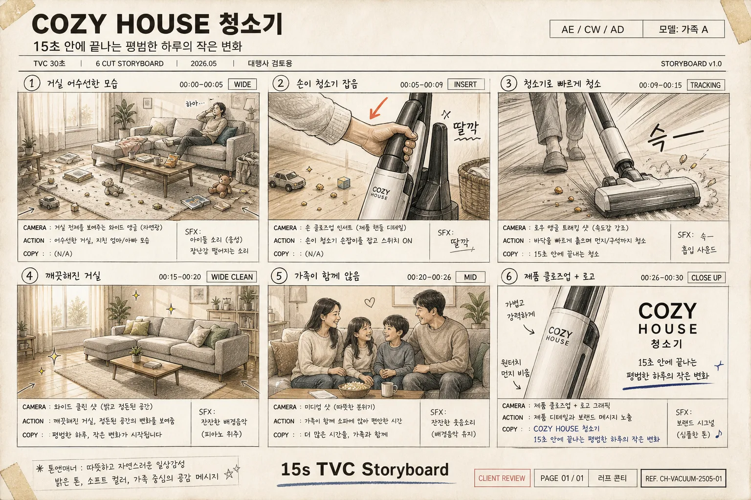
TV 광고 6컷 스토리보드
광고대행사 발표용 TV CF 스토리보드. 6컷 grid + 카메라 앵글 + 카피 + 액션 메모.
TV 광고 6컷 스토리보드摘要
這是用來製作漫畫/插畫內容的 ChatGPT 圖像提示詞,已整理主題、背景、風格與構圖,方便快速調整。
相關關鍵字: TV 광고 6컷 스토리보드, TV 광고 6컷 스토리보드 프롬프트, 漫畫/插畫 프롬프트, 漫畫/插畫 AI 이미지 프롬프트, ChatGPT 이미지 프롬프트, AI 이미지 생성 프롬프트, AI 프롬프트, 이미지 프롬프트
TV 광고 6컷 스토리보드使用方式
保留原始結構並替換主體、背景、色彩或構圖,即可延伸出不同版本。
- 保留核心主體,並依品牌、季節或平台調整色彩與背景。
- 如果畫面太複雜,請減少背景元素並具體描述主體、構圖與光線。
- 複製後可要求 ChatGPT 配合平台、長寬比或文字需求調整。
提示詞原文
[Input]
- language: Korean
- output_size: 1536x1024

[Purpose]
Korean TV commercial storyboard presentation sheet, 6-cut grid (3×2), for agency pitch, production meeting, and animatic planning.
Create a polished, content-rich storyboard page that feels like a real Seoul advertising agency board: readable shot drawings, production notes, timing cues, audio/copy notes, approval metadata, and tactile sketch-paper materials.

[Composition]
- Overall layout: 3×2 grid of exactly 6 storyboard frames, each frame using a 16:9 thumbnail sketch area with a compact memo box directly beneath it.
- Page structure: brand name and campaign title header at the top, small production metadata line under the title, six numbered frames in reading order left-to-right, top-to-bottom, and a footer centered at the bottom reading {하단 문구}.
- Header details: include {브랜드} prominently, {콘셉트} beneath it, plus small realistic pitch-sheet labels such as “TVC 30초”, “STORYBOARD v1.0”, “2026.05”, “대행사 검토용”, “AE / CW / AD”, and “모델: 가족 A”.
- Subject balance: each frame should feel like a practical ad shot board with living-room props, product interaction, shot direction arrows, SFX marks, timing labels, and handwritten production cues that support {6컷 흐름}.
- Background treatment: sketch-paper texture, slightly warm off-white, with subtle paper grain, faint pencil guide lines, marker bleed, tape marks at a few corners, and light watercolor wash bleed around the panels.
- Footer details: keep {하단 문구} centered, and add tiny deck metadata nearby such as “CLIENT REVIEW”, “PAGE 01 / 01”, “러프 콘티”, and a small rectangular reference-code area.
- Use {브랜드}, {콘셉트}, and {6컷 흐름} as the editable content anchors for the page title and frame planning.

[3. CORE STRUCTURE]
- Header zone (top 12–14%): place {브랜드} as the main brand header in bold, then set {콘셉트} as the campaign title beneath it in smaller type, both aligned across the page width; add a thin metadata strip containing “TVC 30초 | 6 CUT STORYBOARD | 2026.05 | 대행사 검토용”.
- Frame 1 (top-left): visualize the first beat from {6컷 흐름} as a messy living room establishing shot; include sofa cushions, scattered toys, snack crumbs, a rug, sunlight through curtains, a sleepy parent silhouette, and a small memo box with CAMERA / ACTION / COPY notes in handwritten Korean storyboard style. Add timing label “00:00–00:05” and shot tag “WIDE”.
- Frame 2 (top-middle): depict the second beat from {6컷 흐름} with a hand reaching in and grabbing the vacuum cleaner; keep the shot framing slightly tighter than Frame 1 to emphasize action, showing product handle detail, dust on the floor, an arrow toward the vacuum, and small SFX text “딸깍”. Add timing label “00:05–00:09” and shot tag “INSERT”.
- Frame 3 (top-right): show the third beat from {6컷 흐름} as a fast cleaning motion shot with motion lines, speed streaks, quick sketch marks, lifted dust particles, and a dynamic diagonal composition suggesting energetic movement and product performance. Add timing label “00:09–00:15”, shot tag “TRACKING”, and SFX text “슥—”.
- Frame 4 (bottom-left): render the fourth beat from {6컷 흐름} as the cleaned living room, brighter and tidier, with cushions arranged, rug restored, sunlight glow, a small plant, and a calm composition that contrasts clearly with Frame 1. Add timing label “00:15–00:20” and shot tag “WIDE CLEAN”.
- Frame 5 (bottom-middle): illustrate the fifth beat from {6컷 흐름} with the family seated together in a relaxed room scene, using a medium-wide shot feel and stable composition; include warm facial expressions, tea cups, a pet or child’s toy in the corner, and a small caption cue like “우리집이 다시 편안해지는 순간”. Add timing label “00:20–00:25” and shot tag “FAMILY”.
- Frame 6 (bottom-right): present the sixth beat from {6컷 흐름} as a product close-up plus logo/end card composition, with the product occupying the center, soft hero lighting, a simplified living-room background, {브랜드} lockup area, CTA line such as “지금 만나보세요”, and final supers/copy space. Add timing label “00:25–00:30” and shot tag “END CARD”.
- Memo boxes: under every frame, add a compact technical note block containing CAMERA, ACTION, COPY, SFX, and TIME lines in small handwritten Korean tone, legible and consistent across all six panels.
- Number markers: place each frame number in the top-left corner of its panel, small but clearly visible, matching traditional storyboard layout conventions; add small cut arrows between panels and faint editorial notes such as “CUT”, “DISSOLVE”, or “MATCH CUT” where appropriate.
- Realistic board details: include tiny checkboxes for “촬영”, “CG”, “자막”, small pencil correction marks, circled emphasis notes, and one or two sticky-note style callouts with Korean production reminders like “로고 노출 2초 확보” and “제품 손잡이 강조”.

[4. STYLE RULES]
- Typography: use Pretendard or Noto Sans KR for headers in bold weight, with handwritten Korean memo text in a marker-pen style; frame numbers should be compact sans-serif, and the footer should use a slightly condensed sans-serif.
- Color palette: off-white paper #F4F0E6, graphite black #222222, warm gray #7A736A, muted beige #D8CBB8, soft blue-gray #A9B7C6, watercolor accent wash in pale sage and dusty teal.
- Border/shadow: thin black or dark-gray panel rules, very light hand-drawn irregularity, subtle overlapping paper layers, soft graphite smudges, and gentle shadow separation as if the sheet is placed on a desk for a pitch review.
- Sketch treatment: black marker outlines, loose construction lines, selective watercolor wash fills, visible storyboard arrows, shot-size labels, and presentation-board clarity with rich ad-production detail.
- Text density: include enough small Korean notes to feel like a real working storyboard, while keeping the main labels, frame numbers, and required placeholders clearly readable.

[5. VISUAL STYLE]
- Camera / lens: storyboard-like commercial previsualization, with each panel framed as a 16:9 shot reference rather than a finished photographic still; emulate a 35mm lens perspective for room shots, 50mm for mid shots, and 85mm for close-up product framing.
- Lighting: neutral studio presentation lighting across the physical sheet; inside panels, imply practical Korean TVC ad lighting with soft window key light, warm home ambience, and brighter hero lighting for the product end card.
- Color grade: muted commercial storyboard grade with warm paper tones, soft watercolor neutrals, pale sage and dusty teal accents, graphite linework, and a realistic scanned/photographed agency-board finish.
- Surface realism: slight paper curl, pencil underdrawing, marker pressure variation, watercolor pooling at panel edges, and small annotation marks that make the board feel actually prepared for client review.

[6. MOOD]
Korean ad agency storyboard presentation — premium Seoul commercial planning board with practical TVC production notes, warm family-home detail, and a believable animatic pitch-deck atmosphere.

[7. CRITICAL]
- Korean text accuracy: 반드시 정확히 들어가야 하는 문구: {브랜드}, {콘셉트}, {6컷 흐름}, {하단 문구}, 그리고 각 프레임의 CAMERA / ACTION / COPY 메모 항목 표기.
- 반드시 포함할 추가 한글 표기: “TVC 30초”, “대행사 검토용”, “STORYBOARD v1.0”, “모델: 가족 A”, “로고 노출 2초 확보”, “지금 만나보세요”.
- Layout invariant: exactly 6 frames in a 3×2 grid, each frame with a thumbnail sketch area and a memo box beneath it.
- Frame numbers must appear in the top-left corner of each panel.
- All handwritten Korean memo text must remain legible and correctly formed.
- The sheet must retain the storyboard sketch / animatic feel while adding realistic advertising-board details, production metadata, timing cues, and living-room context.

[8. 🚫 PROHIBITED]
- Fake official seals / certifications
- Broken Korean characters