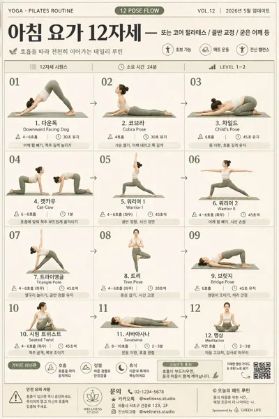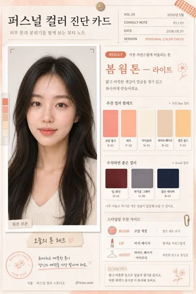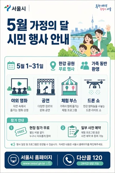
インフォグラフィック・案内
브랜드 무드보드·컨셉 시트
광고대행사 캠페인 발표용 무드보드. 사진 collage + 컬러 팔레트 + 폰트 샘플 + 콘셉트 키워드.
브랜드 무드보드·컨셉 시트の概要
インフォグラフィック・案内画像を作るためのChatGPT画像プロンプトです。主題、背景、スタイル、構図を整理し、すぐに試せるよう構成しています。
関連キーワード: 브랜드 무드보드·컨셉 시트, 브랜드 무드보드·컨셉 시트 프롬프트, インフォグラフィック・案内 프롬프트, インフォグラフィック・案内 AI 이미지 프롬프트, ChatGPT 이미지 프롬프트, AI 이미지 생성 프롬프트, AI 프롬프트, 이미지 프롬프트
브랜드 무드보드·컨셉 시트の活用方法
元の構造を保ちながら、被写体、背景、色、構図を変更して別案に展開できます。
- 主題を維持し、ブランドや季節、媒体に合わせて色と背景を変更してください。
- 結果が複雑な場合は背景要素を減らし、被写体、構図、照明を具体化してください。
- コピー後、ChatGPTに媒体、アスペクト比、文字の有無を追加で指定できます。
プロンプト原文
[Input]
- language: Korean
- output_size: 1024x1024

[Purpose]
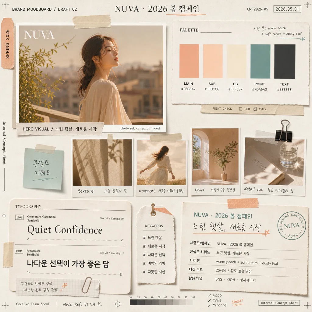
Korean brand campaign mood board / concept sheet in a 1:1 square collage format for internal presentation or creative direction.
Curated editorial layout that reads like a high-end Korean agency strategy board, combining mixed campaign photography, tactile paper samples, palette chips, typography specimens, micro annotations, and realistic project metadata for {캠페인}.

[Composition]
- Overall frame: square 1:1 collage on warm off-white textured paper, with slightly imperfect cut-paper edges, washi tape strips, tracing-paper overlays, small sticky notes, binder-clip shadows, and printed proof-sheet details.
- Main structure: five-zone grid with the largest image anchored at upper-left, palette chips at upper-right, smaller reference photos in the center, typography samples at lower-left, and caption block at lower-right.
- Spacing and framing: use editorial module spacing with believable paper layering, slight overlaps, angled tape corners, and natural alignment variations so the board feels hand-curated and photographed on a real desk.
- Use {캠페인}, {콘셉트}, and {시각 톤} as the visible content cues across headings, labels, captions, handwritten notes, project metadata, and tiny production marks.
- Add realistic deck details: small header line "BRAND MOODBOARD / DRAFT 02", project code "CM-2026-05", date label "2026.05.01", team credit "Creative Team Seoul", model/reference credit "Model Ref. YUNA K.", and a small file note "Internal Concept Sheet".

[3. CORE STRUCTURE]
- Upper-left hero module (about 30%): place the largest mood image as a premium rectangular print with a thin white border, showing either a model, landscape, or lifestyle scene that matches {콘셉트}; add a soft paper shadow beneath it, a small caption strip reading "HERO VISUAL / {콘셉트}", and tiny photo-credit text "photo ref. campaign mood".
- Upper-right palette module (about 18%): show 5 color chips in neat rows with readable HEX codes underneath; base the chips on {시각 톤} and make the swatches matte like printed ink on paper. Include labels such as "MAIN", "SUB", "POINT", "BG", "TEXT" and a small note "시각 톤: {시각 톤}".
- Center reference cluster (about 22%): arrange 3-4 small mood photos in a realistic mini-grid with slightly varied sizes, each with tiny handwritten-style labels that echo {콘셉트}; include notes like "texture", "movement", "space", "detail cut", plus one translucent sticky note reading "콘셉트 키워드".
- Lower-left typography module (about 15%): display two font sample lines, one English and one Korean, using clean editorial specimen formatting with font-name labels, weight notes, size annotations, baseline marks, and sample copy. Set Korean sample text: "나다운 선택이 가장 좋은 답" and English sample text: "Quiet Confidence".
- Lower-right caption block (about 15%): set a concise text card summarizing {캠페인} and {콘셉트} in Korean, with short lines stacked like a creative brief. Include visible fields: "브랜드/캠페인: {캠페인}", "콘셉트 키워드: {콘셉트}", "시각 톤: {시각 톤}", "타깃 무드: 25-34 / 감도 높은 일상", and "활용 채널: SNS · OOH · 상세페이지".
- Scatter accents: add small keyword tags, paper stickers, page tabs, crop marks, tiny arrows, pencil underlines, and micro labels around the board so it feels like a real agency working document while remaining premium and readable.

[4. STYLE RULES]
- Typography: use Pretendard SemiBold for Korean labels, Noto Sans KR Regular for body captions, and a refined serif such as Cormorant Garamond or Didot for English sample text; sizing should feel like a presentation board, with headers around 24-32px, section labels around 14-18px, body notes around 12-16px, and micro production text around 8-10px.
- Color palette: translate {시각 톤} into a printable palette of soft peach, warm cream, dusty teal, pale beige, and muted sand; if HEX is shown, use tones like #F6E7DD, #FFF6EC, #A7C3BE, #D8C2A8, #E8D6C8.
- Border/shadow: use thin off-white borders around image prints, with soft drop shadows at 3-4px y-offset, 10-14px blur, and 12-18% opacity; sticky notes, tape pieces, and translucent overlays should have believable shadow separation.
- Paper realism: include visible fiber grain, faint ink absorption, slightly curled photo corners, imperfect scissor-cut edges, light pencil registration marks, and subtle print texture on labels and swatches.
- Content density: make the board feel like a complete creative direction sheet, with readable headings, caption fragments, project metadata, reference tags, and small production notes placed naturally across the collage.

[5. VISUAL STYLE]
- Camera / lens: editorial still-life look shot on a full-frame camera with an 85mm f/1.8 for the main mood photo and a 35mm lens for smaller references, as if photographed for a premium campaign deck.
- Lighting: soft diffused daylight from upper-left, like window light through sheer curtains, with a gentle fill from the right to preserve paper texture and readable text.
- Color grade: warm cream + peach + muted teal grade, slightly desaturated and filmic, with soft contrast and no harsh blacks.
- Rendering: realistic top-down product-still composition with shallow tactile shadows, crisp printed Korean text, realistic paper thickness, and photo prints that look physically placed on the board.

[6. MOOD]
Premium Korean ad agency concept board — feels like a Kinfolk-style editorial layout mixed with a luxury brand strategy presentation, but with believable working-document details, annotated references, and campaign-ready visual direction for {캠페인}.

[7. CRITICAL]
- Korean text accuracy: 반드시 정확히 보여야 하는 문구 — "브랜드/캠페인", "콘셉트 키워드", "시각 톤".
- Korean text accuracy: {캠페인}, {콘셉트}, {시각 톤}는 렌더링된 보드 안에서 한글/영문 표기와 함께 자연스럽고 또렷하게 읽혀야 함.
- Additional visible Korean text should include: "나다운 선택이 가장 좋은 답", "타깃 무드", "활용 채널", "Creative Team Seoul", "DRAFT 02", and "2026.05.01".
- Layout invariants: keep the 5-zone collage structure recognizable; upper-left hero, upper-right palette chips, center mini-grid, lower-left typography samples, lower-right caption block.
- Typography must be clean and legible; HEX code lines under palette chips must remain readable and aligned.

[8. 🚫 PROHIBITED]
- Fake official seals / certifications
- Broken Korean characters