広告・ポスター
앰비언트·게릴라 광고 목업
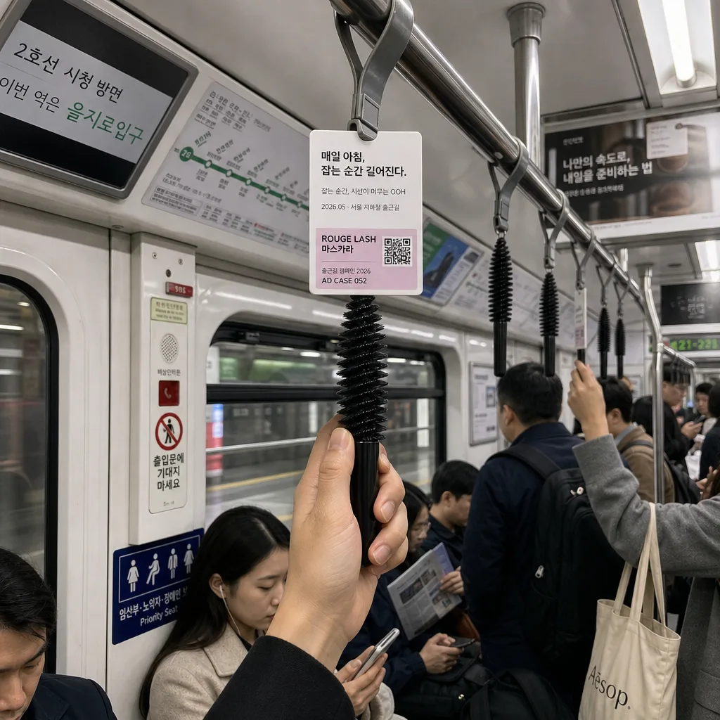
환경에 박힌 창의적 OOH 광고. 지하철 손잡이가 마스카라가 됨 / 정류장 의자가 침대 됨 식 wordplay.
앰비언트·게릴라 광고 목업の概要
広告・ポスター画像を作るためのChatGPT画像プロンプトです。主題、背景、スタイル、構図を整理し、すぐに試せるよう構成しています。
関連キーワード: 앰비언트·게릴라 광고 목업, 앰비언트·게릴라 광고 목업 프롬프트, 広告・ポスター 프롬프트, 広告・ポスター AI 이미지 프롬프트, ChatGPT 이미지 프롬프트, AI 이미지 생성 프롬프트, AI 프롬프트, 이미지 프롬프트
앰비언트·게릴라 광고 목업の活用方法
元の構造を保ちながら、被写体、背景、色、構図を変更して別案に展開できます。
- 主題を維持し、ブランドや季節、媒体に合わせて色と背景を変更してください。
- 結果が複雑な場合は背景要素を減らし、被写体、構図、照明を具体化してください。
- コピー後、ChatGPTに媒体、アスペクト比、文字の有無を追加で指定できます。
プロンプト原文
[Input]
- language: Korean
- output_size: 1024x1024

[Purpose]
Korean ambient and guerrilla advertising mockup, square 1:1 photo-realistic OOH concept image for presentation and portfolio use.
A busy Seoul subway interior scene where a product object is integrated into a public transit handgrip with a small copy label, surrounded by real commuter details, route signage, transit notices, and documentary case-study realism.

[Composition]
- Main scene: {환경} fills about 80% of the frame with a realistic commuter train interior, seen at eye level with slight wide-angle perspective and enough cabin depth to show poles, straps, windows, seats, route map panels, and passengers.
- Hero integration: {컨셉} is placed as the central creative intervention, attached naturally to the overhead handgrip zone or hanging strap area, so it reads as a surprising but believable ad object discovered during a commute.
- Brand/product label: {브랜드} appears as a small, neatly attached product identifier near the installed object, using the proportions of a real transit sticker or hanging tag, with a tiny QR-style square and micro line such as “출근길 캠페인 2026”.
- Copy placement: {카피} sits as a small caption-style line adjacent to the ad element, aligned like a subway notice tag rather than a billboard headline; add a secondary tiny case-study note in Korean such as “잡는 순간, 시선이 머무는 OOH”.
- Environmental text details: include believable Korean subway signage such as “2호선 시청 방면”, “이번 역은 을지로입구”, “출입문에 기대지 마세요”, priority-seat icons, a small route map strip, and faint overhead ad cards in the background.
- Human interaction: commuter hands are naturally gripping the altered handhold and nearby straps, with varied sleeves, bags, phone screens, and casual body positions; the ad remains clearly visible within a real commuter moment.
- Background treatment: authentic Korean subway cabin materials, stainless poles, gray straps, molded plastic seat backs, emergency intercom panel, safety sticker edges, subtle motion blur outside the windows, slightly worn surfaces, smudges, fingerprints, and realistic reflections.

[3. CORE STRUCTURE]
1. Establish the subway cabin as the full environmental context, with rows of hanging straps, vertical poles, seated and standing commuters, route maps, safety labels, overhead ads, window reflections, and the visual rhythm of a real Seoul train car.
2. Place the modified handgrip or strap replacement at the visual center, making {컨셉} instantly noticeable while still matching the subway interior’s material logic, weight, scale, and attachment hardware.
3. Attach {브랜드} as a compact product identifier on the object using a small label, printed tag, or sticker, sized like a real transit campaign element with a tiny QR-style mark and micro credit text “AD CASE 052”.
4. Position {카피} immediately beside the object in a tiny ad-note format, keeping the typography clean and legible at close viewing distance; add a small date/location line such as “2026.05 · 서울 지하철 출근길”.
5. Frame commuter hands around the object naturally, ensuring the product integration looks discovered in the environment rather than composited on top, with believable grip pressure, skin texture, sleeves, rings, nails, and motion from the train.
6. Maintain photo-realistic mockup behavior: correct perspective, believable shadows, consistent reflections on metal and plastic, accurate hanging tension, practical sticker edges, scuffed materials, and camera-captured depth.
7. Add realistic presentation richness through background campaign artifacts: one small overhead ad card, a route-map panel, a safety notice, a tiny agency credit line “Creative OOH Study”, and partial commuter objects like a tote bag, earbuds, folded newspaper, and phone screen reflections.

[4. STYLE RULES]
- Typography: Pretendard or Noto Sans KR for the Korean copy, Medium to Semibold weight, small urban-signage size, crisp and modern, with smaller Regular-weight micro text for date, route, and case-study labels.
- Color palette: subway grays, steel silver, off-white plastic, muted navy accents, yellow safety-label details, soft green route-map accents, and restrained product-brand contrast pulled from {브랜드}.
- Material detail: brushed steel poles, matte rubber straps, translucent plastic handgrips, slightly glossy product surface, vinyl sticker edges, adhesive label thickness, paper notice texture, and subtle grime from everyday commuting.
- Border/shadow: subtle realistic ambient shadow under the installed ad object, 8px y-offset, 18px blur, 20% opacity, matching overhead fluorescent lighting and the physical distance from the strap mount.

[5. VISUAL STYLE]
- Camera / lens: full-frame documentary look, 28mm or 35mm lens at f/4, eye-level framing with slight perspective depth, editorial OOH mockup realism.
- Lighting: overhead fluorescent subway lighting with soft even coverage, slight specular highlights on poles and straps, gentle reflections on windows and product surfaces, faint exterior light streaks from the moving tunnel.
- Color grade: cool neutral commuter palette with slightly desaturated grays and controlled product accent color, similar to contemporary advertising case-study photography, with realistic skin tones and subtle film-like grain.
- Image behavior: real captured-photo feeling, crisp central ad object, mild background depth falloff, slight handheld immediacy, natural occlusion from hands and straps, and authentic commuter density.

[6. MOOD]
Cannes Lions ambient OOH case-study aesthetic — a clever public-space product intervention like a high-end agency mockup, balancing realism, wit, everyday Seoul subway texture, and immediate street-level surprise.

[7. CRITICAL]
- Korean text accuracy: 반드시 정확히 보여야 하는 문자열: "매일 아침, 잡는 순간 길어진다.", "ROUGE LASH 마스카라".
- Render {카피} as the main small copy line and {브랜드} as the product/brand label; for this entry they must read exactly as the required Korean strings above.
- Additional Korean micro text may appear as realistic environmental signage, for example “2호선 시청 방면”, “2026.05 · 서울 지하철 출근길”, “AD CASE 052”, and “출입문에 기대지 마세요”.
- The subway interior must look physically plausible and photo-realistic, with naturally placed commuter hands, correct grip contact, believable fingers, and authentic train-car scale.
- The ad object must feel embedded in the scene through attachment points, shadows, reflections, occlusion, and material consistency.

[8. 🚫 PROHIBITED]
- Fake official seals / certifications
- Broken Korean characters