グッズ・モックアップ
식품·음료 패키징 디자인
라면·음료·과자 등 한국 식품 패키지 mockup. flat-lay 또는 standing shot. 한글 제품명·일러스트.
식품·음료 패키징 디자인の概要
グッズ・モックアップ画像を作るためのChatGPT画像プロンプトです。主題、背景、スタイル、構図を整理し、すぐに試せるよう構成しています。
関連キーワード: 식품·음료 패키징 디자인, 식품·음료 패키징 디자인 프롬프트, グッズ・モックアップ 프롬프트, グッズ・モックアップ AI 이미지 프롬프트, ChatGPT 이미지 프롬프트, AI 이미지 생성 프롬프트, AI 프롬프트, 이미지 프롬프트
식품·음료 패키징 디자인の活用方法
元の構造を保ちながら、被写体、背景、色、構図を変更して別案に展開できます。
- 主題を維持し、ブランドや季節、媒体に合わせて色と背景を変更してください。
- 結果が複雑な場合は背景要素を減らし、被写体、構図、照明を具体化してください。
- コピー後、ChatGPTに媒体、アスペクト比、文字の有無を追加で指定できます。
プロンプト原文
[Input]
- language: Korean
- output_size: 1024x1024

[Purpose]
Korean food and beverage packaging design mockup, square product presentation for portfolio, e-commerce, or pitch deck use.
Create a polished, content-rich single-package hero image that feels like a real retail FMCG package photographed in a professional studio, with authentic printed details, clear Korean typography, and realistic shelf-ready information hierarchy.

[Composition]
- Main package placement: one {제품 종류} package occupies about 62% of the frame, standing upright or tilted 8–12 degrees, centered slightly below midline for a premium mockup feel.
- Background treatment: soft light gray to ivory seamless studio sweep with subtle paper texture, warm tabletop contact shadow, and a few small contextual food cues such as red chili flakes, sesame seeds, steam-like graphic accents, or a folded napkin placed far behind the package so the package remains dominant.
- Framing direction: front-facing package emphasis with readable label details, full product silhouette, crisp top and side seams, visible gusset folds or carton edges, and believable package thickness.
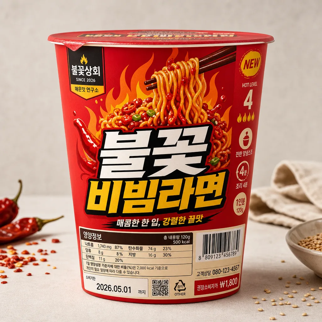
- Front-facing design elements should include {제품명 KOR} as the dominant title, {부제} as a smaller supporting line, a compact brand mark area, nutrition label, barcode area, net weight, flavor callout, preparation time, date code, and small manufacturer/contact microcopy like a real Korean retail package.
- Visual direction should reflect {시각 컨셉} while preserving a realistic printed-packaging mockup surface, crisp folds, ink density variation, sealed edges, and believable material finish.

[3. CORE STRUCTURE]
1. Hero package zone: render {제품 종류} as the sole main package, with crisp die-cut edges, realistic carton/cup/pouch curvature, sealed seams, small wrinkles, subtle corner highlights, and a soft studio shadow directly beneath it.
2. Primary typography zone: place {제품명 KOR} large and centered on the front face in bold Korean lettering, ensuring strong contrast, immediate shelf impact, and realistic ink registration.
3. Secondary copy zone: position {부제} below the main title in smaller type, with tighter tracking and a clean hierarchy that supports the product name without competing with it.
4. Illustration zone: build a large graphic illustration that follows {시각 컨셉}, scaled to occupy the upper or central area of the package face with clear color separation, print-friendly shapes, and appetizing flavor cues such as chili flame shapes, noodle swirl graphics, sauce droplets, or ingredient icons.
5. Utility label zone: add a realistic nutrition-info placeholder area on the lower front or side panel with tiny Korean grid text: "영양정보", "총 내용량 120g", "나트륨", "탄수화물", "당류", "지방", "단백질"; include a barcode block, QR-like square, recycling icon, lot/date code "2026.05.01", and customer service line "고객상담 080-123-4567".
6. Brand mark zone: place a compact generic brand area near the top corner or header strip, using believable Korean microcopy such as "불꽃상회", "SINCE 2026", or "매운맛 연구소" as decorative retail branding, integrated naturally into the package layout without implying official certification.
7. Retail detail zone: add short Korean callouts on the package such as "HOT LEVEL 4", "조리 4분", "진한 양념스프", "NEW", "1인분", "120g", "권장소비자가 ₩1,800" in small badges, tabs, or side-panel text to make the packaging feel complete and commercially real.

[4. STYLE RULES]
- Typography: Pretendard ExtraBold for {제품명 KOR} at very large display size, Noto Sans KR Medium for {부제}, and Noto Sans KR Regular for label text; keep Korean letterforms crisp and fully legible, including small package microcopy.
- Color palette: vivid food-packaging palette matched to flavor, anchored by red, orange, black, and warm cream with optional accent tones from {시각 컨셉}; use clean contrast against the pale background and let the package graphics feel bold, appetizing, and shelf-ready.
- Border/shadow: soft drop shadow with 4px vertical offset, 14px blur, and 18% opacity; add realistic contact shadow, gentle edge shading, and subtle printed fold shadows without harsh outlines or glossy glare that hides text.
- Surface finish: matte or semi-matte printed packaging texture with subtle paper/plastic grain, tiny ink speckling, slight foil or varnish accents where appropriate, realistic seam pressure marks, and believable light falloff across curved surfaces.
- Layout density: use a realistic retail-package information density with title, subtitle, badges, barcode, nutrition grid, ingredient microcopy, preparation cues, and decorative flavor graphics arranged in a clean but fully designed hierarchy.

[5. VISUAL STYLE]
- Camera / lens: studio product photography look, 85mm lens at f/8, front-facing composition with mild perspective correction and sharp packaging edges.
- Lighting: large softbox key light from upper-left at 45°, gentle fill from front-right, faint rim separation from the background, even exposure across the package face.
- Color grade: clean commercial product grade with vivid red/orange accents, neutral gray-white background, and slightly lifted highlights for print clarity.
- Rendering detail: high-resolution print mockup realism, readable Korean type, natural shadows in package seams, slight tactile texture on the label, and subtle tabletop realism suitable for a premium branding portfolio.

[6. MOOD]
Premium Korean FMCG packaging mockup — polished studio still life like a high-end branding portfolio shot, but enriched with real supermarket package details, appetizing spicy flavor graphics, authentic Korean retail microcopy, and believable printed-material realism.

[7. CRITICAL]
- Korean text accuracy: the following strings must appear exactly and clearly on the package artwork: "불꽃 비빔라면", "매콤한 한 입, 강렬한 끝맛".
- Also include realistic Korean package text elements such as "영양정보", "총 내용량 120g", "조리 4분", "HOT LEVEL 4", "진한 양념스프", "소비기한 2026.05.01", "고객상담 080-123-4567" where they fit the design.
- Keep all Korean typography clean, correctly spelled, and fully readable; no broken syllables, mirrored characters, or placeholder gibberish.
- The main {제품 종류} package must remain the clear focal object; any surrounding ingredient cues or tabletop details should support the commercial package shot and never compete with the front label.
- Nutrition label, barcode, QR-like square, and logo areas should remain generic retail design elements, not real official certification marks.

[8. 🚫 PROHIBITED]
- Fake official seals / certifications
- Broken Korean characters