굿즈/목업
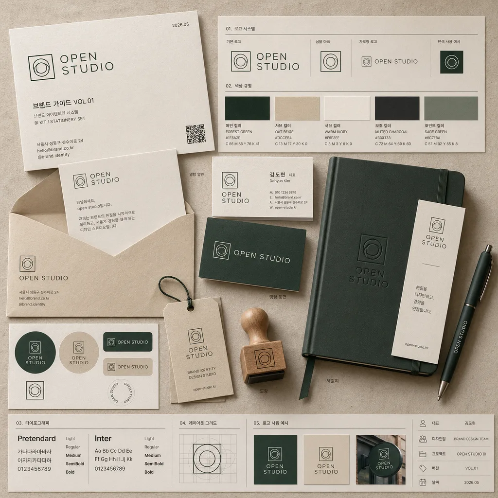
명함·BI 키트 목업 (브랜드 아이덴티티)
flat-lay 명함 + 봉투 + 노트 + 펜 + 머그 등 BI 패키지 mockup. 신생 브랜드 발표용.
명함·BI 키트 목업 (브랜드 아이덴티티) 검색 요약
명함·BI 키트 목업 (브랜드 아이덴티티)은 굿즈/목업 결과물을 만들 때 바로 복사해 활용할 수 있는 ChatGPT 이미지 프롬프트입니다. 주제, 배경, 스타일, 구도 조건을 함께 담아 빠르게 시안을 만들 수 있도록 구성했습니다.
관련 키워드: 명함·BI 키트 목업 (브랜드 아이덴티티), 명함·BI 키트 목업 (브랜드 아이덴티티) 프롬프트, 굿즈/목업 프롬프트, 굿즈/목업 AI 이미지 프롬프트, ChatGPT 이미지 프롬프트, AI 이미지 생성 프롬프트, AI 프롬프트, 이미지 프롬프트
명함·BI 키트 목업 (브랜드 아이덴티티) 활용 포인트
원본 구조를 유지하면서 피사체, 배경, 색감, 구도를 바꿔 다양한 시안으로 확장할 수 있습니다.
- 핵심 소재는 유지하고 브랜드, 계절, 채널 목적에 맞는 색감과 배경을 바꿔보세요.
- 결과가 산만하면 배경 요소를 줄이고 피사체, 구도, 조명 조건을 구체화하세요.
- 복사한 뒤 ChatGPT에서 플랫폼, 화면 비율, 텍스트 포함 여부를 추가로 요청할 수 있습니다.
프롬프트 원문
[Input]
- language: Korean
- output_size: 1024x1024

[Purpose]
Korean brand identity kit mockup, 1:1 top-down flat-lay presentation for a realistic BI showcase.
Behance/Dribbble-style branding board that displays stationery, logo usage, color rules, typography samples, and tactile material texture in a polished studio layout.

[Composition]
- Main composition: all items arranged in a premium top-down flat-lay on textured paper or a warm wooden surface, with the full BI kit filling the square frame like a photographed editorial case-study board.
- Hero hierarchy: the {브랜드} name and logo system should feel like the primary focal point, while stationery, guide cards, color chips, and printed samples expand the brand story.
- Item placement: {아이템} should be distributed in a balanced diagonal flow; business cards slightly overlapped, envelope slightly open with a visible letterhead insert, notebook paired with a bookmark, sticker sheet and color swatches near the logo guide, and pen placed diagonally to guide the eye.
- Surface treatment: use a natural tactile background with visible paper grain, linen fiber, or fine wood texture in tones that complement {컬러 팔레트}; add believable paper thickness, folded corners, emboss/deboss details, and soft edge shadows.
- Framing: keep the 1:1 board dense enough to feel like a real brand kit photo, with multiple readable identity details, small captions, contact lines, and organized specimen blocks.

[Core Structure]
- Base layer: create a flat-lay tabletop scene on matte textured paper or light wood surface, with soft, realistic shadow falloff beneath every object and slight height differences between stacked cards, paper sheets, stickers, and notebook.
- Brand block: set {브랜드} as the identity anchor, shown through logo applications on business cards, envelope, notebook cover, letterhead, sticker sheet, and a small brand guide card.
- Logo system: apply {로고 컨셉} across the mockup as a unified mark language, ensuring the symbol and wordmark feel coherent on each stationery piece; show a primary logo, symbol-only mark, horizontal lockup, and small monochrome usage sample.
- Color application: distribute {컬러 팔레트} as the dominant palette, with the lightest tone used for base paper and the darkest tone reserved for type, fine rules, QR code, and logo details; include 4–5 printed color swatches labeled in Korean such as '메인 컬러', '서브 컬러', '포인트 컬러'.
- Stationery set: place {아이템} as a complete BI kit, including business cards stacked in a slight offset, envelope angled open, letterhead sheet with address and contact text, notebook closed but clearly visible, bookmark partially inserted, sticker labels, small hang tag, and a pen or pencil as a realistic studio prop.
- Typography samples: include realistic Korean and English text applications on the stationery surfaces, using short readable lines such as '브랜드 가이드 VOL.01', '명함 앞면', '색상 규정', '로고 사용 예시', '서울시 성동구 성수이로 24', 'hello@brand.co.kr', and '@brand.identity'.
- Detail panels: add a small layout grid card, typography specimen strip, QR code block, and micro captions showing '대표', '디자인팀', '2026.05', 'BI KIT / STATIONERY SET' to make the kit feel produced for a real client presentation.
- Shadow and depth: add micro-shadows under every item, with slightly stronger contact shadows under the card stack, notebook, opened envelope flap, pen, and overlapping paper edges to reinforce realism.

[Style Rules]
- Typography: use Pretendard or Noto Sans KR for Korean UI-style text, paired with a clean geometric sans-serif like Inter; weights around 400–700, with small but legible sizes suitable for a brand presentation board.
- Color palette: oat beige, deep forest green, warm ivory, muted charcoal, and a refined accent from {컬러 팔레트}; use the palette across printed paper, ink, stickers, swatches, notebook cloth, and small guide labels.
- Printed details: include crisp ink edges, slight letterpress impression or subtle debossing on the main business card, natural paper fibers, faint registration marks, tiny crop marks on the guide sheet, and realistic matte finish.
- Border/shadow: soft drop shadow with 3–5px y-offset, 10–14px blur, 12–18% opacity; use delicate hairline rules, dividers, and printed grid marks where appropriate for a professional BI kit.

[Visual Style]
- Camera / lens: high-resolution studio top-down capture, 50mm lens look at f/5.6, perspective kept flat and symmetrical like a premium product editorial flat lay.
- Lighting: soft diffused daylight from upper-left at about 45°, with a gentle fill from right and subtle contact shadow under each object.
- Color grade: warm cream + forest green + ivory with a slightly desaturated editorial finish, similar to a refined Behance brand identity case study.
- Material realism: matte coated card stock, uncoated ivory letter paper, textured envelope flap, woven notebook cover, ink-stamped sticker labels, and a fine-grain tabletop surface.

[Mood]
Premium Korean boutique brand identity presentation — a thoughtful Behance case study board with the calm precision of a modern studio stationery shoot, enriched with real printed details, contact information, logo rules, and tactile paper craft.

[Critical]
- Korean text accuracy: '브랜드', '로고 컨셉', '컬러', '포함 아이템' labels must appear clearly and correctly if rendered as on-image text.
- Add readable Korean microcopy on the printed pieces: '브랜드 가이드 VOL.01', '로고 사용 예시', '명함 앞면', '색상 규정', '대표', '디자인팀', '2026.05', '서울시 성동구 성수이로 24'.
- The {브랜드} name, {로고 컨셉}, {컬러 팔레트}, and {아이템} references must remain visually central and consistent across the kit.
- All stationery objects must feel physically plausible and proportionally consistent in a real flat-lay mockup.
- Keep the layout strictly 1:1 and top-down, with no perspective tilt.

[8. 🚫 PROHIBITED]
- Fake official seals / certifications
- Broken Korean characters