廣告/海報
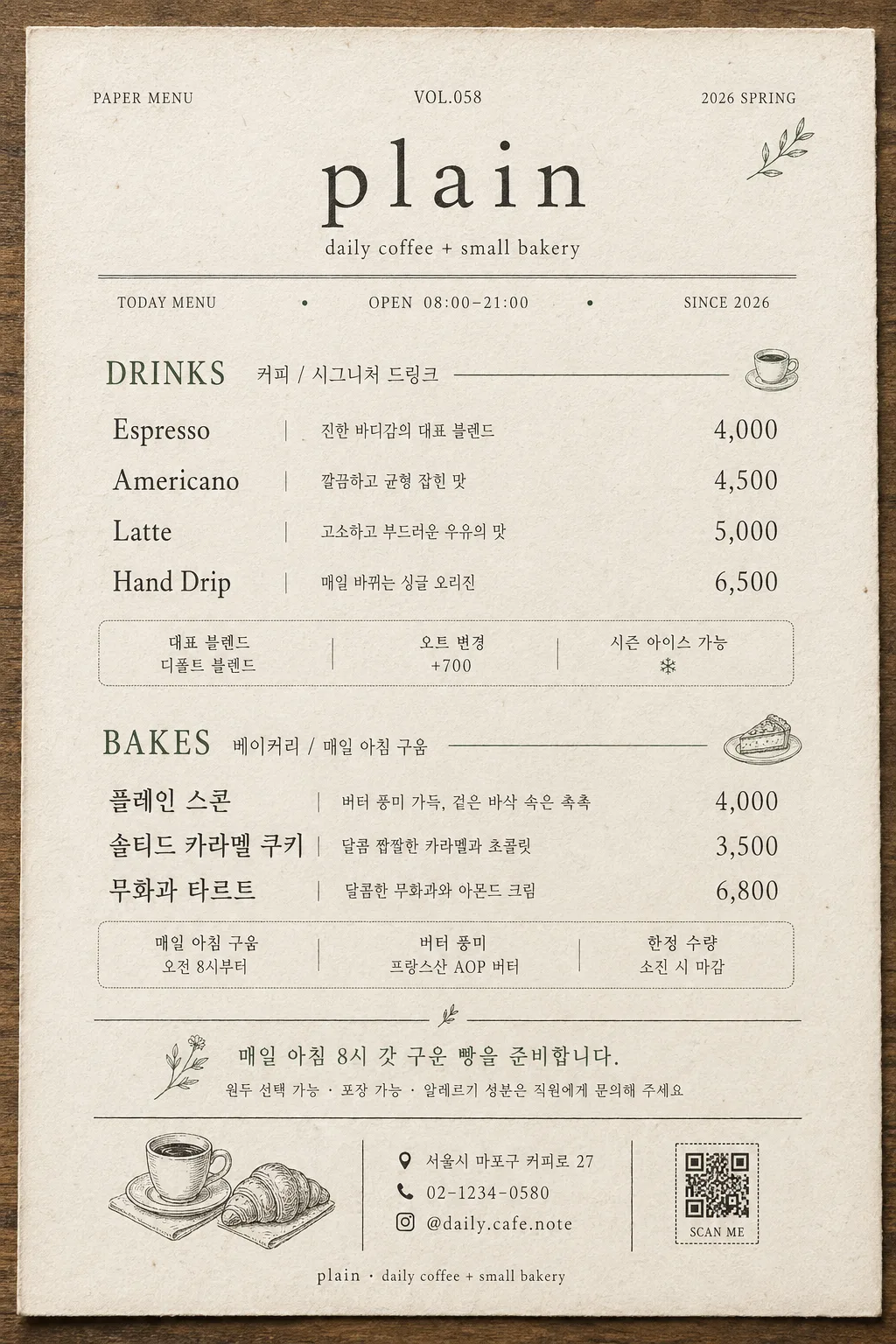
카페 미니멀 종이 메뉴판
흰 종이 + 명조체. 모던 디저트 카페·베이커리 풍. 깔끔하고 여백 많음.
카페 미니멀 종이 메뉴판摘要
這是用來製作廣告/海報內容的 ChatGPT 圖像提示詞,已整理主題、背景、風格與構圖,方便快速調整。
相關關鍵字: 카페 미니멀 종이 메뉴판, 카페 미니멀 종이 메뉴판 프롬프트, 廣告/海報 프롬프트, 廣告/海報 AI 이미지 프롬프트, ChatGPT 이미지 프롬프트, AI 이미지 생성 프롬프트, AI 프롬프트, 이미지 프롬프트
카페 미니멀 종이 메뉴판使用方式
保留原始結構並替換主體、背景、色彩或構圖,即可延伸出不同版本。
- 保留核心主體,並依品牌、季節或平台調整色彩與背景。
- 如果畫面太複雜,請減少背景元素並具體描述主體、構圖與光線。
- 複製後可要求 ChatGPT 配合平台、長寬比或文字需求調整。
提示詞原文
[Input]
- language: Korean
- output_size: 1024x1536

[Purpose]
Korean cafe paper menu poster, A4-portrait vertical layout for countertop display or wall menu. Create a believable printed cafe menu sheet with refined editorial typography, tactile cream paper, realistic ink texture, visible menu pricing, store information, and small decorative cafe graphics that make it feel like an actual independent cafe menu.

[Composition]
- Center the cafe identity block in the upper 18% of the frame, followed by a subtitle line, a thin hairline divider, and small operational microtext such as “TODAY MENU”, “OPEN 08:00–21:00”, and “SINCE 2026”.
- Main menu body occupies the middle 62% with two clearly separated sections, each aligned in a calm left-to-right reading flow, with item names, short Korean descriptions, and prices.
- Background: off-white or cream paper surface with visible fine grain, slight recycled-paper fibers, subtle print registration variation, faint paper-edge shadow, and a warm tabletop tone around the sheet.
- Use {카페 이름}, {부제}, {음료}, {베이커리}, {노트} as the primary customizable text content, and enrich the menu with fixed Korean microcopy such as address, contact, opening hours, seasonal labels, and small category notes.
- Add realistic cafe-menu details: store name repeated as small footer text, address line “서울시 마포구 커피로 27”, contact “02-1234-0580”, Instagram-like handle “@daily.cafe.note”, tiny QR placeholder box, and neat decorative dividers.

[3. CORE STRUCTURE]
1) Header area (top 18%): place {카페 이름} refined in a thin serif style with elegant letter spacing; set {부제} directly below in smaller type. Add fixed micro labels around the header: “PAPER MENU”, “VOL.058”, “2026 SPRING”, and a single hairline rule spanning about 70% width.
2) Menu section 1 — DRINKS (middle upper block): show the {음료} items as a readable list with menu name on the left and price on the right, using clean column alignment. Add 2–3 small fixed Korean supporting lines where natural, such as “대표 블렌드”, “오트 변경 +700”, “시즌 아이스 가능”, and realistic prices like “₩4,800”, “₩5,500”, “₩6,200”.
3) Menu section 2 — BAKES (middle lower block): place {베이커리} beneath DRINKS with matching alignment and typographic scale. Include short item descriptors such as “매일 아침 구움”, “한정 수량”, “버터 풍미”, with prices like “₩3,800”, “₩4,500”, “₩5,200”.
4) Note area (lower section): render {노트} as a smaller editorial note, separated by a fine divider and aligned with the menu body. Add fixed practical details beneath it: “원두 선택 가능 · 포장 가능 · 알레르기 성분은 직원에게 문의해 주세요”.
5) Bottom information band (bottom 8%): add a tiny line-style illustration of a coffee cup and croissant, a small QR placeholder square, store address “서울시 마포구 커피로 27”, contact “02-1234-0580”, and handle “@daily.cafe.note”, all printed in muted ink with subtle decorative dividers.

[4. STYLE RULES]
- Typography: use a Korean serif like Noto Serif KR or Nanum Myeongjo for the cafe name and note, paired with a clean serif like Cormorant Garamond or Libre Baskerville for English section labels; weights should stay light to regular, with the title around 24–30 px, subtitles 14–16 px, body text 16–20 px, and microtext 9–12 px.
- Color palette: off-white #F6F1E8, warm gray #6F6A63, deep forest green #3F5A46 or dusty rose #C99593 as a single accent, charcoal #2E2A27 for primary text.
- Border/shadow: use a faint paper-edge shadow, 3px y-offset, 10px blur, 8–12% opacity, with printed hairline rules, small divider marks, and restrained monochrome cafe illustrations.
- Add tactile realism: slightly uneven ink density, soft paper fibers, tiny speckles, gentle edge darkening, and natural printed-menu imperfections without making the text hard to read.

[5. VISUAL STYLE]
- Camera / lens: flat scanned print aesthetic, as if captured with a high-resolution overhead scan or a Phase One IQ4-style reproduction at 80mm equivalent, perfectly parallel to the paper surface.
- Lighting: diffuse studio light from upper-left with near-zero specular reflection, soft and even across the page, with a believable paper shadow along the lower-right edge.
- Color grade: warm paper-white with muted sage/forest-green accents, slightly desaturated, print-editorial neutral tone.
- Surface detail: the menu sits on a warm light-wood or stone cafe counter background just visible at the edges, with realistic cream paper texture and crisp but slightly ink-pressed typography.

[6. MOOD]
Korean modern independent cafe menu — feels like a real printed sheet from a quiet neighborhood coffee shop, combining refined editorial design with practical price-list information, warm paper texture, and small handcrafted cafe details.

[7. CRITICAL]
- Korean text accuracy: the following Korean strings must appear exactly as rendered text where provided by the arguments: {카페 이름}, {부제}, {음료}, {베이커리}, {노트}.
- Render fixed Korean microcopy clearly where included: “서울시 마포구 커피로 27”, “원두 선택 가능”, “포장 가능”, “알레르기 성분은 직원에게 문의해 주세요”.
- Layout invariants: vertical A4-like 9:13 composition, centered hierarchy, two main menu sections labeled DRINKS and BAKES, note area near the bottom, realistic prices, footer contact details, and one small cafe illustration cluster.

[8. 🚫 PROHIBITED]
- Fake official seals / certifications
- Broken Korean characters