広告・ポスター
카페 디지털 메뉴 디스플레이
프랜차이즈 카페·POS 화면 풍 디지털 메뉴 보드. 큰 사진 + 가격. 가로 wide.
카페 디지털 메뉴 디스플레이の概要
広告・ポスター画像を作るためのChatGPT画像プロンプトです。主題、背景、スタイル、構図を整理し、すぐに試せるよう構成しています。
関連キーワード: 카페 디지털 메뉴 디스플레이, 카페 디지털 메뉴 디스플레이 프롬프트, 広告・ポスター 프롬프트, 広告・ポスター AI 이미지 프롬프트, ChatGPT 이미지 프롬프트, AI 이미지 생성 프롬프트, AI 프롬프트, 이미지 프롬프트
카페 디지털 메뉴 디스플레이の活用方法
元の構造を保ちながら、被写体、背景、色、構図を変更して別案に展開できます。
- 主題を維持し、ブランドや季節、媒体に合わせて色と背景を変更してください。
- 結果が複雑な場合は背景要素を減らし、被写体、構図、照明を具体化してください。
- コピー後、ChatGPTに媒体、アスペクト比、文字の有無を追加で指定できます。
プロンプト原文
[Input]
- language: Korean
- output_size: 1536x1024

[Purpose]
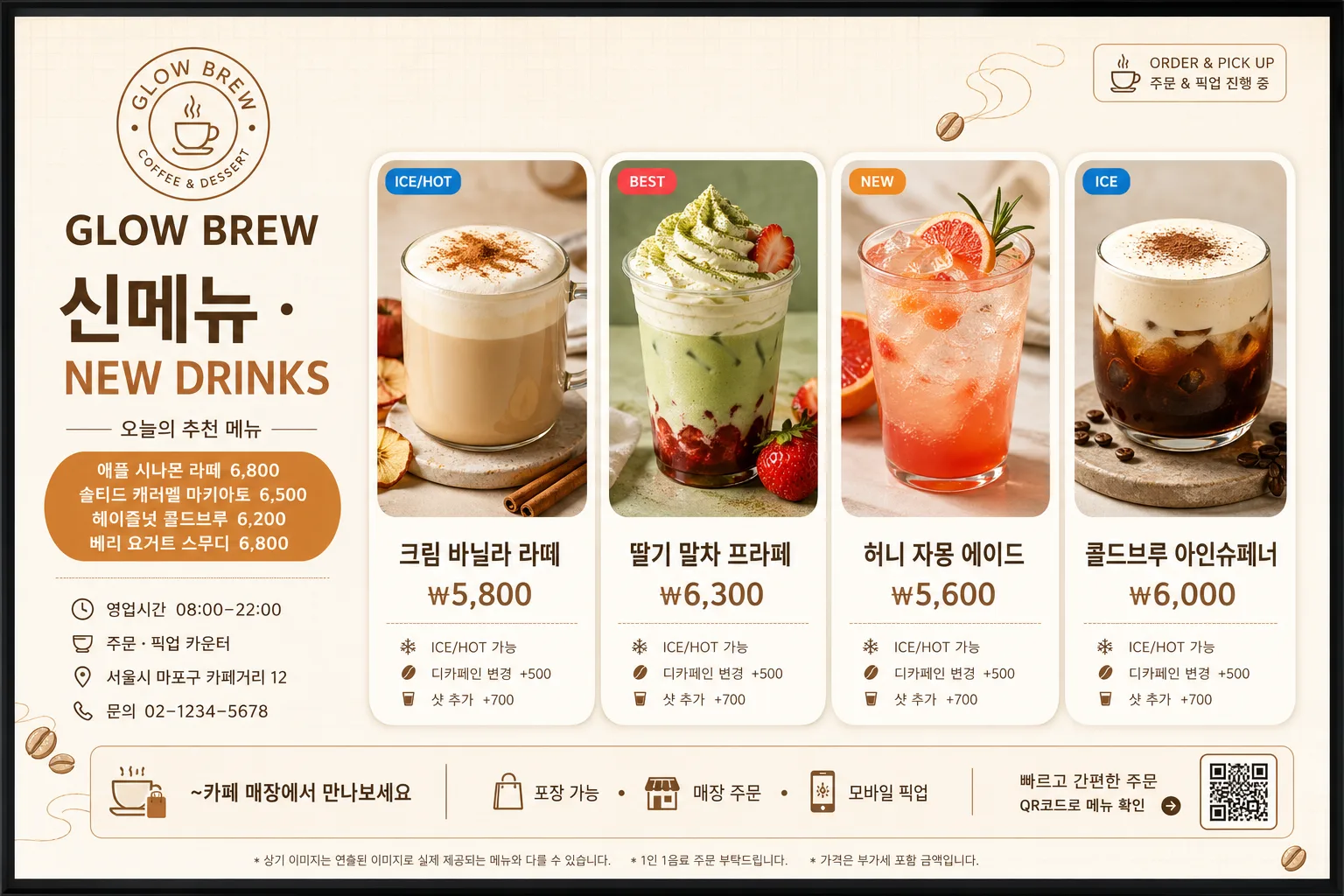
Korean cafe digital menu display board for TV/POS, 16:9 horizontal widescreen. Retail-ready menu UI with polished drink photos, realistic store information, item pricing, promotional microcopy, and clear menu hierarchy designed to read instantly from a distance.

[Composition]
- Left 30% of frame: cafe identity zone with {카페} as the store name, a compact logo mark placeholder, large {카테고리} category header, seasonal subtitle, opening-hours line, and contact/address microcopy stacked vertically.
- Right 70% of frame: exactly four featured menu items arranged in a clean horizontal row, each as a separate rounded card with one polished drink photo on top and text below.
- Use {카페}, {카테고리}, and {신메뉴} as the editable content anchors.
- Background should feel like a modern in-store digital board: warm cream base, subtle off-white paneling, faint menu-grid texture, gentle caramel dividers, and a premium franchise cafe atmosphere.
- Add realistic cafe signage details: small top-right service label, bottom information strip, compact price notes, pickup/order guidance, and decorative coffee-bean or steam-line graphics that support the menu without changing the main layout.

[3. CORE STRUCTURE]
- Left header block: place a simple circular logo placeholder at the top-left area, then set {카페} as the main cafe name in strong Korean type, followed by {카테고리} in large bold Korean type beneath it.
- Under the category header, add a smaller subtitle line such as "오늘의 추천 메뉴" and a highlighted pill badge reading "{신메뉴}".
- Add practical store details in the lower left block: "영업시간 08:00–22:00", "주문 · 픽업 카운터", "서울시 마포구 카페거리 12", "문의 02-1234-5678".
- Main menu row: display four featured drinks across the right side, each card using one square hero photo area, then one Korean menu name and one price underneath in a clear vertical stack.
- Suggested four drink cards: "크림 바닐라 라떼 ₩5,800", "딸기 말차 프라페 ₩6,300", "허니 자몽 에이드 ₩5,600", "콜드브루 아인슈페너 ₩6,000".
- Menu card styling: each card should have a white or very light cream background, rounded corners, soft shadow, equal gutter spacing, small flavor tag chips such as "ICE", "BEST", or "NEW", and realistic product-photo highlights so the row feels like a franchise POS board.
- Include small secondary notes below the prices where space allows: "ICE/HOT 가능", "디카페인 변경 +500", "샷 추가 +700" in tiny but legible Korean type.
- Footer line: add a refined bottom strip reading "~카페 매장에서 만나보세요" together with "포장 가능 · 매장 주문 · 모바일 픽업" and a small barcode/QR-style order area at the far right.
- Text placement: {카페} should appear as the cafe name near the top of the left block, with strong visual hierarchy above all other text.

[4. STYLE RULES]
- Typography: use Pretendard or Noto Sans KR for the main headers in bold weight, with menu names in medium weight and prices in bold; subtitle/footer/store-info in regular weight with smaller size.
- Color palette: warm cream #F6F1E8, caramel #C98B5A, cocoa #5A3E2B, soft brown #8B6A4A, white #FFFFFF, muted gray #6F6A64.
- Border/shadow: rounded 18px cards with soft drop shadow, 0px x-offset, 6px y-offset, 16px blur, 14% opacity.
- Add thin caramel divider lines, small rounded category chips, subtle coffee-bean icons, steam-line accents, and POS-style micro labels while preserving a clean commercial hierarchy.
- Drink photos should look real: condensation on iced cups, glossy cream foam, fruit garnish, matcha powder dusting, clear plastic cups or glassware, and natural shadows on the photo surface.

[5. VISUAL STYLE]
- Camera / lens: polished product photography look, equivalent to a 50mm lens with f/4 for the drink images, clean frontal presentation with minimal distortion.
- Lighting: studio softbox key light from upper-left at 45°, gentle fill from right, even exposure with crisp highlights on cups and glassware.
- Color grade: warm cream + caramel + cocoa with slightly boosted saturation on beverage toppings and garnish, clean commercial finish.
- Display rendering: sharp digital signage on a TV/POS screen, crisp Korean typography, realistic backlit screen glow, subtle reflection along the screen edge, and high readability at storefront viewing distance.

[6. MOOD]
Korean franchise cafe POS board — polished chain-cafe digital signage with Starbucks / Ediya / Mega Coffee-style retail clarity, warm in-store hospitality, realistic menu pricing, and appetizing product presentation.

[7. CRITICAL]
- Korean text accuracy: 반드시 정확히 보여야 하는 문자열: "카페 이름", "메뉴 카테고리", "신메뉴", "~카페 매장에서 만나보세요".
- Render all Korean menu text cleanly and legibly, including prices such as "₩5,800", store info such as "영업시간 08:00–22:00", and footer text such as "포장 가능 · 매장 주문 · 모바일 픽업".
- Layout invariants: left 30% header zone and right 70% four-item menu row must remain clearly separated; each menu card must contain one drink image, one Korean menu name, and one price.
- Menu count: exactly 4 featured drink cards should be visible in the main row.
- Keep {카페}, {카테고리}, and {신메뉴} as the editable content anchors and display them as the primary cafe name, category, and new-menu badge.

[8. 🚫 PROHIBITED]
- Fake official seals / certifications
- Broken Korean characters
- Celebrity composites / unauthorized likeness