광고/포스터
카페 신메뉴 카드뉴스 광고
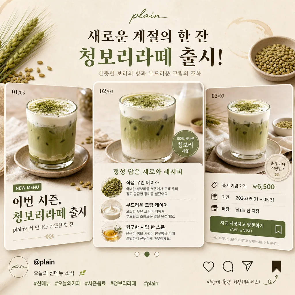
신메뉴 출시 카드뉴스 3슬라이드 sample. 음료 사진 + 카피 + 가격 + CTA.
카페 신메뉴 카드뉴스 광고 검색 요약
카페 신메뉴 카드뉴스 광고은 광고/포스터 결과물을 만들 때 바로 복사해 활용할 수 있는 ChatGPT 이미지 프롬프트입니다. 주제, 배경, 스타일, 구도 조건을 함께 담아 빠르게 시안을 만들 수 있도록 구성했습니다.
관련 키워드: 카페 신메뉴 카드뉴스 광고, 카페 신메뉴 카드뉴스 광고 프롬프트, 광고/포스터 프롬프트, 광고/포스터 AI 이미지 프롬프트, ChatGPT 이미지 프롬프트, AI 이미지 생성 프롬프트, AI 프롬프트, 이미지 프롬프트
카페 신메뉴 카드뉴스 광고 활용 포인트
원본 구조를 유지하면서 피사체, 배경, 색감, 구도를 바꿔 다양한 시안으로 확장할 수 있습니다.
- 핵심 소재는 유지하고 브랜드, 계절, 채널 목적에 맞는 색감과 배경을 바꿔보세요.
- 결과가 산만하면 배경 요소를 줄이고 피사체, 구도, 조명 조건을 구체화하세요.
- 복사한 뒤 ChatGPT에서 플랫폼, 화면 비율, 텍스트 포함 여부를 추가로 요청할 수 있습니다.
프롬프트 원문
[Input]
- language: Korean
- output_size: 1024x1024

[Purpose]
Korean café new-menu promotional card news for Instagram, 3-slide swipeable square carousel. Realistic editorial food marketing layout with a polished café-launch feel, showing an appetizing beverage photo, readable Korean promo copy, carousel UI details, and café-brand social content cues.

[Composition]
- Square 1:1 composition designed as a 3-slide Instagram carousel preview, with the center slide emphasized slightly larger and the two side slides angled or offset just enough to show the swipeable sequence.
- Main subject placement: each slide uses a top-heavy layout where the drink image occupies about 55–60% of the frame, and the lower 40% contains headline, body copy, price/date/store information, slide number, and carousel indicators.
- Background treatment: warm cream or oat-colored paper-like surface with subtle café stationery grain, faint espresso-ring marks, small ingredient accents, soft napkin texture, and gentle natural shadows that make the image feel photographed in a real café.
- Use {카페}, {신메뉴}, and {3슬라이드} as the editable content anchors.
- Add a small Instagram-style handle such as “@brand.cafe” or “@{카페}” in a clean corner, plus tiny save/share micro icons and a short hashtag line like “#신메뉴 #오늘의카페 #시즌음료”.

[3. CORE STRUCTURE]
- Slide preview structure: show three square cards in a horizontal carousel stack, labeled clearly as 01/03, 02/03, 03/03 so the {3슬라이드} concept is immediately readable.
- Hero image area (top 55–60%): feature a polished realistic beverage photo of {신메뉴} with condensation or creamy foam depending on the drink, glass/ceramic highlights, visible garnish or ingredient detail, and a soft contact shadow on the card.
- Slide 1 content: large launch headline in Korean, for example “이번 시즌, {신메뉴} 출시” and supporting line “{카페}에서 만나는 산뜻한 한 잔”, with a small label “NEW MENU”.
- Slide 2 content: ingredients / preparation explanation with 2–3 concise Korean bullets such as “직접 우린 베이스”, “부드러운 크림 레이어”, “향긋한 시럽 한 스푼”, accompanied by small ingredient close-ups like beans, citrus peel, milk splash, herbs, or chocolate pieces appropriate to the beverage.
- Slide 3 content: price / period / store info + CTA, for example “출시 기념 ₩6,500”, “기간 2026.05.01–05.31”, “매장: {카페} 전 지점”, “지금 저장하고 방문하기”, plus a small end-card CTA button shape reading “SAVE & VISIT”.
- Carousel indicator area: add 3 small dots or a thin page bar near the bottom edge, with the current slide dot filled in the accent color; include “1/3”, “2/3”, “3/3” page indicators on the respective cards.
- Brand/social area: place “@brand.cafe” or “@{카페}” in small legible text, plus tiny heart/comment/share/save icons, a subtle caption line “오늘의 신메뉴 소식”, and a compact hashtag row.
- Design should look like a real Instagram card news ad exported from a café brand account, with layered paper cards, realistic beverage photography, crisp typography, and believable promotional details.

[4. STYLE RULES]
- Typography: use Pretendard or Noto Sans KR for body copy, with a refined Korean serif such as Noto Serif KR for the main headline; headline weight 700–800, body weight 400–500, headline size roughly 28–40px equivalent in the square preview.
- Color palette: use warm cream #F6F0E6, oat beige #E8DDCF, charcoal #2C2C2C, and one accent color chosen to match the drink mood, such as muted green #7E9B73 or latte brown #8A6A4E.
- Border/shadow: use fine card edges, realistic paper thickness, soft layered shadows, and a soft drop shadow around the hero drink, about 4px y-offset, 12px blur, 15% opacity.
- Add refined café-ad details such as small decorative dividers, price tag chips, ingredient icons, date labels, micro captions, and subtle sticker-like tags while keeping a premium editorial hierarchy.
- Text must remain clean and readable, with strong contrast between charcoal text and cream/oat backgrounds; accent labels and CTA buttons should feel intentionally designed rather than generic.

[5. VISUAL STYLE]
- Camera / lens: realistic café product photography using a Sony A7R IV with 85mm f/1.4 for a softly compressed hero look, or a top-down 35mm equivalent for flat-lay-style menu presentation.
- Lighting: soft window light from upper-left at about 45°, with a gentle fill from the right to preserve highlight detail on the drink and keep shadows smooth.
- Color grade: warm cream + oat + muted green palette with lightly desaturated highlights and natural beverage tones, resembling high-end café social-media content.
- Material realism: beverage glass or ceramic should show believable reflections, foam texture, condensation, syrup layers, ice, garnish, and surface contact shadows; paper cards should show subtle grain and slight thickness.

[6. MOOD]
Premium Korean café editorial — a refined Brunch-style Instagram launch card with the inviting, polished atmosphere of a modern specialty café feed, lively enough to feel like an actual seasonal menu announcement.

[7. CRITICAL]
- Korean text accuracy: 반드시 정확히 보여야 하는 문자열: “카페”, “신메뉴”, “3슬라이드”.
- Include the editable anchors {카페}, {신메뉴}, and {3슬라이드} clearly in the layout copy without changing the placeholder names.
- Recommended visible Korean copy examples: “이번 시즌, {신메뉴} 출시”, “{카페}에서 만나는 산뜻한 한 잔”, “출시 기념 ₩6,500”, “기간 2026.05.01–05.31”, “지금 저장하고 방문하기”, “#신메뉴 #오늘의카페”.
- If the carousel preview includes copy, keep the Korean typography clean and fully legible with no broken Hangul characters.
- The 3-slide logic must be visually understandable at a glance, with 01/03, 02/03, 03/03 labels or three active-state indicators clearly distinguished.
- All beverage visuals should look like a real café menu photo, not a generic illustration.

[8. 🚫 PROHIBITED]
- Fake official seals / certifications
- Broken Korean characters
- Celebrity composites / unauthorized likeness