Merch/Mockups
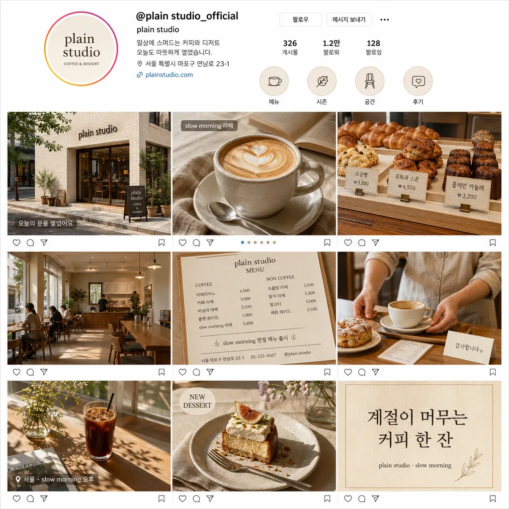
카페 인스타그램 9그리드 목업
카페 인스타그램 피드 mockup. 3×3 그리드로 일관된 톤·구도. 브랜딩 발표용.
카페 인스타그램 9그리드 목업 summary
Copy this ChatGPT image prompt to create Merch/Mockups results. Its subject, background, style, and composition are organized for quick iteration.
Related keywords: 카페 인스타그램 9그리드 목업, 카페 인스타그램 9그리드 목업 프롬프트, Merch/Mockups 프롬프트, Merch/Mockups AI 이미지 프롬프트, ChatGPT 이미지 프롬프트, AI 이미지 생성 프롬프트, AI 프롬프트, 이미지 프롬프트
How to use 카페 인스타그램 9그리드 목업
Keep the prompt structure and swap the subject, background, palette, or composition to create new variations.
- Keep the main subject and adjust the palette and background for your brand, season, or channel.
- If the result feels busy, simplify the background and make the subject, composition, and lighting more specific.
- After copying, ask ChatGPT to adapt it for your platform, aspect ratio, or text requirements.
Original prompt
[Input]
- language: Korean
- output_size: 1024x1024

[Purpose]
Korean cafe Instagram 9-grid mockup for {카페}, a realistic square social-media profile feed preview that feels ready to post during {시즌}.
Compact 3×3 editorial layout that communicates the cafe’s brand mood, menu personality, seasonal promotion, and everyday atmosphere at a glance.

[Composition]
- Main canvas: one 1:1 square Instagram-style profile screen mockup with a top profile header and 9 equal posts arranged in a strict 3×3 grid below.
- Grid structure: each post same size, separated by thin white divider lines, with even alignment and a real app-preview feeling.
- Top header zone: include a circular profile avatar with a simple cafe mark, handle text such as “@{카페}_official”, display name “{카페}”, short Korean bio, post/follower/following stats, and tiny highlight chips labeled “메뉴”, “시즌”, “공간”, “후기”.
- Include tiny Instagram-like UI details: small save/share/comment micro icons beneath selected post previews, carousel indicator dots on one tile, and a faint page-status feel while keeping the 9-grid clearly visible.
- Visual consistency: all 9 posts should feel like the same cafe identity, using the same palette, lighting logic, table textures, dishware, signage, and editorial finish.
- Text placeholders: cafe identity and seasonal concept must follow {카페} and {시즌}; the 9-post plan must follow {9개 게시물} and influence the content of the nine tiles.

[3. CORE STRUCTURE]
- Post 1 (top-left): exterior cafe shot with storefront, real signage reading “{카페}”, glass door reflections, small sidewalk sandwich board, potted greenery, nearby street texture, and a small caption overlay “오늘의 문을 열었어요”.
- Post 2 (top-center): latte close-up with visible crema, cup texture, saucer, spoon, linen napkin, and a tiny product label sticker reading “{시즌} 라떼”.
- Post 3 (top-right): bread display counter with layered pastries, croissants, canelés, scones, menu tags with Korean names and prices such as “소금빵 ₩3,800”, “무화과 스콘 ₩4,500”, “플레인 까눌레 ₩3,200”.
- Post 4 (middle-left): interior wide shot showing seating, table spacing, wood surfaces, pendant lights, wall art, menu board, customers blurred naturally in the background, and strong spatial clarity.
- Post 5 (middle-center): menu board or menu paper close-up with store name “{카페} MENU”, multiple drink items and prices, small address/contact line, and a seasonal notice like “{시즌} 한정 메뉴 출시”.
- Post 6 (middle-right): owner’s hand or staff hand in a candid service moment, placing a cup or serving a pastry; include apron texture, tray, receipt slip, and a small thank-you card reading “감사합니다”.
- Post 7 (bottom-left): window-sunlight scene with soft rays falling across tableware, a half-full iced coffee, plant shadows, magazine corner, and a subtle location/date label “서울 · {시즌} 오후”.
- Post 8 (bottom-center): dessert hero shot with a plated cake or tart, fork, crumbs, ceramic plate, folded napkin, small flower stem, and an editorial tag “NEW DESSERT”.
- Post 9 (bottom-right): Korean quote card with warm paper texture and refined typography; set bold Korean quote text: “계절이 머무는 커피 한 잔” plus small footer “{카페} · {시즌}”.
- Use {9개 게시물} as the planning logic for the nine panels, translating it into realistic Instagram feed content rather than leaving it as visible placeholder text.

[4. STYLE RULES]
- Typography: use Pretendard or Noto Sans KR for profile text, menu labels, captions, hashtags, and UI microcopy; medium to semibold weight, 18–42px depending on area. Quote card can use Nanum Myeongjo for a refined editorial accent.
- Korean text rendered in image may include: “{카페}”, “{시즌} 한정 메뉴”, “오늘도 따뜻하게 열었습니다”, “계절이 머무는 커피 한 잔”, “#서울카페 #스페셜티커피 #디저트맛집”.
- Color palette: warm beige, cream, soft green, muted brown, and off-white; specific tones can include #F4EBDD, #FFF9F1, #C9D6C2, #A88F78, and #E7DED2.
- Separators and UI: thin white separators between posts, very light 2px soft shadow around the overall phone/profile area at 10–15% opacity, realistic Instagram-inspired spacing and icons.
- Add natural cafe textures and details: paper menu grain, ceramic glaze, pastry flakes, wood table pattern, linen napkins, glass reflections, soft plant shadows, subtle wall texture, and handwritten price tags.
- Keep typography crisp and evenly spaced, with a clean Instagram-inspired UI feel rather than a poster look.

[5. VISUAL STYLE]
- Camera / lens: editorial cafe photography feel using a Sony A7R IV with 35mm f/1.8 for interiors and products, plus 50mm f/1.4 for close-ups; flat-lay elements can feel like a 24mm top-down composition.
- Lighting: soft diffused daylight, like overcast window light from upper-left, with gentle fill from the opposite side; interior shots may include subtle practical light for warmth.
- Color grade: warm cream + beige + soft green with slightly muted contrast, clean highlights, and a polished lifestyle-editorial finish.
- Rendering: photorealistic cafe images inside each grid tile, believable shallow depth of field where appropriate, sharp UI typography, accurate Korean lettering, and realistic social-media screenshot proportions.

[6. MOOD]
Seoul specialty cafe Instagram profile grid — like a polished Kinfolk x local cafe editorial feed with a calm, design-forward boutique aesthetic, realistic enough to feel like an actual curated account for {카페} during {시즌}.

[7. CRITICAL]
- Korean text accuracy: all visible Korean text must render cleanly and without broken characters, especially “{카페}”, “{시즌}”, “계절이 머무는 커피 한 잔”, menu items, prices, hashtags, and profile bio.
- All 9 panels must maintain the same overall cafe identity, palette, lighting, tableware style, and editorial finish.
- Grid lines must remain straight and evenly spaced; the image must read clearly as a 3×3 Instagram feed preview.
- Profile text should be small but readable: include handle “@{카페}_official”, bio “계절을 담은 커피와 디저트”, and highlight labels “메뉴 / 시즌 / 공간 / 후기”.
- Use realistic Korean cafe microcopy and pricing, such as “아메리카노 ₩4,500”, “바닐라빈 라떼 ₩5,800”, “{시즌} 블렌드 ₩6,200”.

[8. 🚫 PROHIBITED]
- Fake official seals / certifications
- Broken Korean characters