廣告/海報
스마트스토어 상세페이지 히어로
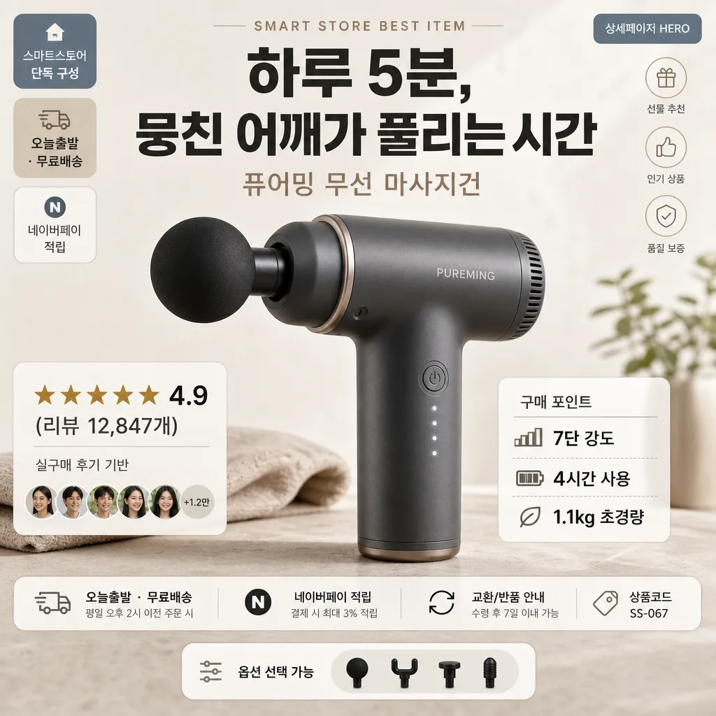
스마트스토어 상품 상세페이지의 헤로. 큰 제품 + 후킹 카피 + 별점 + 핵심 USP. 정사각.
스마트스토어 상세페이지 히어로摘要
這是用來製作廣告/海報內容的 ChatGPT 圖像提示詞,已整理主題、背景、風格與構圖,方便快速調整。
相關關鍵字: 스마트스토어 상세페이지 히어로, 스마트스토어 상세페이지 히어로 프롬프트, 廣告/海報 프롬프트, 廣告/海報 AI 이미지 프롬프트, ChatGPT 이미지 프롬프트, AI 이미지 생성 프롬프트, AI 프롬프트, 이미지 프롬프트
스마트스토어 상세페이지 히어로使用方式
保留原始結構並替換主體、背景、色彩或構圖,即可延伸出不同版本。
- 保留核心主體,並依品牌、季節或平台調整色彩與背景。
- 如果畫面太複雜,請減少背景元素並具體描述主體、構圖與光線。
- 複製後可要求 ChatGPT 配合平台、長寬比或文字需求調整。
提示詞原文
[Input]
- language: Korean
- output_size: 1024x1024

[Purpose]
Korean smart-store product detail page hero section, square 1:1 main visual for e-commerce conversion.
Realistic Naver SmartStore-style product hero with premium photography, clear purchase cues, trust signals, delivery information, and content-rich seller-page details optimized for mobile scrolling and quick decision-making.

[Composition]
- Canvas: 1:1 square layout with a centered dominant hero product occupying about 58–62% of the frame, slightly tilted for dimensional depth and photographed as a real product placed on a warm tabletop surface.
- Background treatment: warm gray and ivory studio backdrop with subtle paper-matte texture, faint tabletop horizon, soft fabric or paper shadows, and natural e-commerce styling details that support the product without stealing focus.
- Spacing and framing: place the main headline in the upper zone, product in the center, trust and USP blocks in the lower zone, with additional tiny seller-page UI labels, shipping info, and product metadata arranged along the sides for a realistic detail-page hero.
- Use {제품명}, {메인 카피}, {평점·후기}, {USP} placeholders as the exact primary on-image content.
- Add realistic Korean microcopy around the hero such as “스마트스토어 단독 구성”, “오늘출발 · 무료배송”, “구매 포인트”, “상품코드 SS-067”, “옵션 선택 가능”, and “상세페이지 HERO” in small readable UI-style labels.

[3. CORE STRUCTURE]
1. Hero product area (center 60%): {제품명} shown as a polished front-facing or slightly angled product hero shot with crisp edges, realistic material detail, gentle highlights, and a soft physical shadow on the surface beneath it.
2. Top headline band (upper 18%): {메인 카피} placed in large Korean sans-serif type, spanning the width with strong hierarchy above the product, aligned for immediate readability on mobile. Add a small eyebrow label above it: “SMART STORE BEST ITEM”.
3. Trust block (lower-left 14%): {평점·후기} set as a compact review badge line with a star-rating motif, tiny “실구매 후기 기반” caption, and a small profile-dot row suggesting multiple buyers.
4. Feature block (lower-right 14%): {USP} split into three short lines or slash-separated benefits, arranged as a compact spec list with small icon-like separators, plus a small heading “구매 포인트”.
5. Seller information strip: include a slim lower information bar with “오늘출발 · 무료배송”, “네이버페이 적립”, “교환/반품 안내”, and a small product code label “상품코드 SS-067” to make the hero feel like a real Korean commerce page.
6. Decorative commerce details: add subtle thumbnail cards or small rounded chips near the product edge, such as “NEW”, “인기 옵션”, “선물 추천”, and tiny line icons for delivery, review, and quality check.
7. Balance and flow: keep the product as the unmistakable focal point, with copy blocks framing rather than covering it; maintain a premium seller-page feel with realistic overlays, labels, and conversion-oriented information hierarchy.

[4. STYLE RULES]
- Typography: Pretendard or Noto Sans KR for all Korean text; headline in Bold 800, body in Medium 500, small details in Regular 400; headline size about 68–84 px equivalent, supporting text 24–34 px equivalent, microcopy 13–18 px equivalent.
- Color palette: ivory #F5F1E8, warm gray #D8D2C8, charcoal #2B2B2B, soft beige #E7DDCF, muted accent gray-blue #8A93A0, with small warm taupe and cream UI chips.
- Border/shadow: soft drop shadow under product, 4px y-offset, 14px blur, 18% opacity; use refined rounded panels, thin divider lines, small icon marks, and subtle paper-card shadows for seller-page realism.
- Layout language: premium Korean D2C commerce aesthetic with clear typographic rhythm, tactile product photography, and useful shopping information integrated into the hero area.
- Text rendering: all Korean labels must appear clean, readable, and aligned like a professionally designed smart-store detail page.

[5. VISUAL STYLE]
- Camera / lens: clean studio product photography look, equivalent to a 85mm f/4 product shot with a slightly compressed perspective and crisp detail.
- Lighting: soft diffused studio light from upper-left at about 45°, with a very subtle fill from the right, a faint underside shadow for depth, and realistic highlights on product edges or packaging surfaces.
- Color grade: warm neutral e-commerce grade with creamy whites, soft beige midtones, restrained contrast, and polished smart-store catalog clarity.
- Surface detail: warm matte tabletop, faint paper grain, soft folded card shadows, tiny printed UI labels, and natural product reflections appropriate to the material.

[6. MOOD]
Premium Korean smart-store bestseller hero — polished Naver SmartStore / direct-to-consumer product page aesthetic, trustworthy, content-rich, warm, and ready for purchase conversion.

[7. CRITICAL]
- Korean text accuracy: 반드시 아래 문구가 이미지에 정확히 보여야 함:
  - {제품명}
  - {메인 카피}
  - {평점·후기}
  - {USP}
- Additional Korean text must be realistic smart-store microcopy, for example: “스마트스토어 단독 구성”, “오늘출발 · 무료배송”, “구매 포인트”, “상품코드 SS-067”, “네이버페이 적립”, “옵션 선택 가능”.
- Product must remain the dominant hero object, with clear hierarchy and no text covering essential product details.
- Layout must stay in a 1:1 square composition with top headline, central product, lower-left trust line, lower-right USP block, and a slim commerce information strip.

[8. 🚫 PROHIBITED]
- Fake official seals / certifications
- Broken Korean characters