資訊圖表/指南
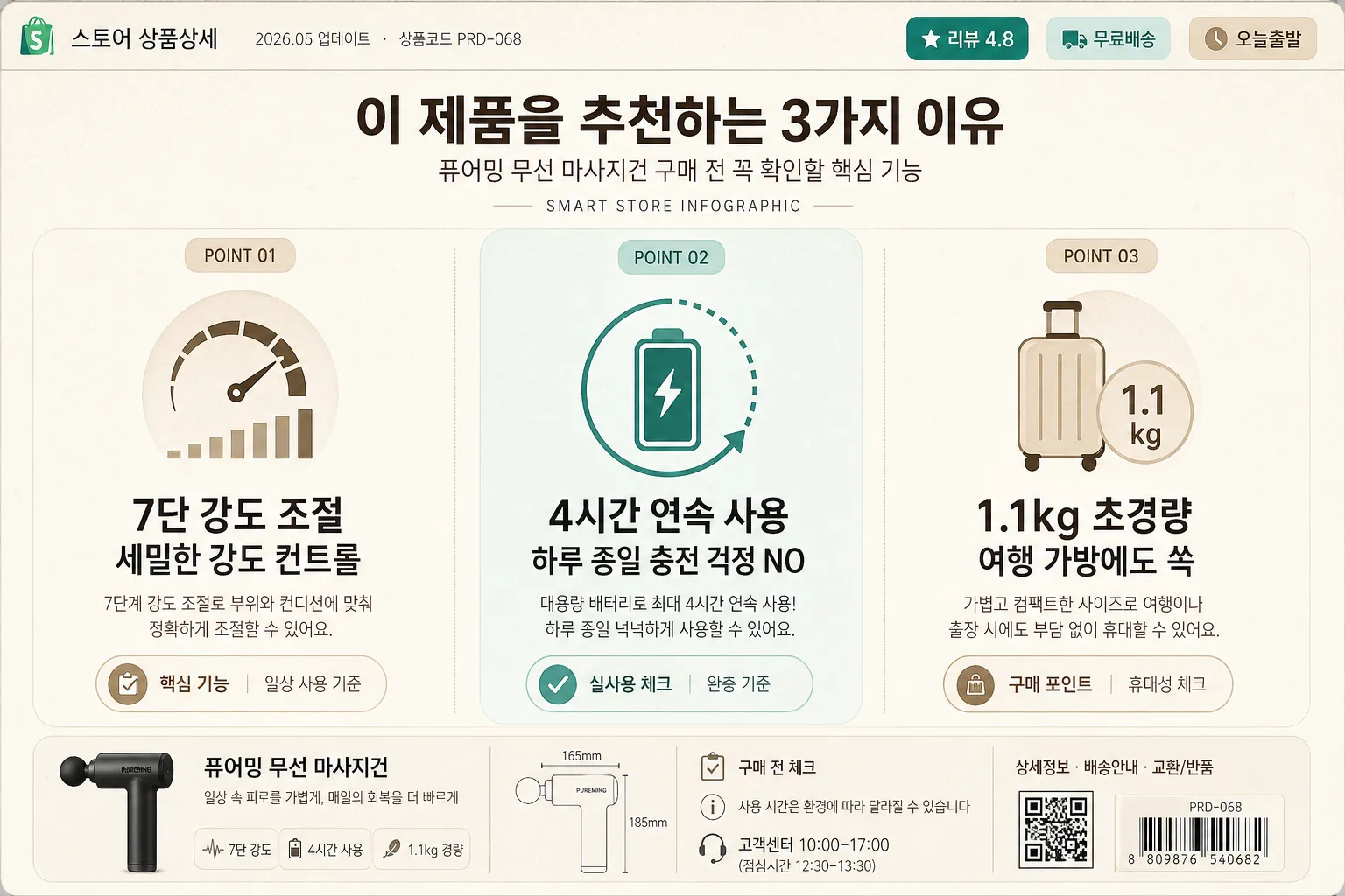
스마트스토어 핵심 기능 인포그래픽
제품의 3가지 핵심 기능을 아이콘 + 설명으로 정리한 인포 섹션. 가로 wide.
스마트스토어 핵심 기능 인포그래픽摘要
這是用來製作資訊圖表/指南內容的 ChatGPT 圖像提示詞,已整理主題、背景、風格與構圖,方便快速調整。
相關關鍵字: 스마트스토어 핵심 기능 인포그래픽, 스마트스토어 핵심 기능 인포그래픽 프롬프트, 資訊圖表/指南 프롬프트, 資訊圖表/指南 AI 이미지 프롬프트, ChatGPT 이미지 프롬프트, AI 이미지 생성 프롬프트, AI 프롬프트, 이미지 프롬프트
스마트스토어 핵심 기능 인포그래픽使用方式
保留原始結構並替換主體、背景、色彩或構圖,即可延伸出不同版本。
- 保留核心主體,並依品牌、季節或平台調整色彩與背景。
- 如果畫面太複雜,請減少背景元素並具體描述主體、構圖與光線。
- 複製後可要求 ChatGPT 配合平台、長寬比或文字需求調整。
提示詞原文
[Input]
- language: Korean
- output_size: 1536x1024

[Purpose]
Korean smart-store product detail infographic for an e-commerce listing, 3-column feature showcase in a polished horizontal wide layout.
Designed to communicate three buying reasons quickly for mobile-first shoppers and desktop viewers while feeling like a real SmartStore product-detail section with practical shopping micro-information.

[Composition]
- Overall canvas: 16:9 wide composition with a compact commerce header band at the top, followed by 3 equal-width feature columns across the full width, plus a slim product-info footer strip.
- Main product reference: {제품} should appear as the central topic across the three columns through iconography, feature text, small product silhouette details, and shopping information chips, not as a large hero photo.
- Header area: {헤더} centered near the top as the main Korean headline, supported by small realistic e-commerce labels such as "스토어 상품상세", "BEST POINT", "2026.05 업데이트", and "상품코드 PRD-068".
- Feature row: {3가지} is split into three visually balanced cards/columns with refined dividers between them, each column containing one icon, a bold feature title, and a short supporting line; add small supporting badges inside each card such as "핵심 기능", "실사용 체크", "구매 포인트" without adding extra feature columns.
- Background treatment: pale beige or warm off-white base with subtle paper grain, faint rounded panel layering, and gentle cream-to-beige tonal variation for realistic printed-detail-page depth.
- Framing direction: clean retail infographic with a clear grid, consistent padding, useful commerce details, small caption labels, and believable product-detail page finishing touches.

[3. CORE STRUCTURE]
- Top commerce strip (top 6%): place a small left-aligned label "스토어 상품상세" and tiny metadata "2026.05 업데이트 · 상품코드 PRD-068"; on the right add compact chips "리뷰 4.8", "무료배송", "오늘출발" in muted teal and beige.
- Header strip (next 12%): place {헤더} in bold centered Korean text; include a smaller subtitle beneath reading "{제품} 구매 전 꼭 확인할 핵심 기능" and a tiny category label "SMART STORE INFOGRAPHIC".
- Column 1 (left 33%): show the first feature from {3가지} as a large flat vector icon above a bold feature label, then a one-line supporting description beneath; include a small numbered marker "POINT 01" and a micro caption line such as "일상 사용 기준" while keeping exactly one primary icon, one primary title, and one short description.
- Column 2 (center 34%): present the second feature with the same icon/title/description hierarchy, matching scale and spacing to the left column; add a soft teal accent tint behind the card and a small marker "POINT 02" so the center panel feels slightly emphasized without breaking balance.
- Column 3 (right 33%): show the third feature from {3가지} with the same structure, ensuring all three columns are visually consistent in icon size, text width, and padding; include a small marker "POINT 03" and a micro caption line such as "휴대성 체크".
- Product integration: {제품} should be implied through the feature content and visual language; add a small simplified product silhouette, tiny measurement tick marks, or line-art detail near the footer only as supporting context, secondary to the three-column information layout.
- Divider treatment: use refined vertical rules between columns, light gray or muted beige, with soft inner card shadows and rounded panel edges to resemble a finished marketplace 상세페이지 graphic.
- Footer strip (bottom 10%): add realistic shopping-detail microcopy: "구매 전 체크", "사용 시간은 환경에 따라 달라질 수 있습니다", "고객센터 10:00–17:00", "상세정보 · 배송안내 · 교환/반품"; include a small barcode-like SKU block or QR-style square purely as decorative product-code graphics, not an official certification.
- Copy hierarchy: feature titles should be the largest text inside each column, followed by a compact explanatory line in smaller weight; commerce metadata and captions should be tiny but legible.

[4. STYLE RULES]
- Typography: Pretendard or Noto Sans KR for all Korean text; header in Bold 34–42px, feature titles in SemiBold 24–30px, descriptions in Regular 16–20px, metadata and footer captions in 11–14px.
- Color palette: off-white #F7F3EA, beige #E9DFC9, soft teal #5FAEAA, muted peach #F2A987, charcoal #2E2E2E, light gray #D8D8D8.
- Icon style: flat vector, two-tone or monochrome with simple fills, rounded edges, clean geometric construction, marketplace-friendly pictograms.
- Panel/shadow: subtle card separation with 1px divider lines, rounded rectangles, soft shadow 0px 4px 10px 8% opacity, and tiny label pills for realistic e-commerce information density.
- Text alignment: centered within each feature column, with consistent baseline alignment across all three feature blocks; top metadata and footer microcopy may use left/right alignment for realistic product-detail-page structure.

[5. VISUAL STYLE]
- Camera / lens: graphic design infographic style, no photographic camera look; if rendered with product mockup detail, use an orthographic flat-lay presentation with no perspective distortion.
- Lighting: diffuse studio-style even lighting simulation with soft panel shadows and gentle highlight separation on cards, avoiding harsh directional cast shadows.
- Color grade: clean e-commerce palette with warm cream base, soft teal and peach accents, neutral charcoal text, slightly muted saturation for a trustworthy marketplace look.

[6. MOOD]
Practical Korean e-commerce editorial — clean Market Kurly / Musinsa-style product communication with a modern D2C brochure feel, enriched with believable SmartStore detail-page labels, shopping chips, review cues, and product-support captions.

[7. CRITICAL]
- Korean text accuracy: the following strings must appear correctly in the rendered image: "이 제품을 추천하는 3가지 이유", "7단 강도 조절", "4시간 연속 사용", "1.1kg 초경량".
- Also render supporting Korean commerce text cleanly where included: "스토어 상품상세", "리뷰 4.8", "무료배송", "오늘출발", "구매 전 체크", "상세정보", "배송안내", "교환/반품".
- The feature layout must remain exactly 3 equal columns with one primary icon, one primary title, and one short description per column.
- Maintain clean, legible Korean sans-serif typography with no broken characters.

[8. 🚫 PROHIBITED]
- Fake official seals / certifications
- Broken Korean characters