グッズ・モックアップ
펀코팝 캐릭터 박스 패키지
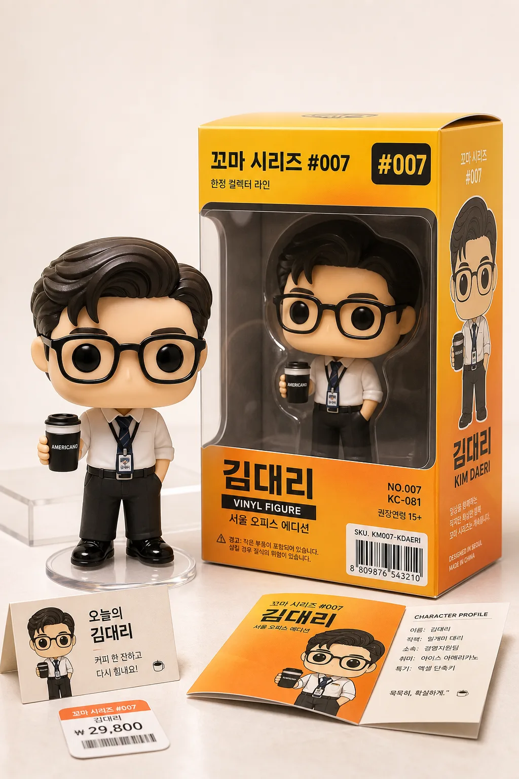
펀코팝 특유의 큰 머리·작은 몸·점 같은 까만 눈 + 노란 박스 윈도우 패키지. 캐릭터/직업/취미 묘사하면 펀코팝 + 박스 일러스트로 변환.
펀코팝 캐릭터 박스 패키지の概要
グッズ・モックアップ画像を作るためのChatGPT画像プロンプトです。主題、背景、スタイル、構図を整理し、すぐに試せるよう構成しています。
関連キーワード: 펀코팝 캐릭터 박스 패키지, 펀코팝 캐릭터 박스 패키지 프롬프트, グッズ・モックアップ 프롬프트, グッズ・モックアップ AI 이미지 프롬프트, ChatGPT 이미지 프롬프트, AI 이미지 생성 프롬프트, AI 프롬프트, 이미지 프롬프트
펀코팝 캐릭터 박스 패키지の活用方法
元の構造を保ちながら、被写体、背景、色、構図を変更して別案に展開できます。
- 主題を維持し、ブランドや季節、媒体に合わせて色と背景を変更してください。
- 結果が複雑な場合は背景要素を減らし、被写体、構図、照明を具体化してください。
- コピー後、ChatGPTに媒体、アスペクト比、文字の有無を追加で指定できます。
プロンプト原文
[Input]
- language: Korean
- output_size: 1024x1536

[Purpose]
Kiddult collector catalog illustration of a Funko Pop-style vinyl character and retail collector box package, staged like a real premium toy product launch photograph.
Vertical packaging showcase for social-media and catalog use, with the figure and box clearly readable at a 3/4 angle, enriched with realistic package labeling, barcode area, edition details, and small collector-display accessories.

[Composition]
- Main subject: a Funko Pop-style vinyl figure with an oversized square head, tiny body, black dot eyes, and no mouth, positioned in the foreground-left with the box package standing slightly behind it on the right.
- Character design details should follow {캐릭터 컨셉}, with simplified but recognizable color-block clothing, accessory shapes, molded vinyl seams, glossy highlights, and tiny sculpted details.
- Packaging: a tall collector box with a transparent plastic window, side panel character illustration, bold title placement, top number badge, item code, warning label area, barcode block, and small manufacturing-style micro text, using {박스 메인 컬러} as the dominant box treatment.
- Layout: figure occupies about 40% of the frame, box occupies about 45%, both fully in frame and angled for product visibility; include a realistic tabletop base with soft reflections, a small removable character-name card, a tiny price sticker, and a folded insert leaflet partly visible near the box.
- Background: {배경 스타일} as a warm studio product set with subtle paper sweep texture, soft gradient, faint shelf-line shadow, and realistic reflections on the box window.
- Title and name areas should feature {시리즈 타이틀} and {피규어 이름} in clearly legible Korean typography, plus realistic supporting package text such as series number, vinyl figure label, edition line, SKU, and barcode captions.

[Core Structure]
1. Foreground figure: render the vinyl character with the Funko Pop proportion logic—large head, reduced limbs, simplified hands, glossy black eyes, neutral mouthless expression, plastic specular highlights, visible molded edges, and the outfit/accessory cues from {캐릭터 컨셉}.
2. Packaging body: place the collector-style box immediately beside the figure, using {박스 메인 컬러} across the main surfaces, with a transparent front window that reveals a faint inner figure silhouette, plastic reflections, inner cardboard backing, and folded tabs at the top/bottom edges.
3. Front panel details: add a top title band with {시리즈 타이틀}, a large number mark "#007", a lower nameplate with {피규어 이름}, a small label "VINYL FIGURE", a Korean line "서울 오피스 에디션", and a lower-right barcode area with SKU-style micro text.
4. Side panel: add a character illustration panel on the visible side of the box, matching the same outfit and accessory cues as the figure, with clean graphic shapes, simplified shadows, a vertical name strip, and tiny collector-series copy.
5. Typography zone: set {시리즈 타이틀} near the top/front panel and {피규어 이름} prominently on the front name area, with Korean lettering crisp, centered, and packaged like a real retail toy box; include small readable package callouts such as "한정 컬렉터 라인", "NO.007", "KC-081", and "권장연령 15+" without making them look like official certification seals.
6. Display context: stage the entire product on a satin-finish tabletop with realistic contact shadows, a subtle clear acrylic riser edge behind the figure, a small collector card reading "오늘의 김대리", and a warm catalog lighting setup that emphasizes the box corners, window plastic, and vinyl material.

[Style Rules]
- Typography: use bold, clean sans-serif packaging typography similar to Pretendard Bold or Noto Sans KR Bold, with small supporting labels in Regular; title size should be large enough to read at thumbnail scale, while micro text should feel like authentic packaging detail.
- Color palette: base the box on {박스 메인 컬러}, supported by warm white, soft cream, charcoal black, and a small amount of accent orange/yellow for hierarchy; use matching accent strips, small numbering tags, and graphic dividers across the box panels.
- Border/shadow: use soft product shadows with 4px y-offset, 12px blur, and 15% opacity under the box and figure; keep package edges crisp and toy-like, with realistic cardboard thickness, folded seams, and subtle glossy lamination.
- Add believable retail-package features: barcode block, SKU label, tiny caution copy, series number marker, inner backing pattern, side-panel portrait, top-flap tab line, and a small price sticker marked "₩17,900".
- Keep all Korean package text sharp and intentionally designed, not random filler; arrange labels with real hierarchy like a premium designer-toy package.

[Visual Style]
- Camera / lens: Canon EOS R5 product photography look, 85mm lens at f/5.6 with a slightly elevated 3/4 angle, clean perspective and minimal distortion.
- Lighting: soft studio softbox from upper-left at 45° with a gentle fill from the right, producing even reflections on the window plastic, soft highlights on the vinyl head, and a subtle rim on the box edges.
- Color grade: bright catalog neutrals with controlled yellow-orange saturation, clean whites, a slight warm tint to the packaging colors, and realistic contrast in the shadows beneath the product.
- Material rendering: glossy vinyl figure, semi-gloss printed cardboard box, clear PET window with diagonal light streaks, satin tabletop surface, and tiny paper texture on the insert card.

[Mood]
Premium kiddult collectible catalog — retail designer-toy display aesthetic with the polished feel of a real product shoot, playful Korean office-character charm, and enough package detail to feel like a collectible item customers could pick up in a toy shop.

[Critical]
- Korean text accuracy: 반드시 정확히 렌더링할 문구: "꼬마 시리즈 #007", "김대리".
- Also render these Korean package details clearly where appropriate: "서울 오피스 에디션", "한정 컬렉터 라인", "오늘의 김대리", "권장연령 15+", "₩17,900".
- The character must preserve the Funko Pop-style proportions: oversized square head, very small body, black dot eyes, mouthless face.
- The box and figure must both be visible at the same time, and the visible front/side panels must remain readable and not cropped.
- Use {캐릭터 컨셉}, {박스 메인 컬러}, {시리즈 타이틀}, {피규어 이름}, {배경 스타일}, and {전체적인 분위기} as the guiding content and mood references.

[8. 🚫 PROHIBITED]
- Fake official seals / certifications
- Broken Korean characters