Social/Card News
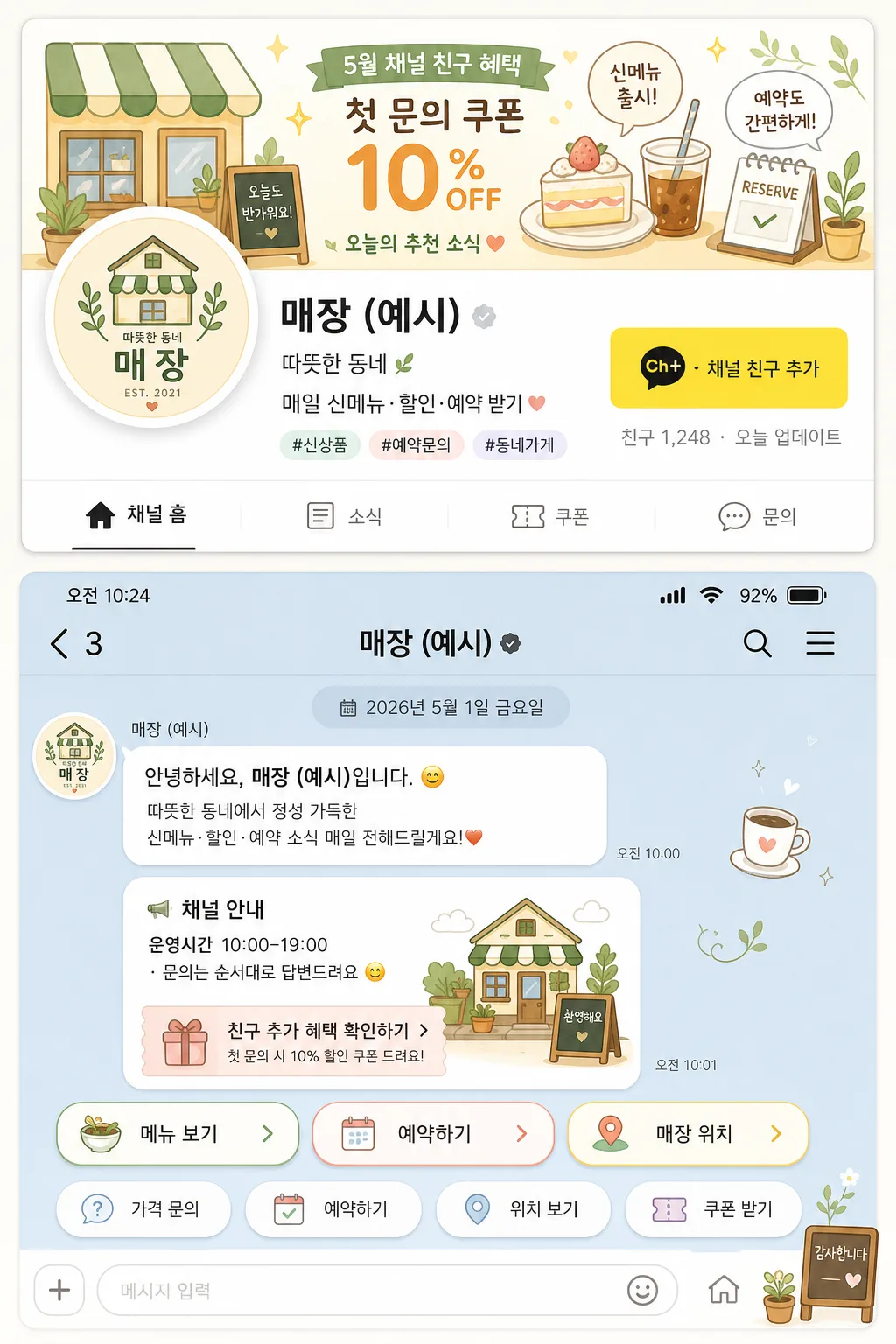
카카오톡 채널 배너 + 채팅 시작 화면
카카오톡 채널 헤더 배너 + 채팅 첫 메시지 화면. 매장 컨셉·정보 입력하면 카카오톡 채널 톤으로 변환.
카카오톡 채널 배너 + 채팅 시작 화면 summary
Copy this ChatGPT image prompt to create Social/Card News results. Its subject, background, style, and composition are organized for quick iteration.
Related keywords: 카카오톡 채널 배너 + 채팅 시작 화면, 카카오톡 채널 배너 + 채팅 시작 화면 프롬프트, Social/Card News 프롬프트, Social/Card News AI 이미지 프롬프트, ChatGPT 이미지 프롬프트, AI 이미지 생성 프롬프트, AI 프롬프트, 이미지 프롬프트
How to use 카카오톡 채널 배너 + 채팅 시작 화면
Keep the prompt structure and swap the subject, background, palette, or composition to create new variations.
- Keep the main subject and adjust the palette and background for your brand, season, or channel.
- If the result feels busy, simplify the background and make the subject, composition, and lighting more specific.
- After copying, ask ChatGPT to adapt it for your platform, aspect ratio, or text requirements.
Original prompt
[Input]
- language: Korean
- output_size: 1024x1536

[Purpose]
KakaoTalk business channel banner and chat start screen mockup for a small shop, shown together as a registration-ready UI concept with realistic service details.
Vertical presentation that combines a channel header banner and an opening chat screen in one mobile-style layout, including channel identity, promotional banner copy, chat welcome flow, quick replies, micro UI labels, and small business contact cues.

[Composition]
- Overall layout: split into two stacked sections on a 1024x1536 canvas, with the channel header mockup occupying the top 46% and the chat start screen occupying the bottom 54%.
- The channel header section should feel like a KakaoTalk business channel preview card, with a lively banner background, circular profile image, channel name, short concept line, friend-add button area, follower/notice micro text, and small category tags clearly separated.
- The chat start section should resemble the first chat screen after entering the channel, with a phone status bar, channel top bar, date separator, welcome message area, business-hour notice, coupon or announcement card, and rounded quick-reply buttons below.
- Use {채널명}, {채널 컨셉}, {채널 안내 문구}, {디자인 스타일}, {색감}, {프로필 사진 내용}, {빠른 답장 버튼} placeholders naturally inside the UI text and content blocks.
- Background should be a very light off-white or pale cream base with soft card shadows, rounded corners, layered app panels, subtle paper-like surface texture, tiny icons, and warm small-shop details so the mockup feels registration-ready and believable.

[3. CORE STRUCTURE]
1. Top header mockup: place a wide rectangular banner across the upper section, with a compact profile circle overlapping the lower-left edge of the banner, channel name to the right, and a friendly yellow friend-add button area aligned near the right side. Add small realistic UI labels such as “채널 홈”, “소식”, “쿠폰”, “문의”, and a tiny count line like “친구 1,248 · 오늘 업데이트”.
2. Channel identity block: show {채널명} in a bold but friendly Korean UI type style, with a smaller subline using {채널 컨셉} and a short promotional line containing {채널 안내 문구} beneath it. Add two or three compact tags such as “#신상품”, “#예약문의”, “#동네가게” in small rounded chips.
3. Profile image area: render {프로필 사진 내용} as a polished logo-style image inside a circular frame, with flat illustration treatment, small shadow, neat highlight, and background accents matching {색감}. The logo should feel suitable for a Korean small-business channel, not like a personal portrait.
4. Banner content: apply {디자인 스타일} to the banner with illustrated shop-related motifs, soft gradient blocks, tiny sparkle marks, product silhouettes, speech-bubble accents, and short Korean banner copy such as “5월 채널 친구 혜택”, “첫 문의 쿠폰”, “오늘의 추천 소식”. Keep the main placeholder text readable and make the supporting details secondary.
5. Chat start screen: below the header mockup, create a phone-like chat panel with a realistic top status bar showing “오전 10:24”, signal/battery icons, a channel title bar with {채널명}, and a centered date separator “2026년 5월 1일 금요일”. Include a welcome message bubble from the channel: “안녕하세요, {채널명}입니다.” followed by {채널 안내 문구}.
6. Service message cards: add one small announcement card inside the chat flow with title “채널 안내”, short body text “운영시간 10:00–19:00 · 문의는 순서대로 답변드려요”, and a small coupon-style strip “친구 추가 혜택 확인하기”. Include a tiny thumbnail illustration that echoes {프로필 사진 내용}.
7. Quick-reply buttons: place three to five rounded buttons in a tidy wrapped row using {빠른 답장 버튼} as the visible primary button label, plus supporting Korean options such as “가격 문의”, “예약하기”, “위치 보기”, “쿠폰 받기”. Buttons should have consistent spacing, pastel outlines, small icons, and equal visual weight.
8. Illustration treatment: apply {디자인 스타일} across the banner accents, button icons, small decorative stickers, leaf shapes, sparkle marks, receipt-like mini labels, and shop-related motifs so the UI feels cohesive and content-rich.

[4. STYLE RULES]
- Typography: Pretendard or Noto Sans KR for UI text, with Bold 700 for {채널명} at large size, Medium 500 for {채널 컨셉}, and Regular 400 for the promotional line; keep the text crisp, readable, and Korean mobile-UI-like.
- Color palette: use {색감} anchored by soft pastel mint #DDF3EC, cream #FFF8EF, warm peach #F8DCCB, pale sky #DCEBFA, Kakao-style warm yellow #FEE500, and charcoal text #2B2B2B.
- Border/shadow: rounded cards with 20px corner radius, soft drop shadow 0 8px 24px rgba(0,0,0,0.08), thin divider lines in #EAEAEA, button outlines in slightly darker pastel tones, and subtle inner highlights on white UI panels.
- UI details: include believable mobile interface details such as status icons, back arrow, search/menu dots, tab labels, tiny notification dot, message timestamp “오전 10:25”, light gray chat background, and small microcopy labels without overpowering the placeholders.
- Text hierarchy: make {채널명}, {채널 컨셉}, {채널 안내 문구}, and {빠른 답장 버튼} the most legible Korean text; secondary details should be smaller but still plausible and correctly formed.

[5. VISUAL STYLE]
- Camera / lens: front-facing screen mockup rendered like an editorial app UI screenshot, equivalent to a 50mm standard lens look with minimal distortion and straight verticals.
- Lighting: soft studio diffuse light from upper-left with gentle fill from the right, subtle screen-glow effect, mild glass reflection on the phone-like panels, and even illumination across both stacked sections.
- Color grade: pastel Korean service UI palette with airy cream, mint, peach, sky blue, and warm yellow tones, slightly desaturated for a neat app-preview appearance while keeping the interface friendly and realistic.

[6. MOOD]
A polished KakaoTalk business onboarding mockup with a modern Korean mobile UI feel, similar to a well-designed small-business channel presentation in a startup product deck, but with enough real service copy, message details, tags, icons, and promotional cues to feel ready for actual shop registration.

[7. CRITICAL]
- Korean text accuracy: 반드시 다음 문구가 정확하게 보여야 함: "{채널명}", "{채널 컨셉}", "{채널 안내 문구}", "{빠른 답장 버튼}".
- Additional Korean UI text may include: "채널 홈", "소식", "쿠폰", "문의", "친구 1,248", "2026년 5월 1일 금요일", "안녕하세요, {채널명}입니다.", "운영시간 10:00–19:00", "가격 문의", "예약하기", "위치 보기", "쿠폰 받기".
- The two main sections must be clearly distinguishable: top channel header mockup and bottom chat start screen.
- Buttons should appear as distinct rounded quick-reply chips, not as flat text lines.
- The profile image must read as a logo-style placeholder for {프로필 사진 내용}, not a realistic portrait.

[8. 🚫 PROHIBITED]
- Fake official certification seals or verification badges
- Broken Korean characters or gibberish text