Seasonal/Events
시즌·명절 인사 카드
매장에서 단골에게 보내는 명절·시즌 인사 카드. 시즌·매장 입력하면 인스타·카톡·인쇄 모두 활용 가능한 인사 카드로 변환.
시즌·명절 인사 카드 summary
Copy this ChatGPT image prompt to create Seasonal/Events results. Its subject, background, style, and composition are organized for quick iteration.
Related keywords: 시즌·명절 인사 카드, 시즌·명절 인사 카드 프롬프트, Seasonal/Events 프롬프트, Seasonal/Events AI 이미지 프롬프트, ChatGPT 이미지 프롬프트, AI 이미지 생성 프롬프트, AI 프롬프트, 이미지 프롬프트
How to use 시즌·명절 인사 카드
Keep the prompt structure and swap the subject, background, palette, or composition to create new variations.
- Keep the main subject and adjust the palette and background for your brand, season, or channel.
- If the result feels busy, simplify the background and make the subject, composition, and lighting more specific.
- After copying, ask ChatGPT to adapt it for your platform, aspect ratio, or text requirements.
Original prompt
[Input]
- language: Korean
- output_size: 1024x1536

[Purpose]
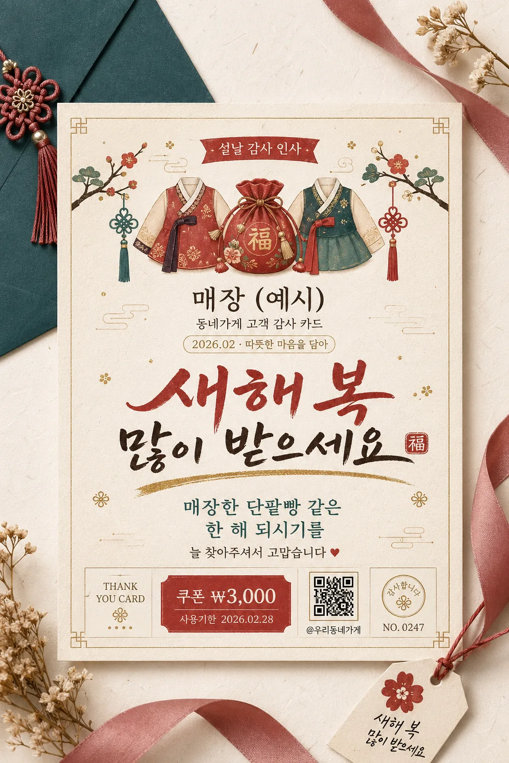
Korean seasonal greeting card for a small local business, designed as a realistic printable social-media graphic and customer thank-you card.
Vertical postcard-style layout with a refined traditional holiday feel, suitable for Instagram posting, in-store display, and enclosing with purchases.

[Composition]
- Create a premium printed greeting card in {카드 비율}, placed within a 1024x1536 vertical frame as a realistic studio flat-lay stationery scene.
- The main card should feel like a finished boutique print piece on warm hanji-inspired paper, with surrounding seasonal details such as a matching envelope corner, thin silk ribbon, tiny gift tag, pressed flower sprig, or small traditional ornament related to {시즌/명절}.
- Top header area features {시즌/명절} themed illustration motifs, using {일러스트 모티프} as decorative artwork with layered ink lines, muted gold highlights, and small pattern details.
- Center area features the store identity and headline, while the lower area contains the short message plus realistic card micro-details: date label, customer appreciation note, small SNS/contact-style line, and a tiny coupon or thank-you stamp element.
- Background treatment: soft off-white paper surface with subtle fiber texture, warm cream tone, visible print grain, slight edge shadow, and tactile stationery realism.
- Use {매장 이름}, {인사말 헤드라인}, {따뜻한 메시지}, {디자인 스타일}, {일러스트 모티프}, and {카드 비율} placeholders naturally within the layout.

[Core Structure]
1. Header illustration band (top 22%): arrange {일러스트 모티프} as traditional seasonal ornaments for {시즌/명절}, with small printed motifs, tiny gold dots, red thread accents, and a soft illustrated banner reading "{시즌/명절} 감사 인사".
2. Logo zone (upper-middle 14%): place {매장 이름} as a clear boutique-style brand mark, with a small subline in Korean such as "동네가게 고객 감사 카드" and a tiny date label like "2026.02 · 따뜻한 마음을 담아".
3. Main greeting zone (middle 28%): render {인사말 헤드라인} in the largest Korean lettering, visually dominant and highly legible, with subtle decorative accent strokes inspired by hand lettering and a small gold brush underline.
4. Message zone (lower-middle 18%): place {따뜻한 메시지} in smaller, friendly Korean text, centered and spaced for easy reading, with a natural short line break if needed. Add a small closing line beneath it such as "늘 찾아주셔서 고맙습니다".
5. Detail zone (bottom 12%): include realistic printed micro-elements: "THANK YOU CARD", "쿠폰 ₩3,000", "사용기한 2026.02.28", "@우리동네가게", a small QR-code-like square graphic, and a tiny serial mark such as "NO. 0247".
6. Finishing layer (entire card): add delicate paper grain texture, tactile ink impression, soft drop shadow, gentle edge contrast, and faint metallic shimmer on gold accents so the card feels like premium printed stationery.

[Style Rules]
- Typography: use a mix of Pretendard SemiBold for supporting text and a hand-drawn Korean calligraphy style for the headline; headline size large, message size medium-small, logo text medium, micro-labels very small but crisp.
- Color palette: deep red #A61C2B, muted gold #C9A24A, teal #2D6F6A, warm cream #F6EBDD, dark ink #2B1F1A.
- Border/shadow: soft drop shadow with 4px y-offset, 14px blur, 16% opacity; very thin gold accent line or frame, understated and elegant.
- Apply {디자인 스타일} as the overall visual direction while retaining Korean seasonal stationery realism, handcrafted print texture, and detailed boutique-card finishing.
- Decorative elements may include subtle hanji fibers, tiny floral or folk-pattern stamps, corner flourishes, small sticker labels, ribbon shadows, and tasteful seasonal icon details connected to {일러스트 모티프}.

[Visual Style]
- Camera / lens: studio flat-lay look, 50mm equivalent with a straight-on top-to-bottom card presentation, crisp edges, print-design clarity.
- Lighting: soft diffused studio light from upper-left, gentle natural shadow falloff, faint reflective lift on gold accents, no specular glare.
- Color grade: warm cream base with red-gold emphasis and restrained teal accents, slightly muted for a traditional Korean New Year card aesthetic.
- Material realism: premium matte paper, slightly raised ink feel, faint gold foil impression, soft envelope texture, realistic layered paper depth.

[Mood]
Traditional Korean small-business holiday card — editorial stationery feel with the polished warmth of a premium local boutique print piece, enriched with sincere customer-appreciation details, seasonal charm, and tactile handmade warmth.

[Critical]
- Korean text accuracy: 반드시 다음 문구가 정확히 렌더링되어야 함: "{매장 이름}", "{인사말 헤드라인}", "{따뜻한 메시지}"
- Also render supporting Korean details cleanly where included: "{시즌/명절} 감사 인사", "동네가게 고객 감사 카드", "늘 찾아주셔서 고맙습니다", "쿠폰 ₩3,000", "사용기한 2026.02.28".
- All Hangul characters must be clean, properly formed, and fully legible with no broken syllables or incorrect spacing.
- Keep the hierarchy clear: store name smaller than the main headline, message shorter and lighter than the headline, micro-details secondary but readable.

[8. 🚫 PROHIBITED]
- Fake official seals / certifications
- Broken Korean characters