굿즈/목업
인스타 인증샷 매장 포토존
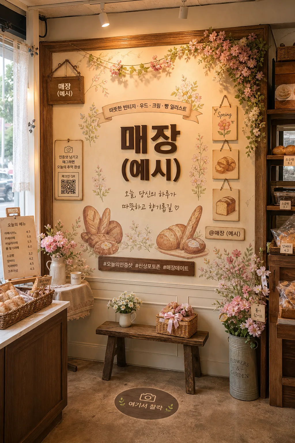
매장 안에 만드는 인스타 인증샷용 포토존 mockup — 벽면 그래픽·네온사인·꽃벽·시즌 데코 등. 매장·컨셉 입력하면 매장 포토존 시안으로 변환.
인스타 인증샷 매장 포토존 검색 요약
인스타 인증샷 매장 포토존은 굿즈/목업 결과물을 만들 때 바로 복사해 활용할 수 있는 ChatGPT 이미지 프롬프트입니다. 주제, 배경, 스타일, 구도 조건을 함께 담아 빠르게 시안을 만들 수 있도록 구성했습니다.
관련 키워드: 인스타 인증샷 매장 포토존, 인스타 인증샷 매장 포토존 프롬프트, 굿즈/목업 프롬프트, 굿즈/목업 AI 이미지 프롬프트, ChatGPT 이미지 프롬프트, AI 이미지 생성 프롬프트, AI 프롬프트, 이미지 프롬프트
인스타 인증샷 매장 포토존 활용 포인트
원본 구조를 유지하면서 피사체, 배경, 색감, 구도를 바꿔 다양한 시안으로 확장할 수 있습니다.
- 핵심 소재는 유지하고 브랜드, 계절, 채널 목적에 맞는 색감과 배경을 바꿔보세요.
- 결과가 산만하면 배경 요소를 줄이고 피사체, 구도, 조명 조건을 구체화하세요.
- 복사한 뒤 ChatGPT에서 플랫폼, 화면 비율, 텍스트 포함 여부를 추가로 요청할 수 있습니다.
프롬프트 원문
[Input]
- language: Korean
- output_size: 1024x1536

[Purpose]
Korean small-business store interior photo zone mockup for Instagram check-ins, designed as a catalog-style proposal for an interior contractor.
The scene should feel like a real in-store wall or corner installation, optimized for social-media photo-taking, with believable materials, store details, customer-facing signage, and Instagram-ready decorative touchpoints.

[Composition]
- The photo zone occupies one wall or corner inside the store, with the main backdrop taking about 70% of the frame and a realistic 15–20% walk-in/photo-taking area where one or two customers could stand.
- The central typography zone sits at eye level, while seasonal decor, small props, framed labels, hashtag plaques, QR-style check-in signage, and shelf details frame both sides in a natural retail composition.
- Background treatment: warm vintage interior surface with visible wood textures, cream-toned panels, illustrated wall graphics, raised lettering, subtle seams, screw caps, wall brackets, floor texture, and adjacent store details so it reads as a real indoor installation.
- Include small Instagram-like micro details: a tiny handle label “@{매장 이름}”, a small hashtag strip “#오늘의인증샷 #신상포토존 #다시찾고싶은곳”, and tiny save/share icon-style graphics printed on a corner sticker or acrylic tag.
- Use {매장 이름} as the main focal store identity, {매장 컨셉} as the overall styling direction, {주요 키워드} as the material and graphic accents, {시즌} as the seasonal decor cue, {포토존 주요 요소} as the structural decoration, {포토존 문구} as the central caption text, and {조명 스타일} for the atmosphere.

[3. CORE STRUCTURE]
1. Main backdrop area: build a warm vintage photo wall that reads as a real interior installation, with an illustrated mural surface, layered {시즌} floral decoration, cream panel molding, wood trim, and tactile installed elements integrated into the wall.
2. Center text zone: place {포토존 문구} in large, high-contrast Korean lettering at the visual center, sized to command attention from a diagonal in-store viewpoint; use raised acrylic or painted dimensional letters with soft shadows.
3. Store identity layer: integrate {매장 이름} as a secondary brand cue on a small hanging plaque, wall-mounted sign, or printed acrylic tag; also include a tiny Instagram handle label “@{매장 이름}” near the lower side of the installation.
4. Side composition: place illustrated accents and prop objects on both sides, using {주요 키워드}, bread-themed illustration cards if appropriate, wood-framed details, cream-toned trims, ceramic mini objects, small baskets, dried flowers, ribbon tags, and realistic shelf props that feel naturally used in a store.
5. Instagram check-in details: add a small sign reading “인증샷 남기고 태그하면 오늘의 추억 완성”, a compact QR-style square labeled “체크인 QR”, a hashtag plaque with “#오늘의인증샷 #신상포토존 #매장데이트”, and tiny printed save/share icon-style marks on a sticker sheet.
6. Seasonal layer: add {시즌} elements through floral clusters, botanical graphics, pastel paper ornaments, small hanging garlands, and soft accent objects so the design feels current and photogenic.
7. Photo-taking space: create a clear standing spot using a small floor decal reading “여기서 찰칵”, a low bench or stool, and a warm-toned floor area in front or to the side of the backdrop so it feels natural for customers to pose.
8. Real store context: show a hint of adjacent counter edge, menu card, wall outlet, track light, ceiling detail, baseboard, or display shelf to ground the scene as an actual small-business interior rather than a flat poster.
9. Lighting setup: render {조명 스타일} so the wall graphics, typography, props, floor, and decor all feel warm, readable, and camera-friendly.

[4. STYLE RULES]
- Typography: use Pretendard Bold or Noto Sans KR ExtraBold for the main Korean copy, with clean geometric spacing and a size that occupies roughly 18–22% of the wall width; use smaller Pretendard Medium for supporting labels, hashtags, handle text, and small informational signs.
- Color palette: cream #F5EDE0, warm beige #D9C7AE, wood brown #8B5E3C, soft peach #F2C7B8, muted green #9FB38A, accent terracotta #C96B4B.
- Border/shadow: use subtle soft drop shadows under raised letters, about 4px y-offset, 12px blur, 15% opacity, and thin wood-framed outlines for structure.
- Materials: emphasize real interior materials such as lightly grained wood, matte acrylic lettering, painted plaster, cream wall panels, paper stickers, linen ribbon, ceramic props, metal sign brackets, and warm floor finishes.
- Graphic detail: supporting stickers and tags should look printed and installed, including short Korean labels like “오늘의 포토존”, “찰칵!”, “좋아요 꾸욱”, and “태그 환영”.

[5. VISUAL STYLE]
- Camera / lens: 35mm full-frame lens at f/4, slightly angled from inside the store toward the photo zone, with a realistic interior photography perspective.
- Lighting: warm tungsten practical lighting mixed with gentle natural daylight from one side, with soft shadow falloff and no harsh hotspots.
- Color grade: warm cream + beige + wood brown with soft pastel spring accents, lightly desaturated for a polished interior-catalog look.
- Render quality: realistic architectural-interior photography, visible depth, believable scale, accurate perspective, tactile surfaces, and crisp Korean signage suitable for a contractor proposal.

[6. MOOD]
Premium small-business interior proposal — like a stylish Instagrammable café wall concept seen in Kinfolk-meets-retail design catalog photography, but with enough lived-in retail detail to feel ready for real customers taking 인증샷.

[7. CRITICAL]
- Korean text accuracy: 반드시 정확히 보일 문구: "{포토존 문구}", "{매장 이름}"
- Additional Korean text should be clean and legible where visible: “오늘의 포토존”, “여기서 찰칵”, “체크인 QR”, “#오늘의인증샷 #신상포토존 #매장데이트”, “좋아요 꾸욱”, “태그 환영”.
- The text should be clean, legible, and correctly rendered in Korean without broken characters.
- The photo zone must read as an in-store installation, not an outdoor signboard.
- The composition should include a believable standing/posing area for one or two people while still showing rich wall details, props, signage, floor texture, and store context.

[8. 🚫 PROHIBITED]
- Fake official seals / certifications
- Broken Korean characters