周邊/模型
한국 굿즈 라인업 목업
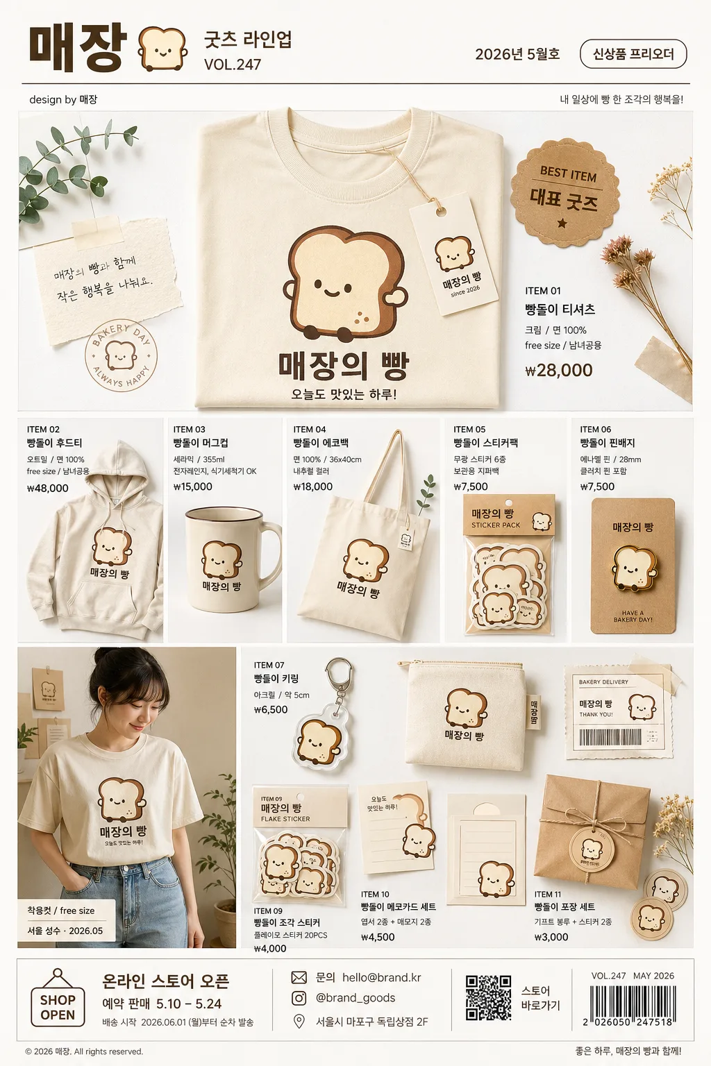
1인 브랜드/작가가 만든 굿즈 라인업 mockup — 티셔츠·후드·머그·키링·에코백·스티커. 디자인 컨셉 입력하면 한 장에 굿즈 라인업 카탈로그.
한국 굿즈 라인업 목업摘要
這是用來製作周邊/模型內容的 ChatGPT 圖像提示詞,已整理主題、背景、風格與構圖,方便快速調整。
相關關鍵字: 한국 굿즈 라인업 목업, 한국 굿즈 라인업 목업 프롬프트, 周邊/模型 프롬프트, 周邊/模型 AI 이미지 프롬프트, ChatGPT 이미지 프롬프트, AI 이미지 생성 프롬프트, AI 프롬프트, 이미지 프롬프트
한국 굿즈 라인업 목업使用方式
保留原始結構並替換主體、背景、色彩或構圖,即可延伸出不同版本。
- 保留核心主體,並依品牌、季節或平台調整色彩與背景。
- 如果畫面太複雜,請減少背景元素並具體描述主體、構圖與光線。
- 複製後可要求 ChatGPT 配合平台、長寬比或文字需求調整。
提示詞原文
[Input]
- language: Korean
- output_size: 1024x1536

[Purpose]
1-2 English lines: Korean 1-person brand merchandise lineup mockup catalog, multi-product grid, social-media shop announcement and crowdfunding-page ready.
Showcase one signature mascot or emblem applied consistently across apparel, mugs, keychains, bags, stickers, pin badges, packaging cards, and small printed inserts in a polished editorial catalog page.

[Composition]
- Main composition: a tall realistic catalog page organized by {굿즈 배치 방식}, filling the central product field with layered merchandise, product labels, price tags, and small catalog annotations while preserving clear product recognition.
- Product hierarchy: the most visually important item occupies the upper-middle 22% as a hero product, with the rest of {굿즈 종류} arranged around it in a shop-ready lineup with believable scale differences.
- Brand identity: every product must feature {시그니처 디자인} with identical visual language across all items, unified by {브랜드 컬러}; repeat the motif on hang tags, sticker backing cards, enamel pin cards, and packaging sleeves.
- Optional lifestyle element: if {모델 포함 여부} is included, place the model in one lower-side panel wearing the apparel, cropped from mid-thigh upward, styled like a small lookbook photo with natural hands, fabric folds, and visible print placement.
- Background treatment: {배경 스타일} with warm off-white paper, subtle grain, realistic tabletop depth, kraft paper backing cards, folded fabric swatches, washi tape pieces, shipping label scraps, and a few small dried-flower or plant props that make the scene feel photographed.
- Framing: keep the layout vertically structured like a boutique merch catalog spread, with crisp product separation, realistic shadows, layered paper details, and enough surrounding context to feel like an actual product shoot for Instagram and a funding page.

[3. CORE STRUCTURE]
1. Header zone (top 12%): create a branded catalog masthead using {브랜드 이름}; include Korean micro text such as "굿즈 라인업", "VOL.247", "2026년 5월호", "신상품 프리오더", a thin divider line, small credit text "design by {브랜드 이름}", and a tiny issue/date label.
2. Hero product zone (upper-center 22%): show the most representative item from {굿즈 종류} larger than the others, featuring {시그니처 디자인} sharply printed; add a small callout sticker reading "BEST ITEM" and Korean label "대표 굿즈" with a realistic product tag and price such as "₩28,000".
3. Merchandise grid zone (middle 46%): arrange the remaining {굿즈 종류} in a tidy editorial grid with product name captions, short Korean descriptors, SKU-style labels like "ITEM 01", "ITEM 02", and prices such as "₩7,500", "₩12,000", "₩18,000"; include a mug, tote or pouch, keychain, sticker pack, badge card, and apparel item if relevant.
4. Apparel presentation zone (lower-left or lower-right, only when {모델 포함 여부} is used): place a model wearing the branded shirt or hoodie, styled like a Korean indie lookbook insert photo, with natural pose, correct fabric drape, and the same {시그니처 디자인} visible on chest, sleeve, or back; add a small caption "착용컷 / free size" and date-location label "서울 성수 · 2026.05".
5. Small accessory zone (lower-middle 14%): cluster keychains, pin badges, sticker flakes, backing cards, tiny zip pouch, and postcard-size inserts; render realistic enamel shine, metal rings, sticker paper edges, transparent packaging reflections, stitching, and printed barcode-style product labels.
6. Footer zone (bottom 8%): include a shop information strip with Korean text "온라인 스토어 오픈", "예약 판매 5.10–5.24", "문의 hello@brand.kr", "@brand_goods", a small barcode area, simple QR-like square graphic, address line "서울시 마포구 독립상점 2F", and tiny production credit text.

[4. STYLE RULES]
- Typography: use Pretendard SemiBold for the brand title and main product labels, Pretendard Regular for supporting micro text, around 28–42 px for the title, 16–24 px for item names, and 10–14 px for barcode, SKU, credit, handle, and caption details.
- Color palette: derive all accents from {브랜드 컬러}, with cream #F6F0E6, beige #D8C7B0, dark brown #4A3327 as the core set, plus warm gray #E9E4DB for paper fields, tags, caption boxes, and subtle dividers.
- Border/shadow: use soft drop shadows with 4px y-offset, 14px blur, 14% opacity; add thin 1px neutral borders, rounded backing-card corners, taped paper edges, and small printed dividers where they help the catalog feel real.
- Surface treatment: matte paper-like background with subtle grain, gentle edge vignetting, realistic product cutout boundaries, tactile cotton weave, ceramic glaze, brushed metal, enamel coating, sticker-paper fibers, and transparent plastic sleeve reflections.

[5. VISUAL STYLE]
- Camera / lens: studio product-catalog setup, full-frame camera with 85mm f/1.8 for apparel/model cutouts and 50mm f/2.8 for flat mockups, straight-on orthographic feel.
- Lighting: softbox key light from upper-left at 45° with a weak fill from right, producing even shadows and crisp material definition; controlled specular highlights on mug glaze, metal keychain rings, enamel pins, and glossy sticker sheets.
- Color grade: warm cream and cocoa-toned grade with restrained contrast, slightly desaturated beige highlights, clean neutral whites, and natural print-shop color density.

[6. MOOD]
Indie Korean boutique merch lookbook — a small creator brand catalog photographed on a warm studio tabletop, mixing crowdfunding-ready product clarity with charming handmade shop details.

[7. CRITICAL]
- Korean text accuracy: 반드시 정확히 렌더링되어야 하는 문자열: "{브랜드 이름}", "{시그니처 디자인}", "{브랜드 컬러}", "{굿즈 종류}", "{굿즈 배치 방식}", "{모델 포함 여부}", "{배경 스타일}"
- Additional Korean text in the image should be short and legible, including examples such as "굿즈 라인업", "신상품 프리오더", "대표 굿즈", "온라인 스토어 오픈", "예약 판매 5.10–5.24", "서울 성수 · 2026.05", "문의 hello@brand.kr".
- All merchandise items must share the same signature visual identity and feel like a coherent brand lineup, including the same {시그니처 디자인} on products, tags, packaging cards, and printed inserts.
- If a model is present, hands and body proportions must be anatomically correct, with natural fabric folds, believable pose, and clean product visibility.
- Keep all product materials realistic: cotton weave for apparel, glossy ceramic for mugs, anodized metal for keychains, enamel-like finish for pin badges, kraft card stock for backing cards, transparent sleeve reflections, and paper texture for stickers.

[8. 🚫 PROHIBITED]
- Fake official seals / certifications
- Broken Korean characters
- Celebrity composites or unauthorized likeness