Comics/Illustration
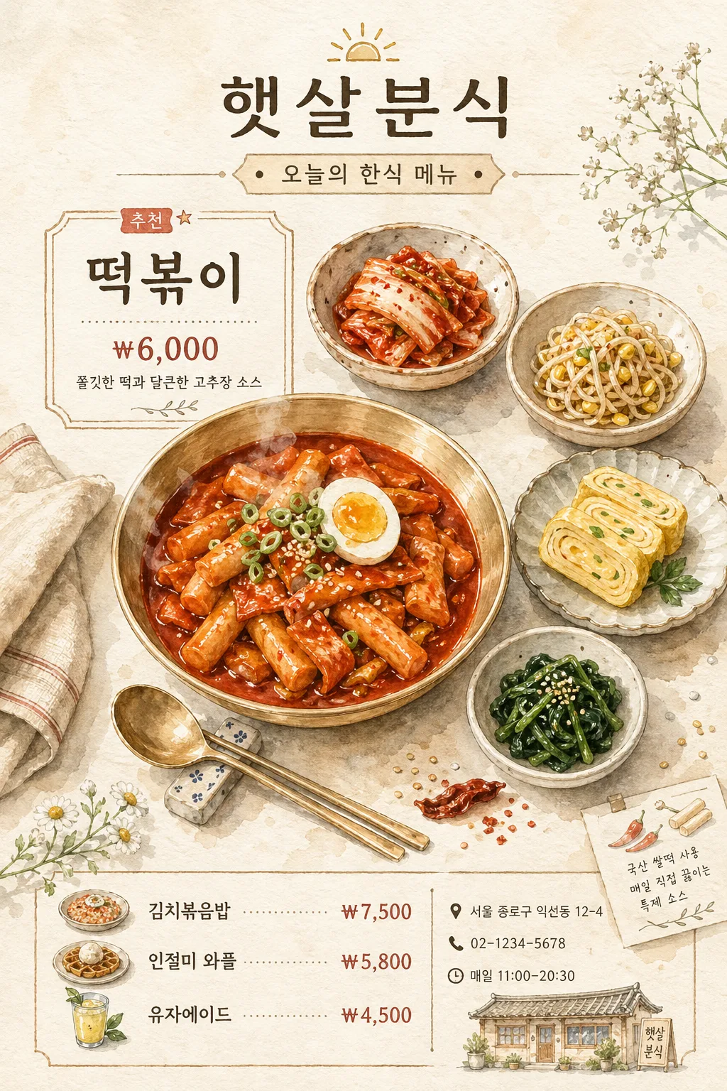
수채 음식 일러스트 (한식·디저트·카페 메뉴)
한식·디저트·카페 메뉴를 부드러운 수채 일러스트로. 음식 입력하면 메뉴북·블로그·인스타용 일러스트로 변환.
수채 음식 일러스트 (한식·디저트·카페 메뉴) summary
Copy this ChatGPT image prompt to create Comics/Illustration results. Its subject, background, style, and composition are organized for quick iteration.
Related keywords: 수채 음식 일러스트 (한식·디저트·카페 메뉴), 수채 음식 일러스트 (한식·디저트·카페 메뉴) 프롬프트, Comics/Illustration 프롬프트, Comics/Illustration AI 이미지 프롬프트, ChatGPT 이미지 프롬프트, AI 이미지 생성 프롬프트, AI 프롬프트, 이미지 프롬프트
How to use 수채 음식 일러스트 (한식·디저트·카페 메뉴)
Keep the prompt structure and swap the subject, background, palette, or composition to create new variations.
- Keep the main subject and adjust the palette and background for your brand, season, or channel.
- If the result feels busy, simplify the background and make the subject, composition, and lighting more specific.
- After copying, ask ChatGPT to adapt it for your platform, aspect ratio, or text requirements.
Original prompt
[Input]
- language: Korean
- output_size: 1024x1536

[Purpose]
Korean watercolor food illustration for a recipe book, cafe menu, and printed menu-board editorial page, featuring one main dish with side dishes, menu labels, store information, and small decorative food-note graphics.
Soft, refined culinary illustration that presents {일러스트 용도} with a balanced, ready-to-print vertical composition and realistic Korean menu details.

[Composition]
- Main subject: {메인 음식} placed slightly below center and sized to occupy about 42% of the frame width, with the side dishes arranged around it in a gentle semicircle.
- Supporting dishes: {곁들임 음식} positioned as complementary components, visually separated but close enough to read as one meal set.
- Tableware: {식기 재질} arranged asymmetrically so the main dish sits in the visual anchor area while the smaller dishes create rhythm around it.
- Background treatment: {배경 및 소품} on an off-white or pale beige watercolor paper field with visible paper grain, warm pigment stains, and light tabletop hints.
- Menu information: include a neat header with {매장명}, a category label {메뉴 카테고리}, the main label {한글 라벨 내용}, and a small pricelist area showing {추가 메뉴 목록}.
- Store details: place {주소}, {연락처}, and {운영 시간} near the lower portion like a real cafe or cookbook menu footer, separated by fine hand-drawn dividers.

[3. CORE STRUCTURE]
- Hero dish area (center-lower 42%): {메인 음식} rendered with realistic ingredient color variation, soft watercolor blooms, fine pen outlines, visible toppings, sauce highlights, steam hints, and edible texture.
- Side-dish cluster (around hero): {곁들임 음식} painted in smaller scale with distinct shapes and colors so each item remains identifiable in a balanced meal layout.
- Tableware layer: {식기 재질} shown with subtle reflective highlights, gentle contour shading, rim thickness, and believable contact shadows integrated naturally under and beside the food.
- Prop layer: {배경 및 소품} include a spoon, chopsticks, a folded napkin corner, tiny flower stems, sesame seeds, chili flakes, and a few watercolor ingredient sketches that support the food story.
- Text layer: {한글 라벨 내용} set as a crisp menu label panel, paired with {매장명}, {메뉴 카테고리}, {추가 메뉴 목록}, {주소}, {연락처}, and {운영 시간} in readable Korean typography.
- Divider and note layer: add thin hand-drawn rule lines, small dot separators, a tiny “추천” tag, and a short caption {짧은 메뉴 설명} to make the page feel like a realistic printed cafe menu.
- Overall finish: preserve visible paper texture, watercolor diffusion at the edges, controlled pigment pooling, delicate ink definition, and a warm artisanal hand-painted look.

[4. STYLE RULES]
- Typography: clean sans-serif Korean font such as Pretendard or Noto Sans KR for menu text, medium weight for prices, slightly larger header for {매장명}, precise spacing and sharp anti-aliased edges.
- Color palette: warm natural hues with off-white #F7F3EB, beige #E9DDC9, muted red #C95A4A, soft green #8FA57A, earthy brown #8B6A4A, gentle gold #B08A57, and ink gray #3F3A34.
- Menu graphics: use fine divider lines, small watercolor dots, tiny ingredient icons, and light beige label blocks; shadows may appear softly under plates and paper elements, 4px y-offset, 10px blur, 12% opacity.
- Layout hierarchy: store name at top, illustrated meal as the hero, price and menu notes near the food, additional menu items and store details toward the bottom with consistent alignment.

[5. VISUAL STYLE]
- Camera / lens: top-down editorial food composition, as if photographed with a 50mm lens on a high-resolution studio setup, then translated into watercolor illustration with controlled perspective.
- Lighting: soft diffused daylight from upper-left at about 45°, with very mild fill from the lower-right to maintain ingredient visibility and avoid harsh contrast.
- Color grade: warm cream, soft terracotta, muted herb green, and gentle beige with low saturation and natural pigment variation.

[6. MOOD]
{전체 분위기} — calm cookbook illustration with the charm of a small Korean cafe menu, hand-painted food notes, and a warm printed-paper editorial finish.

[7. CRITICAL]
- Korean text accuracy: the following strings must appear exactly as written: "햇살분식", "떡볶이", "₩6,000", "김치볶음밥 ₩7,500", "인절미 와플 ₩5,800", "유자에이드 ₩4,500".
- Store detail text must appear legibly: "서울 종로구 익선동 12-4", "02-1234-5678", "매일 11:00–20:30", "추천", "쫄깃한 떡과 달큰한 고추장 소스".
- The label, menu list, address, phone number, and operating hours must be fully readable, correctly spaced, and rendered without broken Korean characters.
- Food anatomy and tableware proportions must remain believable; no distorted bowls, no floating utensils, and no overlapping text over the main dish.

[8. 🚫 PROHIBITED]
- Fake official seals / certifications
- Broken Korean characters
- Celebrity composites or real-person likeness misuse
- Text that is blurry, misspelled, or partially cut off