인포그래픽/안내
사회 이슈 신문 일러스트
출산율·MZ·주거·고령화 등 사회 이슈를 한 장 일러스트로 시각화. 이슈 입력하면 신문/매거진 메인 일러스트 톤으로 변환. 자극적 표현 X.
사회 이슈 신문 일러스트 검색 요약
사회 이슈 신문 일러스트은 인포그래픽/안내 결과물을 만들 때 바로 복사해 활용할 수 있는 ChatGPT 이미지 프롬프트입니다. 주제, 배경, 스타일, 구도 조건을 함께 담아 빠르게 시안을 만들 수 있도록 구성했습니다.
관련 키워드: 사회 이슈 신문 일러스트, 사회 이슈 신문 일러스트 프롬프트, 인포그래픽/안내 프롬프트, 인포그래픽/안내 AI 이미지 프롬프트, ChatGPT 이미지 프롬프트, AI 이미지 생성 프롬프트, AI 프롬프트, 이미지 프롬프트
사회 이슈 신문 일러스트 활용 포인트
원본 구조를 유지하면서 피사체, 배경, 색감, 구도를 바꿔 다양한 시안으로 확장할 수 있습니다.
- 핵심 소재는 유지하고 브랜드, 계절, 채널 목적에 맞는 색감과 배경을 바꿔보세요.
- 결과가 산만하면 배경 요소를 줄이고 피사체, 구도, 조명 조건을 구체화하세요.
- 복사한 뒤 ChatGPT에서 플랫폼, 화면 비율, 텍스트 포함 여부를 추가로 요청할 수 있습니다.
프롬프트 원문
[Input]
- language: Korean
- output_size: 1536x1024

[Purpose]
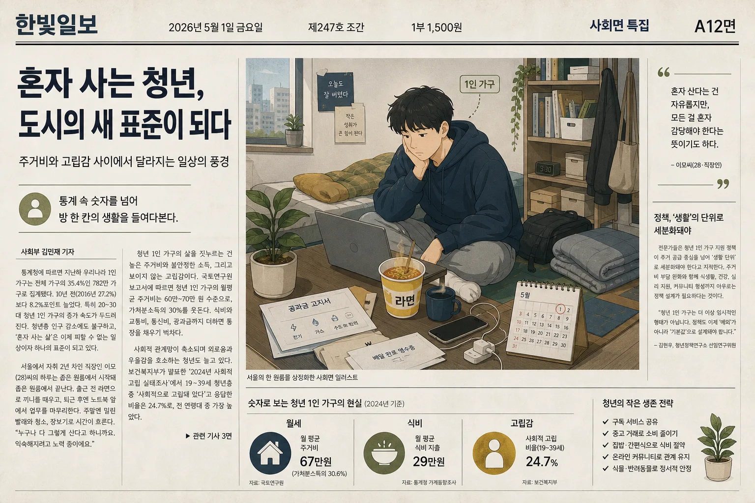
Korean newspaper and online media main headline illustration for a social issue article. Create one editorial newspaper feature layout that combines a symbolic illustration with realistic newspaper-page elements, suitable for a Sunday feature section or digital main article hero image.

[Composition]
- Main subject: simplified young adult figure as a universal representative, placed slightly off-center inside a compact studio-room vignette.
- Composition: the {이슈 주제} is communicated through {구체적 상황/장면} with {주요 시각 요소} arranged as everyday objects around the figure, forming a readable editorial scene.
- Newspaper layout: place the illustration as the dominant visual on a Korean newspaper page with a masthead, date, edition line, page number, captions, and multiple article columns wrapping around the artwork.
- Text hierarchy: use a large Korean headline area containing {메인헤드라인}, a smaller deck line containing {서브헤드라인}, and a short summary block containing {기사요약}.
- Label placement: render {한글 라벨 내용} as a small Korean annotation tag attached naturally to the room vignette, like an infographic callout.

[3. CORE STRUCTURE]
- Newspaper page base: a horizontal broadsheet-style editorial page with slightly warm off-white newsprint paper texture, faint fold line, narrow column guides, and realistic ink density variation.
- Masthead zone: top band includes {신문명}, {발행일}, {판정보}, {가격정보}, and a compact section label such as “사회면 특집”.
- Central figure: a simplified youth figure with clean silhouette, relaxed but tired posture, and subtle facial marks that suggest everyday pressure without resembling a real person.
- Symbolic objects: place a laptop, ramen bowl, potted plant, phone charger, folded blanket, utility bill envelope, small calendar, and delivery receipt around the figure to make the one-person household setting feel lived-in.
- Article structure: include 3–4 narrow Korean article columns with visible paragraph blocks, pull quote box, small subheading, byline {기자명}, and caption {캡션문구} below the illustration.
- Spatial cues: compress the living space into a tight, slightly asymmetrical studio-room arrangement, using shelves, floor mat, window edge, and wall outlet to reinforce small-room scale.
- Navigation details: add page marker {면번호}, small continuation note “관련 기사 3면”, and a tiny infographic strip showing “월세·식비·고립감” as three labeled indicators.

[4. STYLE RULES]
- Typography: use Pretendard or Noto Sans KR, newspaper-like hierarchy with bold headline, medium subhead, regular body columns, compact captions, and clearly legible Korean text.
- Color palette: {주요 색상 팔레트} with neutral support tones like off-white #F4F1EA, charcoal #2A2F36, faded ink gray #77736B, and muted paper beige #E7DDCC.
- Linework and paint: {일러스트 스타일}, clean editorial line art, soft flat color fills, slight gradient transitions, restrained shadow edges, and subtle halftone/newsprint grain.
- Newspaper realism: show column dividers, small paragraph rhythm, caption rule lines, masthead spacing, edition metadata, and slight ink misregistration for authentic printed-media texture.
- Border/shadow: subtle paper-edge softness and a light 8px blur shadow at 12% opacity to separate layered illustration objects from the newspaper background.

[5. VISUAL STYLE]
- Camera / lens: editorial illustration look, top-down-to-slightly-oblique composition akin a 35mm documentary layout translated into vector-like art.
- Lighting: diffused studio-style light from upper-left with a soft fill from the right, gentle contrast, natural paper shadows, and readable object silhouettes.
- Color grade: muted navy + mustard + olive + sage + light gray, with a slightly cool newsroom tint, gentle desaturation, and warm paper undertone.
- Rendering: hybrid newspaper illustration and editorial page design, crisp Korean typography, tactile paper surface, soft grain, clean icon-like objects, and believable printed-page proportions.

[6. MOOD]
Korean newspaper feature illustration — calm, socially observant, information-rich editorial mood with a lived-in everyday realism and a thoughtful Sunday-paper opener aesthetic.

[7. CRITICAL]
- Korean text accuracy: the following strings must appear exactly as written: "1인 가구", "{메인헤드라인}", "{서브헤드라인}", "{신문명}", "{발행일}", "{판정보}", "{면번호}"
- Render realistic Korean newspaper text elements including masthead, date, edition, byline, captions, page marker, and article columns; body paragraph text may be small but must look like coherent Korean newsprint.
- Human figure: simplified and universally readable, no identifiable real person, no political likeness.
- Composition intent: the issue should be conveyed symbolically through ordinary objects and newspaper context, with the compact room scene clearly supporting the social-issue headline.

[8. 🚫 PROHIBITED]
- Fake official seals / certifications
- Broken Korean characters
- Celebrity composites or identifiable real-person likenesses
- Party-specific propaganda imagery