社群/圖卡
Z세대 트렌드 요약 카드
Z세대·MZ·신조어·라이프 트렌드를 한 줄 요약 카드로. 트렌드 키워드 입력하면 인스타·블로그 공유용 카드 변환.
Z세대 트렌드 요약 카드摘要
這是用來製作社群/圖卡內容的 ChatGPT 圖像提示詞,已整理主題、背景、風格與構圖,方便快速調整。
相關關鍵字: Z세대 트렌드 요약 카드, Z세대 트렌드 요약 카드 프롬프트, 社群/圖卡 프롬프트, 社群/圖卡 AI 이미지 프롬프트, ChatGPT 이미지 프롬프트, AI 이미지 생성 프롬프트, AI 프롬프트, 이미지 프롬프트
Z세대 트렌드 요약 카드使用方式
保留原始結構並替換主體、背景、色彩或構圖,即可延伸出不同版本。
- 保留核心主體,並依品牌、季節或平台調整色彩與背景。
- 如果畫面太複雜,請減少背景元素並具體描述主體、構圖與光線。
- 複製後可要求 ChatGPT 配合平台、長寬比或文字需求調整。
提示詞原文
[Input]
- language: Korean
- output_size: 1024x1536

[Purpose]
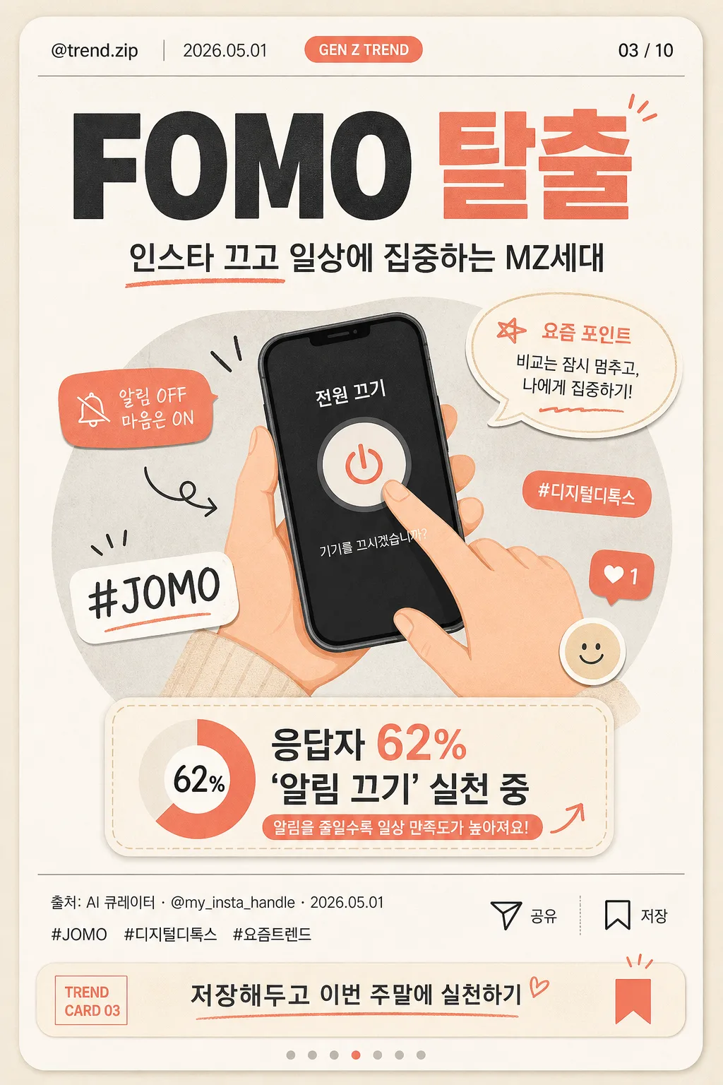
Korean Gen Z trend summary card, single-page editorial infographic for Instagram-style card news sharing.
A modern vertical card that explains one trend keyword with a memorable visual, micro-data, slide indicator, account metadata, and save-worthy CTA.

[Composition]
- Vertical social card composition based on {이미지 비율}, optimized for 1024x1536 display while retaining the feel of a 1080x1350 Instagram card.
- Top utility strip occupies about 8–10% of the frame: include {계정 핸들}, {날짜 라벨}, {카테고리 태그}, and a small page marker {페이지 표시}.
- Main header occupies about 18% of the frame, with {트렌드 키워드} set as the largest typographic element and treated like a strong Gen Z trend headline.
- Subtitle sits directly below the header in a compact editorial line block, using {한 줄 설명} with readable spacing and a warm social-card tone.
- Central visual zone takes 42–48% of the frame and features an editorial illustration based on {시각화 내용}, supported by sticker-like labels, tiny arrows, reaction bubbles, and a hashtag accent.
- Data emphasis area appears near the central visual as a rounded callout containing {미니 데이터}, plus a small label that reinforces the key insight.
- Bottom information zone occupies 14–18% of the frame: include {푸터 정보}, {해시태그}, tiny save/share micro icons, and the CTA text {CTA 문구}.
- Background uses {색상 팔레트} with subtle paper grain, soft geometric shapes, thin dividers, and card-news editorial texture that fits {디자인 스타일}.

[3. CORE STRUCTURE]
1. Utility header: place {계정 핸들} at the upper-left, {날짜 라벨} near it, {카테고리 태그} as a small rounded pill, and {페이지 표시} at the upper-right so the card feels like part of a swipeable card-news series.
2. Headline block: place {트렌드 키워드} in oversized bold Korean type, centered or slightly left-aligned, with {한 줄 설명} directly beneath it in a shorter paragraph width.
3. Main visual block: render {시각화 내용} as a friendly editorial infographic illustration in the center, adding 2–3 natural card-news accents such as a coral sticker, a small arrow, a speech bubble reading “요즘 포인트”, and a tiny hashtag badge.
4. Data callout: add a rounded rectangle or ticket-shaped label near the illustration containing {미니 데이터}; make it visually prominent enough to be saved or shared.
5. Footer and CTA: place {푸터 정보} along the lower-left or lower-center, add {해시태그}, then place {CTA 문구} near the bottom with small save/share/bookmark micro icons.
6. Slide identity: integrate {슬라이드 번호} subtly near the footer or side edge, while {페이지 표시} remains visible in the top utility strip.
7. Layout integrity: maintain crisp hierarchy, readable Korean spacing, consistent baseline alignment, and clear separation between headline, illustration, callout, and footer metadata.

[4. STYLE RULES]
- Typography: use Pretendard or Noto Sans KR for all Korean text; headline weight 800–900 at large display size, subtitle weight 500–600, metadata weight 500, footer weight 400–500.
- Color palette: use {색상 팔레트} as the base, interpreted as beige #EDE3D1, soft gray #D8D8D8, coral #F38B7C, plus off-white #FAF7F2 and deep charcoal #2B2B2B for readability.
- Border/shadow: rounded card container with a soft editorial drop shadow, 4px y-offset, 14px blur, 12% opacity; use thin muted-gray dividers and small coral highlight strokes.
- Graphic treatment: flat editorial illustration with smooth curves, friendly icon language, tactile paper-grain texture, sticker tags, tiny UI-like icons, and restrained accent shapes.
- Social-card details: include micro elements common to Korean Instagram card news, such as a bookmark icon, share arrow, carousel dot indicator, small handle line, and hashtag-style typography.

[5. VISUAL STYLE]
- Camera / lens: top-down flat lay editorial framing, equivalent to a 35mm full-frame look with crisp composition and minimal distortion.
- Lighting: soft diffused studio light from upper-left at about 45°, with a very faint fill from lower-right to keep the card evenly legible.
- Color grade: warm beige and coral accent palette with soft gray neutrals, low contrast, clean social-media infographic finish.
- Surface detail: subtle matte paper texture, faint printed ink feel, and soft contact shadows around sticker-like graphics and callout cards.

[6. MOOD]
Kinfolk-meets-Carrot Market editorial card — calm, smart, save-worthy, and realistic as a Korean Gen Z trend briefing on social media.

[7. CRITICAL]
- Korean text accuracy: the following strings must appear exactly as rendered text where placed:
  - {트렌드 키워드}
  - {한 줄 설명}
  - {계정 핸들}
  - {날짜 라벨}
  - {카테고리 태그}
  - {페이지 표시}
  - {슬라이드 번호}
  - {미니 데이터}
  - {해시태그}
  - {CTA 문구}
  - {푸터 정보}
- Keep all Korean typography clean and correctly spaced; no broken Hangul, no garbled punctuation, no mixed-up line breaks.
- The central illustration must clearly communicate the trend as a card-news infographic, with social UI details that make it feel ready to post.
- Render the save/share/bookmark micro icons as tiny interface symbols, not as large decorative objects.

[8. 🚫 PROHIBITED]
- Fake official seals / certifications
- Broken Korean characters or garbled Hangul
- Celebrity composites or recognizable real-person likenesses unless explicitly requested