인포그래픽/안내
사업자등록증 디지털 카드
자기 사업자 정보 → 깔끔 디지털 카드 변환.
사업자등록증 디지털 카드 검색 요약
사업자등록증 디지털 카드은 인포그래픽/안내 결과물을 만들 때 바로 복사해 활용할 수 있는 ChatGPT 이미지 프롬프트입니다. 주제, 배경, 스타일, 구도 조건을 함께 담아 빠르게 시안을 만들 수 있도록 구성했습니다.
관련 키워드: 사업자등록증 디지털 카드, 사업자등록증 디지털 카드 프롬프트, 인포그래픽/안내 프롬프트, 인포그래픽/안내 AI 이미지 프롬프트, ChatGPT 이미지 프롬프트, AI 이미지 생성 프롬프트, AI 프롬프트, 이미지 프롬프트
사업자등록증 디지털 카드 활용 포인트
원본 구조를 유지하면서 피사체, 배경, 색감, 구도를 바꿔 다양한 시안으로 확장할 수 있습니다.
- 핵심 소재는 유지하고 브랜드, 계절, 채널 목적에 맞는 색감과 배경을 바꿔보세요.
- 결과가 산만하면 배경 요소를 줄이고 피사체, 구도, 조명 조건을 구체화하세요.
- 복사한 뒤 ChatGPT에서 플랫폼, 화면 비율, 텍스트 포함 여부를 추가로 요청할 수 있습니다.
프롬프트 원문
[Input]
- reference_image: {참고 이미지}
- language: Korean
- output_size: 1024x1536

[Purpose]
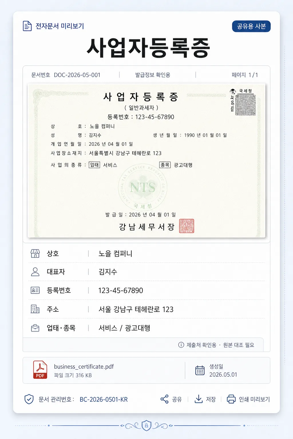
Korean business registration certificate digital card for chat sharing, email attachments, mobile preview, and small-screen verification workflows.
Create a realistic, content-rich portrait digital document card that feels like a polished Korean corporate onboarding / fintech document preview, while remaining clearly a shareable business-info card rather than an official government certificate reproduction.

[Composition]
- Subject placement: the certificate-style content block occupies the central portrait canvas, with a prominent title area at the top, a realistic document-preview panel beneath it, and clearly organized business information rows stacked in the lower half.
- Background treatment: use a refined off-white to pale cool-gray workspace background with subtle paper grain, faint UI-card texture, soft ambient shadow, and a few understated digital-document details such as attachment labels, page markers, and thin divider rules.
- Spacing, framing direction: keep the portrait reading flow implied by {비율}, with a centered vertical document card, realistic margins, and enough surrounding context to feel like a mobile-ready shared document preview.
- Use {참고 이미지} as the factual reference for the document content, then rebuild it as a crisp digital card with clean alignment, realistic layered paper depth, and high readability.
- Add small supporting text elements around the main block, such as “공유용 사본”, “전자문서 미리보기”, “생성일 2026.05.01”, “DOC-2026-05-001”, and “페이지 1/1” to make the card feel complete and used in a real workflow.

[3. CORE STRUCTURE]
1. Header area (top 18%): place the title "사업자등록증" centered in bold black text, with compact letter spacing and a strong document-heading scale. Add a small upper label above or beside it reading "전자문서 미리보기" and a subtle status chip reading "공유용 사본".
2. Main certificate block (upper-mid 26%): frame the reference content from {참고 이미지} as a front-facing document preview panel with slight paper depth, crisp edges, soft shadow, and realistic scanned-document feel. Include a thin top metadata bar with short Korean labels such as "문서번호 DOC-2026-05-001", "발급정보 확인용", and "페이지 1/1". The block should look structured and credible, not empty.
3. Information area (mid-lower 38%): stack the fields in a single-column list inside the centered block, using left-aligned labels and values for quick scanning. Use subtle gray dividers, small label captions, and consistent row spacing.
   - Line 1: "상호: {상호}" in regular black text.
   - Line 2: "대표자: {대표자}" in regular black text.
   - Line 3: "등록번호: {등록번호}" in regular black text.
   - Line 4: "주소: {주소}" in regular black text.
   - Line 5: "업태·종목: {업태·종목}" in regular black text.
   - Add a small side note within the card: "제출처 확인용 · 원본 대조 필요" in light gray, clearly secondary and not official-looking.
4. Footer area (bottom 18%): include realistic digital-card footer details: a small file attachment strip reading "business_certificate.pdf", a date label "생성일 2026.05.01", a compact verification-code style text line "문서 관리번호: BC-2026-0501-KR", and tiny interface micro-icons for share / save / print preview. Add tasteful certificate-style line ornaments or corner rules that do not resemble official seals.

[4. STYLE RULES]
- Typography: Noto Sans KR for all text; header bold 58px equivalent, body regular 30px equivalent, metadata 18–22px equivalent, with sharp anti-aliased rendering and consistent baseline alignment.
- Color palette: pure white #FFFFFF for the main card, black #000000 text, deep charcoal #111827 for headings, cool gray #E5E7EB and #9CA3AF for dividers and metadata, pale blue-gray #F3F6FA for the outer background, and a restrained navy accent #1E3A8A for small chips or labels.
- Border/shadow: layered digital document card with a fine 1px cool-gray border, subtle inner dividers, and a soft drop shadow under the main content block, 0px x-offset, 8px y-offset, 24px blur, 12% opacity.
- Add realistic document UI details: thin ruled lines, small attachment tag, light metadata chips, page indicator, and gentle paper texture while keeping the business information visually dominant.

[5. VISUAL STYLE]
- Camera / lens: straight-on flat document capture look, equivalent to a 50mm normal lens at f/8 with zero distortion.
- Lighting: even diffused overhead studio light with soft natural shadow around the raised card edges, optimized for document readability and clean edges.
- Color grade: neutral cool-white document grade with true blacks, crisp whites, soft gray UI depth, and a professional Korean fintech-document presentation.
- Rendering detail: high-resolution realistic digital print texture, crisp Korean typography, subtle paper fiber, gentle shadow falloff, and clean vector-like dividers.

[6. MOOD]
Professional Korean business-document digital card — a credible, polished, mobile-friendly certificate preview inside a corporate onboarding, accounting, or fintech document-sharing interface.

[7. CRITICAL]
- Korean text accuracy: "사업자등록증", "상호", "대표자", "등록번호", "주소", "업태·종목" must appear exactly as written.
- The information fields must remain fully legible, consistently aligned, and clearly separated by dividers and spacing that preserves document readability.
- Include realistic Korean microcopy such as "전자문서 미리보기", "공유용 사본", "생성일 2026.05.01", "문서번호 DOC-2026-05-001", "페이지 1/1", and "business_certificate.pdf" where appropriate.
- Keep the layout portrait-oriented and document-like, with the added UI details supporting the form structure rather than overwhelming it.
- Every field label must be rendered in correct Korean with no broken characters, spacing errors, or line-wrap corruption.

[8. 🚫 PROHIBITED]
- Fake official seals / certifications or government authentication marks
- Broken Korean characters