Infographics/Guides
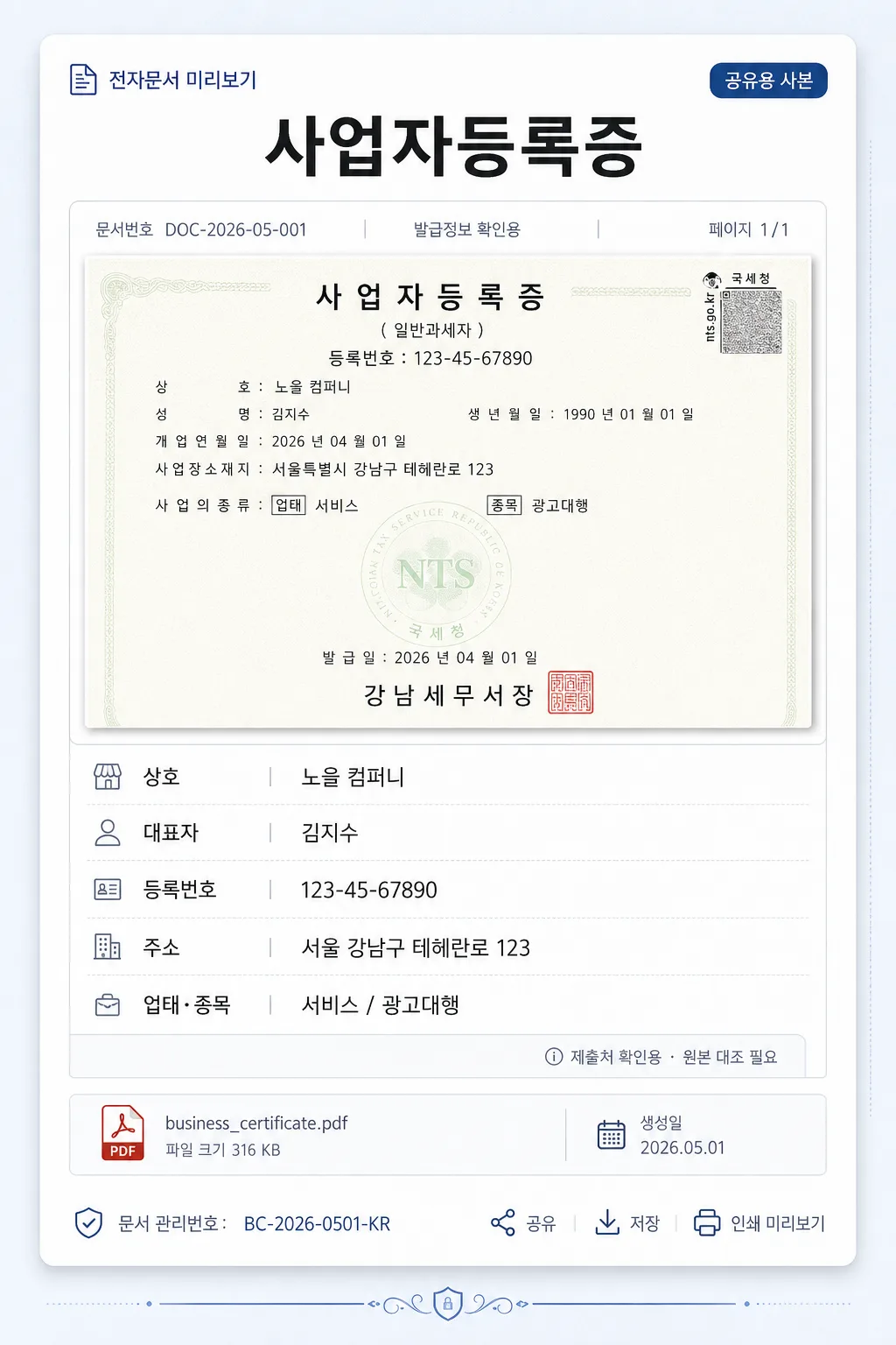
사업자등록증 디지털 카드
자기 사업자 정보 → 깔끔 디지털 카드 변환.
사업자등록증 디지털 카드 summary
Copy this ChatGPT image prompt to create Infographics/Guides results. Its subject, background, style, and composition are organized for quick iteration.
Related keywords: 사업자등록증 디지털 카드, 사업자등록증 디지털 카드 프롬프트, Infographics/Guides 프롬프트, Infographics/Guides AI 이미지 프롬프트, ChatGPT 이미지 프롬프트, AI 이미지 생성 프롬프트, AI 프롬프트, 이미지 프롬프트
How to use 사업자등록증 디지털 카드
Keep the prompt structure and swap the subject, background, palette, or composition to create new variations.
- Keep the main subject and adjust the palette and background for your brand, season, or channel.
- If the result feels busy, simplify the background and make the subject, composition, and lighting more specific.
- After copying, ask ChatGPT to adapt it for your platform, aspect ratio, or text requirements.
Original prompt
[Input]
- reference_image: {참고 이미지}
- language: Korean
- output_size: 1024x1536

[Purpose]
Korean business registration certificate digital card for chat sharing, email attachments, mobile preview, and small-screen verification workflows.
Create a realistic, content-rich portrait digital document card that feels like a polished Korean corporate onboarding / fintech document preview, while remaining clearly a shareable business-info card rather than an official government certificate reproduction.

[Composition]
- Subject placement: the certificate-style content block occupies the central portrait canvas, with a prominent title area at the top, a realistic document-preview panel beneath it, and clearly organized business information rows stacked in the lower half.
- Background treatment: use a refined off-white to pale cool-gray workspace background with subtle paper grain, faint UI-card texture, soft ambient shadow, and a few understated digital-document details such as attachment labels, page markers, and thin divider rules.
- Spacing, framing direction: keep the portrait reading flow implied by {비율}, with a centered vertical document card, realistic margins, and enough surrounding context to feel like a mobile-ready shared document preview.
- Use {참고 이미지} as the factual reference for the document content, then rebuild it as a crisp digital card with clean alignment, realistic layered paper depth, and high readability.
- Add small supporting text elements around the main block, such as “공유용 사본”, “전자문서 미리보기”, “생성일 2026.05.01”, “DOC-2026-05-001”, and “페이지 1/1” to make the card feel complete and used in a real workflow.

[3. CORE STRUCTURE]
1. Header area (top 18%): place the title "사업자등록증" centered in bold black text, with compact letter spacing and a strong document-heading scale. Add a small upper label above or beside it reading "전자문서 미리보기" and a subtle status chip reading "공유용 사본".
2. Main certificate block (upper-mid 26%): frame the reference content from {참고 이미지} as a front-facing document preview panel with slight paper depth, crisp edges, soft shadow, and realistic scanned-document feel. Include a thin top metadata bar with short Korean labels such as "문서번호 DOC-2026-05-001", "발급정보 확인용", and "페이지 1/1". The block should look structured and credible, not empty.
3. Information area (mid-lower 38%): stack the fields in a single-column list inside the centered block, using left-aligned labels and values for quick scanning. Use subtle gray dividers, small label captions, and consistent row spacing.
   - Line 1: "상호: {상호}" in regular black text.
   - Line 2: "대표자: {대표자}" in regular black text.
   - Line 3: "등록번호: {등록번호}" in regular black text.
   - Line 4: "주소: {주소}" in regular black text.
   - Line 5: "업태·종목: {업태·종목}" in regular black text.
   - Add a small side note within the card: "제출처 확인용 · 원본 대조 필요" in light gray, clearly secondary and not official-looking.
4. Footer area (bottom 18%): include realistic digital-card footer details: a small file attachment strip reading "business_certificate.pdf", a date label "생성일 2026.05.01", a compact verification-code style text line "문서 관리번호: BC-2026-0501-KR", and tiny interface micro-icons for share / save / print preview. Add tasteful certificate-style line ornaments or corner rules that do not resemble official seals.

[4. STYLE RULES]
- Typography: Noto Sans KR for all text; header bold 58px equivalent, body regular 30px equivalent, metadata 18–22px equivalent, with sharp anti-aliased rendering and consistent baseline alignment.
- Color palette: pure white #FFFFFF for the main card, black #000000 text, deep charcoal #111827 for headings, cool gray #E5E7EB and #9CA3AF for dividers and metadata, pale blue-gray #F3F6FA for the outer background, and a restrained navy accent #1E3A8A for small chips or labels.
- Border/shadow: layered digital document card with a fine 1px cool-gray border, subtle inner dividers, and a soft drop shadow under the main content block, 0px x-offset, 8px y-offset, 24px blur, 12% opacity.
- Add realistic document UI details: thin ruled lines, small attachment tag, light metadata chips, page indicator, and gentle paper texture while keeping the business information visually dominant.

[5. VISUAL STYLE]
- Camera / lens: straight-on flat document capture look, equivalent to a 50mm normal lens at f/8 with zero distortion.
- Lighting: even diffused overhead studio light with soft natural shadow around the raised card edges, optimized for document readability and clean edges.
- Color grade: neutral cool-white document grade with true blacks, crisp whites, soft gray UI depth, and a professional Korean fintech-document presentation.
- Rendering detail: high-resolution realistic digital print texture, crisp Korean typography, subtle paper fiber, gentle shadow falloff, and clean vector-like dividers.

[6. MOOD]
Professional Korean business-document digital card — a credible, polished, mobile-friendly certificate preview inside a corporate onboarding, accounting, or fintech document-sharing interface.

[7. CRITICAL]
- Korean text accuracy: "사업자등록증", "상호", "대표자", "등록번호", "주소", "업태·종목" must appear exactly as written.
- The information fields must remain fully legible, consistently aligned, and clearly separated by dividers and spacing that preserves document readability.
- Include realistic Korean microcopy such as "전자문서 미리보기", "공유용 사본", "생성일 2026.05.01", "문서번호 DOC-2026-05-001", "페이지 1/1", and "business_certificate.pdf" where appropriate.
- Keep the layout portrait-oriented and document-like, with the added UI details supporting the form structure rather than overwhelming it.
- Every field label must be rendered in correct Korean with no broken characters, spacing errors, or line-wrap corruption.

[8. 🚫 PROHIBITED]
- Fake official seals / certifications or government authentication marks
- Broken Korean characters