Social/Card News
직장인 부업 5가지 (블로그·강의·중고)
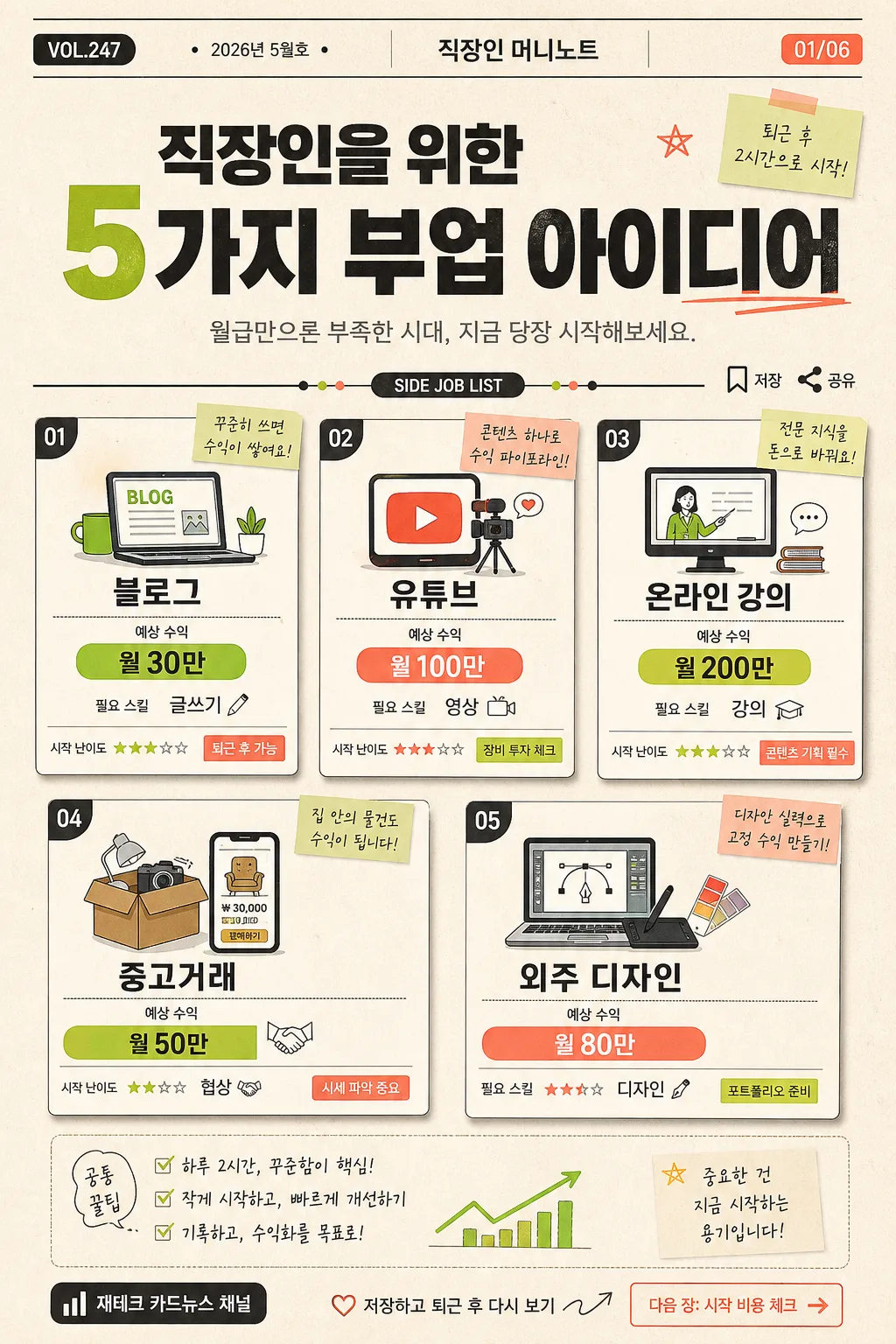
직장인 부업 5가지 인포 카드.
직장인 부업 5가지 (블로그·강의·중고) summary
Copy this ChatGPT image prompt to create Social/Card News results. Its subject, background, style, and composition are organized for quick iteration.
Related keywords: 직장인 부업 5가지 (블로그·강의·중고), 직장인 부업 5가지 (블로그·강의·중고) 프롬프트, Social/Card News 프롬프트, Social/Card News AI 이미지 프롬프트, ChatGPT 이미지 프롬프트, AI 이미지 생성 프롬프트, AI 프롬프트, 이미지 프롬프트
How to use 직장인 부업 5가지 (블로그·강의·중고)
Keep the prompt structure and swap the subject, background, palette, or composition to create new variations.
- Keep the main subject and adjust the palette and background for your brand, season, or channel.
- If the result feels busy, simplify the background and make the subject, composition, and lighting more specific.
- After copying, ask ChatGPT to adapt it for your platform, aspect ratio, or text requirements.
Original prompt
[Input]
- language: Korean
- output_size: 1024x1536

[Purpose]
Korean finance-card-news poster introducing 5 side jobs for office workers, designed as a vertical carousel cover page with a 5-box grid, editorial metadata, realistic print texture, and compact visual annotations.
Social-media-friendly finance editorial layout for quick reading and saving, focused on side-income ideas, estimated earnings, required skills, and practical after-work action cues.

[Composition]
- Main subject: a structured 5-panel grid occupying about 72–78% of the canvas height, with each box clearly separated and styled like a printed card-news page.
- Header zone: top 16% contains the title, publisher tag, issue label, date label, and slide indicator, arranged with strong hierarchy and centered editorial balance.
- Add realistic card-news details: small label chips reading "VOL.247", "2026년 5월호", "01/06", a tiny bookmark/share icon row, and a short note such as "퇴근 후 2시간으로 시작".
- Background treatment: warm cream paper-like base with subtle grain, faint ledger lines, small sticky-note shapes, charcoal text blocks, and accent pops in lime green and coral.
- Use {5가지 부업}, {각자 수익 예상}, {필요 기술}, {비주얼}, {컬러}, {발행처}, {비율} placeholders exactly where variable content is needed.
- Keep the layout highly readable while allowing useful editorial micro-elements such as page markers, divider labels, small captions, and CTA badges.

[3. CORE STRUCTURE]
1) Header area (top 16%): set the main title in large bold Korean type, with a short subtitle beneath in smaller weight; include "VOL.247", "2026년 5월호", "직장인 머니노트", and page indicator "01/06" as small editorial labels.
2) Grid area (middle 68%): arrange 5 equal boxes in a tidy card-news grid, each box containing one side job, one earnings line, one skill line, and a tiny practical cue chip.
3) Per-box structure: each box should show a recognizable icon at the upper-left, the side-job label as the primary line, estimated monthly income as a colored badge, required skill as a compact bottom line, plus a tiny caption such as "시작 난이도", "퇴근 후 가능", or "초기비용 체크".
4) Visual treatment: use editorial flat icons with small realistic print imperfections, thin charcoal dividers, subtle paper shadow, mini highlight stickers, and consistent spacing so every box reads as part of the same finance-card system.
5) Footer area (bottom 8%): place {발행처} as a small but legible channel mark, add "저장하고 퇴근 후 다시 보기", "다음 장: 시작 비용 체크", and tiny save/share micro icons aligned with the overall layout.
6) Content mapping: populate the 5 boxes with {5가지 부업}, show {각자 수익 예상} as the income row, and {필요 기술} as the skill row, all rendered in Korean with exact spacing.
7) Ratio and visual reference: apply {비율} for the vertical card-news format, reflect {비주얼} in the icon/illustration language, and use {컬러} as the main accent palette while preserving cream, charcoal, lime green, and coral harmony.

[4. STYLE RULES]
- Typography: Pretendard or Noto Sans KR for the main title in ExtraBold, secondary text in Medium and Regular; title size should dominate, with compact but readable box text and clear Korean line breaks.
- Color palette: cream #F4EEDF, charcoal #2B2B2B, lime green #B8D94A, coral #FF6F61; use accent colors for icons, badges, page indicators, highlight underlines, and small CTA chips.
- Border/shadow: 1px charcoal outline around each card, soft shadow 4px y-offset, 10px blur, 12% opacity, with slight printed-paper depth and gentle edge texture.
- Add editorial details: tiny section label "SIDE JOB LIST", small chart-like dots, divider tabs, bookmark/share icons, and handwritten-style micro captions while keeping all essential Korean text crisp.
- Korean text should be sharp, evenly aligned, and natural, with no awkward wrapping inside the small cards.

[5. VISUAL STYLE]
- Camera / lens: top-down photographed printed card-news sheet, Canon EOS R5 with RF 50mm f/2.8 Macro, orthographic editorial composition with slight paper curl and realistic ink-on-paper texture.
- Lighting: soft even studio illumination with gentle natural paper shadows, preserving uniform readability across the entire poster.
- Color grade: warm cream base with restrained high-contrast charcoal text and bright lime/coral accents, similar to a contemporary Korean fintech carousel saved from a social feed and printed as an editorial reference card.
- Surface realism: subtle paper grain, faint halftone ink texture, tiny registration-like marks, and tactile sticker labels that make the infographic feel like a real designed finance card rather than a sterile mockup.

[6. MOOD]
Practical, energetic Korean finance editorial — similar to a well-produced 매거진 카드뉴스 page for office workers planning realistic after-work income, with a modern startup-finance aesthetic and useful save-worthy details.

[7. CRITICAL]
- Korean text accuracy: 반드시 다음 문자열이 정확히 보여야 함: "직장인 부업 5가지", "블로그 / 유튜브 / 온라인 강의 / 중고거래 / 외주 디자인", "월 30만 / 월 100만 / 월 200만 / 월 50만 / 월 80만", "글쓰기 / 영상 / 강의 / 협상 / 디자인", "재테크 카드뉴스 채널".
- Also render short Korean editorial elements clearly: "VOL.247", "2026년 5월호", "01/06", "퇴근 후 2시간으로 시작", "저장하고 퇴근 후 다시 보기", "다음 장: 시작 비용 체크".
- The 5 boxes must remain evenly spaced and consistently styled, with each income badge and skill chip aligned to its corresponding side job.
- Keep all icon shapes aligned with their corresponding text and make every Korean string sharp enough to read at social-media thumbnail size.

[8. 🚫 PROHIBITED]
- Fake official seals / certifications
- Broken Korean characters