廣告/海報
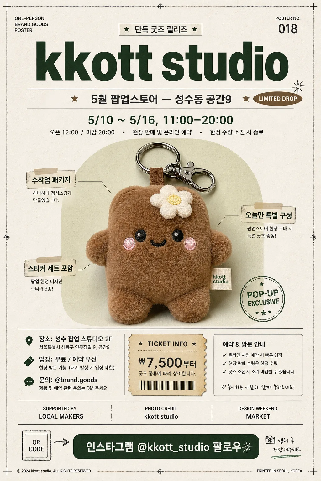
1인 브랜드 굿즈 포스터
자기 굿즈 사진 → 팝업스토어 포스터.
1인 브랜드 굿즈 포스터摘要
這是用來製作廣告/海報內容的 ChatGPT 圖像提示詞,已整理主題、背景、風格與構圖,方便快速調整。
相關關鍵字: 1인 브랜드 굿즈 포스터, 1인 브랜드 굿즈 포스터 프롬프트, 廣告/海報 프롬프트, 廣告/海報 AI 이미지 프롬프트, ChatGPT 이미지 프롬프트, AI 이미지 생성 프롬프트, AI 프롬프트, 이미지 프롬프트
1인 브랜드 굿즈 포스터使用方式
保留原始結構並替換主體、背景、色彩或構圖,即可延伸出不同版本。
- 保留核心主體,並依品牌、季節或平台調整色彩與背景。
- 如果畫面太複雜,請減少背景元素並具體描述主體、構圖與光線。
- 複製後可要求 ChatGPT 配合平台、長寬比或文字需求調整。
提示詞原文
[Input]
- reference_image: {참고 이미지}
- language: Korean
- output_size: 1024x1536

[Purpose]
One-person brand goods promotional poster, designed as a vertical event marketing key visual for social sharing, popup-store promotion, and printed A2-style retail display.
Realistic editorial product poster with a centered hero goods image, bold Korean typography, event information, ticket-style details, sponsor/credit area, and tactile printed-poster atmosphere.

[Composition]
- Subject placement: {참고 이미지} is centered as the hero object and occupies about 55–60% of the frame height, large enough to feel collectible and desirable, with crisp edges and a realistic contact shadow.
- Background treatment: warm off-white or soft neutral poster paper with subtle paper grain, faint ink texture, gentle studio falloff, and small graphic accents that support the goods theme without overpowering the hero image.
- Spacing and framing: strong vertical poster composition matching {비율}, with a confident top brand area, central product focus, and a detailed bottom information band; use clean alignment, but allow realistic retail-poster elements such as thin rules, small stickers, corner marks, and label blocks.
- Placeholder use: keep {브랜드 이름}, {이벤트}, {일자}, and {CTA} clearly legible as distinct text blocks with consistent hierarchy, supported by additional Korean event details such as venue, ticket info, limited-quantity notes, and organizer credits.
- Poster realism: include subtle print registration marks, a small serial code such as “POSTER NO. 018”, a tiny QR-code placeholder box, and a sponsor/partner strip near the bottom using text-only fictional labels.

[3. CORE STRUCTURE]
1. Hero area (mid 55–60%): {참고 이미지} cleanly presented in the center, scaled large enough to feel like the main selling point, with product-photo clarity, realistic shadow, and a lightly printed backdrop shape such as a soft rectangle, circle, or translucent color field behind it.
2. Header text (top 10–12%): "{브랜드 이름}" placed at the top center in bold Korean typography, with tight letter spacing and strong visual weight to establish brand identity immediately; add a small English/Korean kicker above it such as “ONE-PERSON BRAND GOODS POSTER” and “단독 굿즈 릴리즈”.
3. Event detail block (upper-middle): "{이벤트}" placed directly under the header in smaller but still readable type, aligned to the center and separated with a thin divider line, small star/dot icons, or a capsule label reading “LIMITED DROP”.
4. Date and schedule block (middle-lower): "{일자}" set below the event line with a slightly lighter weight; include supporting Korean schedule text such as “오픈 12:00 / 마감 20:00”, “현장 판매 및 온라인 예약”, and “한정 수량 소진 시 종료”.
5. Product annotation layer: add two or three small callout labels around the hero image with short Korean copy like “수작업 패키지”, “스티커 세트 포함”, “오늘만 특별 구성”, connected by fine lines or small tags.
6. Venue and ticket information band: below the hero image, include a compact information block reading “장소: 성수 팝업 스튜디오 2F”, “입장: 무료 / 예약 우선”, “문의: @brand.goods”, plus a small ticket-stub graphic with “TICKET INFO” and “₩7,500부터”.
7. Sponsor / credit area: near the lower edge, add a modest sponsor strip with fictional text-only labels such as “SUPPORTED BY LOCAL MAKERS”, “PHOTO CREDIT: {브랜드 이름}”, and “DESIGN WEEKEND MARKET”, separated by small dividers.
8. CTA block (bottom 12–15%): "{CTA}" placed near the bottom center in a noticeable, high-contrast font, framed by a button-like shape, underline, or sticker label; include a tiny QR-code placeholder square and microcopy “캡처 후 저장해두세요”.

[4. STYLE RULES]
- Typography: Pretendard Bold for the brand header, Pretendard SemiBold or Noto Sans KR Medium for event/date lines, Noto Sans KR Regular for supporting text; mix large condensed headline type with small editorial captions, ticket labels, and numbered details for a real promotional poster feel.
- Color palette: clean neutrals such as #FFFFFF, #111111, #F5F5F2, with one or two accent colors sampled from {참고 이미지} if present; use the accent for labels, divider lines, stickers, and the CTA button while preserving strong contrast.
- Graphic system: use thin rule lines, small dot markers, rounded label boxes, sticker-like badges, ticket perforation marks, and a subtle poster frame or crop marks to make the design feel produced and printed.
- Shadow and depth: use a soft drop shadow under the product image, about 4px y-offset, 12px blur, 15% opacity, plus a faint paper texture and very subtle ink grain so the poster looks tactile rather than flat.
- Information density: include realistic event-poster details while keeping the hierarchy clear: brand first, product second, event/date third, CTA fourth, with all added microcopy kept short and readable.

[5. VISUAL STYLE]
- Camera / lens: Canon EOS R5 with a 50mm f/1.8 lens look, product-photo clarity, straight-on framing, and minimal perspective distortion.
- Lighting: softbox key light from the upper-left at about 45°, with gentle fill from the right to preserve detail and keep the product evenly lit; add a slight natural paper sheen and realistic shadow transitions.
- Color grade: natural neutral whites with slight warmth, restrained contrast, clean commercial finish, and subtle printed ink texture suitable for an indie goods popup poster.
- Finish: high-resolution editorial poster render, crisp Korean typography, realistic printed-paper surface, refined retail display energy, and social-media-ready vertical framing.

[6. MOOD]
Contemporary indie-brand product poster — like a curated popup-market announcement, small-batch goods launch, and design-week retail poster with warm handmade credibility and polished editorial styling.

[7. CRITICAL]
- Korean text accuracy: the rendered image must show these strings exactly as written: "{브랜드 이름}", "{이벤트}", "{일자}", "{CTA}".
- Additional Korean poster text should be crisp and readable, using short realistic phrases such as “단독 굿즈 릴리즈”, “한정 수량”, “현장 판매 및 온라인 예약”, “장소: 성수 팝업 스튜디오 2F”, “입장 무료”, “캡처 후 저장해두세요”.
- Layout invariant: keep the hero product centered and dominant, with brand/event/date/CTA stacked vertically and supported by event details, ticket info, sponsor strip, and decorative graphic accents.
- Readability: all Korean text must be crisp, correctly spaced, and free of broken characters or garbled glyphs.

[8. 🚫 PROHIBITED]
- Fake official seals / certifications
- Broken Korean characters