Social/Card News
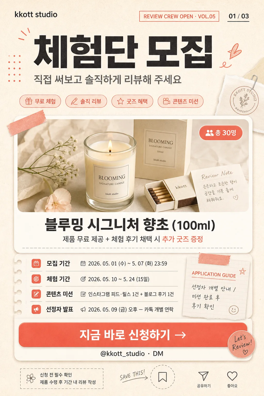
체험단 모집 카드
제품 체험단 모집 기간·혜택·참여 방법을 간단히 보여주는 SNS 모집 카드.
체험단 모집 카드 summary
Copy this ChatGPT image prompt to create Social/Card News results. Its subject, background, style, and composition are organized for quick iteration.
Related keywords: 체험단 모집 카드, 체험단 모집 카드 프롬프트, Social/Card News 프롬프트, Social/Card News AI 이미지 프롬프트, ChatGPT 이미지 프롬프트, AI 이미지 생성 프롬프트, AI 프롬프트, 이미지 프롬프트
How to use 체험단 모집 카드
Keep the prompt structure and swap the subject, background, palette, or composition to create new variations.
- Keep the main subject and adjust the palette and background for your brand, season, or channel.
- If the result feels busy, simplify the background and make the subject, composition, and lighting more specific.
- After copying, ask ChatGPT to adapt it for your platform, aspect ratio, or text requirements.
Original prompt
[Input]
- language: Korean
- output_size: 1024x1536

[Purpose]
Korean brand recruitment poster for a product experience campaign, tall 2:3 social-media announcement card.
Information-first editorial layout with a warm lifestyle-product feel, designed like a realistic Instagram recruitment card that includes campaign identity, product benefit highlights, application details, and a clear CTA.

[Composition]
- Portrait 2:3 layout with a clear vertical hierarchy: top intro band about 18% of frame, central hero/product card about 42%, information block about 28%, and CTA footer about 12%.
- Background is warm cream paper texture (#FFF6EE) with visible fine grain, soft peach wash, coral accent graphics (#FF7A6B / #FFD8C8), and charcoal typography (#2D2D2D) for strong contrast.
- Use a realistic editorial grid with rounded cards, layered paper slips, small sticker labels, washi-tape-like accent strips, tiny checklist marks, page indicator details, and soft shadows that make the announcement feel like a photographed printed campaign card.
- Include practical campaign micro-elements: small top label “REVIEW CREW OPEN”, issue-style tag “VOL.05”, slide indicator “01 / 03”, short Korean feature chips such as “무료 체험”, “솔직 리뷰”, “굿즈 혜택”, and a small application guide note near the details area.
- Use {브랜드명}, {제목}, {상단 문구}, {제품·서비스}, {제공 혜택}, {모집 인원}, {모집 기간}, {활동 기간}, {활동 미션}, {발표일}, {CTA}, {문의} placeholders exactly as editable content anchors.

[3. CORE STRUCTURE]
1) Top header area: place {브랜드명} small near the upper-left as a brand wordmark, add a tiny campaign label “REVIEW CREW OPEN · VOL.05” and slide indicator “01 / 03” near the upper-right, then set {제목} large and bold as the primary focal point, with {상단 문구} directly underneath in lighter weight and slightly smaller size.
2) Central hero card: create a large rounded warm-white panel occupying the middle of the poster. In the panel, show a tasteful realistic product vignette for {제품·서비스}: a candle jar or product package on cream paper, soft wax texture, a small floral sprig, matchbox, folded review note, and subtle shadow. Set {제품·서비스} as the main subject text in the center/lower part of the card, place {제공 혜택} below it as a supporting line, and add a compact rounded badge for 👥 {모집 인원} at the upper-right of the card.
3) Benefit and feature chips: around the hero panel, add small coral/peach pill tags reading “무료 체험”, “후기 선정”, “추가 굿즈”, and “콘텐츠 미션” so the card feels like a real social campaign announcement while keeping the provided benefit text dominant.
4) Information block: arrange four separated rows with tiny icon markers and clear labels, showing 📅 {모집 기간}, 🎯 {활동 기간}, 📝 {활동 미션}, and 📣 {발표일}; make each label semibold and the detail text regular for quick scanning. Add a small section heading “APPLICATION GUIDE” and a tiny note “선정자 개별 안내 / 미션 완료 후 후기 확인” as realistic microcopy.
5) CTA footer: place a coral rounded button spanning most of the width with {CTA} centered in white text, then set {문의} directly below in smaller charcoal type. Add tiny footer details such as “신청 전 필수 확인 · 제품 수령 후 기간 내 리뷰 작성” and small save/share-like micro icons to resemble a social post card.
6) Decorative accents: include coral dots, curved peach shapes, thin divider rules, subtle dashed cut lines, small sticker corners, page-number mark, and soft card shadows; keep all added decoration supportive of readability and the recruitment purpose.

[4. STYLE RULES]
- Typography: Pretendard or Noto Sans KR; title ExtraBold 44–56px, section labels SemiBold 18–24px, supporting copy Regular 14–18px, contact line 13–15px, micro labels 10–12px.
- Color palette: cream #FFF6EE, warm white #FFFDF9, coral #FF7A6B, soft peach #FFD8C8, charcoal #2D2D2D, with tiny muted beige and warm gray accents for paper layering.
- Border/shadow: rounded corners 24px, soft drop shadow 0px 10px 24px rgba(45,45,45,0.10), CTA button shadow 0px 6px 16px rgba(255,122,107,0.24), realistic paper-edge shadows and gentle overlay grain.
- Text hierarchy must remain sharp and readable, with Korean copy aligned to a clean editorial grid and enough contrast between charcoal text and cream panels.

[5. VISUAL STYLE]
- Camera / lens: flat editorial poster design rendered as a high-resolution digital social card, with crisp vector-like typography, realistic paper texture, layered print-card depth, and a product-vignette illustration/photo-composite look inside the hero panel.
- Lighting: soft diffused studio-like evenness, high-key design lighting, gentle contact shadows under paper layers and product objects, no harsh contrast.
- Color grade: warm cream + coral + charcoal with a gentle peach tint, polished, approachable, and realistic for a Korean lifestyle brand campaign.

[6. MOOD]
Friendly Korean brand recruitment poster with a Dazed Korea social-campaign graphic feel, similar to a polished lifestyle event announcement card for Instagram, warm and inviting but still information-rich and application-focused.

[7. CRITICAL]
- Korean text accuracy: "kkott studio", "체험단 모집", "직접 써보고 솔직하게 리뷰해 주세요", "블루밍 시그니처 향초 (100ml)", "제품 무료 제공 + 체험 후기 채택 시 추가 굿즈 증정", "총 30명", "2026. 05. 01 (수) ~ 5. 07 (화) 23:59", "2026. 05. 10 ~ 5. 24 (15일)", "인스타그램 피드·릴스 1건 + 블로그 후기 1건", "2026. 05. 09 (금) 오후 — 카톡 개별 연락", "지금 바로 신청하기 →", "@kkott_studio · DM" must appear exactly and clearly.
- Additional small Korean microcopy may appear, such as “REVIEW CREW OPEN”, “VOL.05”, “01 / 03”, “무료 체험”, “솔직 리뷰”, “굿즈 혜택”, “APPLICATION GUIDE”, and “신청 전 필수 확인”, but it must not overpower the required campaign details.
- All dates, counts, mission items, and CTA wording must be legible and unbroken.
- Keep the card structure strictly vertical 2:3 with clear hierarchy between header, hero, details, and CTA.

[8. 🚫 PROHIBITED]
- Fake official seals / certifications
- Broken Korean characters
- Unauthorized celebrity or influencer likeness composites