광고/포스터
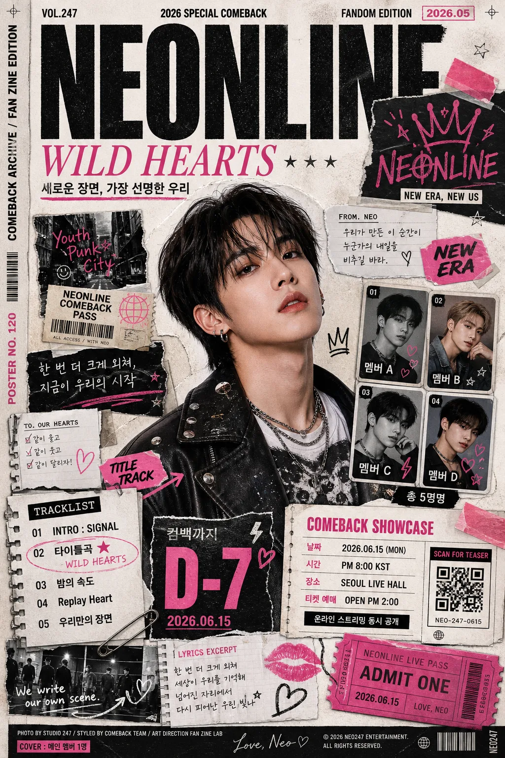
K-pop 컴백 포스터 콜라주
K-pop 아이돌 컴백·컨셉 포스터를 콜라주 zine 톤으로. 멤버 hero + 앨범 트랙리스트 + 컴백일·티저 + 멤버 포토카드 + 손글씨 doodle. 그룹·컨셉 입력하면 컴백 무드보드.
K-pop 컴백 포스터 콜라주 검색 요약
K-pop 컴백 포스터 콜라주은 광고/포스터 결과물을 만들 때 바로 복사해 활용할 수 있는 ChatGPT 이미지 프롬프트입니다. 주제, 배경, 스타일, 구도 조건을 함께 담아 빠르게 시안을 만들 수 있도록 구성했습니다.
관련 키워드: K-pop 컴백 포스터 콜라주, K-pop 컴백 포스터 콜라주 프롬프트, 광고/포스터 프롬프트, 광고/포스터 AI 이미지 프롬프트, ChatGPT 이미지 프롬프트, AI 이미지 생성 프롬프트, AI 프롬프트, 이미지 프롬프트
K-pop 컴백 포스터 콜라주 활용 포인트
원본 구조를 유지하면서 피사체, 배경, 색감, 구도를 바꿔 다양한 시안으로 확장할 수 있습니다.
- 핵심 소재는 유지하고 브랜드, 계절, 채널 목적에 맞는 색감과 배경을 바꿔보세요.
- 결과가 산만하면 배경 요소를 줄이고 피사체, 구도, 조명 조건을 구체화하세요.
- 복사한 뒤 ChatGPT에서 플랫폼, 화면 비율, 텍스트 포함 여부를 추가로 요청할 수 있습니다.
프롬프트 원문
[Input]
- language: Korean
- output_size: 1024x1536

[Purpose]
K-pop comeback poster collage for idol group branding, designed as a fandom zine x trading-card x album-booklet hybrid.
Vertical 1024x1536 promotional poster for social sharing, street-poster printing, fan reposts, and comeback announcement use, with a cinematic center hero, layered collage typography, real album-release information blocks, and collectible fan-culture details.

[Composition]
- Main subject placement: {포스터 메인 인물} takes the central 42–48% of the frame as the hero cut, with the surrounding collage elements wrapping in a loose oval rhythm.
- Background treatment: textured off-white paper base with visible grain, taped magazine scraps, torn edges, photocopy noise, scanned stickers, folded ticket stubs, translucent memo labels, and layered sticker-like fragments in black and neon pink.
- Spacing and framing: keep a strong vertical hierarchy; top area for group title and issue-style release label, middle for hero and collage cluster, lower third for tracklist, comeback date, showcase details, ticket / streaming CTA, and credits.
- Match the energy of {컨셉} while keeping the layout dense, editorial, readable, and realistically printed like a premium K-pop comeback poster pasted into a fan zine.
- Add tangible poster artifacts: tape overlaps, paper fibers, staple marks, small registration crop marks, tiny barcode / QR-style block, serial text such as “POSTER NO. 120”, and a narrow side spine line reading “COMEBACK ARCHIVE / FAN ZINE EDITION”.

[3. CORE STRUCTURE]
1. Top header band: set {그룹 이름} as the largest masthead, with bold condensed sans-serif lettering, slightly distressed print texture, and tight alignment to the top margin; add small issue text around it such as “VOL.247”, “2026 SPECIAL COMEBACK”, “FANDOM EDITION”, and a tiny date label “2026.05”.
2. Secondary title block: place {앨범명} beneath the group name in a smaller serif or italic accent style, like a magazine issue subtitle, with clear hierarchy and strong spacing; add a short Korean cover line: “새로운 장면, 가장 선명한 우리”.
3. Center hero zone: show {포스터 메인 인물} as a realistic cinematic color cutout, sharply separated from the background, with trendy Korean 20s styling, expressive pose, polished idol hair / makeup, fashion-editorial accessories, and a soft realistic shadow on the pasted-paper layer.
4. Collage ring: surround the hero with torn-paper strips, clipping edges, pasted tape corners, hand-cut ticket shapes, photocopied texture fragments, mini lyrics, rehearsal-photo snippets, handwritten memo stickers, and folded paper tabs that create a punk zine wall composition.
5. Member card cluster: add 3–4 small photocard-style panels for the other members, mixing black-and-white and color, each with a tiny Korean name label such as “멤버 A”, “멤버 B”, “멤버 C”, varied crop scale, card numbering, tiny heart stickers, and a footer note “총 {그룹 멤버 수}명”.
6. Tracklist and countdown area: place a compact album tracklist with Korean and English song titles, a title-track marker, and a bold comeback countdown using {컴백일 정보} or a “D-7” style treatment; include realistic track text: “01 INTRO : SIGNAL”, “02 타이틀곡 ★”, “03 밤의 속도”, “04 Replay Heart”, “05 우리만의 장면”.
7. Event and fan info block: include comeback showcase details in Korean, e.g. “COMEBACK SHOWCASE”, “날짜 {컴백일 정보}”, “시간 PM 8:00 KST”, “장소 SEOUL LIVE HALL”, “티켓 예매 OPEN PM 2:00”, “온라인 스트리밍 동시 공개”, plus a small QR/barcode-style area labeled “SCAN FOR TEASER”.
8. Doodle and logo details: add hand-drawn crowns, hearts, stars, arrows, lightning bolts, signature marks, scribbles, lipstick-like marker strokes, sticker labels reading “NEW ERA”, “TITLE TRACK”, “ON AIR”, and a group logo lockup that feels like a fan-decorated zine page.
9. Footer strip: include a small lyric excerpt block “한 번 더 크게 외쳐, 지금이 우리의 시작”, credit-like microtext “PHOTO BY STUDIO 247 / STYLED BY COMEBACK TEAM / ART DIRECTION FAN ZINE LAB”, a model-name credit “COVER: {포스터 메인 인물}”, sponsor-style area with fictional partner text “WITH STAGE MAG / RADIO K / FAN CLUB DESK”, and a tiny legal-style album line without using fake official certification marks.

[4. STYLE RULES]
- Typography: use Pretendard Black or Montserrat ExtraBold for the headline, Noto Sans KR Bold for supporting Korean text, and a small serif like Cormorant Garamond for accent lines; mix in hand-drawn marker lettering for doodles and rough stamped text for ticket / barcode labels.
- Color palette: anchor the design in {시그니처 컬러}, then support with matte black, neon pink #FF4FD8, warm paper cream #F4F0E6, gray photocopy tones, silver-gray tape, and tiny red registration marks.
- Border/shadow: use cut-paper edges, subtle halftone prints, 3–5px taped shadow, soft drop shadow with 12px blur at 18% opacity, folded corners, layered sticker thickness, and printed ink misregistration for a tactile real-poster finish.
- Layout rhythm: combine oversized masthead text, rotated sticker labels, diagonal ticket strips, vertical spine text, and clean rectangular information boxes so the poster feels crowded with real comeback content but still readable at social-feed size.
- Realistic print details: add paper grain, dust specks, scan streaks, slight toner noise, glossy photocard reflections, transparent tape glare, and different paper stocks between the hero cutout, member cards, and photocopied scraps.

[5. VISUAL STYLE]
- Camera / lens: editorial fashion look shot like a Sony A7R IV with 85mm f/1.4 portrait framing for the hero, plus flat photocopy-style inserts for the card pieces.
- Lighting: soft studio key light from upper-left at 45°, light fill from front-right, with crisp but controlled contrast on the hero cutout and flatter scan-like lighting for the collage pieces.
- Color grade: black + neon pink + muted cream with slight magenta lift, punchy contrast, and magazine-print saturation.
- Finish: realistic mixed-media poster photographed or scanned after assembly, with believable shadows between paper layers and crisp high-resolution Korean typography.

[6. MOOD]
High-energy punk zine comeback poster — a Dazed Korea x i-D fashion editorial feel with K-pop fan-collage density, real album-release excitement, collectible photocard culture, and late-night Seoul street-poster energy.

[7. CRITICAL]
- Korean text accuracy: must render exactly these strings where used: {그룹 이름}, {앨범명}, {컴백일 정보}, {컨셉}, {그룹 멤버 수}명, {포스터 메인 인물}, {시그니처 컬러}.
- Include short, legible Korean poster text such as “새로운 장면, 가장 선명한 우리”, “컴백 쇼케이스”, “티켓 예매”, “온라인 스트리밍”, “타이틀곡”, and “총 {그룹 멤버 수}명”.
- The poster must remain a vertical layered collage, with one dominant hero, 3–4 smaller member cards, a top masthead, a tracklist, comeback date, showcase / ticket info, barcode or QR-style block, sponsor-style footer, and clearly separated text zones.
- Keep all Korean and English typography crisp, correctly spaced, and fully legible, especially {그룹 이름}, {앨범명}, {컴백일 정보}, tracklist items, and event details.

[8. 🚫 PROHIBITED]
- Fake official seals / certifications
- Broken Korean characters
- Celebrity composites or unauthorized real-person likeness