照片轉換/濾鏡
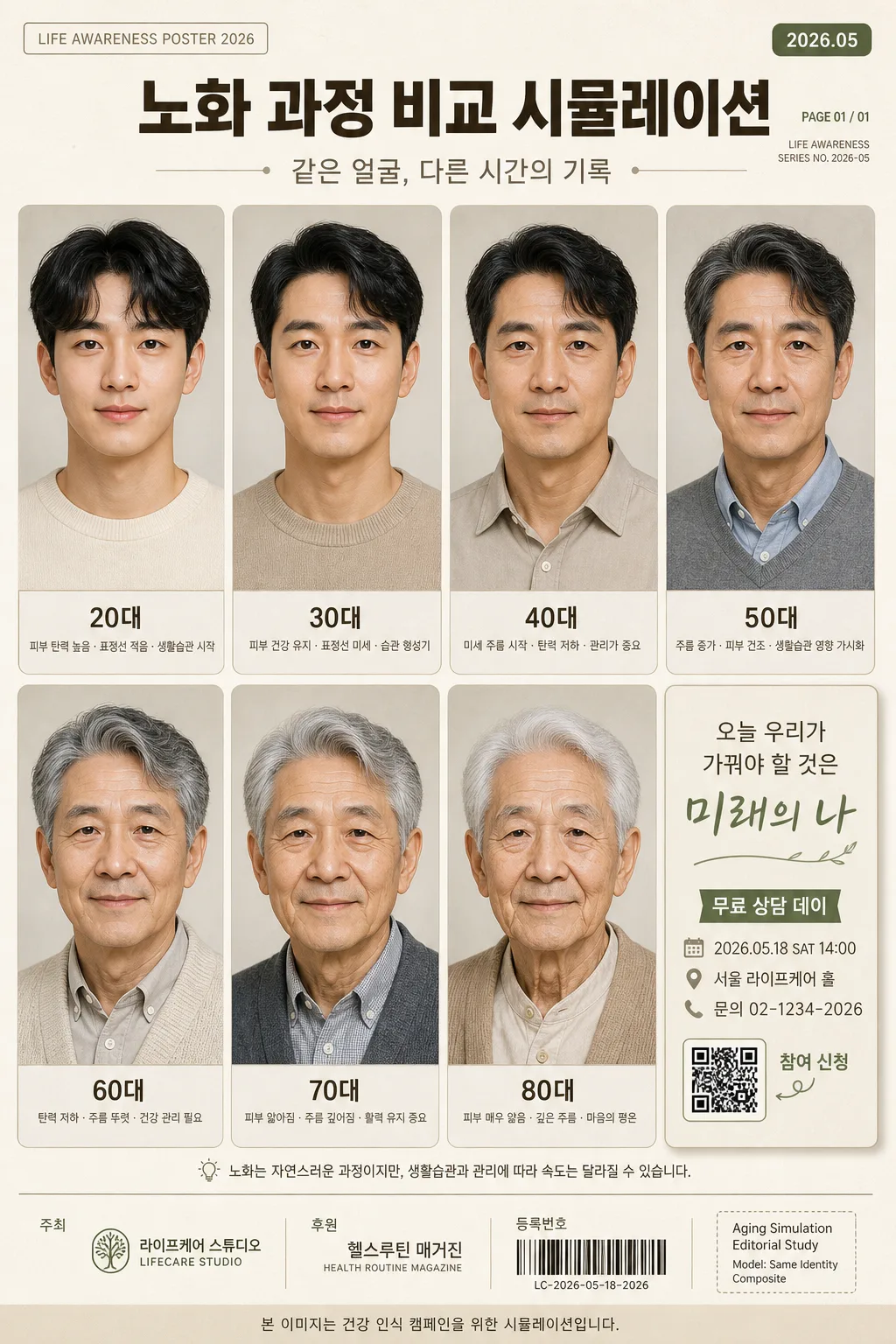
노화 과정 비교 시뮬레이션
내 얼굴 사진을 reference로 박으면 20대·30대·40대·50대·60대·70대·80대 노화 과정 시뮬레이션 그리드. 자기 인식·동기부여 콘텐츠 톤.
노화 과정 비교 시뮬레이션摘要
這是用來製作照片轉換/濾鏡內容的 ChatGPT 圖像提示詞,已整理主題、背景、風格與構圖,方便快速調整。
相關關鍵字: 노화 과정 비교 시뮬레이션, 노화 과정 비교 시뮬레이션 프롬프트, 照片轉換/濾鏡 프롬프트, 照片轉換/濾鏡 AI 이미지 프롬프트, ChatGPT 이미지 프롬프트, AI 이미지 생성 프롬프트, AI 프롬프트, 이미지 프롬프트
노화 과정 비교 시뮬레이션使用方式
保留原始結構並替換主體、背景、色彩或構圖,即可延伸出不同版本。
- 保留核心主體,並依品牌、季節或平台調整色彩與背景。
- 如果畫面太複雜,請減少背景元素並具體描述主體、構圖與光線。
- 複製後可要求 ChatGPT 配合平台、長寬比或文字需求調整。
提示詞原文
[추천·추정·시즌·품종·MBTI 등 결과] 결 매번 다르게 자체 생성합니다.
- 사용자 결 결과 텍스트 결 박지 마세요. AI 결 사진 결 보고 자동 작성합니다.
- 아래 옵션 (디자인 톤·색·언어·길이 등) 만 사용자가 customize 합니다.

[Input]
- language: Korean
- output_size: 1024x1536

[Purpose]
Korean aging-process comparison simulation poster, 4x2 grid layout, family-friendly self-awareness and health-motivation content.
Single-canvas comparison chart showing the same face across multiple life stages with clear age progression, realistic editorial portrait detail, and an informational campaign-style message panel.

[Composition]
- Overall layout: {그리드 레이아웃} arranged as a 4x2 comparison grid on a vertical poster canvas, using seven portrait cells plus one information/message cell that feels like part of a real printed health-awareness poster.
- Subject placement: each portrait cell contains the same person’s face and upper torso, aligned consistently to keep bone structure, eye shape, nose bridge, jawline, and expression identity stable across ages.
- Background treatment: {배경 스타일} in a soft off-white or pale warm gray poster surface with warm paper grain, subtle studio backdrop gradients inside the portrait cells, and faint editorial layout marks that support the comparison-chart feeling.
- Spacing and framing: equal gutters between cells, thin separators, softly rounded cell corners, small caption bars beneath portraits, and an eighth information panel containing the message, date, venue, and campaign details.
- Add realistic poster details: small top date label, campaign subtitle, page-like reference text, sponsor strip, QR-code placeholder box, and tiny credit line such as “Aging Simulation Editorial Study / Model: Same Identity Composite”.
- Use {연령별 변화 강조}, {인물 의상 스타일}, {셀 라벨}, {메시지 문구}, {전체적인 분위기} as controllable placeholders.

[Core Structure]
1) Header area (top 10-12%): create a premium health-campaign title area with Korean headline “노화 과정 비교 시뮬레이션”, small issue-style label “LIFE AWARENESS POSTER 2026”, date tag “2026.05”, and a short subtitle “같은 얼굴, 다른 시간의 기록”.
2) Grid cells: place the same face in seven age stages from 20s through 80s, each cell preserving identity while changing skin elasticity, hair color, wrinkle depth, facial fullness, eyelid heaviness, neck texture, posture nuance, and expression maturity according to age.
3) Age progression detail: 20대 should look smooth and bright; 30대 natural and healthy; 40대 with subtle expression lines and calmness; 50대 with visible eye and forehead lines; 60대 with early silver-gray hair and a warm expression; 70대 with white hair, gentle smile, and deeper wrinkles; 80대 with white hair, serene calm, and a life-worn depth.
4) Clothing treatment: keep {인물 의상 스타일} consistent with each age, updating cut, fabric texture, collar shape, knitwear weight, and styling subtly per life stage so the series feels realistic rather than costume-like.
5) Label area: place {셀 라벨} as small Korean text beneath every cell, aligned centrally, with a readable hierarchy; include secondary micro-captions such as “피부 탄력”, “표정선”, “생활습관 기록” in tiny Korean text where appropriate.
6) Information/message cell: use the remaining grid cell as a campaign card containing {메시지 문구}, plus realistic poster copy: “무료 상담 데이”, “2026.05.18 SAT 14:00”, “서울 라이프케어 홀”, “문의 02-1234-2026”, and a small QR-code placeholder with label “참여 신청”.
7) Footer area: add a slim sponsor/credit strip with invented organizer text such as “주최 라이프케어 스튜디오”, “후원 헬스루틴 매거진”, small barcode-like registration block, and fine-print educational disclaimer in Korean: “본 이미지는 건강 인식 캠페인을 위한 시뮬레이션입니다.”

[Style Rules]
- Typography: Pretendard or Noto Sans KR, medium to semibold weight for labels, bold for the main title and message box, compact microtext for credits and event details, size hierarchy tuned for mobile viewing.
- Color palette: soft cream #F7F3EB, warm gray #D9D4CC, muted beige #CBBBA3, charcoal #2F2F2F, gentle sage #A9B8A8 for accent only if needed.
- Border/shadow: thin 1px separators in light gray, subtle drop shadow 3px y-offset, 10px blur, 12% opacity for the message box, soft rounded portrait cards, gentle inner shadows for a premium printed-poster feel.
- Graphic accents: use small sage dots, thin timeline arrows, age markers, light beige caption ribbons, and discreet registration/barcode/QR blocks to make the poster feel authentic and content-rich.

[Visual Style]
- Camera / lens: editorial portrait consistency using an 85mm f/1.8 look for facial realism, with each age stage framed as a controlled head-and-shoulders crop.
- Lighting: soft diffused studio light from upper-left at about 45°, gentle fill from front-right, even exposure across all cells so age differences read clearly without dramatic mood shifts.
- Color grade: warm neutral editorial grade, slightly desaturated creams and beiges with natural skin tones, avoiding harsh contrast.
- Realism detail: visible natural skin pores, age-appropriate fine lines, hair texture, fabric weave, subtle catchlights in the eyes, and slight variations in facial softness while preserving the same underlying identity.

[Mood]
Positive lifestyle editorial — similar to a thoughtful health-awareness infographic in a premium magazine like Kinfolk or Monocle, with a calm, compassionate, realistic family-content tone and a gentle motivation toward long-term self-care.

[Critical]
- Korean text accuracy: 반드시 정확히 보여야 하는 문자열: “20대”, “30대”, “40대”, “50대”, “60대”, “70대”, “80대”, “오늘 우리가 가꿔야 할 것은 미래의 나”.
- Additional Korean poster text should be legible and natural: “노화 과정 비교 시뮬레이션”, “같은 얼굴, 다른 시간의 기록”, “무료 상담 데이”, “2026.05.18 SAT 14:00”, “서울 라이프케어 홀”, “참여 신청”, “본 이미지는 건강 인식 캠페인을 위한 시뮬레이션입니다.”
- Identity consistency: the same person must remain recognizable across all age stages, with preserved facial structure, eye placement, nose shape, jawline, and expression essence.
- Grid integrity: all 7 age stages must be shown within one coherent comparison layout, with clear age ordering and no duplicated labels.

[8. 🚫 PROHIBITED]
- Fake official seals / certifications
- Broken Korean characters
- Celebrity composites / unauthorized likeness