興趣/生活
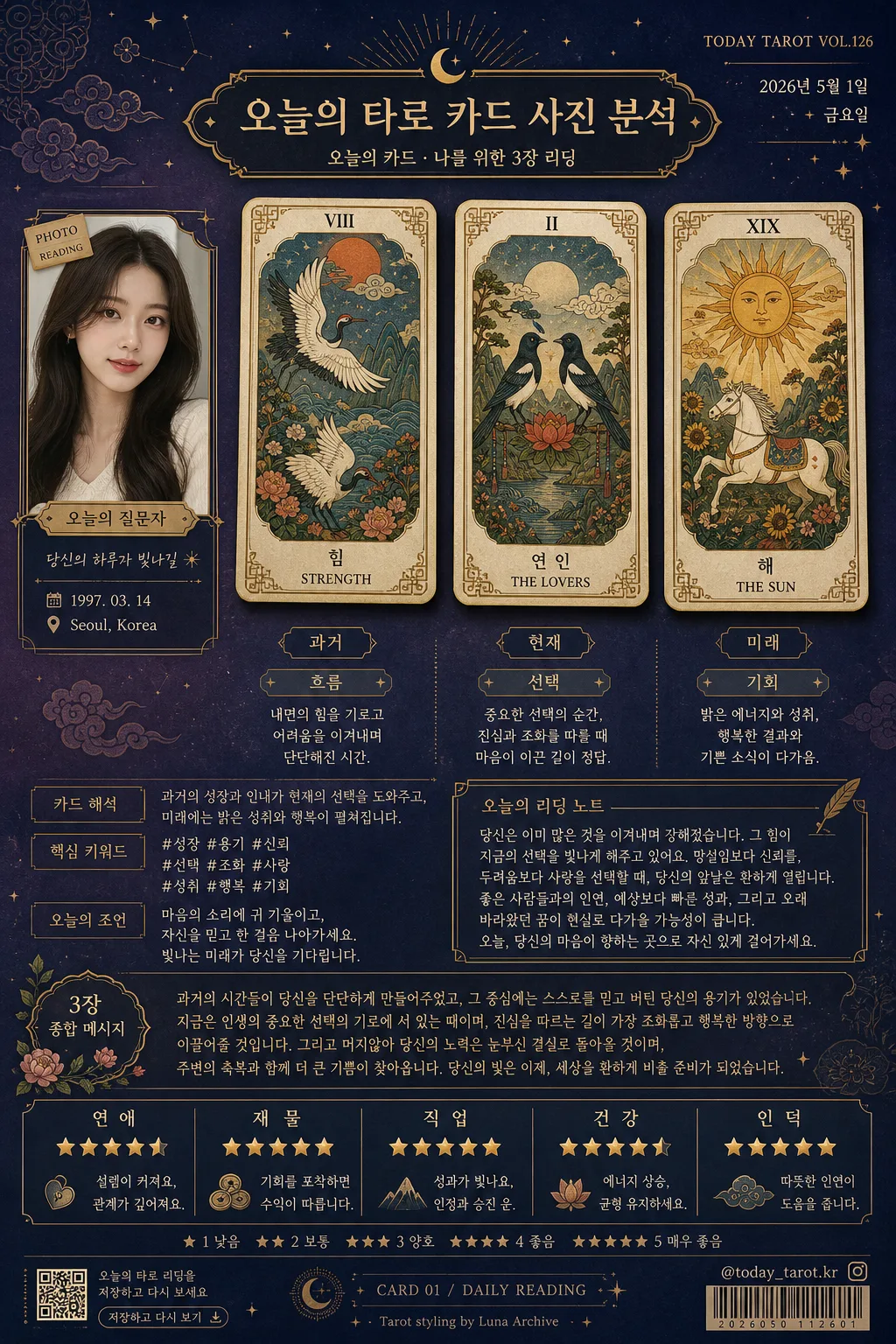
오늘의 타로 카드 사진 분석
내 사진을 reference로 박으면 오늘의 타로 카드 1~3장 + 한글 분석 리포트. 미스틱 카드 + 종합 메시지 + 운세 항목별 별점.
오늘의 타로 카드 사진 분석摘要
這是用來製作興趣/生活內容的 ChatGPT 圖像提示詞,已整理主題、背景、風格與構圖,方便快速調整。
相關關鍵字: 오늘의 타로 카드 사진 분석, 오늘의 타로 카드 사진 분석 프롬프트, 興趣/生活 프롬프트, 興趣/生活 AI 이미지 프롬프트, ChatGPT 이미지 프롬프트, AI 이미지 생성 프롬프트, AI 프롬프트, 이미지 프롬프트
오늘의 타로 카드 사진 분석使用方式
保留原始結構並替換主體、背景、色彩或構圖,即可延伸出不同版本。
- 保留核心主體,並依品牌、季節或平台調整色彩與背景。
- 如果畫面太複雜,請減少背景元素並具體描述主體、構圖與光線。
- 複製後可要求 ChatGPT 配合平台、長寬比或文字需求調整。
提示詞原文
[Input]
- reference_image: {참고 이미지}
- language: Korean
- output_size: 1024x1536

[Purpose]
Korean tarot card analysis report poster for a person using the attached portrait as the reference image. A premium three-card mystical reading laid out like a polished social-media horoscope feature, with realistic printed-card texture, editorial labels, date stamps, fortune ratings, and shareable poster details.

[Composition]
- Main subject: {참고 이미지} is placed as a small cutout portrait panel on the left-middle side, integrated like a client profile card with a gold nameplate-style caption and a tiny date/location label.
- Card arrangement: {카드 배열} should be rendered as three vertically aligned luxury tarot cards with equal spacing, each card framed in gold and presented as real printed cards resting above the poster surface with slight shadow depth.
- Background treatment: deep navy to plum gradient backdrop with subtle star-dot texture, faint Korean minhwa pattern overlays, soft smoky vignette around edges, and layered paper-like grain so the image feels like a real premium fortune poster.
- Text zones: right side contains layered Korean analysis text blocks, small dividers, mini tag labels, and a compact “오늘의 리딩 노트” area; bottom band contains five star-rating items for {운세 항목} with readable alignment.
- Editorial poster details: include a small top-right issue/date label such as “TODAY TAROT VOL.126”, “2026년 5월 1일”, a tiny barcode/QR-style area near the lower corner, a small social handle such as “@today_tarot.kr”, and micro footer text like “저장하고 다시 보기”.
- Typography balance: title and card labels should feel mystical and editorial, while analysis text remains highly readable in {텍스트 폰트}.

[3. CORE STRUCTURE]
- Top header area: elegant title banner with a gold filigree frame, subtle glow, decorative stars, and a premium magazine-like label; title reads “오늘의 타로 카드 사진 분석” with a smaller subtitle “오늘의 카드 · 나를 위한 3장 리딩”.
- Center hero area (middle 55%): three tarot cards arranged in a neat row with slight perspective depth, gold rim decorations, corner ornaments, and each card showing Roman numerals at the top plus Korean/English card names at the bottom.
- Card artwork layer: each card uses {카드 그림체} illustration style, with refined linework, muted jewel tones, antique cream highlights, and a tactile premium printed-card texture with tiny paper fibers.
- Card labels and notes: add compact Korean labels beside or below the three cards: “과거”, “현재”, “미래”; each card has a one-line keyword tag such as “흐름”, “선택”, “기회” and a concise Korean meaning sentence.
- Left portrait inset: a small cropped portrait panel of {참고 이미지} placed beside the cards, bordered in thin gold with a soft shadow, visually linked to the analysis text; include a small caption plate reading “오늘의 질문자” and a subtle sticker tag “PHOTO READING”.
- Analysis text area: adjacent to each card, place one concise Korean meaning line in the style of a tarot note, followed by one short overall interpretation block using {분석 톤}; include realistic section labels like “카드 해석”, “핵심 키워드”, and “오늘의 조언”.
- Summary block: a composite message at mid-lower section written as a warm reading that connects the three cards into one narrative; match {종합 메시지 분량} and make it feel like a personal tarot report rather than generic filler.
- Rating strip: bottom section shows five fortune categories from {운세 항목}, each with a 5-point star rating row, small gold star icons, and short Korean micro-comments such as “차분히 상승”, “기회 포착”, “균형 유지”.
- Footer details: add a refined lower footer with “연애 · 재물 · 직업 · 건강 · 인덕”, a tiny barcode/QR-style graphic block, page-like marker “CARD 01 / DAILY READING”, and a small credit line “Tarot styling by Luna Archive”.
- Decorative finish: scattered gold sparkles, crescent moon icons, fine line ornaments, tiny constellation marks, and subtle minhwa cloud motifs should frame the content and make the poster feel handcrafted and premium.

[4. STYLE RULES]
- Typography: use {텍스트 폰트} for the main Korean typography; headers/card titles may combine a refined serif such as Cormorant Garamond or Noto Serif KR with Pretendard or Noto Sans KR for body text; title around 44-56px, body around 24-30px, rating labels 22-26px, micro footer text 12-16px.
- Color palette: deep navy #0B1230, plum #4A234B, gold #D8B15A, antique cream #F4E9D6, soft violet #8E72B6, star white #F7F6F2, with accent tones drawn from {전체 디자인 테마}.
- Borders/shadows: thin gold border lines, soft drop shadow with 4px y-offset, 14px blur, 18% opacity, plus faint outer glow around cards and portrait panel.
- Text styling: Roman numerals crisp and centered at card tops; Korean and English card names must be stacked neatly at the bottom in high-contrast light cream; use small gold divider rules and pill-shaped tags for realistic editorial hierarchy.
- Realistic print details: include subtle paper grain, slight ink texture on the tarot illustrations, tiny registration-like footer marks, and layered sticker/card shadows to avoid a flat digital mockup.

[5. VISUAL STYLE]
- Camera / lens: front-facing editorial composition, 50mm lens look with slight top-down angle, crisp card edges and controlled depth layering.
- Lighting: studio softbox key from upper-left at 45° with a gentle rim light from upper-right, plus low-intensity ambient glow behind the cards.
- Color grade: luxury nocturne grade with navy, plum, gold, and cream; subtle bloom on highlights, no neon saturation.
- Material realism: cards should look like satin-coated paper with embossed gold foil edges; portrait inset should look like a small glossy photo print mounted onto the design.

[6. MOOD]
Premium mystical fortune editorial — a luxury tarot spread with the refined atmosphere of a high-end magazine horoscope feature, enriched with believable social-poster details, warm personal guidance, and elegant Korean fortune-report styling.

[7. CRITICAL]
- Korean text accuracy: 반드시 정확히 표시되어야 하는 문구: “오늘의 카드”, “과거”, “미래”, “연애”, “재물”, “직업”, “건강”, “인덕”.
- 추가로 선명하게 보이면 좋은 문구: “오늘의 타로 카드 사진 분석”, “현재”, “오늘의 리딩 노트”, “핵심 키워드”, “오늘의 조언”, “저장하고 다시 보기”, “2026년 5월 1일”, “TODAY TAROT VOL.126”, “@today_tarot.kr”.
- 카드 상단의 로마 숫자, 카드 하단의 한글·영문 카드명, 그리고 분석 문장은 모두 깨끗하고 선명하게 읽혀야 함.
- {참고 이미지} 인물 사진은 실제 인물의 얼굴 비율이 자연스럽고 왜곡 없이 유지되어야 함.
- 각 카드의 레이아웃은 3장 모두 통일감 있게 유지하고, 별점은 모두 5점 만점 형식으로 표시해야 함.
- 전체 분석 문체는 {분석 톤}에 맞추고, 종합 메시지는 {종합 메시지 분량}에 맞는 분량으로 구성해야 함.

[8. 🚫 PROHIBITED]
- Fake official seals / certifications
- Broken Korean characters