興趣/生活
AI 프롬프트 사이트 모자이크 비주얼
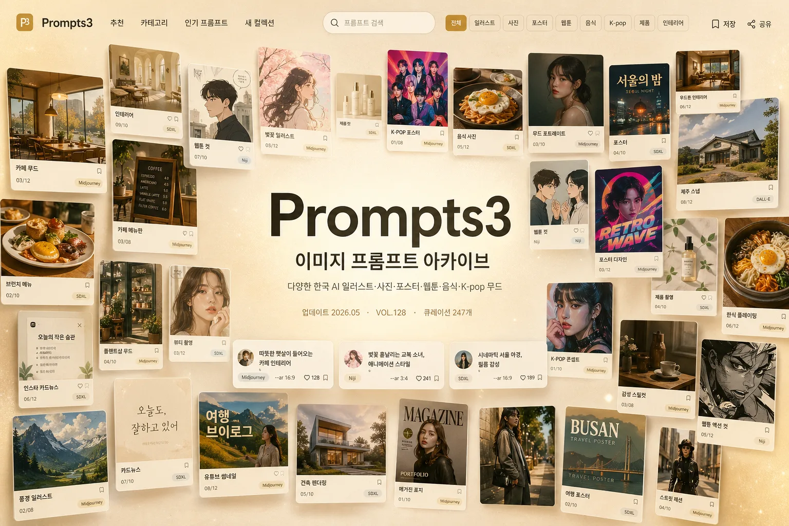
수많은 AI 썸네일이 모자이크 wall 을 이루고 가운데 깔끔한 워드마크가 박힌 매거진 톤의 사이트 hero. 따뜻한 베이지·골드 + 다양한 컬러 썸네일.
AI 프롬프트 사이트 모자이크 비주얼摘要
這是用來製作興趣/生活內容的 ChatGPT 圖像提示詞,已整理主題、背景、風格與構圖,方便快速調整。
相關關鍵字: AI 프롬프트 사이트 모자이크 비주얼, AI 프롬프트 사이트 모자이크 비주얼 프롬프트, 興趣/生活 프롬프트, 興趣/生活 AI 이미지 프롬프트, ChatGPT 이미지 프롬프트, AI 이미지 생성 프롬프트, AI 프롬프트, 이미지 프롬프트
AI 프롬프트 사이트 모자이크 비주얼使用方式
保留原始結構並替換主體、背景、色彩或構圖,即可延伸出不同版本。
- 保留核心主體,並依品牌、季節或平台調整色彩與背景。
- 如果畫面太複雜,請減少背景元素並具體描述主體、構圖與光線。
- 複製後可要求 ChatGPT 配合平台、長寬比或文字需求調整。
提示詞原文
[Input]
- language: Korean
- output_size: 1536x1024

[Purpose]
AI 프롬프트 사이트/아카이브 메인 hero banner, mosaic showcase header image for a curated prompt library.
Premium editorial website visual that communicates variety, curation, creative range, and real product depth at a glance, like a polished creative-tech landing page captured as a high-end digital catalog spread.

[Composition]
- Center hero wordmark occupies about 22% of width and sits slightly above center; subtitle is directly below with tight vertical spacing.
- Surrounding mosaic wall fills the rest of the frame with dozens of floating thumbnail tiles, arranged in a loose isometric arc around the center, with realistic UI card details and small Korean category labels.
- Background is a warm beige-to-cream paper-like field with subtle gold glow near the upper-left and lower-right edges, fine tactile grain, and a faint editorial vignette.
- Add a believable website-header layer: small top navigation labels, a rounded search field, category chips, tiny bookmark/share icons, prompt-count metadata, and a few floating prompt cards that make the hero feel like an actual AI prompt archive service.
- Keep the central wordmark instantly readable while allowing the surrounding thumbnails to feel content-rich, layered, and curated.
- Apply {사이트/서비스 이름}, {한국어 부제}, {썸네일 컨셉}, {배경 톤}, {레이아웃}, {비율/사이즈}, {금지} as content and styling constraints.

[3. CORE STRUCTURE]
1. Background layer — build a soft editorial backdrop in warm beige, cream, and muted gold, with fine paper texture, subtle fiber speckles, faint vignette, and soft gold atmospheric glow to anchor the layout.
2. Central typography block — place {사이트/서비스 이름} as the largest element in the center, set in a bold modern sans-serif, then place {한국어 부제} beneath it in smaller Korean text with clear hierarchy. Add a tiny metadata line below the subtitle such as 업데이트 2026.05 · VOL.128 · 큐레이션 247개, set much smaller so it supports but does not compete.
3. Website UI accents — add a slim top navigation bar with short Korean labels such as 추천, 카테고리, 인기 프롬프트, 새 컬렉션; include a small rounded search box reading 프롬프트 검색 and tiny micro icons for 저장 and 공유 at the far right.
4. Thumbnail mosaic field — surround the center with dozens of small tiles showing varied AI-generated visuals such as Korean cafe scenes, K-pop poster art, webtoon panels, editorial portrait cards, magazine-cover layouts, food photography, product mockups, architecture interiors, fashion crops, menu boards, Instagram cards, and cinematic landscape prompts; each tile should differ in style, framing, color treatment, and apparent use case.
5. Tile details — several thumbnails include realistic Korean micro text such as 카페 무드, 웹툰 컷, 포스터, 메뉴판, 룩북, 썸네일, 카드뉴스, 제품컷, plus tiny slide numbers like 03/12, prompt badges like Midjourney and SDXL, small heart/bookmark icons, and thumbnail captions; all text should be small but legible where visible.
6. Depth and floating effect — offset thumbnail tiles with slight rotations, shallow perspective, soft lifted shadows, thin neutral borders, occasional overlapping corners, and layered z-depth so the wall feels like a floating curated collage rather than a flat grid.
7. Curation rhythm — alternate bright and muted thumbnails, mixing portrait, square, and landscape mini-cards while maintaining premium editorial cohesion; distribute warm cafe browns, vivid poster reds, muted webtoon pastels, food yellows, and fashion blacks evenly around the center.
8. Main readability — maintain a soft luminous halo around the central wordmark, with thumbnails subtly scaling down and fading in contrast near the exact center so the title and subtitle stay crisp.

[4. STYLE RULES]
- Typography: {사이트/서비스 이름} uses a bold modern sans-serif such as Inter, Helvetica Neue, or Pretendard ExtraBold, large headline scale; {한국어 부제} uses Noto Sans KR or Pretendard Medium at a much smaller size.
- Supporting Korean UI labels use Pretendard, Noto Sans KR, or a similar clean interface font; keep labels short, realistic, and aligned like a polished SaaS landing page.
- Color palette: warm beige #EADCC8, cream #F6F1E7, soft gold #D8B66A, muted cocoa #7A5E45, charcoal #2A2522, with small thumbnail accents in dusty coral, sage, muted blue, soft black, and warm ivory.
- Border/shadow: each thumbnail has a soft drop shadow with 4px y-offset, 14px blur, 16% opacity; slight rounded corners and thin neutral borders only where needed.
- Add realistic tactile and digital details: subtle paper grain in the background, faint glassy highlight on select UI cards, small cursor-like dot accents, tiny prompt chips, and soft shadow contact points under overlapping cards.
- Keep all extra text secondary to the main identity; microcopy should make the archive look useful and inhabited, not like filler.

[5. VISUAL STYLE]
- Camera / lens: 35mm editorial product-style composition, front-facing with subtle isometric depth; if thumbnail imagery appears photographic, treat them like mixed-media mini prints rather than a single camera capture.
- Lighting: soft diffused window light from upper-left at 45°, gentle fill from lower-right, faint gold rim glow around the mosaic edges.
- Color grade: warm cream + beige + antique gold with restrained saturation, premium catalog-editorial finish, no neon spill.
- Rendering quality: crisp high-resolution UI typography, believable anti-aliased edges, realistic layered shadows, clean perspective alignment, and rich thumbnail variety without looking randomly generated.

[6. MOOD]
Premium creative-tech editorial — like a curated Notion, Aesop, and Kinfolk-inspired landing page collage with a high-end magazine spread feel, upgraded with the density and usefulness of a real Korean AI prompt archive dashboard.

[7. CRITICAL]
- Korean text accuracy: the subtitle must appear exactly as 이미지 프롬프트 아카이브.
- Korean text accuracy: no broken Korean characters, no missing spacing, no garbled syllables.
- Layout invariant: {사이트/서비스 이름} must be the dominant central wordmark, with {한국어 부제} directly underneath.
- Layout invariant: thumbnail mosaic must include many distinct prompt-image genres and must look curated, not repetitive.
- Required Korean microcopy examples to render where appropriate: 추천, 카테고리, 인기 프롬프트, 새 컬렉션, 프롬프트 검색, 카페 무드, 웹툰 컷, 포스터, 메뉴판, 룩북, 썸네일, 카드뉴스, 제품컷.
- Include small archive metadata such as VOL.128, 2026.05, 큐레이션 247개, and 03/12 on selected cards, while keeping the main wordmark hierarchy intact.

[8. 🚫 PROHIBITED]
- Fake official seals / certifications
- Broken Korean characters