광고/포스터
AI 프롬프트 사이트 펑크 콜라주
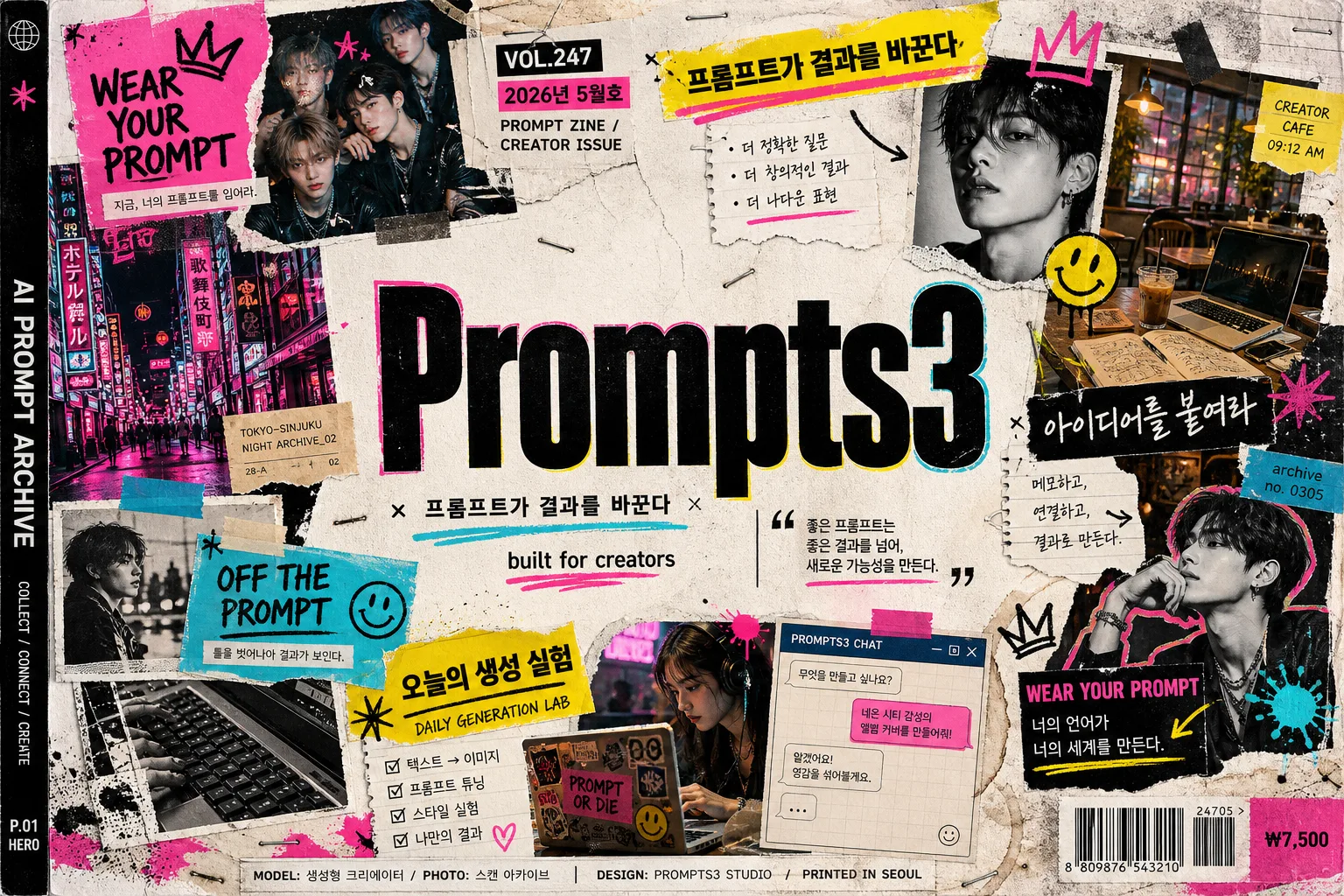
Patagonia·Off-White 풍 펑크 zine 콜라주 hero — 찢어진 종이 + 카탈로그 사진 + 손글씨 doodle + 메인 워드마크.
AI 프롬프트 사이트 펑크 콜라주 검색 요약
AI 프롬프트 사이트 펑크 콜라주은 광고/포스터 결과물을 만들 때 바로 복사해 활용할 수 있는 ChatGPT 이미지 프롬프트입니다. 주제, 배경, 스타일, 구도 조건을 함께 담아 빠르게 시안을 만들 수 있도록 구성했습니다.
관련 키워드: AI 프롬프트 사이트 펑크 콜라주, AI 프롬프트 사이트 펑크 콜라주 프롬프트, 광고/포스터 프롬프트, 광고/포스터 AI 이미지 프롬프트, ChatGPT 이미지 프롬프트, AI 이미지 생성 프롬프트, AI 프롬프트, 이미지 프롬프트
AI 프롬프트 사이트 펑크 콜라주 활용 포인트
원본 구조를 유지하면서 피사체, 배경, 색감, 구도를 바꿔 다양한 시안으로 확장할 수 있습니다.
- 핵심 소재는 유지하고 브랜드, 계절, 채널 목적에 맞는 색감과 배경을 바꿔보세요.
- 결과가 산만하면 배경 요소를 줄이고 피사체, 구도, 조명 조건을 구체화하세요.
- 복사한 뒤 ChatGPT에서 플랫폼, 화면 비율, 텍스트 포함 여부를 추가로 요청할 수 있습니다.
프롬프트 원문
[Input]
- language: Korean
- output_size: 1536x1024

[Purpose]
Punk zine-style collage hero banner for an AI prompt site, designed like a real scanned magazine moodboard advertisement for a creator-focused landing page.
Horizontal website hero with bold typographic branding, cutout imagery, issue-label details, editorial cover blurbs, and high-contrast creator-culture energy.

[Composition]
- Center composition: a large sans-serif wordmark for {사이트/서비스 이름} occupies the middle 28–32% of the frame, with a smaller Korean subtitle directly beneath it and a compact brand quote tucked near the lower-right of the title block.
- Surrounding layout: collage elements radiate around the title in an asymmetric ring, with torn-paper edges, clipped magazine scraps, BW portrait fragments, doodles, paint splashes, sticker labels, tape strips, and scanned note fragments filling the left, right, and top corners.
- Background treatment: gritty off-white paper texture with visible fold marks, scuffed print noise, staple impressions, coffee-ring stains, layered halftone ink, photocopy streaks, and small registration marks so the piece feels physically assembled and scanned.
- Editorial realism: add a tiny issue marker such as “VOL.247”, a date label such as “2026년 5월호”, a small barcode area in one lower corner, a compact price line “₩7,500”, small spine/credit text, and 2–3 short Korean feature blurbs around the collage.
- Framing: keep the central typography highly readable while the pasted collage, captions, and zine artifacts build density toward the outer edges for a lively magazine spread look.
- Use {사이트/서비스 이름}, {브랜드 quote}, {액센트 컬러}, {콜라주 요소}, {텍스트 카피}, {비율/사이즈} as the customizable content anchors.

[3. CORE STRUCTURE]
1. Main title block — Set {사이트/서비스 이름} in a heavy, wide sans-serif wordmark, centered and spanning roughly 40% of the banner width, with crisp black fill, slightly imperfect ink edges, and neon edge accents that feel like screen-printed ink.
2. Subtitle and quote — Place a small Korean subtitle directly under the wordmark using a phrase from {텍스트 카피}; add {브랜드 quote} as a compact supporting line near the title’s lower edge, using tight tracking and a utilitarian editorial layout.
3. Magazine-zine metadata — Add realistic publication details: “VOL.247”, “2026년 5월호”, “PROMPT ZINE / CREATOR ISSUE”, a small barcode block, tiny page code “P.01 HERO”, vertical spine text “AI PROMPT ARCHIVE”, and a model/creator credit line such as “MODEL: 생성형 크리에이터 / PHOTO: 스캔 아카이브”.
4. Feature headline blurbs — Around the title block, include 2–3 short Korean cover-line blurbs in different pasted-label styles: “프롬프트가 결과를 바꾼다”, “아이디어를 붙여라”, “오늘의 생성 실험”, plus smaller stamped fragments derived from {텍스트 카피}.
5. Hero collage field — Arrange {콜라주 요소} across the perimeter as layered cutouts: creator portrait crop shots, café table snapshots with notebooks and laptops, neon alley scenes, BW portrait slices, keyboard close-ups, chat-window printouts, hand-drawn doodles, ticket stubs, sticky notes, ripped arrows, and paint splashes, each overlapping like a physical pasted-up zine page.
6. Accent system — Apply {액센트 컬러} as the dominant highlight language, with 1–2 colors used aggressively on stickers, underline marks, taped corners, rough border strokes, starbursts, arrows, and highlight blocks; keep the remaining tones mostly black, white, paper beige, muted skin tones, and café browns.
7. Copy integration — Embed {텍스트 카피} as scattered slogan fragments in varying sizes, with one phrase acting as a secondary header and the others appearing as stamped cut lines, handwritten labels, caption strips, or tiny sidebar notes.
8. Finish and texture — Add torn paper seams, photocopy grain, staple holes, uneven glue shadows, slight misregistration, rough halftone shadows, ink bleed, scan dust, and curled paper corners so the whole banner feels like a high-end pasted collage from a punk design magazine.

[4. STYLE RULES]
- Typography: use bold grotesk sans-serif for the main brand mark, e.g. Helvetica Neue, Neue Haas Grotesk, or Pretendard ExtraBold; subtitle in Pretendard Medium or Noto Sans KR Medium; keep the wordmark around 88–120 px equivalent on a 1536x1024 canvas.
- Editorial text hierarchy: use tiny condensed sans-serif for issue/date/barcode captions, bold Korean cover lines for feature blurbs, and marker-like handwritten Korean for doodled annotations; make small text look printed or stamped rather than like a clean app UI.
- Color palette: primarily off-white paper, deep black, and the neon spectrum from {액센트 컬러}; let the accent colors appear in sharp blocks, sticker shapes, underlines, paint swipes, doodle strokes, and torn label backgrounds rather than soft gradients.
- Border/shadow: use torn-paper irregular edges, rough taped labels, subtle photocopy shadowing, and 8–14 px offset cast shadows at 18% opacity for pasted elements; favor handmade zine construction with visible overlaps and physical layering.
- Realistic artifacts: include barcode lines, crop marks, tiny edition numbers, caption arrows, sticker residue, creases, thumbprint smudges, and slight paper warping to make the digital banner feel like a scanned physical collage.

[5. VISUAL STYLE]
- Camera / lens: simulated graphic design composition rather than direct photography, but with editorial cutout realism inspired by a 35mm documentary flash look, scanned magazine clippings, and close-up photocopied print textures.
- Lighting: flat studio scan aesthetic with hard contrast, slight flash glare on clipped photos, faint paper sheen on high-ink areas, and small specular highlights on glossy magazine fragments.
- Color grade: aggressive punk zine palette with black, paper white, hot neon pink, cyan, and yellow, plus occasional muted skin tones, café browns, gray newsprint, and saturated {액센트 컬러} overlays from the collage fragments.
- Material feel: combine matte copier paper, glossy magazine scraps, masking tape, risograph-like ink, marker strokes, printed labels, and gritty halftone photo grain.

[6. MOOD]
Patagonia and Off-White advertisement energy fused with a late-1990s punk zine spread and a Korean creator magazine cover — rebellious, tactile, graphic, noisy, and creator-culture forward.

[7. CRITICAL]
- Korean text accuracy: 반드시 정확히 렌더링되어야 하는 문자열 — “프롬프트가 결과를 바꾼다”, “아이디어를 붙여라”, “오늘의 생성 실험”, “메인 사이트 이름”이 아니라 {사이트/서비스 이름}의 실제 값, 그리고 한글 부제는 {텍스트 카피} 안에서 사용되는 한국어 문구를 그대로 정확히.
- Required editorial details: include “VOL.247”, “2026년 5월호”, “₩7,500”, “P.01 HERO”, a barcode area, a small credit line, and at least two short Korean feature blurbs.
- Layout invariant: the main wordmark stays centered and dominant, with collage elements orbiting the title rather than covering it.
- Text rendering must preserve mixed Korean and English exactly as provided, with no broken characters or scrambled glyphs.

[8. 🚫 PROHIBITED]
- Fake official seals / certifications
- Broken Korean characters
- Celebrity composites / unauthorized likeness