広告・ポスター
AI 프롬프트 사이트 미니멀 타이포
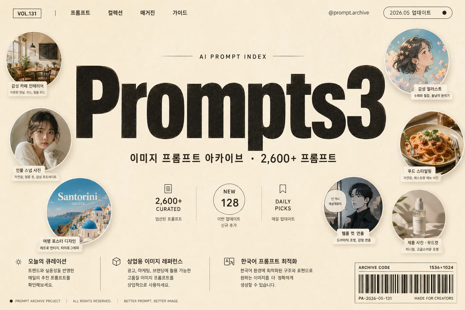
거대한 워드마크 + 작은 원형 썸네일 액센트가 미니멀하게 배치된 premium 브랜드 hero. 정체성 강조.
AI 프롬프트 사이트 미니멀 타이포の概要
広告・ポスター画像を作るためのChatGPT画像プロンプトです。主題、背景、スタイル、構図を整理し、すぐに試せるよう構成しています。
関連キーワード: AI 프롬프트 사이트 미니멀 타이포, AI 프롬프트 사이트 미니멀 타이포 프롬프트, 広告・ポスター 프롬프트, 広告・ポスター AI 이미지 프롬프트, ChatGPT 이미지 프롬프트, AI 이미지 생성 프롬프트, AI 프롬프트, 이미지 프롬프트
AI 프롬프트 사이트 미니멀 타이포の活用方法
元の構造を保ちながら、被写体、背景、色、構図を変更して別案に展開できます。
- 主題を維持し、ブランドや季節、媒体に合わせて色と背景を変更してください。
- 結果が複雑な場合は背景要素を減らし、被写体、構図、照明を具体化してください。
- コピー後、ChatGPTに媒体、アスペクト比、文字の有無を追加で指定できます。
プロンプト原文
[Input]
- language: Korean
- output_size: 1536x1024

[Purpose]
Premium typography hero banner for an AI prompt archive website, designed like a contemporary editorial brand identity poster with realistic web-launch details.
Large, clean, content-rich landing hero with a bold wordmark, Korean subtitle, floating circular prompt-preview thumbnails, small navigation labels, metadata chips, and editorial microcopy that makes the page feel like a real service launch screen.

[Composition]
- Center the huge wordmark across the upper-middle 55% of the frame, spanning nearly the full width, with the subtitle placed directly beneath it in a smaller line.
- Use a smooth {배경 톤} premium background with subtle warm paper grain, soft ink texture, and very faint printed-poster surface variation.
- Arrange {원형 썸네일 컨셉} as 6–8 floating circular mini-scenes around the wordmark, mostly along the left edge, upper-right corner, and lower-right quadrant; each preview should feel like a real saved prompt thumbnail with tiny caption labels.
- Add a refined top navigation strip with small Korean labels: "프롬프트", "컬렉션", "매거진", "가이드", plus a tiny handle-like label "@prompt.archive" and an update chip "2026.05 업데이트".
- Add editorial metadata around the hero: "VOL.131", "AI PROMPT INDEX", "2,600+ CURATED", "NEW 128", and a small bottom-right barcode-style catalog block labeled "ARCHIVE CODE 1536×1024".
- Add 2–3 short Korean feature blurbs in small type near the lower portion, such as "오늘의 큐레이션", "상업용 이미지 레퍼런스", "한국어 프롬프트 최적화", using tidy column alignment.
- Keep the overall design balanced and poster-like, with strong typographic hierarchy, realistic spacing, and rich secondary details that support the main wordmark.

[3. CORE STRUCTURE]
1. Main wordmark zone (upper-middle 55%): render {사이트/서비스 이름} in a huge ultra-bold modern sans-serif, centered, using {워드마크 색상}, with tight tracking, clean edges, and premium editorial weight.
2. Subtitle zone (directly below wordmark): render {한국어 부제} in smaller Korean sans-serif text, centered, with medium weight, slightly increased letter spacing, and exact punctuation.
3. Floating thumbnail system: place {원형 썸네일 컨셉} as 6–8 circular mini-scenes, each with a different visual theme such as portrait, product shot, food styling, magazine cover, interior mood, travel poster, profile card, and cinematic still; each circle evenly clipped with clean edges, realistic image detail, subtle depth, and a tiny Korean label tag nearby.
4. Navigation and metadata layer: add small header text, update/date labels, volume number, archive index text, micro dividers, and a barcode-style catalog block without turning it into a full dashboard.
5. Feature blurb layer: include 2–3 short Korean blurbs in compact editorial columns near the bottom or side margin, set in light sans-serif with small accent dots or rule lines.
6. Background field: fill the canvas with {배경 톤} as a tactile premium backdrop with subtle paper fiber, soft tonal noise, and faint print-like texture.
7. Accent balance: make the wordmark dominate the composition while the thumbnails, metadata, and feature blurbs act as colorful secondary accents that make the hero feel like a real published web identity.

[4. STYLE RULES]
- Typography: use Pretendard or Inter for the English wordmark, ultra-bold 900 weight, very large display size; use Noto Sans KR or Pretendard for the Korean subtitle, navigation, metadata, and feature blurbs.
- Color palette: {배경 톤}, {워드마크 색상}, plus restrained accent colors inside the thumbnails such as coral, teal, mustard, sky blue, olive, soft pink, warm gray, and muted cobalt.
- Detail typography: top navigation and metadata should be small but legible, with realistic editorial spacing, tiny separators, short Korean labels, and catalog-style numbering.
- Thumbnail styling: thumbnails should have a subtle soft drop shadow, about 4px y-offset, 12px blur, 15% opacity, crisp circular clipping, and realistic mini-image content rather than flat icons.
- Decorative system: use tiny accent dots, hairline dividers, small caption tags, barcode-like vertical lines, and catalog labels to enrich the composition while keeping the wordmark visually dominant.
- Surface finish: add a slight printed-paper texture and soft ink softness around dark typography, as if the website hero were photographed from a premium brand poster proof.

[5. VISUAL STYLE]
- Camera / lens: Canon EOS R5 with RF 50mm f/1.2L studio product-shot mindset, front-facing flat composition, orthographic poster feel, no perspective distortion.
- Lighting: soft diffused studio light from upper-left, very even fill, gentle contact shadows under floating circular thumbnails and small printed elements.
- Color grade: clean cream + deep wordmark color + muted colorful thumbnail accents, with a premium editorial web-brand finish.
- Rendering quality: sharp vector-like typography, realistic paper grain, crisp circular image clipping, high-resolution Korean text, and refined print-design realism.

[6. MOOD]
Premium AI startup landing page hero — contemporary Korean editorial archive, independent magazine index, refined brand poster, and curated creative-tool launch page atmosphere.

[7. CRITICAL]
- Korean text accuracy: 반드시 정확히 렌더링할 문자열: "이미지 프롬프트 아카이브 · 2,600+ 프롬프트"
- Korean text accuracy: if any Korean subtitle typography is shown, keep the exact punctuation and spacing clean and unbroken.
- Korean text accuracy: render short supporting labels clearly, for example "프롬프트", "컬렉션", "매거진", "가이드", "오늘의 큐레이션", "상업용 이미지 레퍼런스", "한국어 프롬프트 최적화", "2026.05 업데이트".
- Composition invariant: the main wordmark must occupy more than half of the visual impact, and the circular thumbnails, metadata, navigation, and feature blurbs must remain secondary.
- Circular thumbnails must look like distinct mini image previews, not generic dots or icons.
- Keep {사이트/서비스 이름}, {한국어 부제}, {원형 썸네일 컨셉}, {배경 톤}, {워드마크 색상}, and {비율/사이즈} exactly as usable input concepts.

[8. 🚫 PROHIBITED]
- Fake official seals / certifications
- Broken Korean characters
- Celebrity composites / unauthorized likeness