廣告/海報
매장·팝업스토어 오픈 포스터
신규 오픈/팝업 매장 announcement 포스터. 매장명·날짜·이벤트 입력하면 인스타·간판·전단 공유용 시안.
매장·팝업스토어 오픈 포스터摘要
這是用來製作廣告/海報內容的 ChatGPT 圖像提示詞,已整理主題、背景、風格與構圖,方便快速調整。
相關關鍵字: 매장·팝업스토어 오픈 포스터, 매장·팝업스토어 오픈 포스터 프롬프트, 廣告/海報 프롬프트, 廣告/海報 AI 이미지 프롬프트, ChatGPT 이미지 프롬프트, AI 이미지 생성 프롬프트, AI 프롬프트, 이미지 프롬프트
매장·팝업스토어 오픈 포스터使用方式
保留原始結構並替換主體、背景、色彩或構圖,即可延伸出不同版本。
- 保留核心主體,並依品牌、季節或平台調整色彩與背景。
- 如果畫面太複雜,請減少背景元素並具體描述主體、構圖與光線。
- 複製後可要求 ChatGPT 配合平台、長寬比或文字需求調整。
提示詞原文
[Input]
- language: Korean
- output_size: 1024x1536

[Purpose]
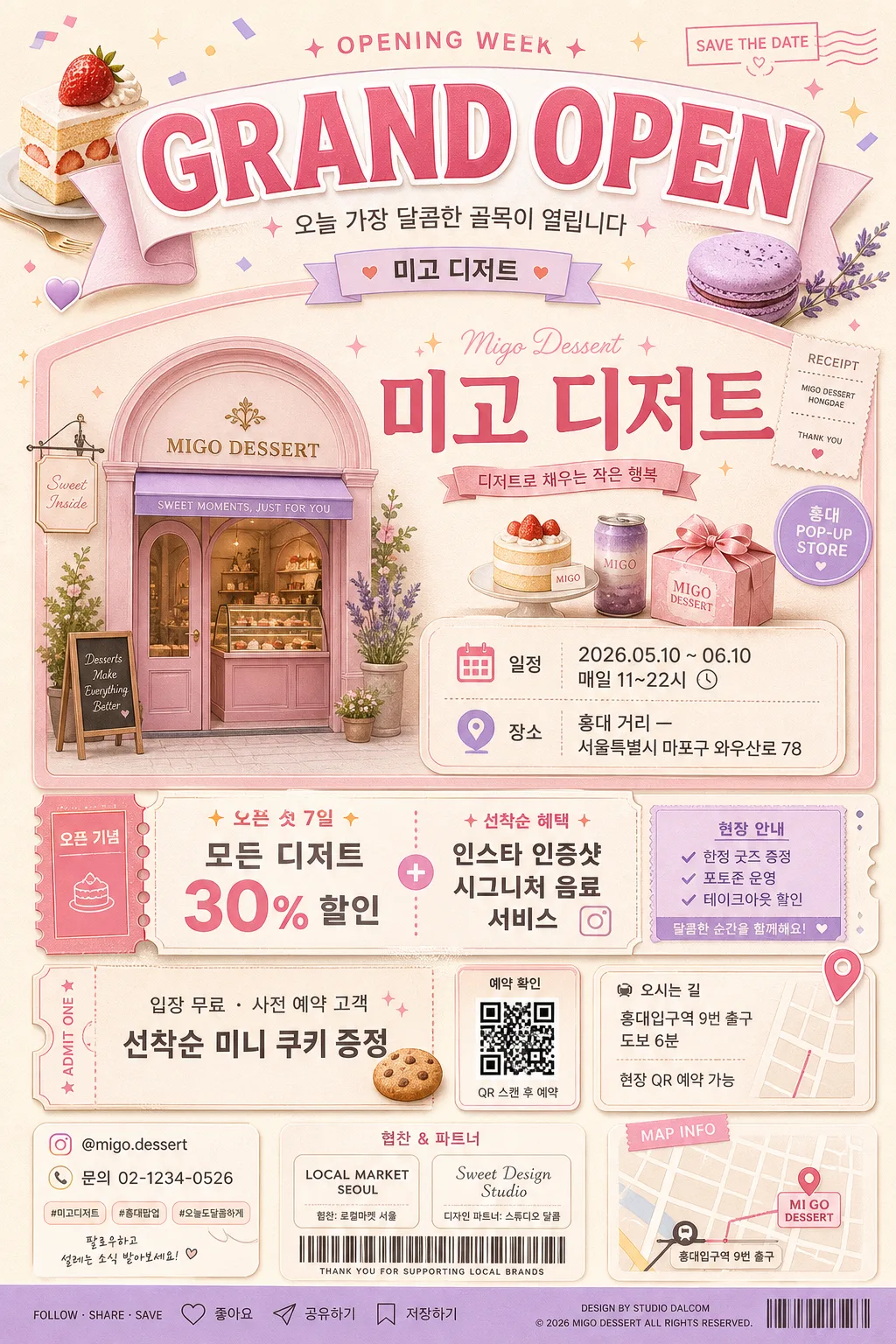
Korean store opening announcement poster, vertical print-ready + SNS-shareable layout.
Promote a new store or pop-up with a large event headline, brand wordmark area, signature illustration, practical visit details, ticket/reservation info, benefit callout, sponsor area, and realistic retail campaign footer.

[Composition]
- Overall layout: tall 1024x1536 poster with a strong top event header occupying about 18–22%, a centered brand and visit-information block occupying about 50–55%, a benefit/ticket strip below it, and a practical footer with sponsor/contact/map cues.
- Main subject: {매장명} presented as the brand focus, with {이벤트 종류} as the primary headline language and {슬로건} as a short campaign phrase.
- Background treatment: soft pastel shop-inspired backdrop with tactile paper grain, cream base, counter-like curved panels, receipt-sticker accents, and {컨셉 톤} color details.
- Composition details: use layered rounded cards, a small illustrated storefront arch, dessert/product motifs, ribbon labels, dotted dividers, map-pin icon, calendar icon, ticket stub shape, and tiny social-media micro icons to make the poster feel like a real opening campaign.

[3. CORE STRUCTURE]
1. Top header area: place a large bold headline reading {이벤트 종류} across the upper band, add a compact brand wordmark area for {매장명}, and include a small line reading {슬로건}. Add decorative sparkles, pastry/product icons, and a soft ribbon behind the headline.
2. Brand block: set {매장명} prominently in the upper-middle section with a refined display style, paired with a signature illustration matching the shop concept such as a pastel storefront, dessert tray, gift box, or pop-up booth.
3. Key info block: place {기간/날짜} and {장소} in a stacked schedule/location card with clear Korean labels like “일정” and “장소”, plus mini icons for calendar, clock, and map pin.
4. Benefit block: highlight {이벤트/혜택} in a coupon-like box or bright ribbon area, with supporting microcopy such as “오픈 기념”, “선착순 혜택”, and “현장 안내”.
5. Ticket and visit info: add a ticket-stub panel reading {티켓/입장정보}, a QR/reservation cue labeled “예약 확인”, and a small wayfinding note reading {지도안내}.
6. Sponsor/contact footer: include {인스타그램}, {연락처}, {후원/협찬}, and a small address/contact strip with divider lines, sponsor logos as generic text badges, social save/share micro icons, and a compact page-like production credit.
7. Decorative graphics: use pastel confetti, sticker tags, ribbon folds, receipt-paper texture, illustrated product thumbnails, and subtle shadows so the poster feels like a real Seoul café/pop-up retail announcement.

[4. STYLE RULES]
- Typography: use Pretendard ExtraBold for the headline, Pretendard SemiBold for labels, and Noto Sans KR Regular for details; headline around 72–96px, brand name around 54–72px, body around 28–36px, footer around 18–22px.
- Color palette: use the tones in {컨셉 톤}, anchored by soft pink #F7C6D0, cream #FFF6EA, lavender #CDB9F6, butter yellow #FFE7A8, and warm gray #6E6A67.
- Border/shadow: rounded cards, coupon perforation details, small dotted dividers, soft drop shadows with 4px y-offset, 14px blur, 12–15% opacity, and warm pastel outlines where helpful.
- Text hierarchy: headline and store name must be dominant, schedule/location must be immediately readable, benefits should appear as the strongest callout after the headline, and footer details should feel practical but still legible.
- Print realism: include tiny production marks such as “OPENING WEEK”, “MAP INFO”, “SAVE THE DATE”, a compact barcode-like retail graphic, and small sponsor badges without implying official certification.

[5. VISUAL STYLE]
- Camera / lens: studio product-poster look, equivalent to a 50mm standard lens with a clean front-facing composition and minimal distortion.
- Lighting: soft diffused studio light from upper-left, gentle fill from right, even exposure with mild highlight control.
- Color grade: pastel editorial grade with cream, pink, and lavender balance, slightly warm whites and clean neutral shadows.
- Material feeling: matte coated poster paper, soft paper grain, printed ink texture, layered sticker/coupon elements, and gentle tactile shadows between panels.

[6. MOOD]
Elegant boutique opening poster — polished retail campaign feel like a Kinfolk-inspired brand launch with a contemporary Seoul café/pop-up aesthetic, playful enough for SNS sharing and detailed enough for a real storefront announcement.

[7. CRITICAL]
- Korean text accuracy: 반드시 아래 문구가 정확히 렌더되어야 함:
  - {매장명}
  - {이벤트 종류}
  - {슬로건}
  - {기간/날짜}
  - {장소}
  - {이벤트/혜택}
  - {티켓/입장정보}
  - {지도안내}
  - {인스타그램}
  - {연락처}
  - {후원/협찬}
- Poster must clearly show these Korean labels as readable rendered text: “일정”, “장소”, “혜택”, “입장 안내”, “예약 확인”, “오픈 기념”, “선착순 혜택”.
- Layout invariant: headline, brand name, schedule, location, benefit, ticket/reservation cue, and contact/footer information must all be clearly legible and not overlap.
- Keep the design vertical, print-poster-like, and suitable for 1024x1536 SNS sharing.

[8. 🚫 PROHIBITED]
- Fake official seals / certifications
- Broken Korean characters
- Fake government or institutional approval marks