広告・ポスター
유튜브·디스플레이 광고 키비주얼
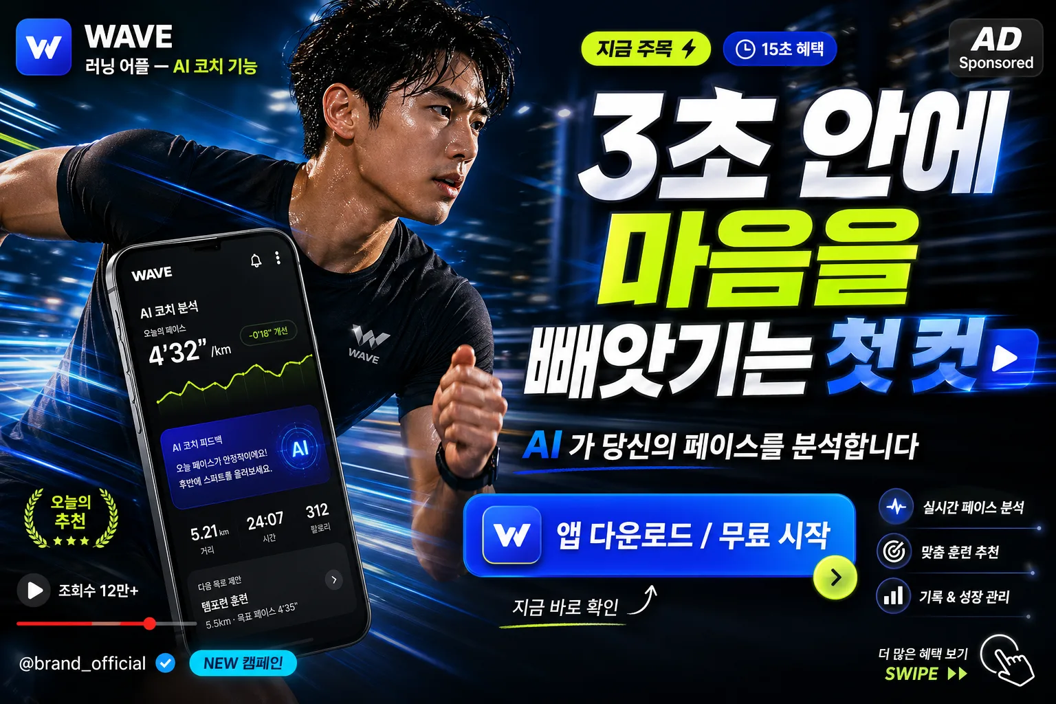
유튜브 광고·디스플레이 광고 첫 키프레임. 제품·메시지·CTA 입력하면 5초 안에 시선 잡는 광고 비주얼.
유튜브·디스플레이 광고 키비주얼の概要
広告・ポスター画像を作るためのChatGPT画像プロンプトです。主題、背景、スタイル、構図を整理し、すぐに試せるよう構成しています。
関連キーワード: 유튜브·디스플레이 광고 키비주얼, 유튜브·디스플레이 광고 키비주얼 프롬프트, 広告・ポスター 프롬프트, 広告・ポスター AI 이미지 프롬프트, ChatGPT 이미지 프롬프트, AI 이미지 생성 프롬프트, AI 프롬프트, 이미지 프롬프트
유튜브·디스플레이 광고 키비주얼の活用方法
元の構造を保ちながら、被写体、背景、色、構図を変更して別案に展開できます。
- 主題を維持し、ブランドや季節、媒体に合わせて色と背景を変更してください。
- 結果が複雑な場合は背景要素を減らし、被写体、構図、照明を具体化してください。
- コピー後、ChatGPTに媒体、アスペクト比、文字の有無を追加で指定できます。
プロンプト原文
[Input]
- language: Korean
- output_size: 1536x1024

[Purpose]
YouTube and display ad key visual, strong first-frame composition for fast attention capture.
Dynamic motion-still editorial ad image with a bold headline, supporting subcopy, clear CTA button, and realistic platform-ad details, suitable for performance marketing placements and high-impact YouTube bumper/display campaigns.

[Composition]
- Center-left hero zone: dynamic human or product visual occupies about 55–60% of the frame, angled for immediate motion impact, with authentic contextual details around the subject that make {제품/서비스} feel real, desirable, and in use.
- Background treatment: deep high-contrast commercial backdrop with subtle motion blur streaks, light trails, expansion effects, realistic reflections, atmospheric haze, and environment cues matching {컨셉 톤}; keep headline readability strong while allowing rich visual texture.
- Text hierarchy: large headline at the upper or mid-right area, sub-message directly below, CTA button anchored lower-right or lower-center, plus small ad metadata such as “AD”, “15초 혜택”, “@brand_official”, and a short Korean hook badge like “지금 주목 ⚡”.
- Add YouTube/display-ad flavor: include an accent emoji or graphic burst, small channel/brand handle, compact view-bait style sticker such as “오늘의 추천”, a tiny progress-bar motif, and subtle UI-inspired micro icons that do not overpower the main message.
- Use {제품/서비스}, {후킹 헤드라인}, {핵심 메시지}, {CTA}, {컨셉 톤}, {비율/사이즈} as editable Korean placeholders.

[3. CORE STRUCTURE]
1. Hero subject area: present {제품/서비스} as the visual focal point, either as a sharply lit product shot or a dynamic person-in-motion frame, with crisp separation from the background, realistic surface detail, and a slight freeze-frame campaign feel.
2. Motion effect layer: add directional blur, glow streaks, speed expansion, flying accent shapes, and light particles around the hero edges only, keeping the face/product core sharp and readable.
3. Headline block: place {후킹 헤드라인} in very large Korean type, stacked for instant scanability, with tight leading, strong contrast, and a subtle depth effect for mobile thumbnail impact.
4. Supporting copy block: place {핵심 메시지} beneath the headline in smaller but still legible Korean type, using a concise two-line or single-line arrangement.
5. CTA block: render {CTA} as a button-like element with clear padding, rounded rectangle or hard-edge ad button style, visually separated from surrounding text; add small nearby microcopy such as “지금 바로 확인” or “클릭하고 혜택 보기”.
6. Platform detail layer: add small realistic ad elements such as “AD”, “Sponsored”, “@brand_official”, “조회수 12만+”, “NEW 캠페인”, a tiny play icon, progress bar, or swipe arrow, all in Korean-friendly layout proportions.
7. Tone integration: interpret {컨셉 톤} through a performance-ad aesthetic with punchy composition, high energy, polished commercial finish, and believable real-world staging rather than a sterile template.
8. Canvas fit: format everything for {비율/사이즈}, keeping the ad instantly legible across desktop, mobile, and display placements while allowing layered graphics, product context, and promotional details.

[4. STYLE RULES]
- Typography: Pretendard or Noto Sans KR for headline and body, headline in ExtraBold 900 at very large size, subcopy in SemiBold 600, CTA in Bold 700 with slightly widened letter spacing; use smaller Medium 500 text for handle, AD label, badge captions, and UI microcopy.
- Color palette: use a high-contrast base such as charcoal black #111111, pure white #FFFFFF, and 1–2 accent colors like electric blue #2D6BFF and neon lime #B9FF3D, or vivid red #FF3B30 if needed for CTA emphasis.
- Border/shadow: CTA button with soft drop shadow, 0px x-offset, 6px y-offset, 18px blur, 20% opacity; headline may use a thin dark shadow, subtle outline, or luminous rim for readability.
- Layout discipline: maintain a strong advertising grid with clear hierarchy between hero, headline, subcopy, CTA, badge, and handle; layer secondary details like arrows, stickers, UI icons, and light streaks to enrich the image without obscuring the Korean text.
- Realistic detail: include tactile materials, product reflections, clothing texture, natural skin detail if a person appears, believable background depth, and campaign-production lighting so the image feels like a finished commercial key visual.

[5. VISUAL STYLE]
- Camera / lens: Canon EOS R5 with 85mm f/1.4 portrait look for a person-led key visual, or Sony A7R V with 50mm f/1.8 product-commercial look for an object-led key visual, both with shallow depth of field and crisp subject focus.
- Lighting: studio key light from upper-left at about 45° with a controlled rim light from the right, plus a small fill to preserve facial or product detail; add luminous edge highlights, practical light reflections, and colored accent glows for motion energy.
- Color grade: high-contrast commercial grade with deep blacks, bright whites, and saturated accent colors; slight teal-blue highlights or warm red punch depending on the chosen accent, with realistic skin/product tones and glossy digital-ad finish.

[6. MOOD]
Premium performance-ad key visual — Think Apple-style clarity meets Nike campaign energy, with a polished digital billboard, YouTube thumbnail urgency, and real campaign-shoot richness.

[7. CRITICAL]
- Korean text accuracy: 반드시 아래 문구를 정확한 한글로 렌더링해야 함.
  - {제품/서비스}
  - {후킹 헤드라인}
  - {핵심 메시지}
  - {CTA}
- Additional Korean text details may appear as realistic ad elements: “AD”, “15초 혜택”, “@brand_official”, “지금 주목 ⚡”, “오늘의 추천”, “조회수 12만+”, “NEW 캠페인”, “지금 바로 확인”.
- Typography must render Korean Jamo correctly, with no broken characters, no spacing glitches, and no illegible overlap.
- If a person is used, facial proportions and hands must be anatomically correct, with natural posture and no extra fingers.
- The layout must remain ad-like and instantly legible within a 5-second glance while feeling like a real premium YouTube/display campaign asset.

[8. 🚫 PROHIBITED]
- Fake official seals / certifications
- Broken Korean characters
- Unauthorized celebrity likeness or celebrity composite